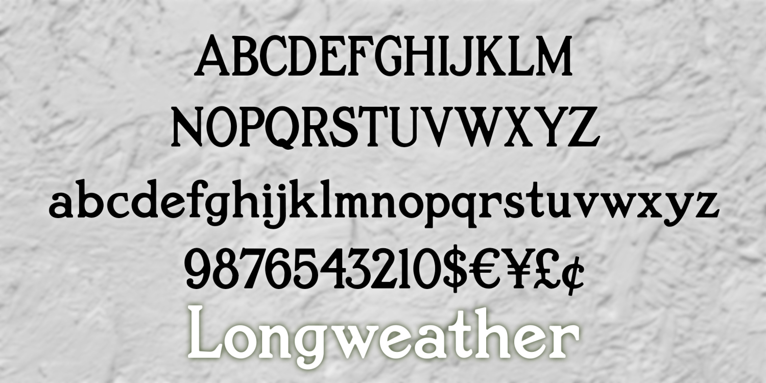
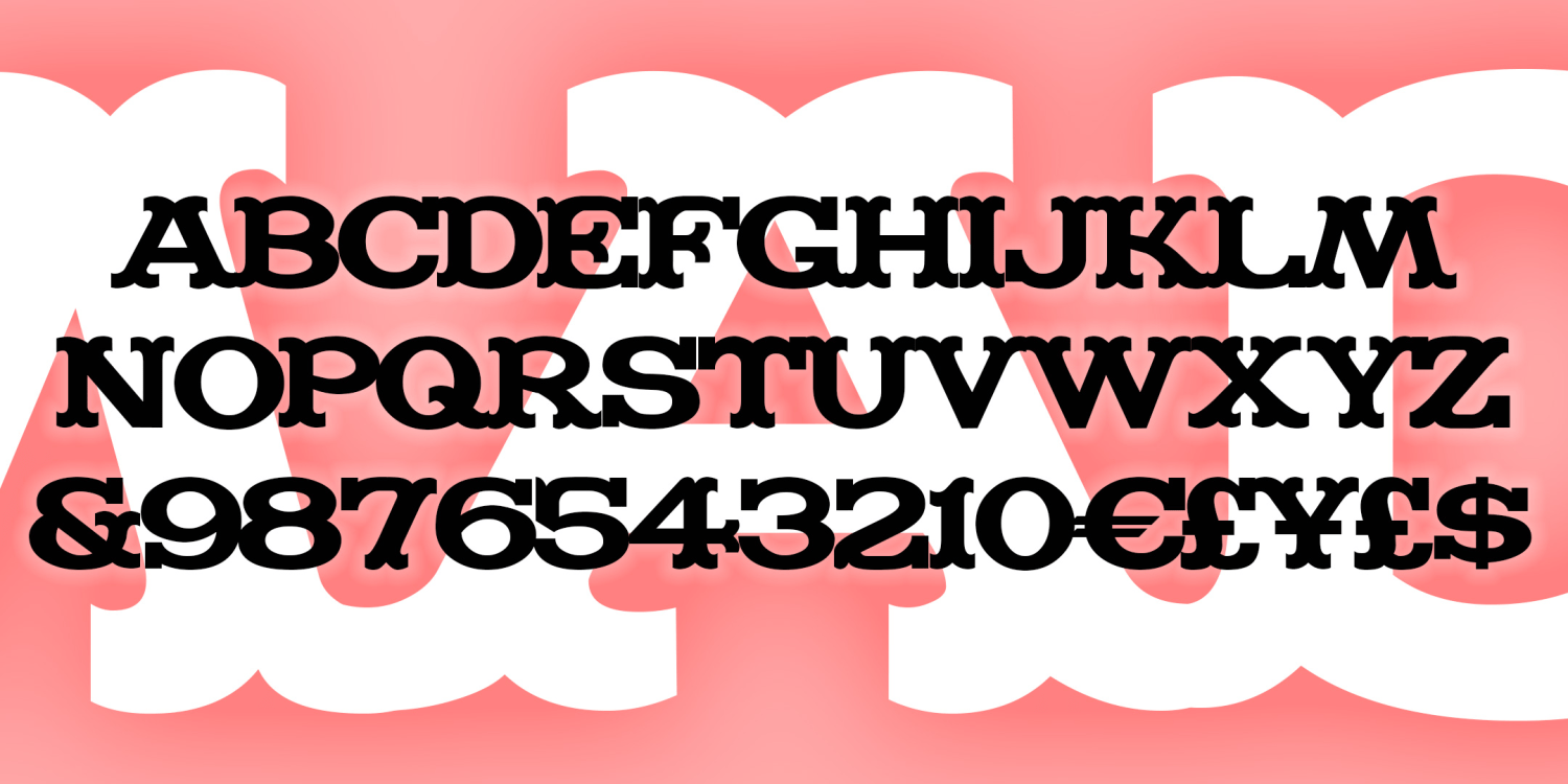
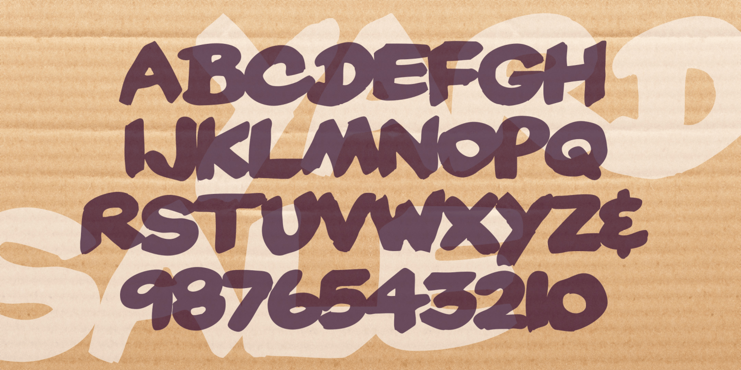
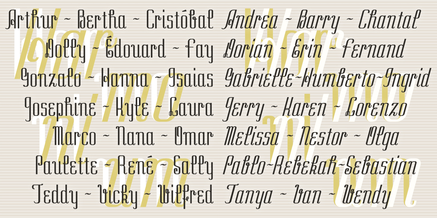
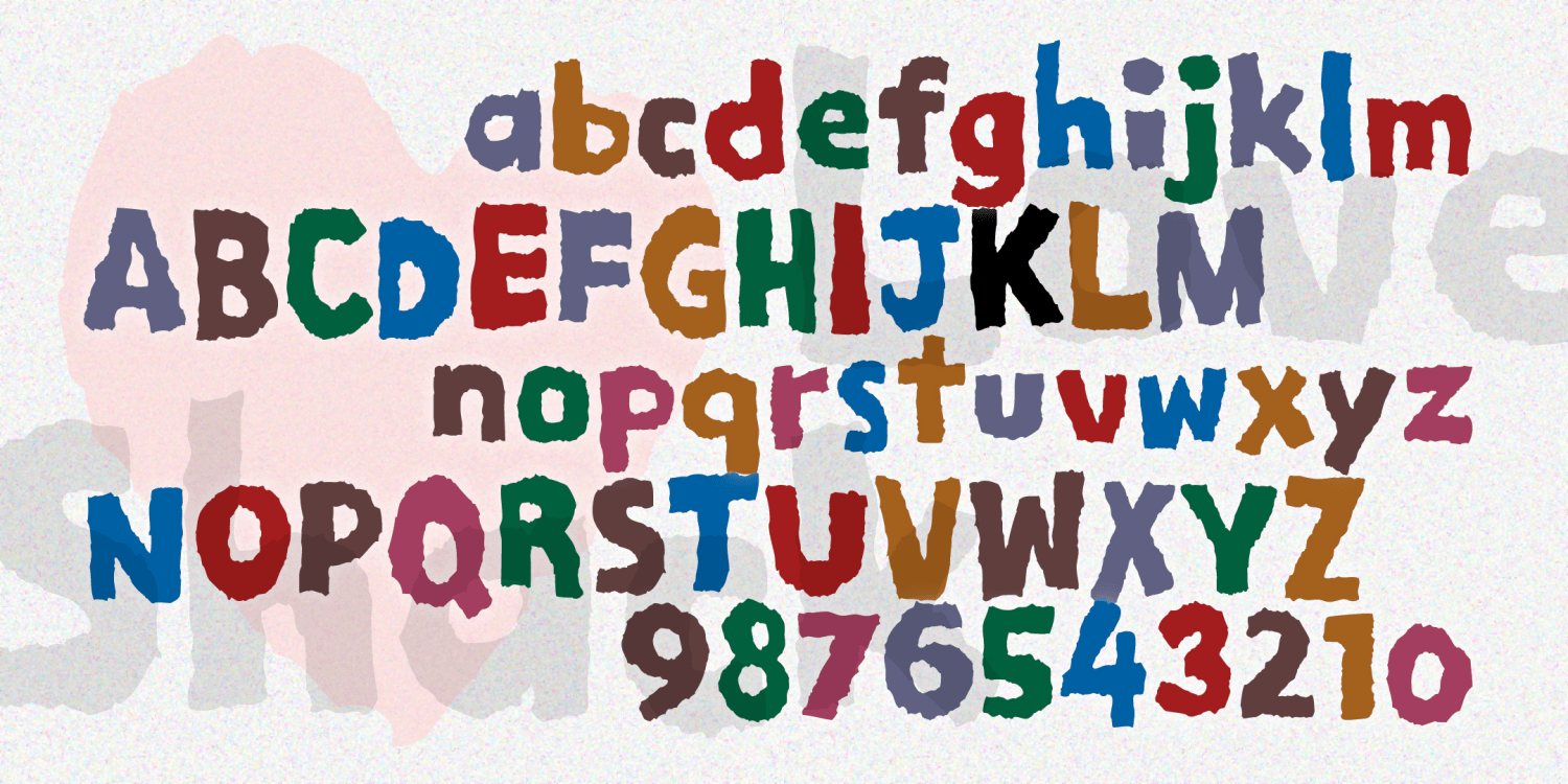
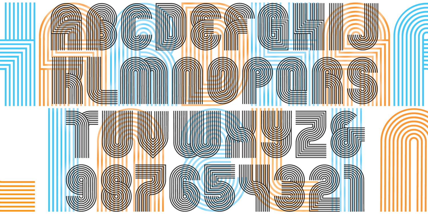
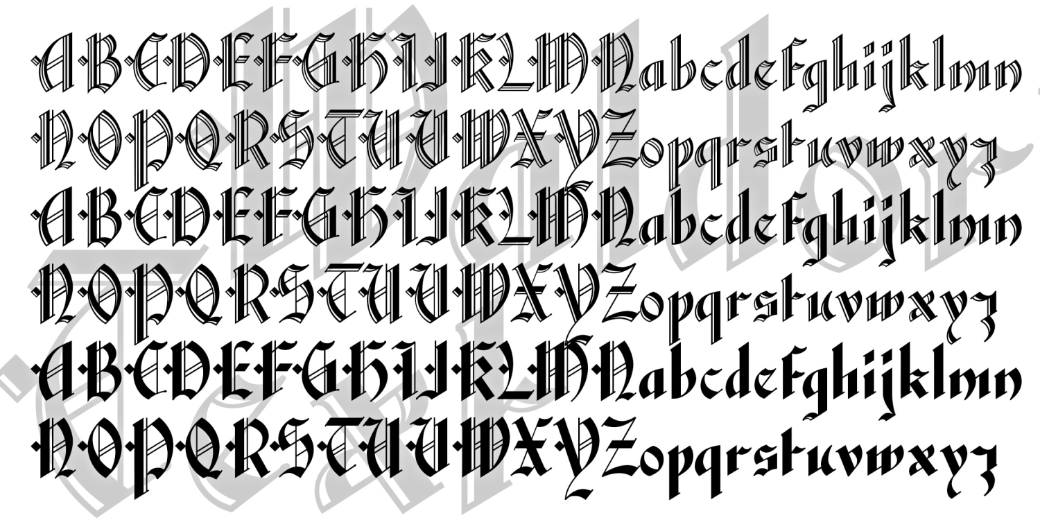
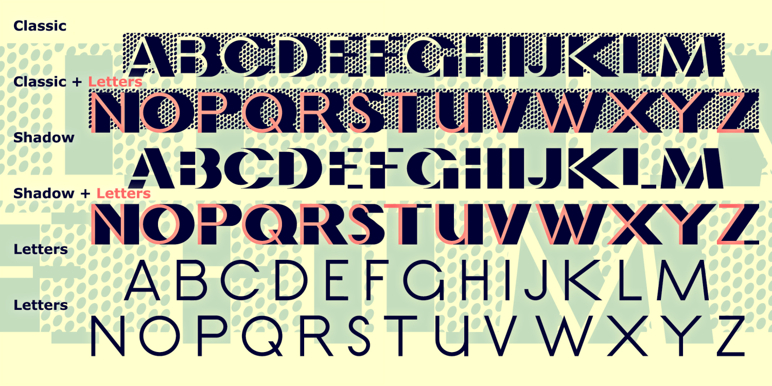
Longweather
1 Font | from $19.95
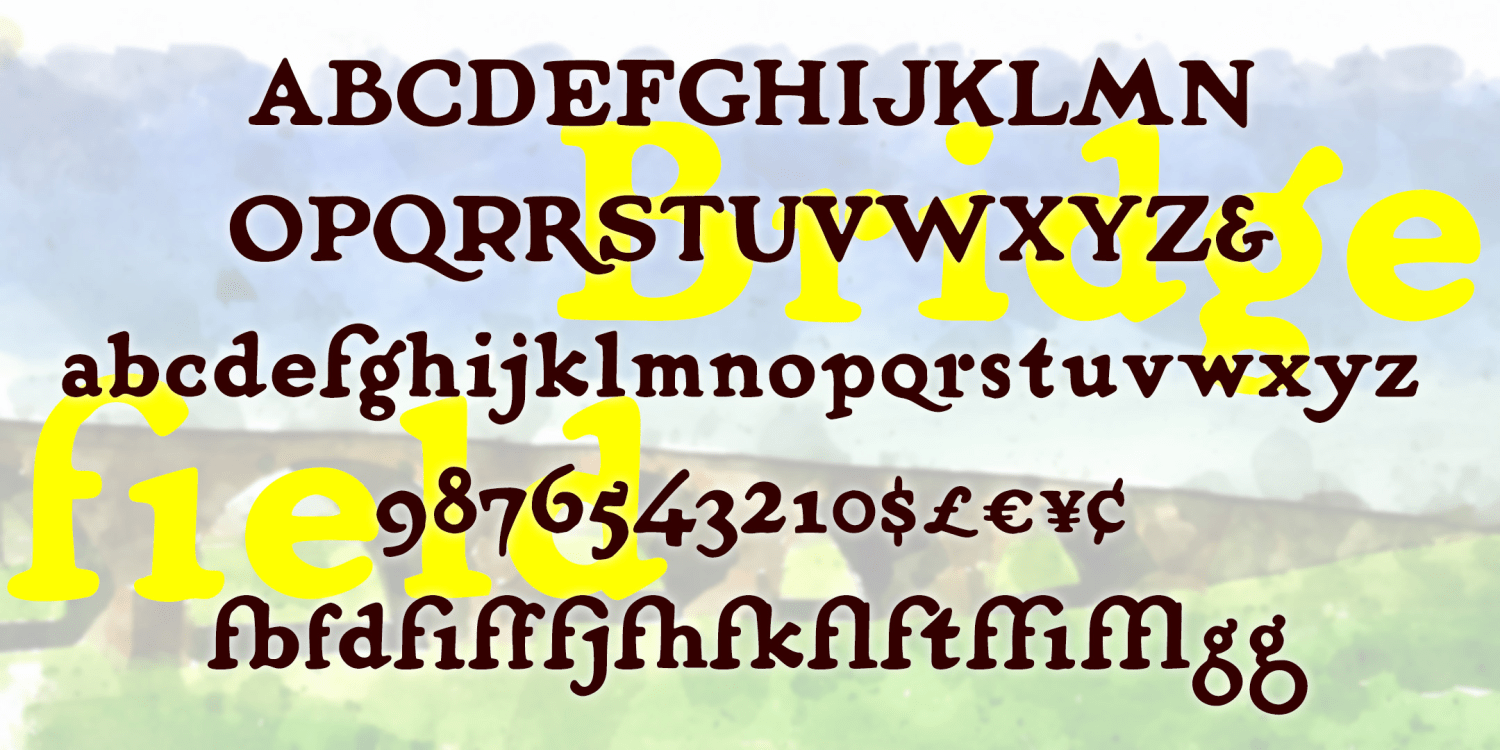
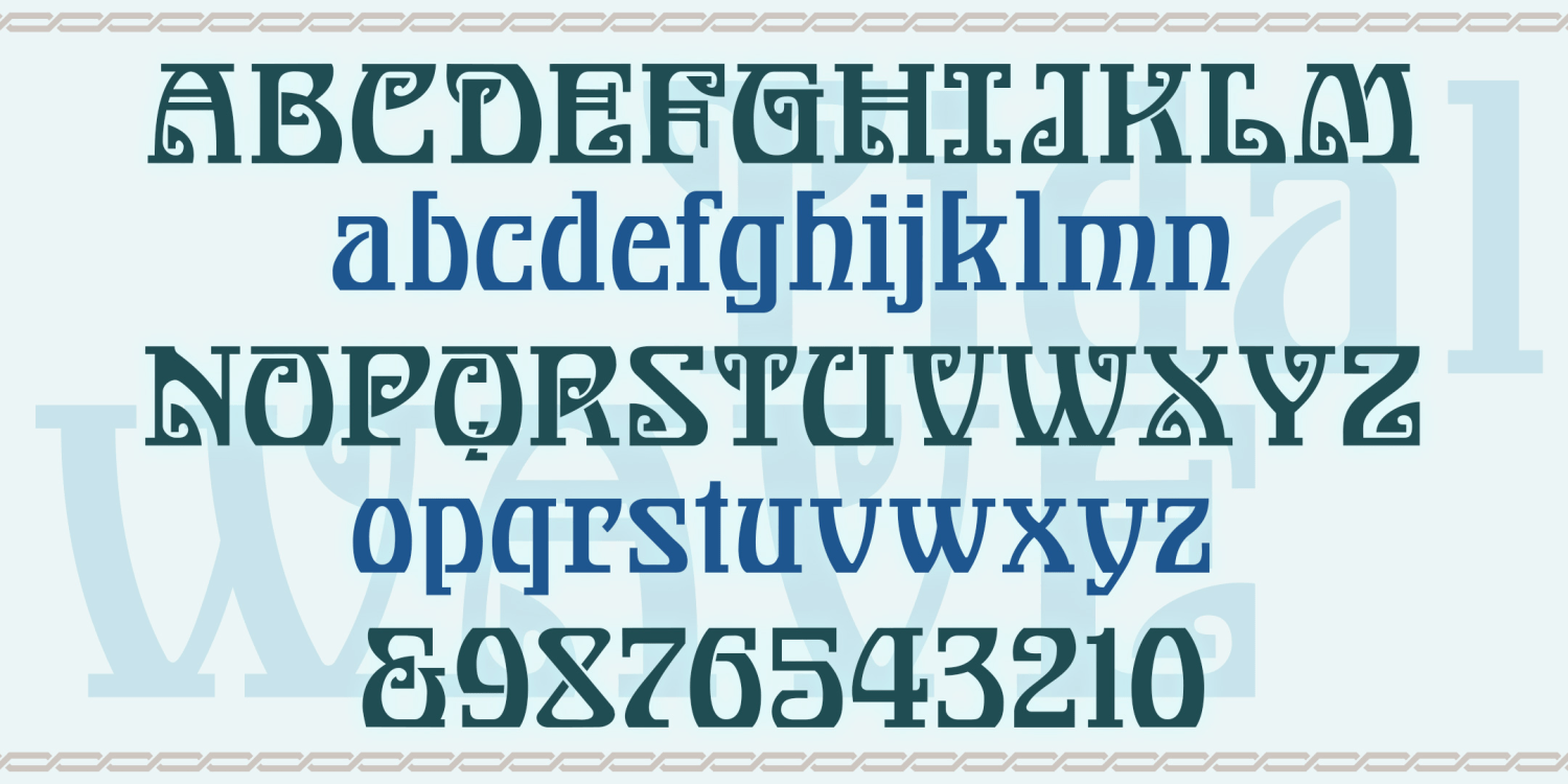
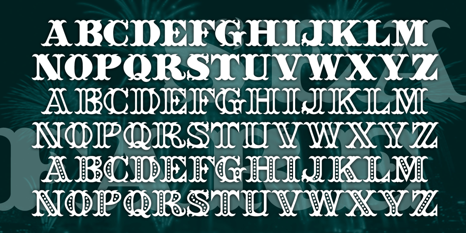
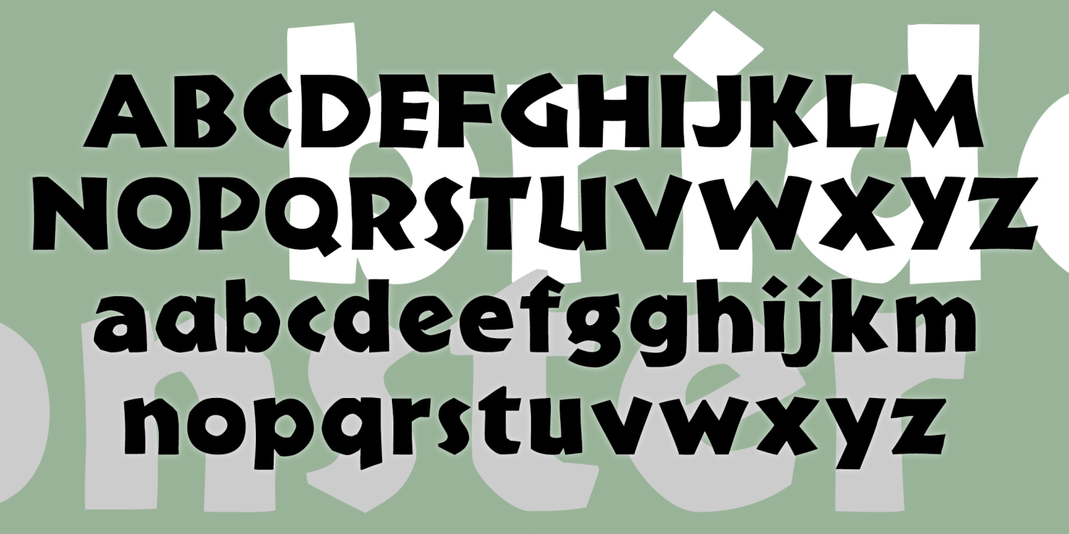
Bridgefield
1 Font | from $19.95
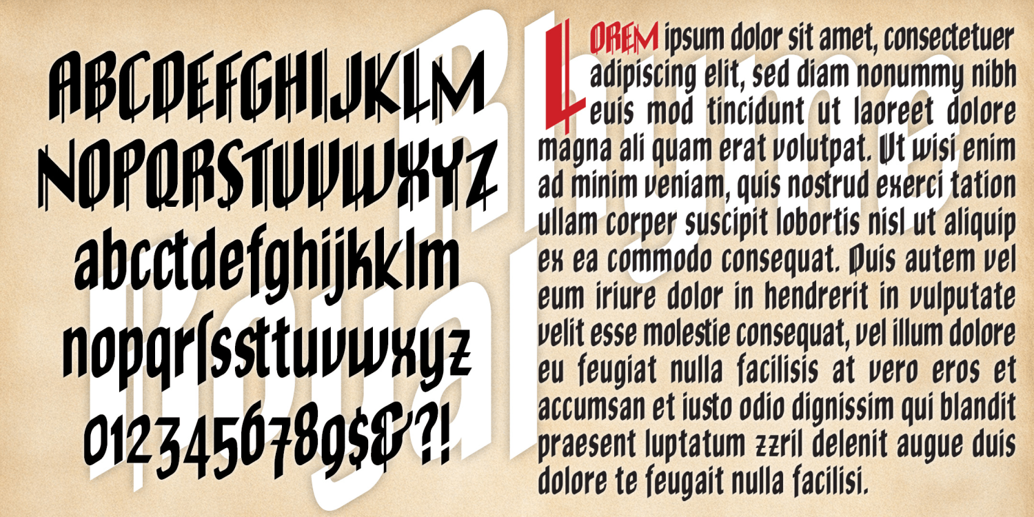
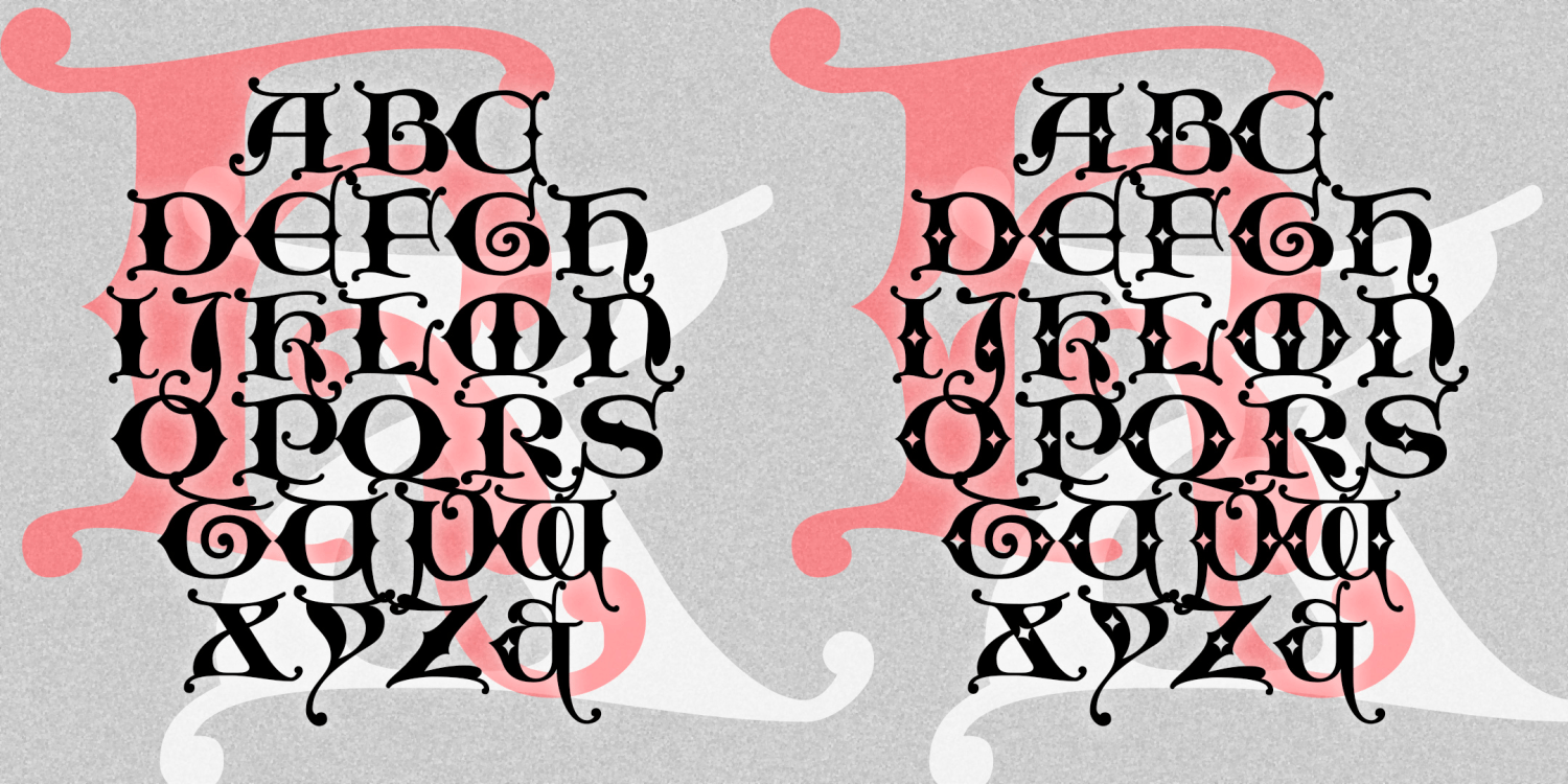
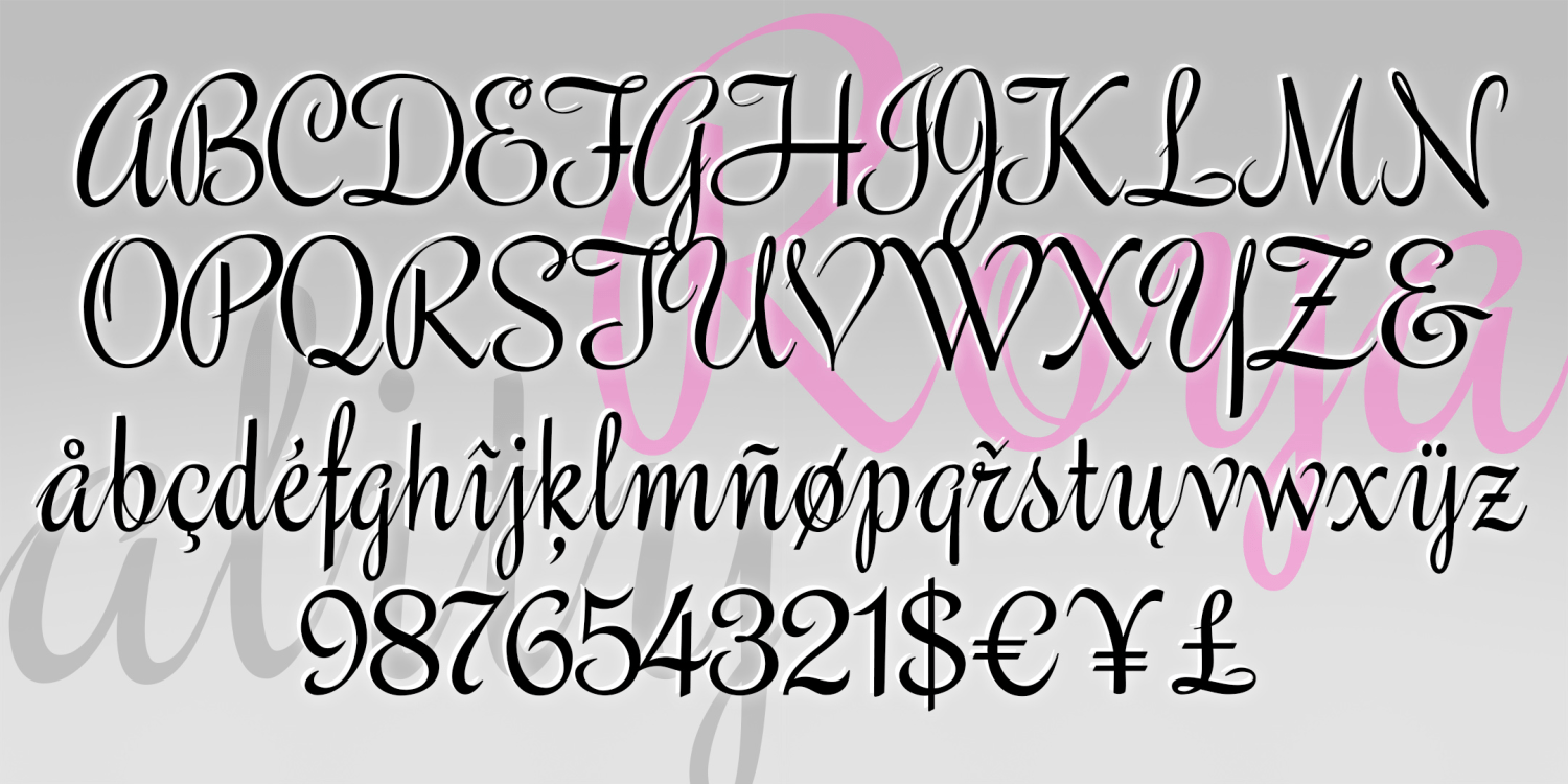
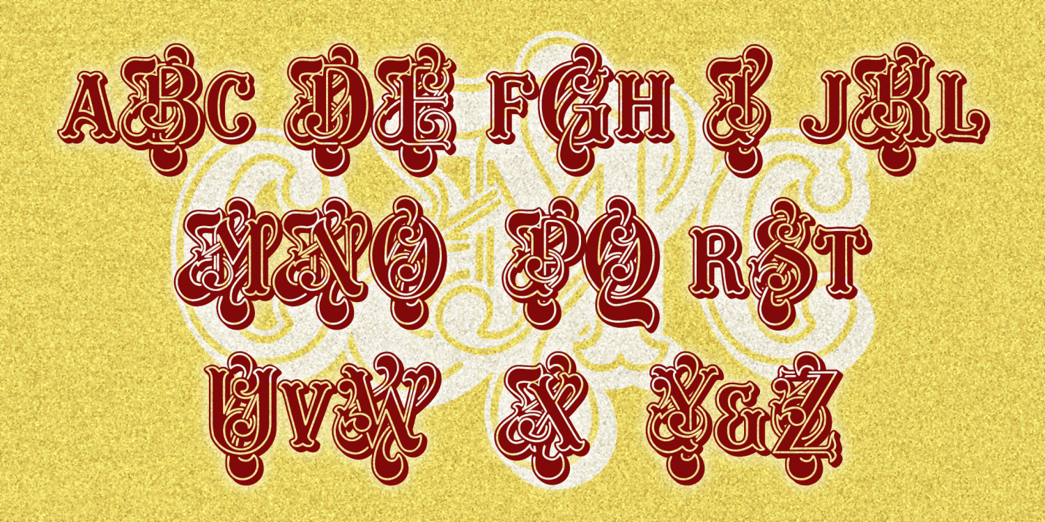
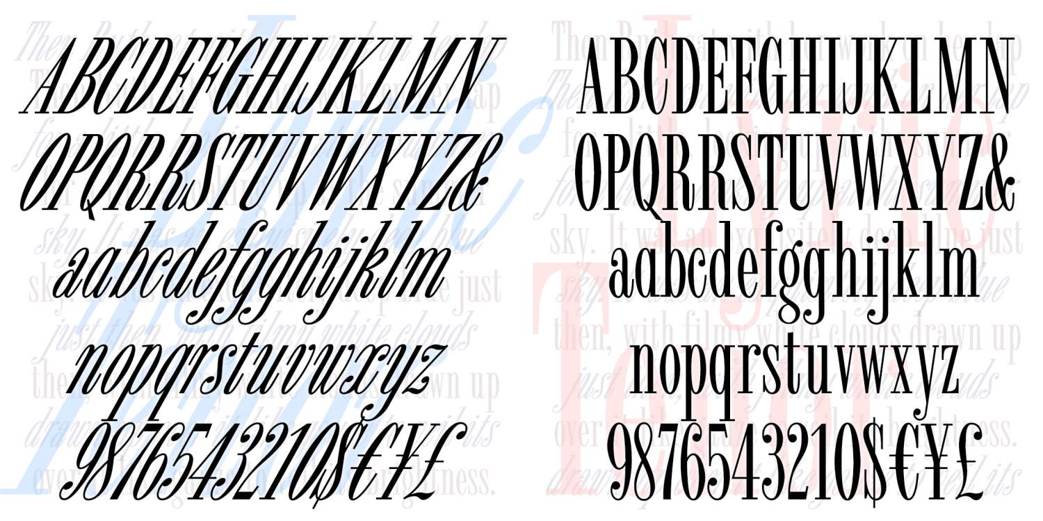
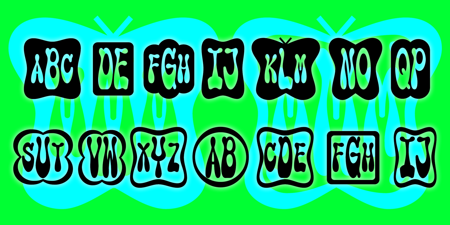
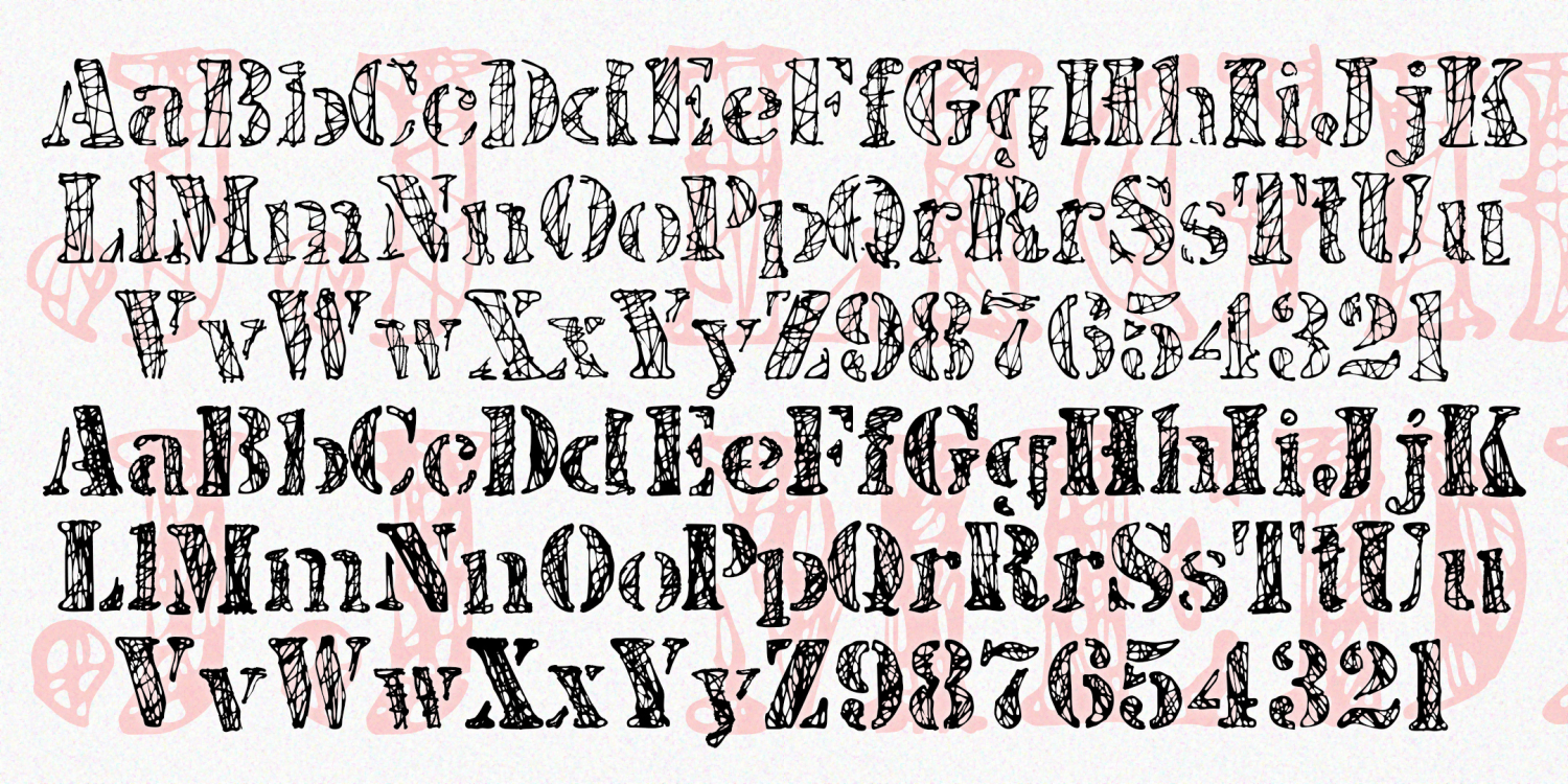
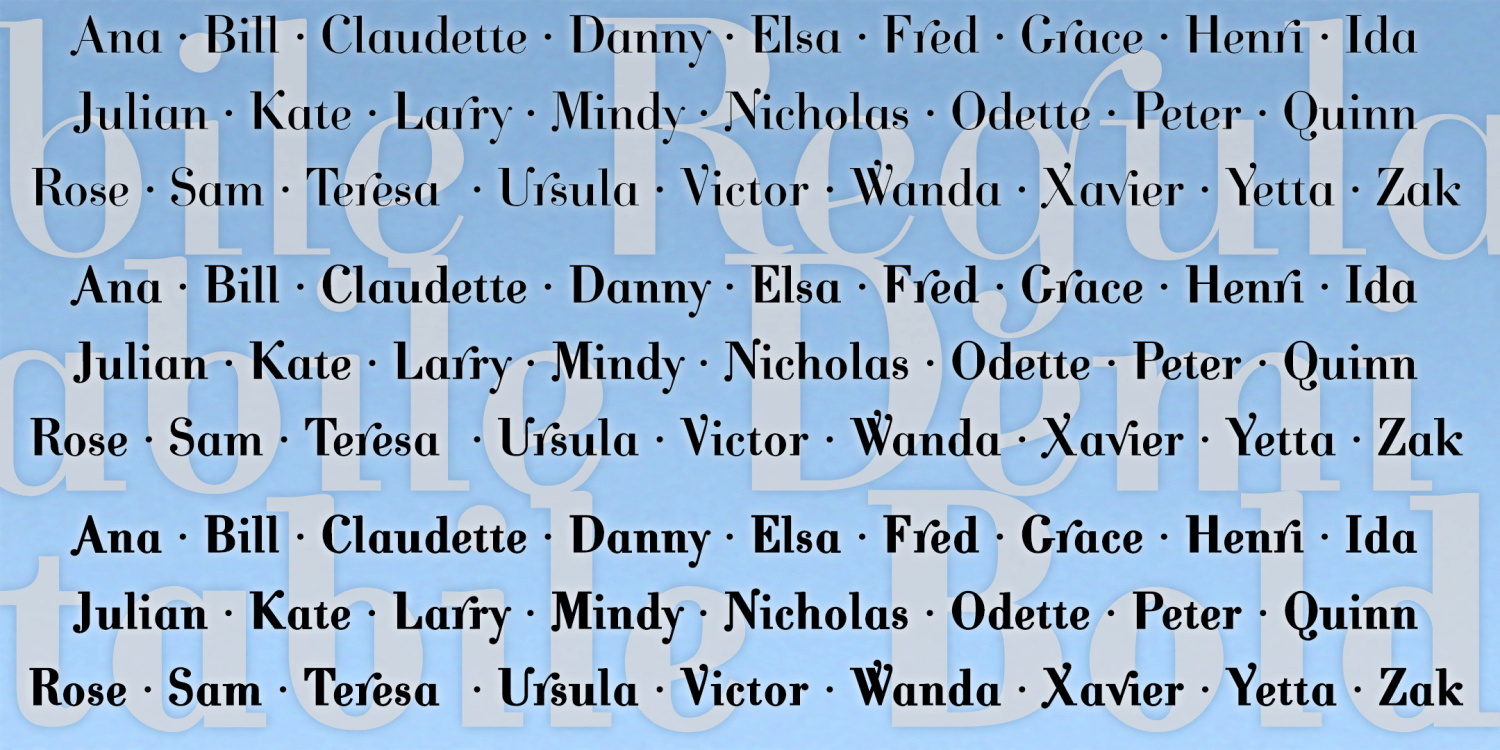
Rhyme Royal
1 Font | Free Download
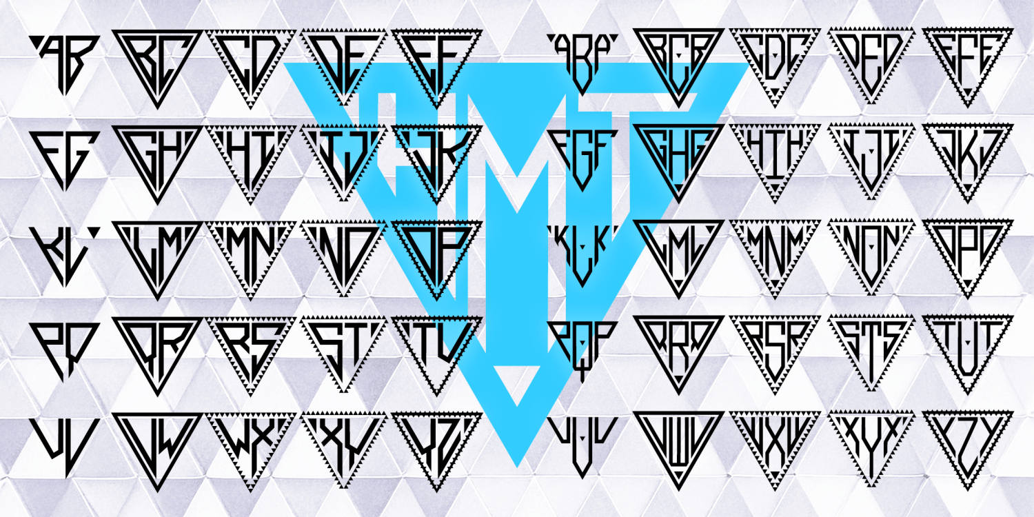
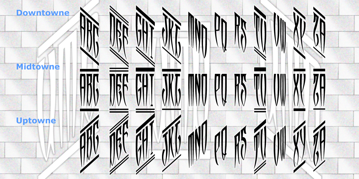
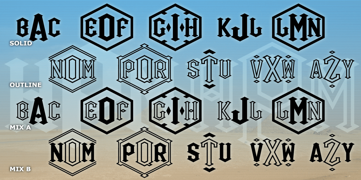
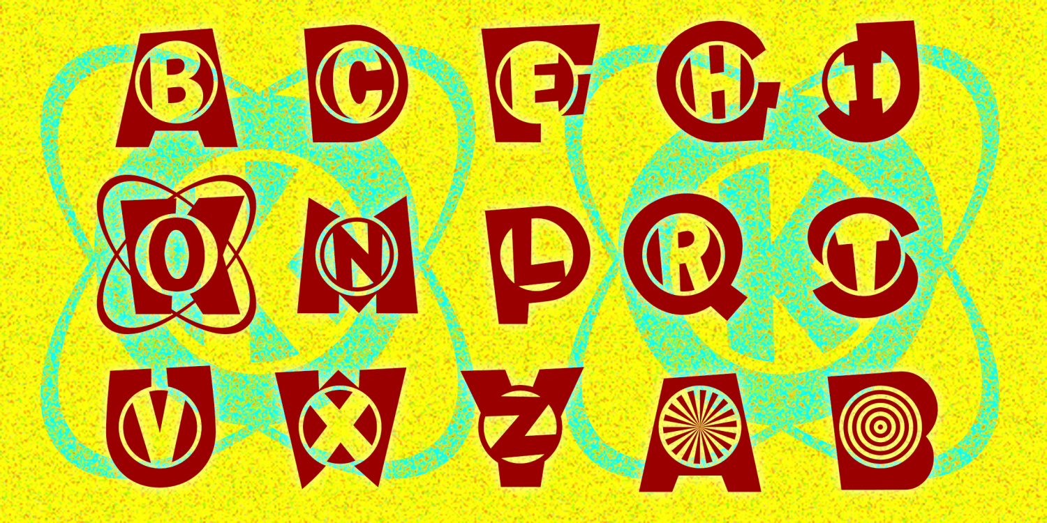
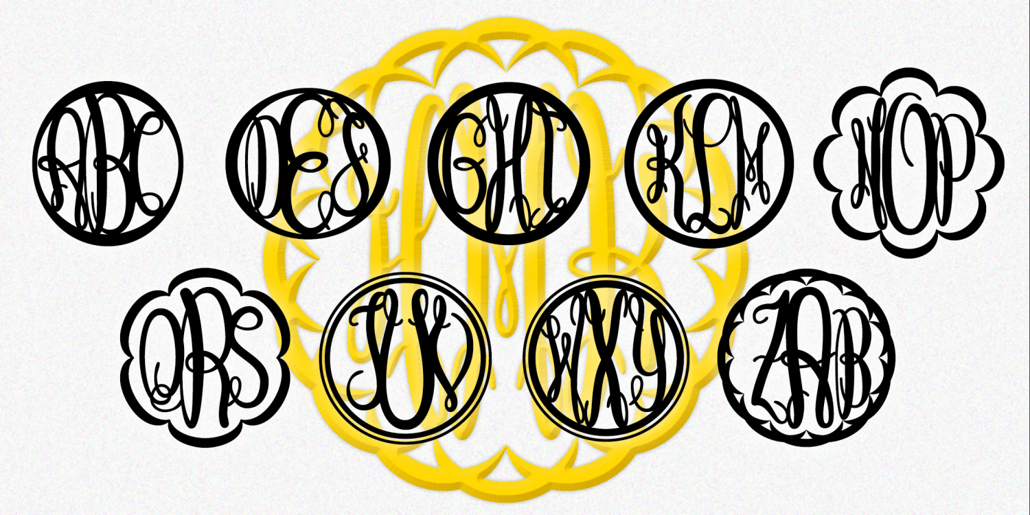
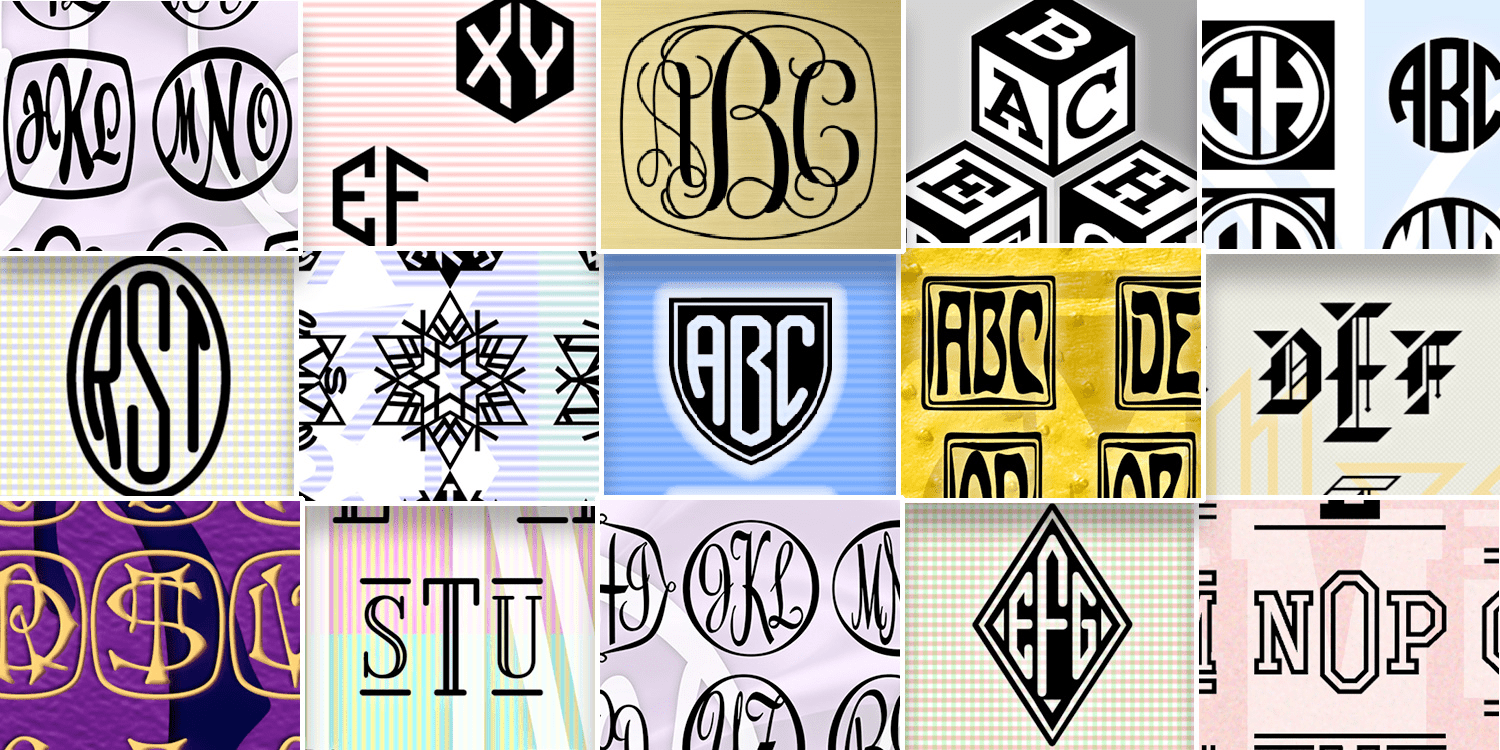
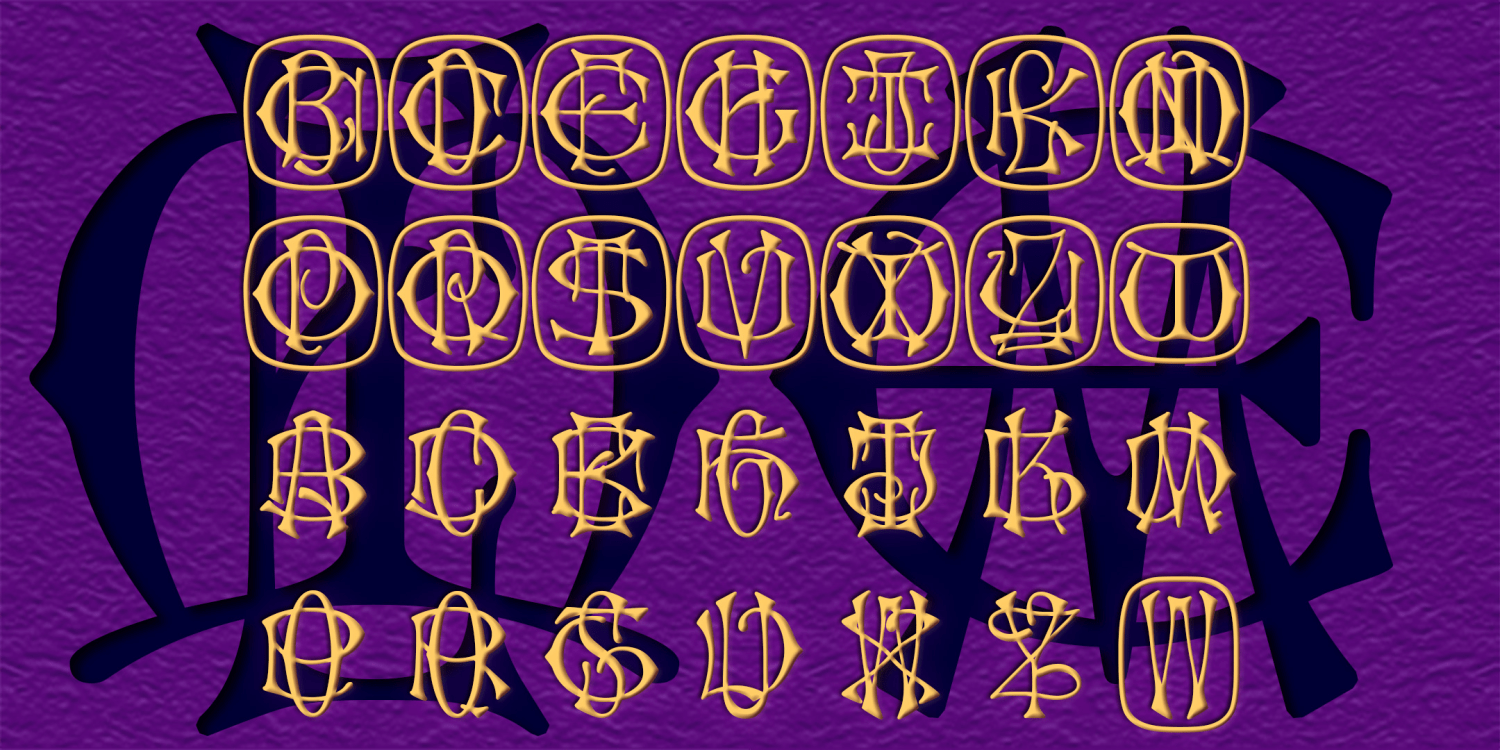
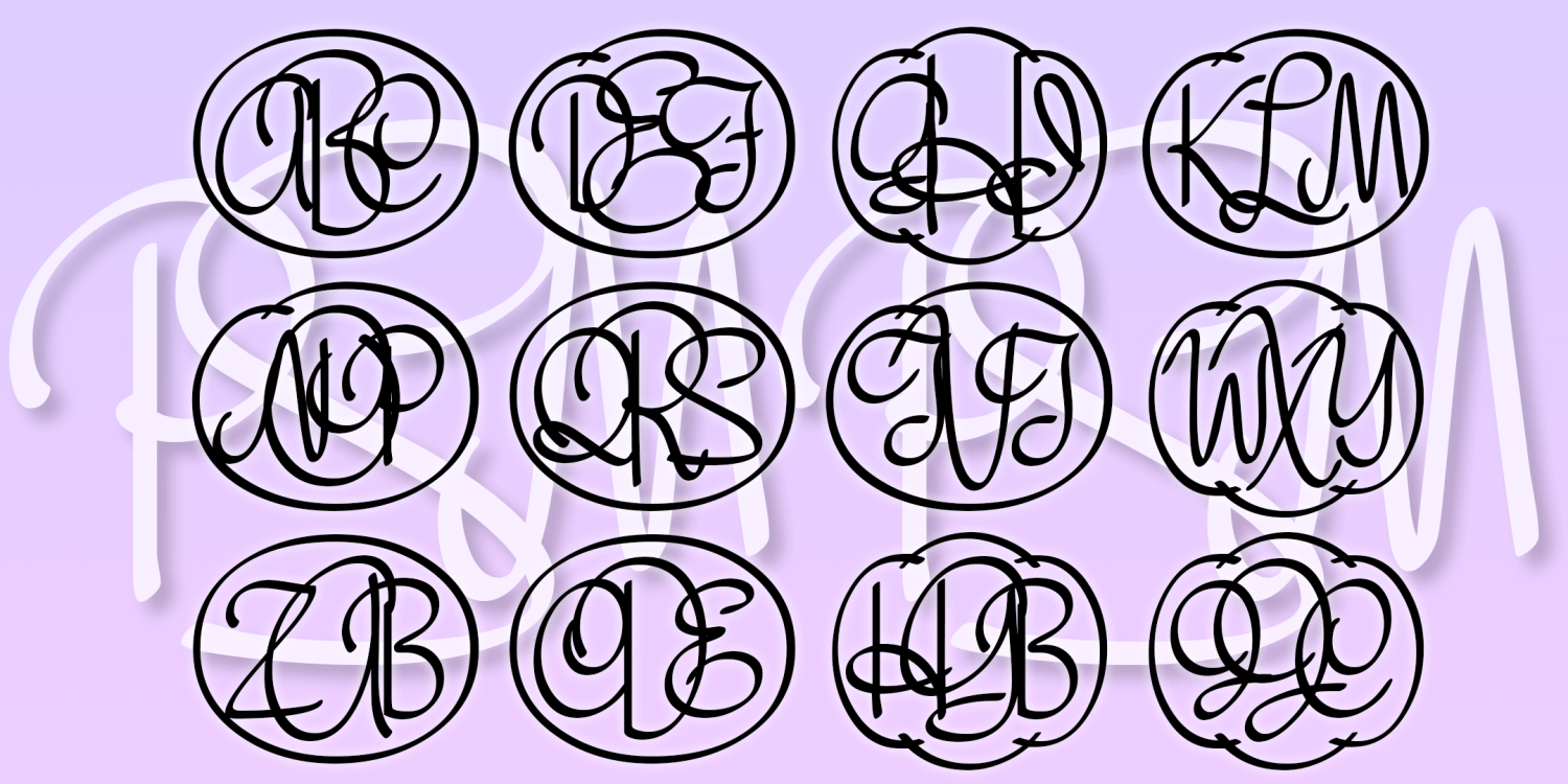
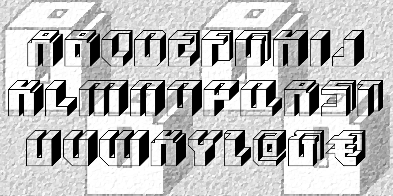
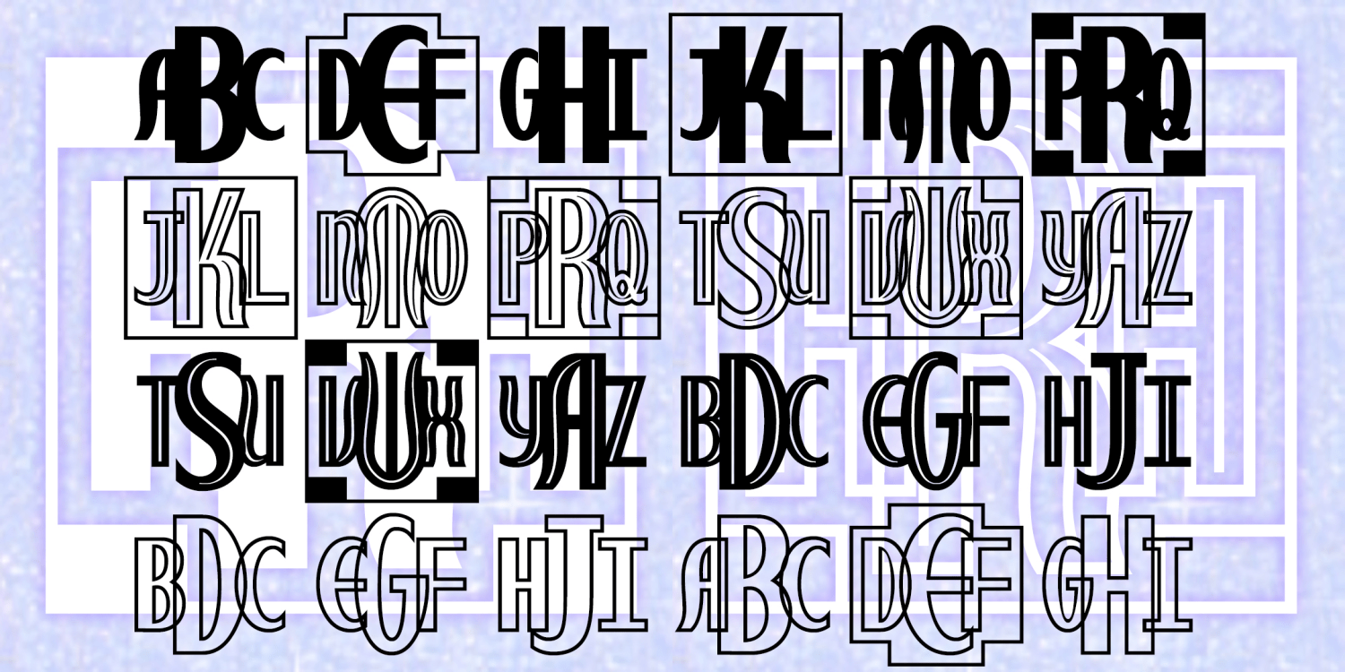
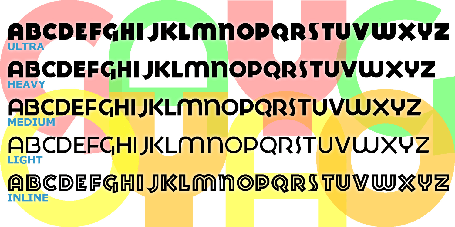
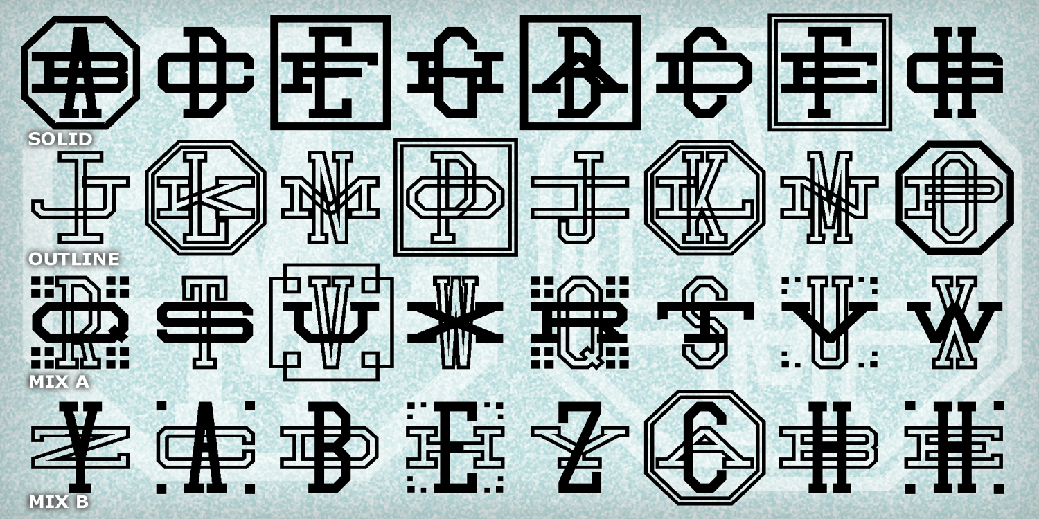
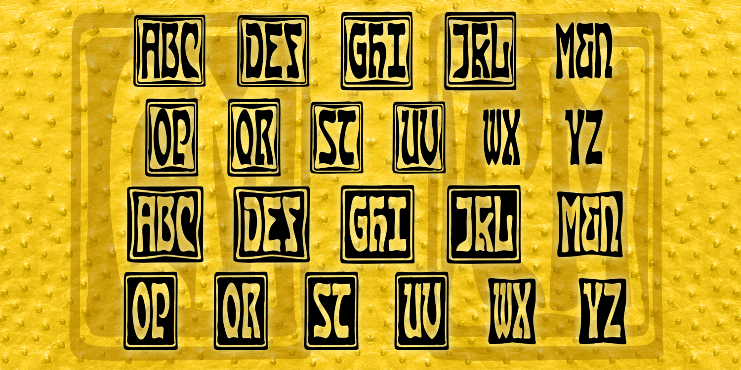
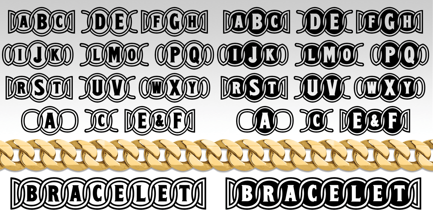
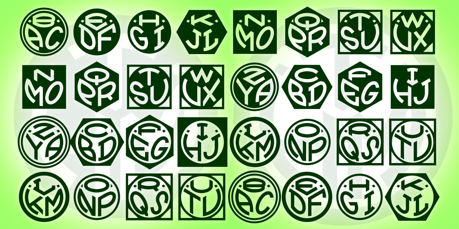
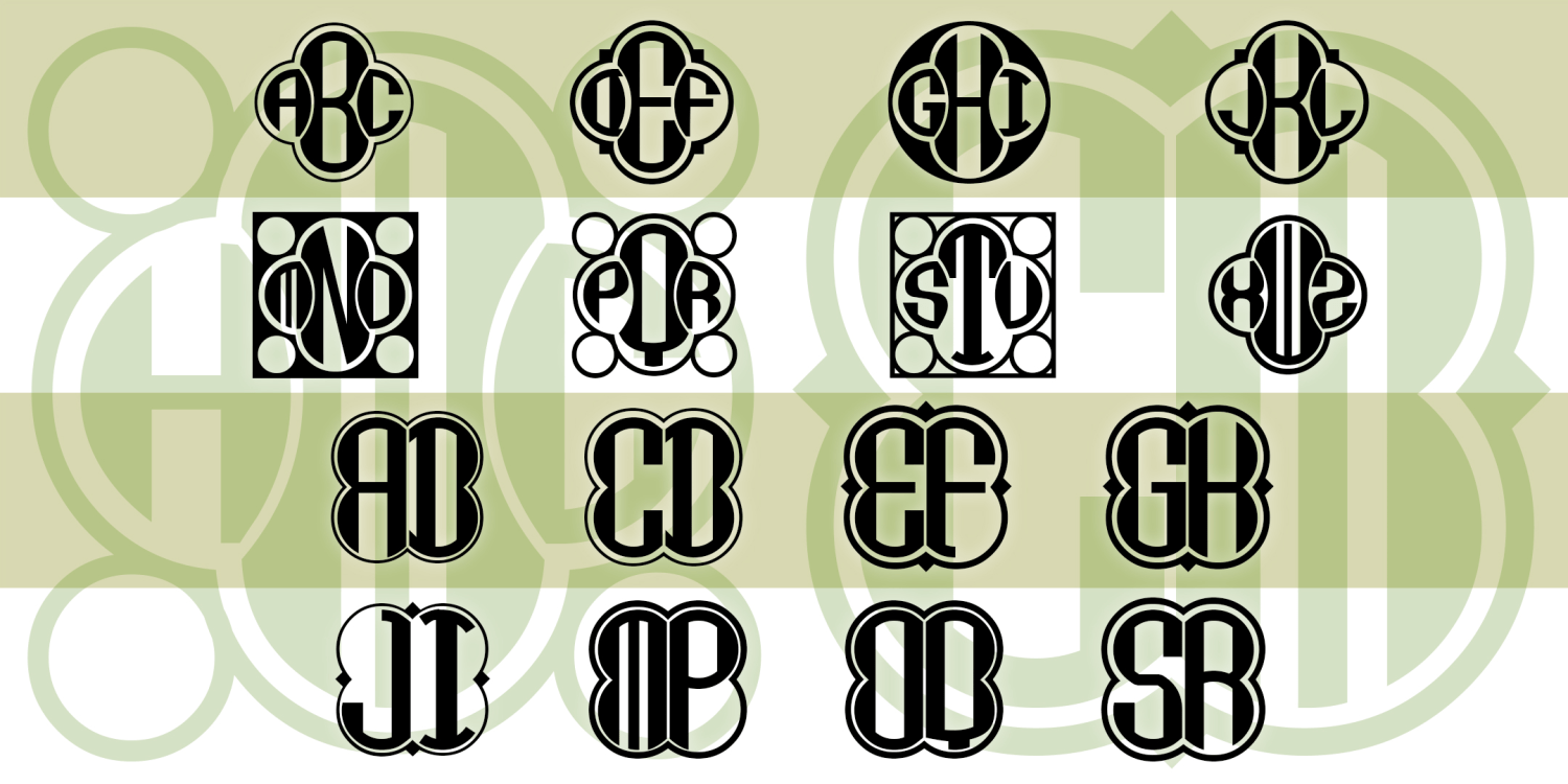
Triangle Monograms
4 Fonts | from $19.95
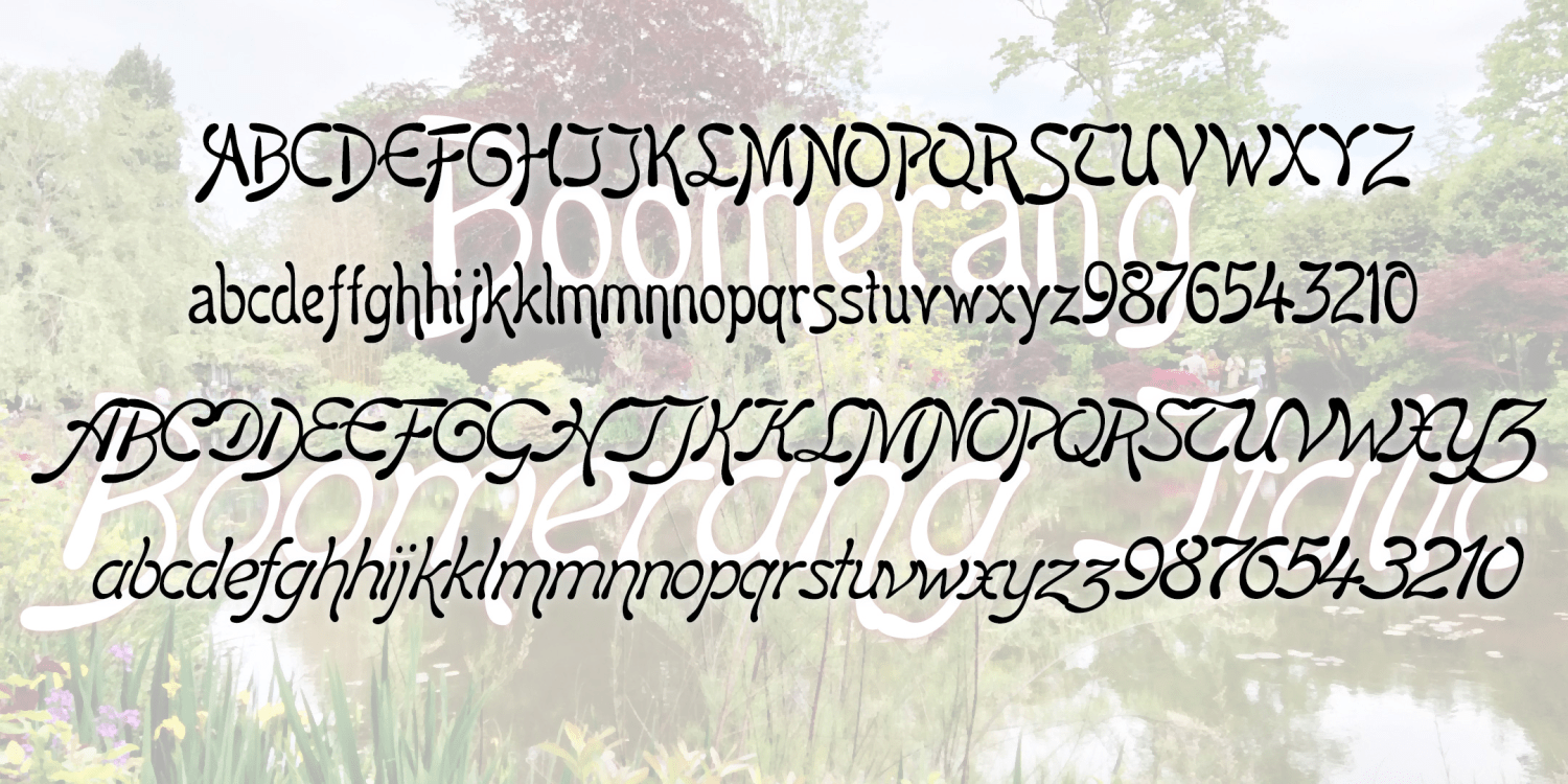
Boomerang
2 Fonts | Free Download
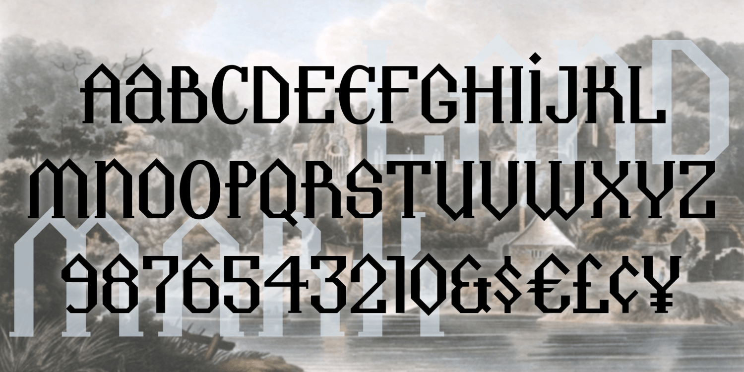
Landmark
1 Font | Free Download
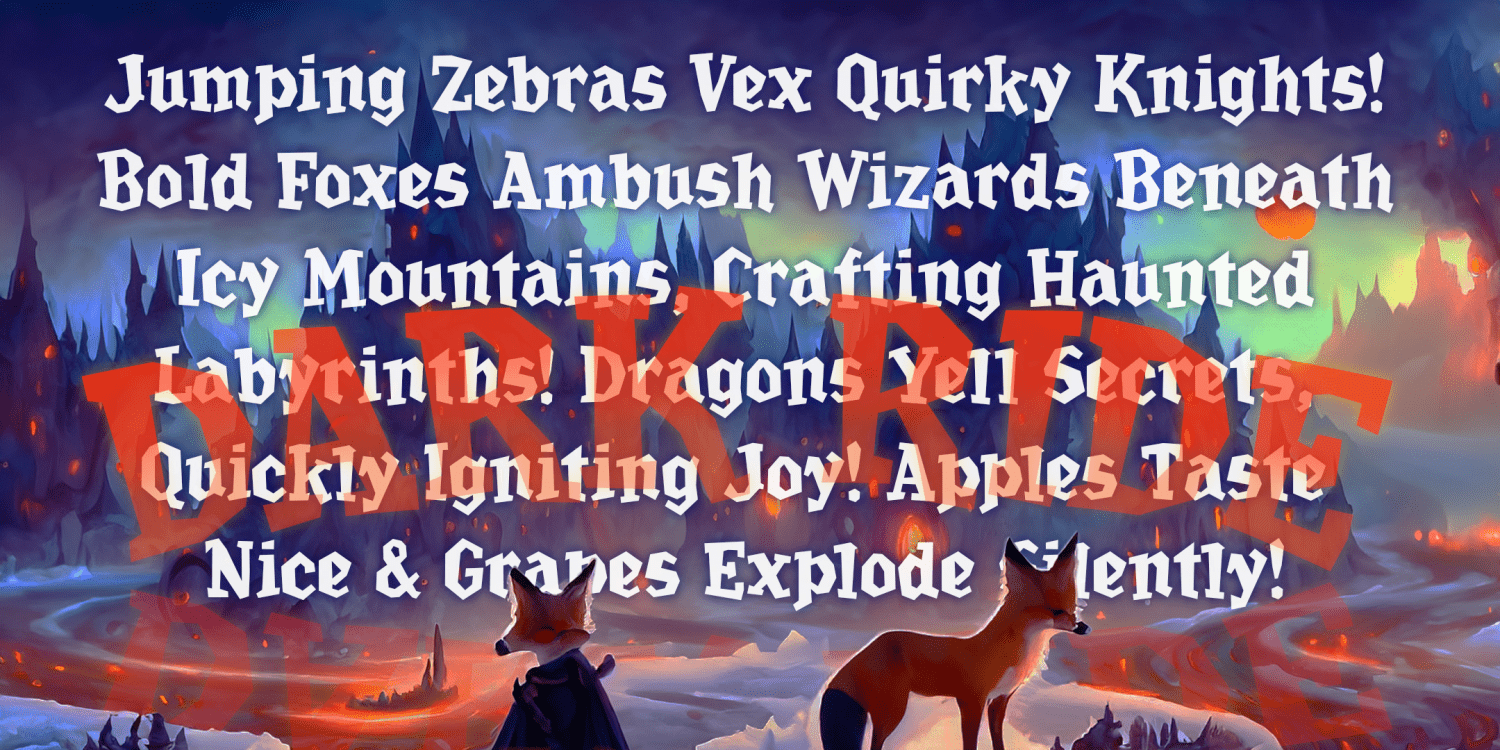
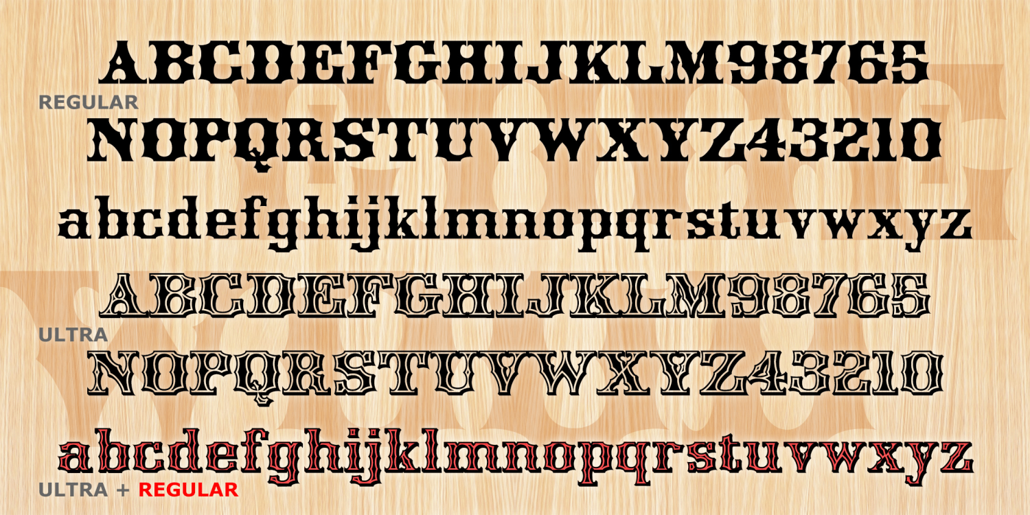
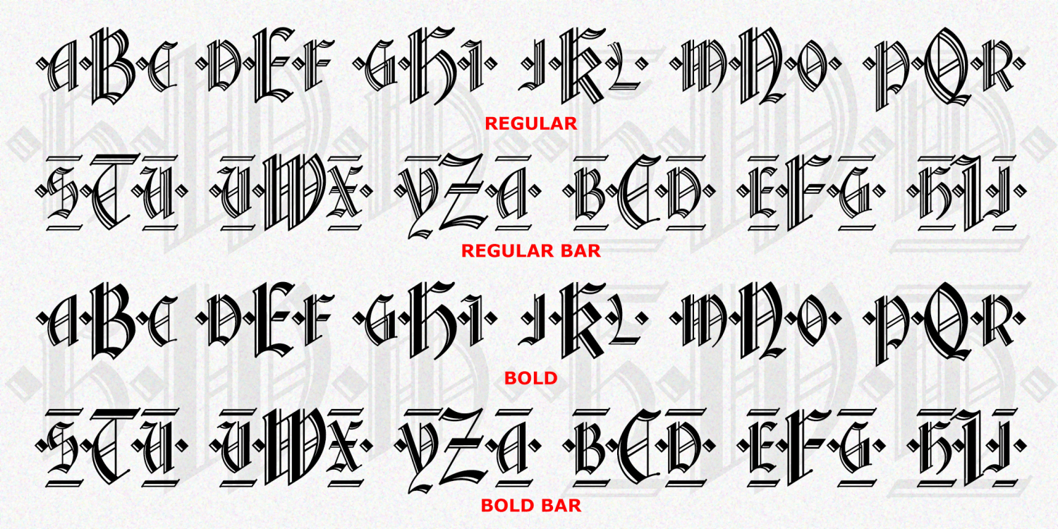
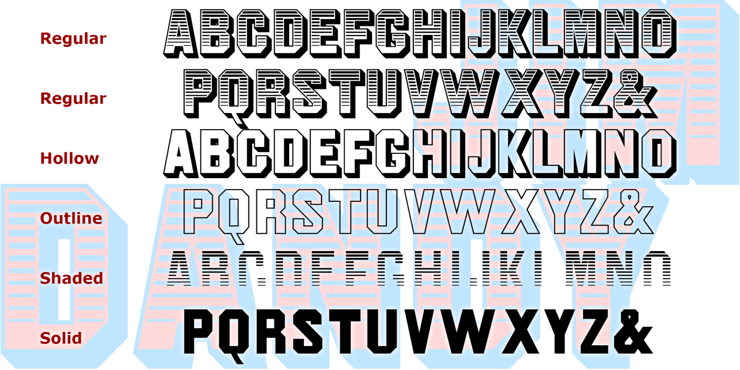
Dark Ride
1 Font | from $19.95
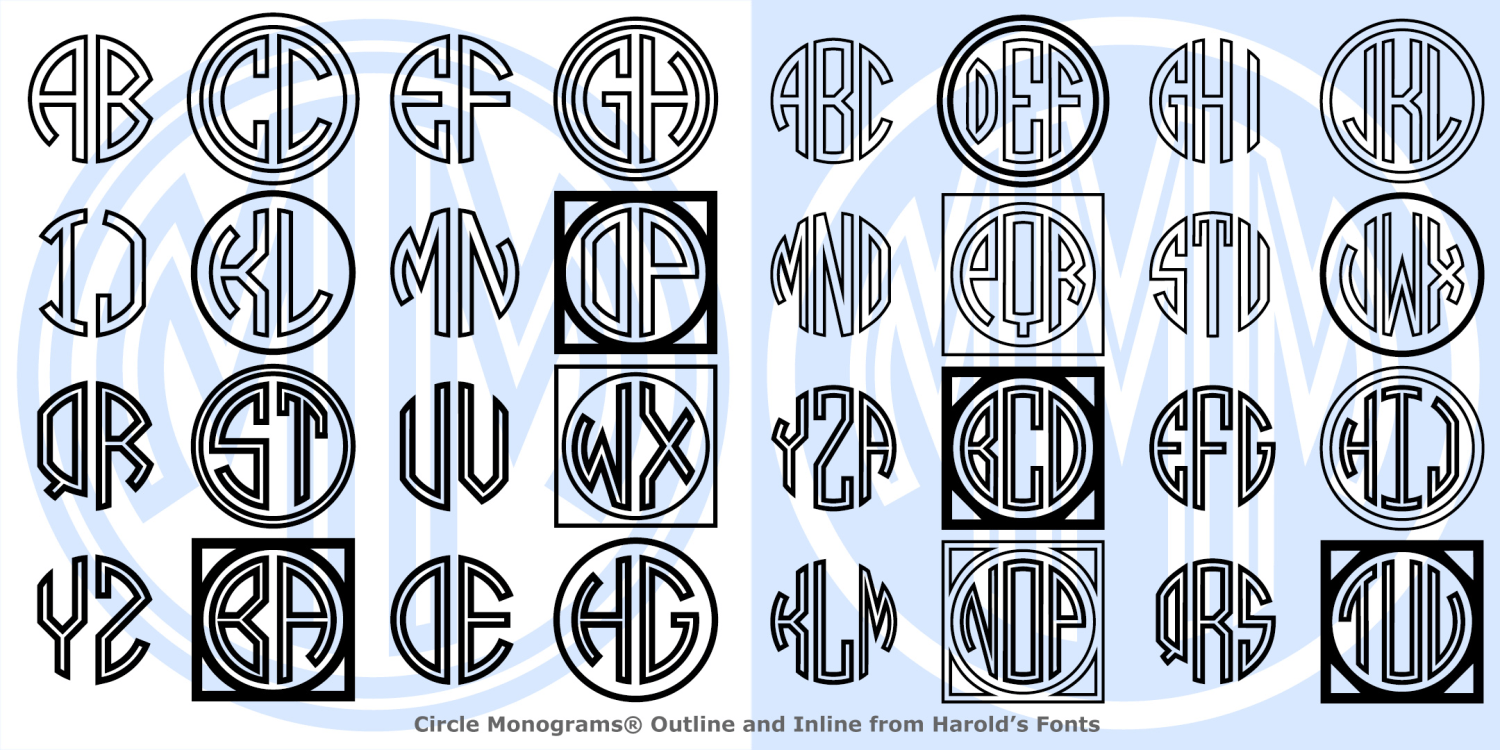
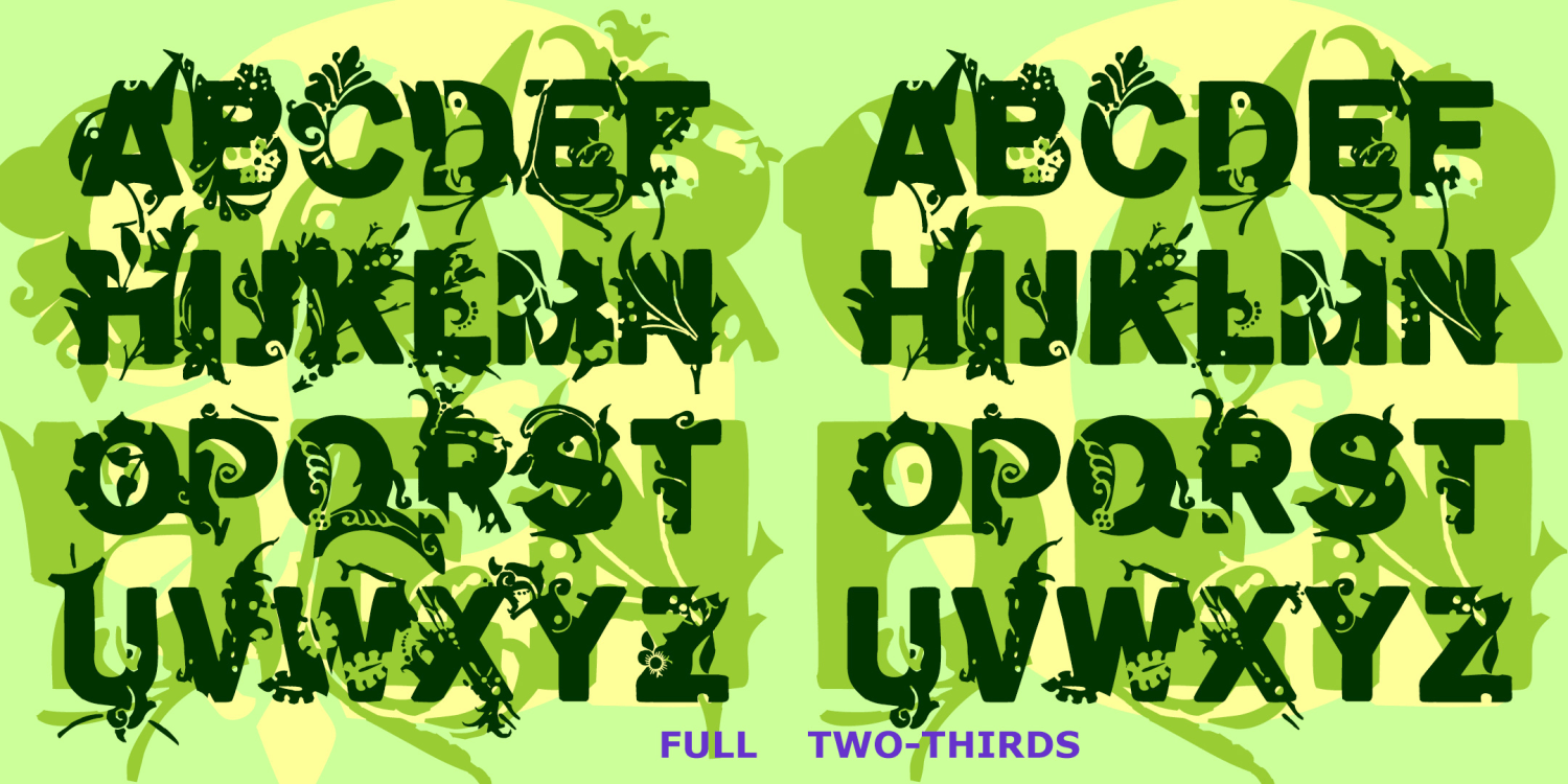
Circle Monograms Outline & Inline
4 Fonts | from $19.95

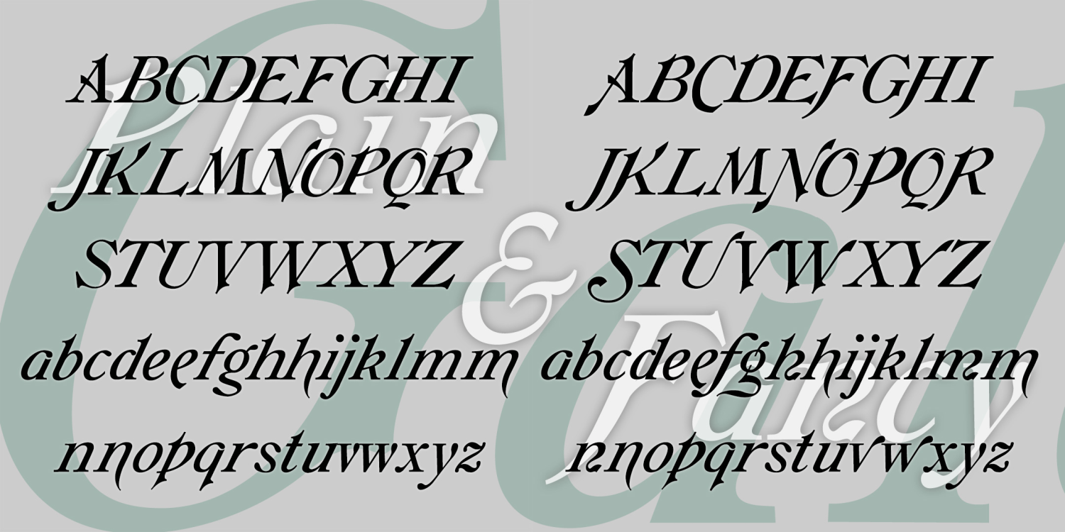
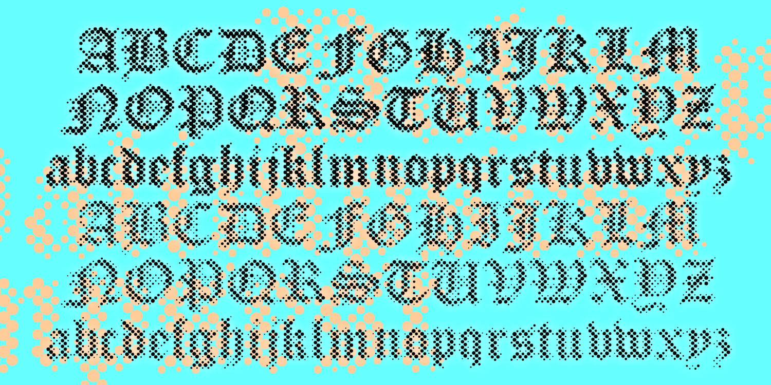
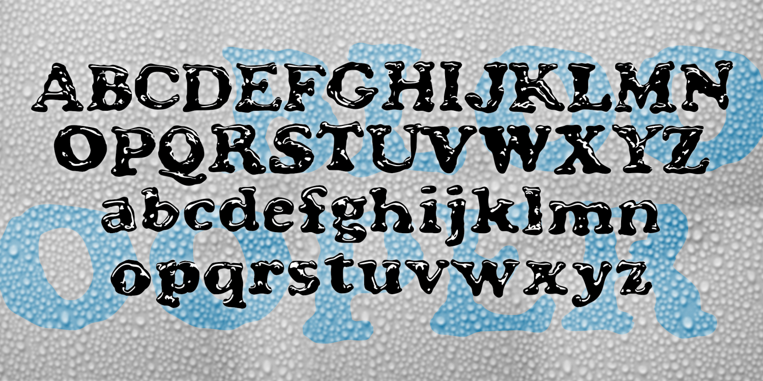
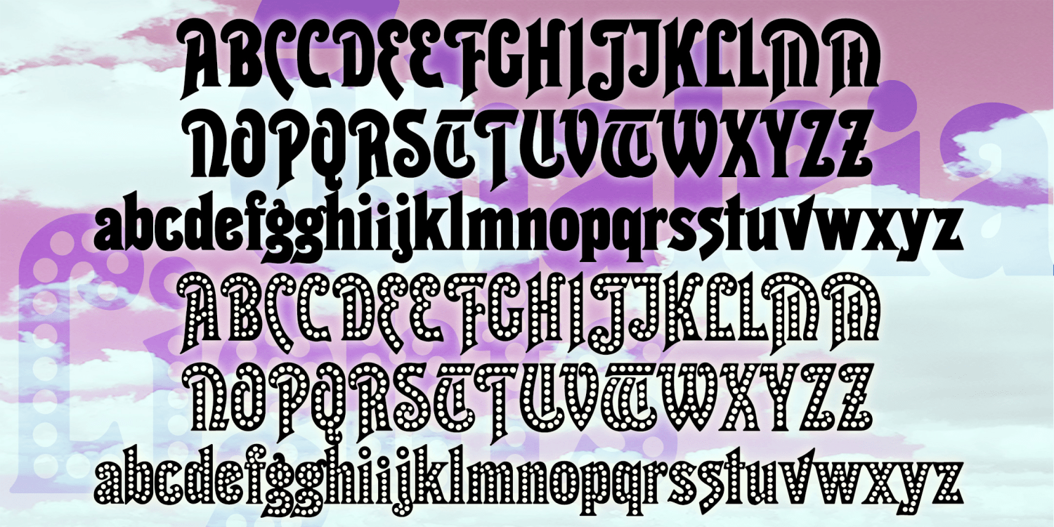
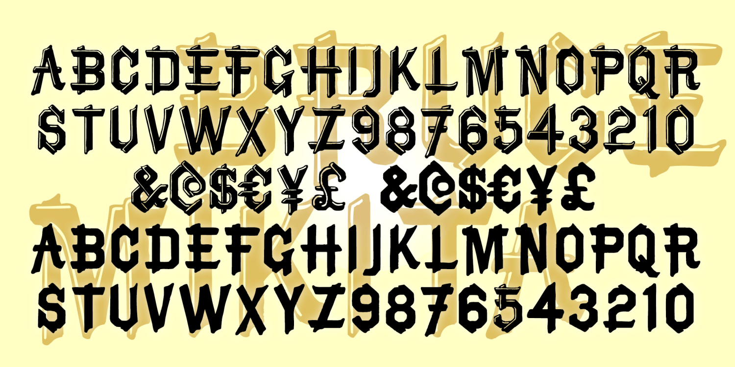
Rubaiyat
1 Font | Free Download

Latin Quarter
2 Fonts | from $19.95
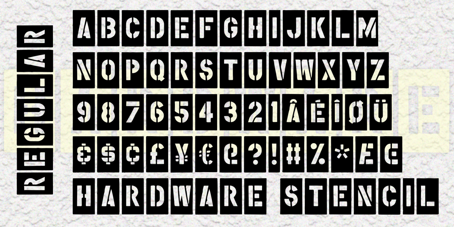
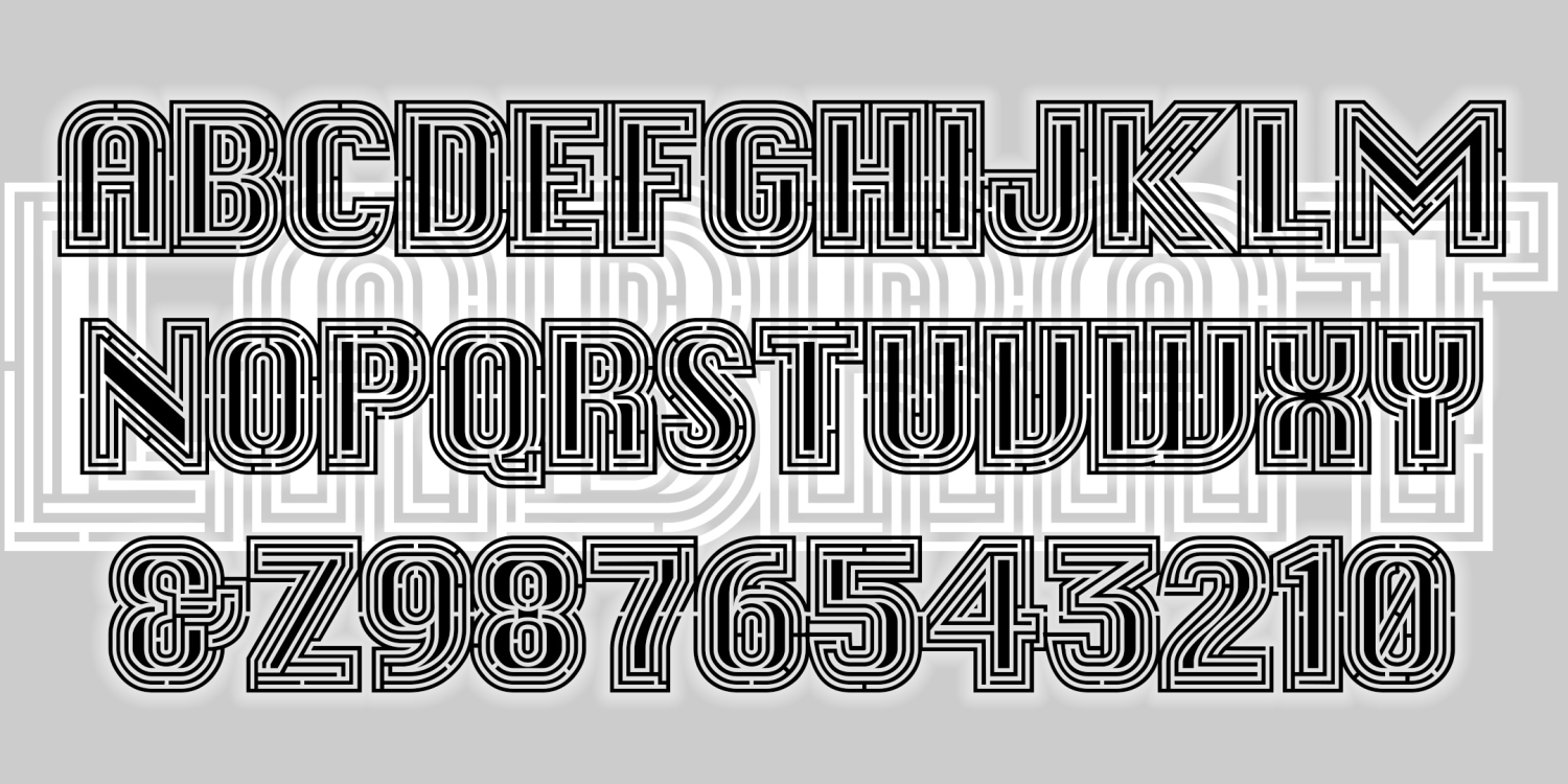
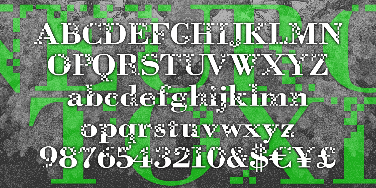
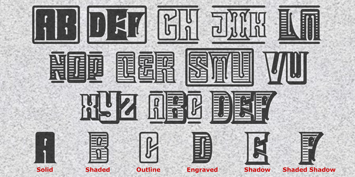
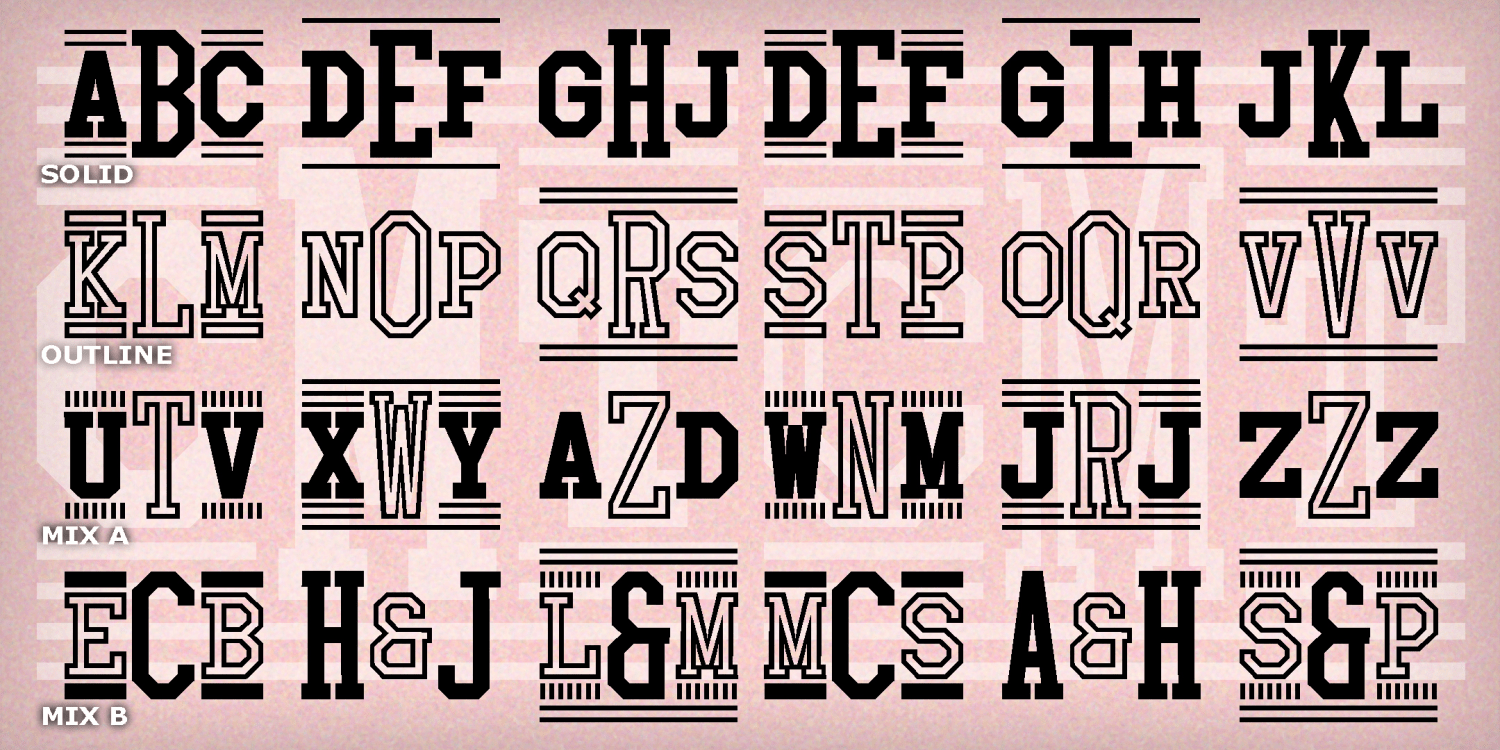
Hardware Stencil
3 Fonts | from $19.95
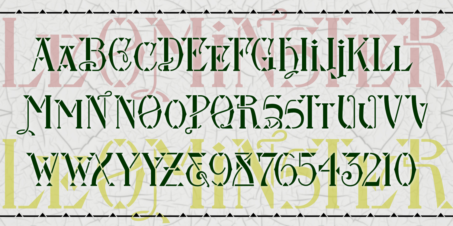
Leominster
1 Font | from $19.95
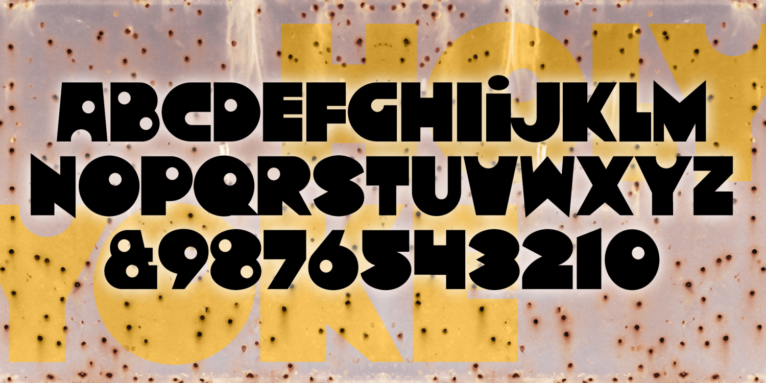
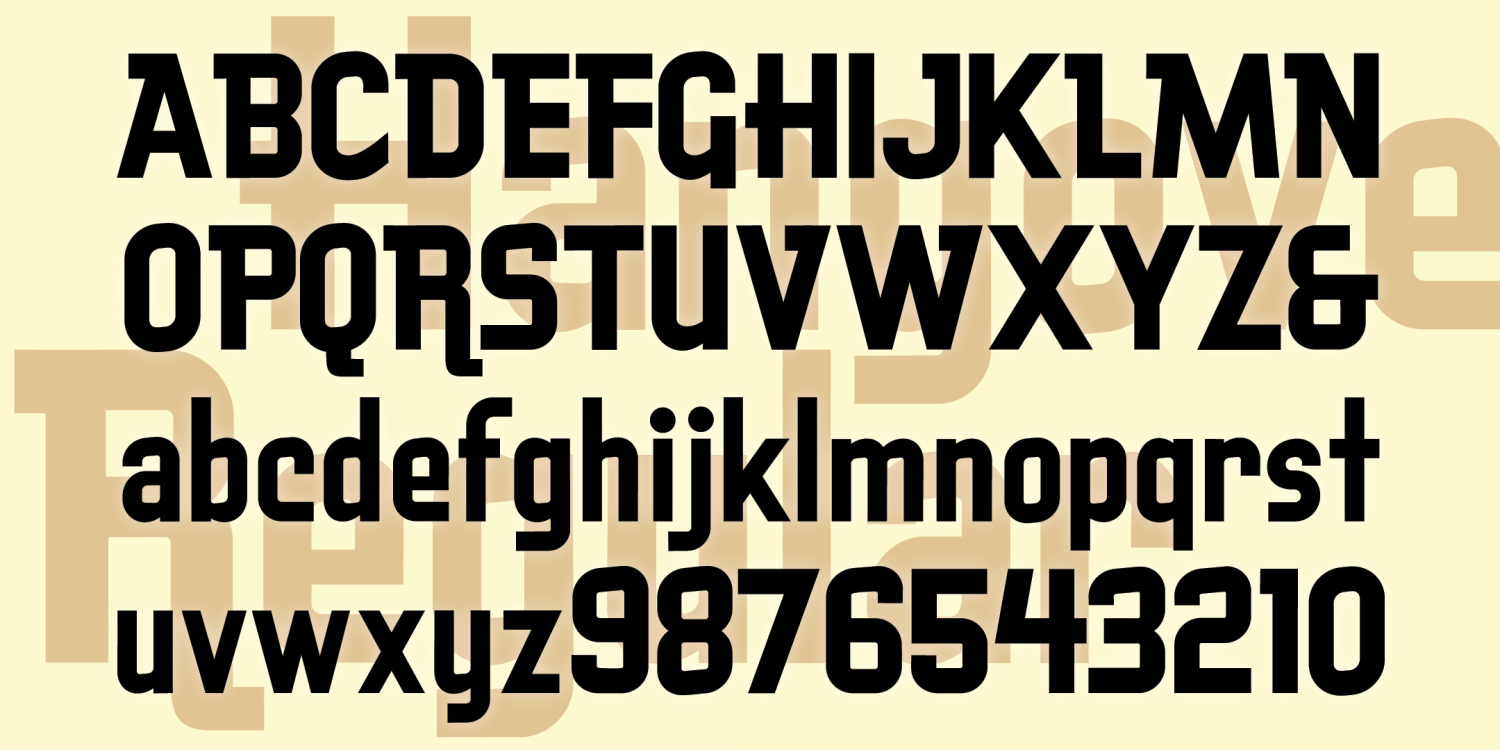
Holyoke
1 Font | from $9.95
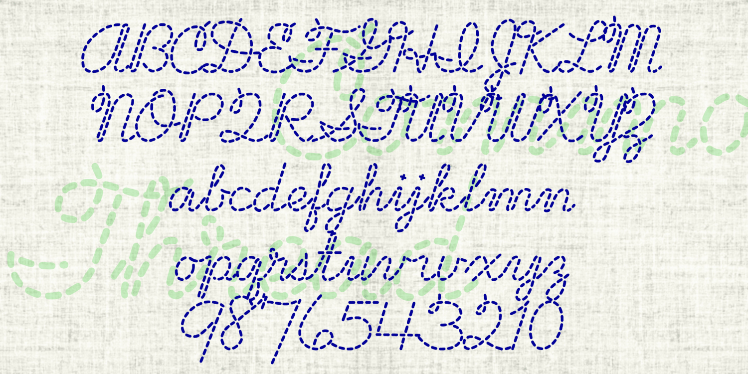
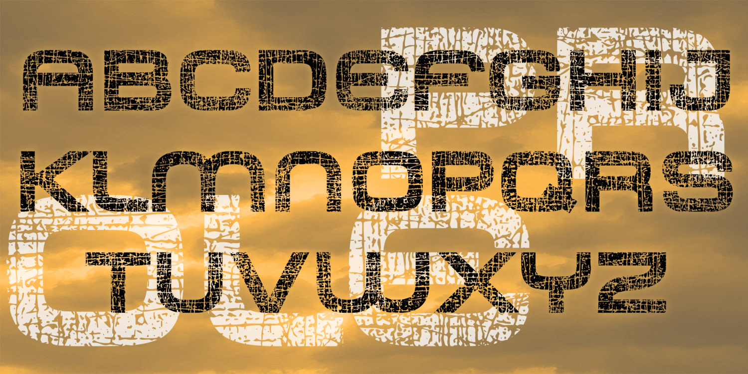
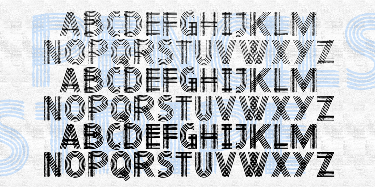
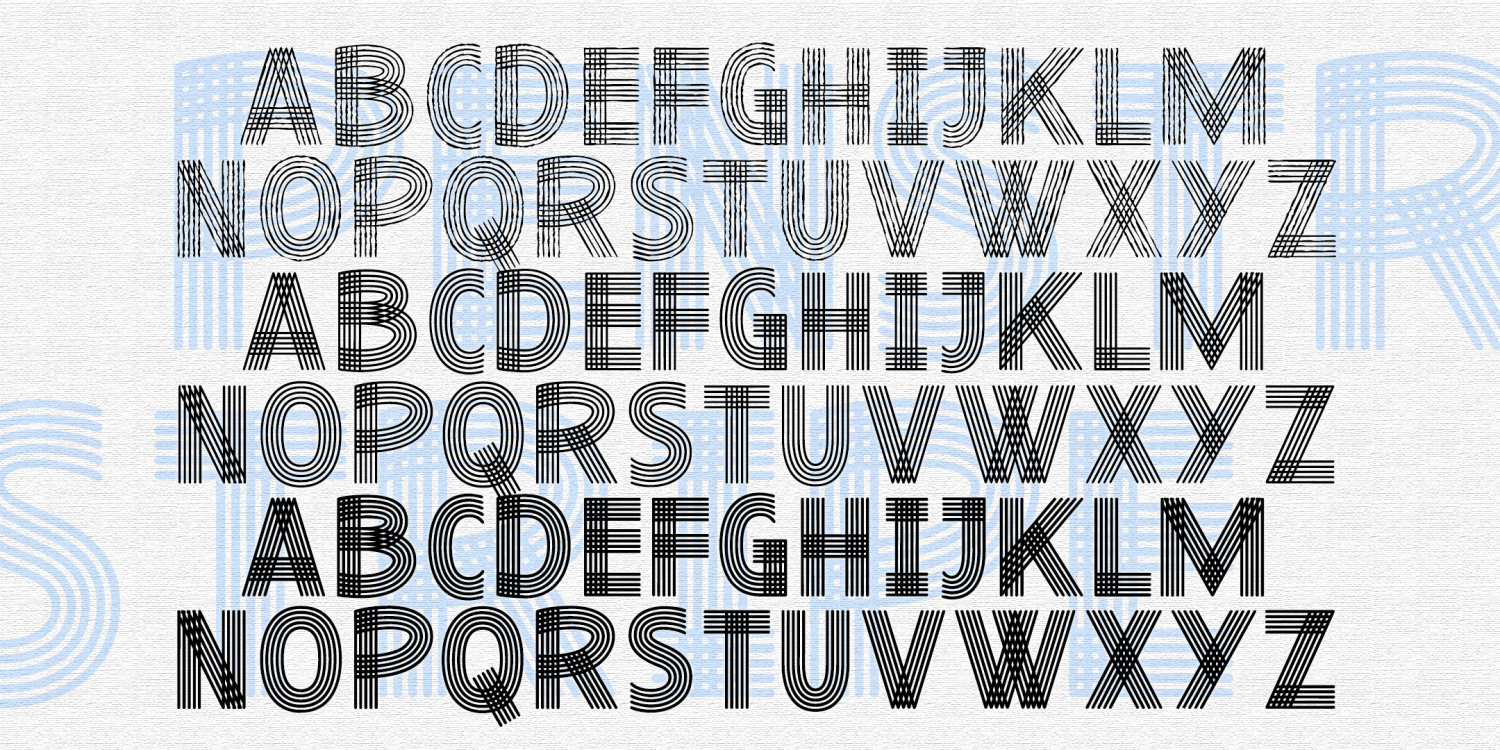
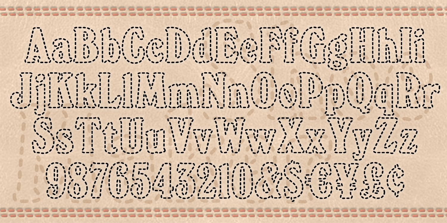
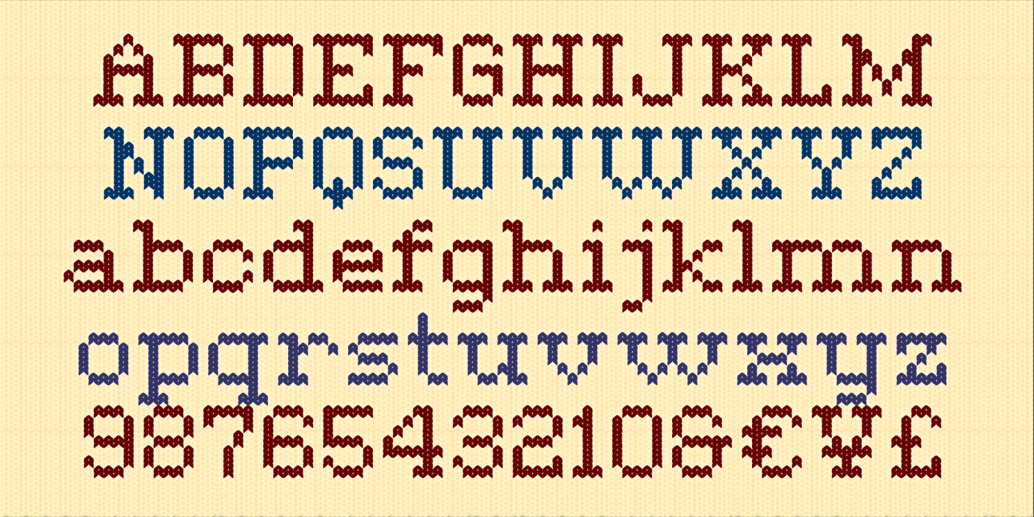
Common Thread
1 Font | from $19.95
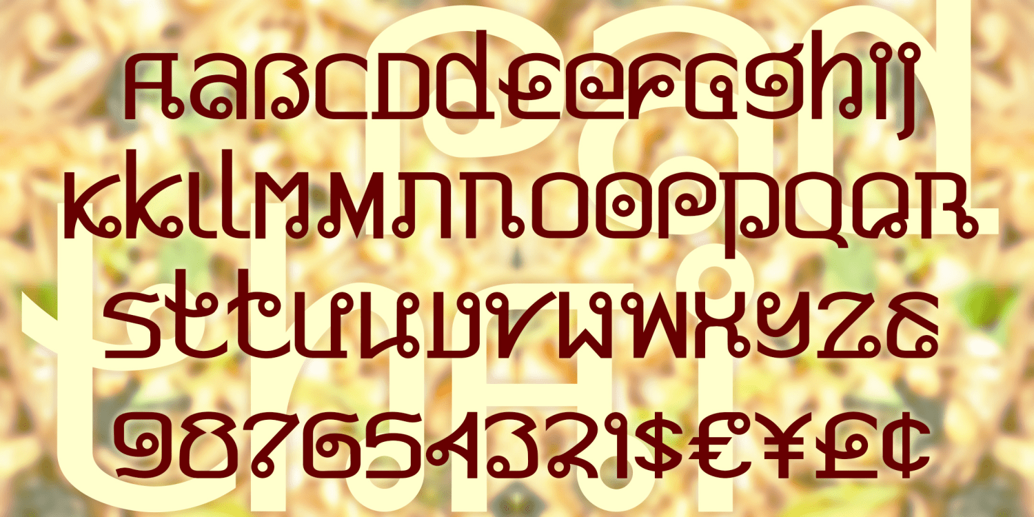
Pad Thai
1 Font | Free Download
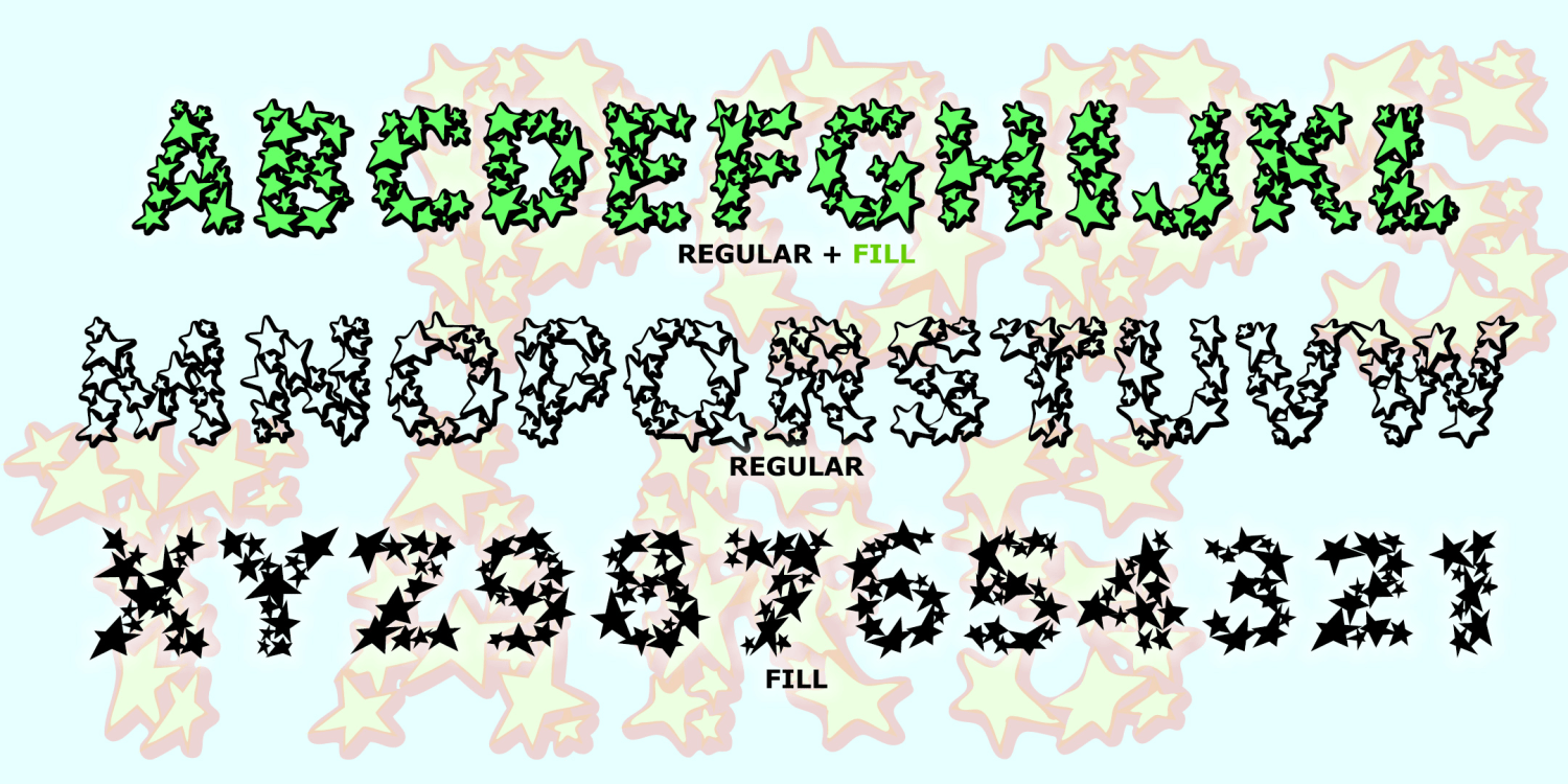
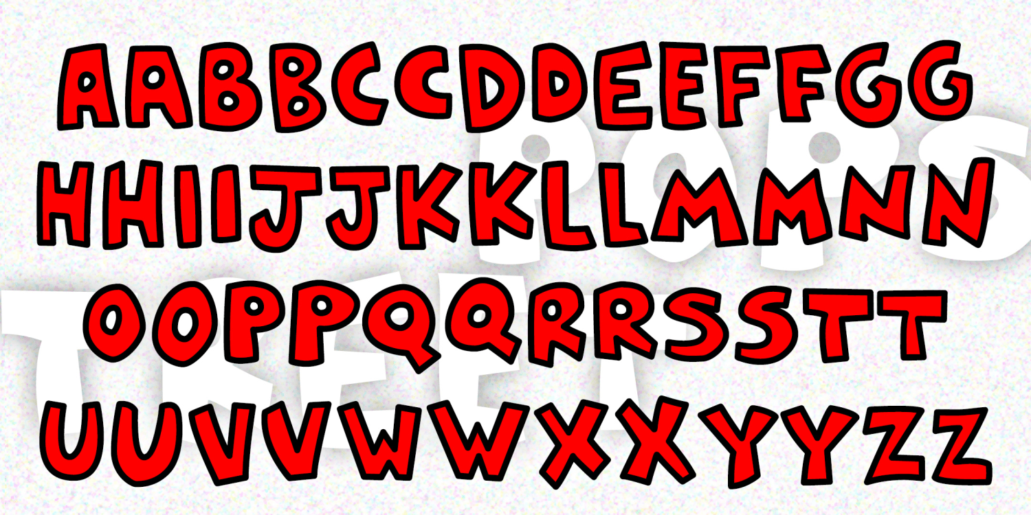
Popstars
2 Fonts | Free Download
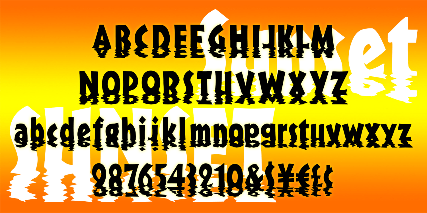
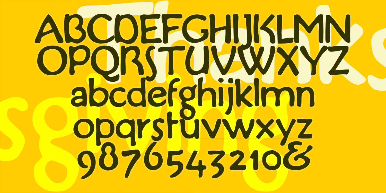
Sunset
1 Font | Free Download
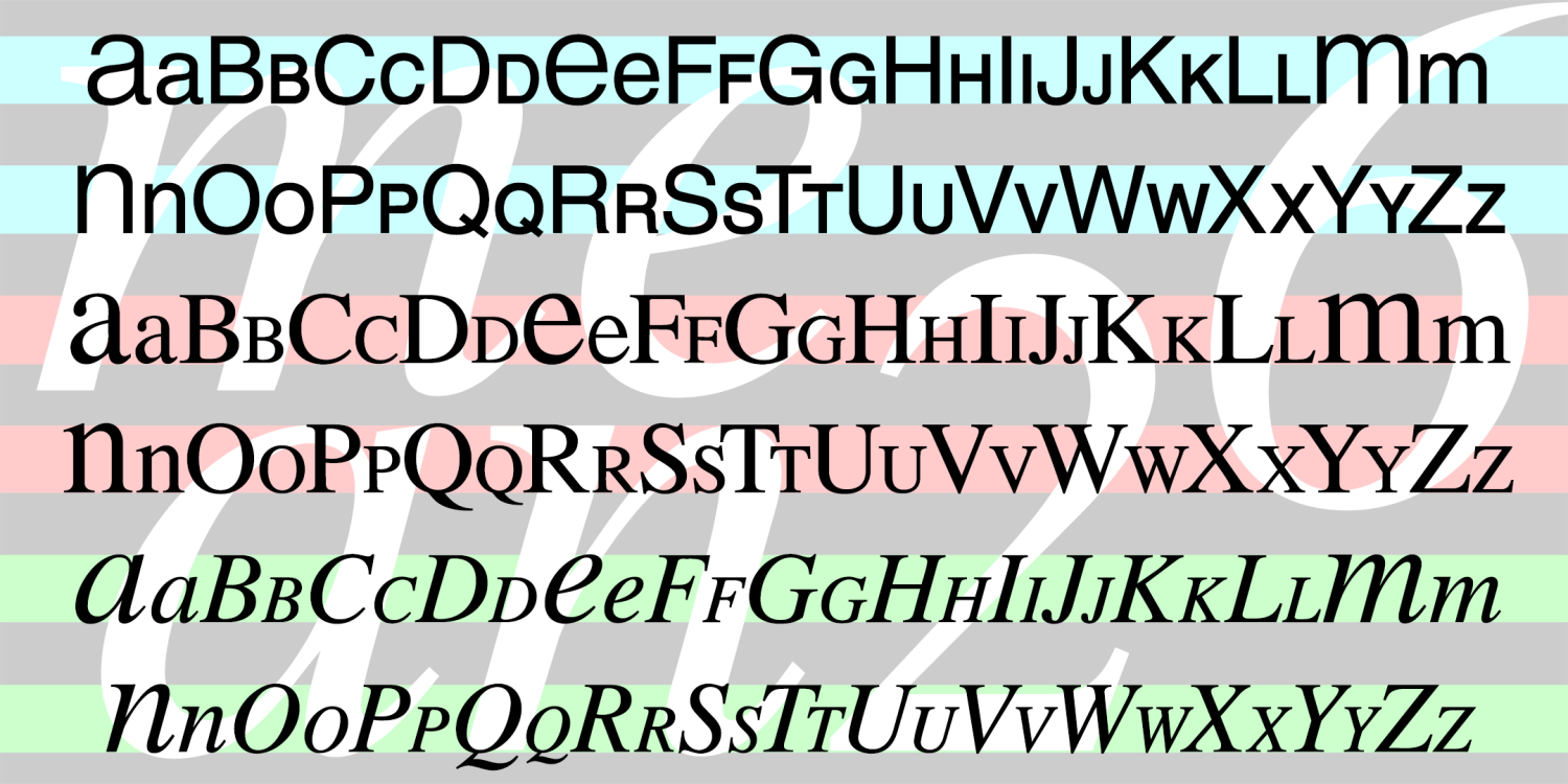
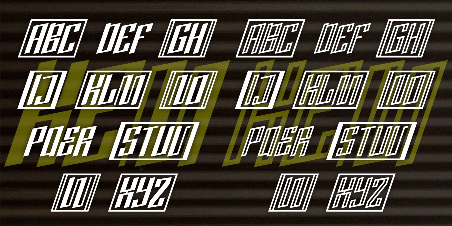
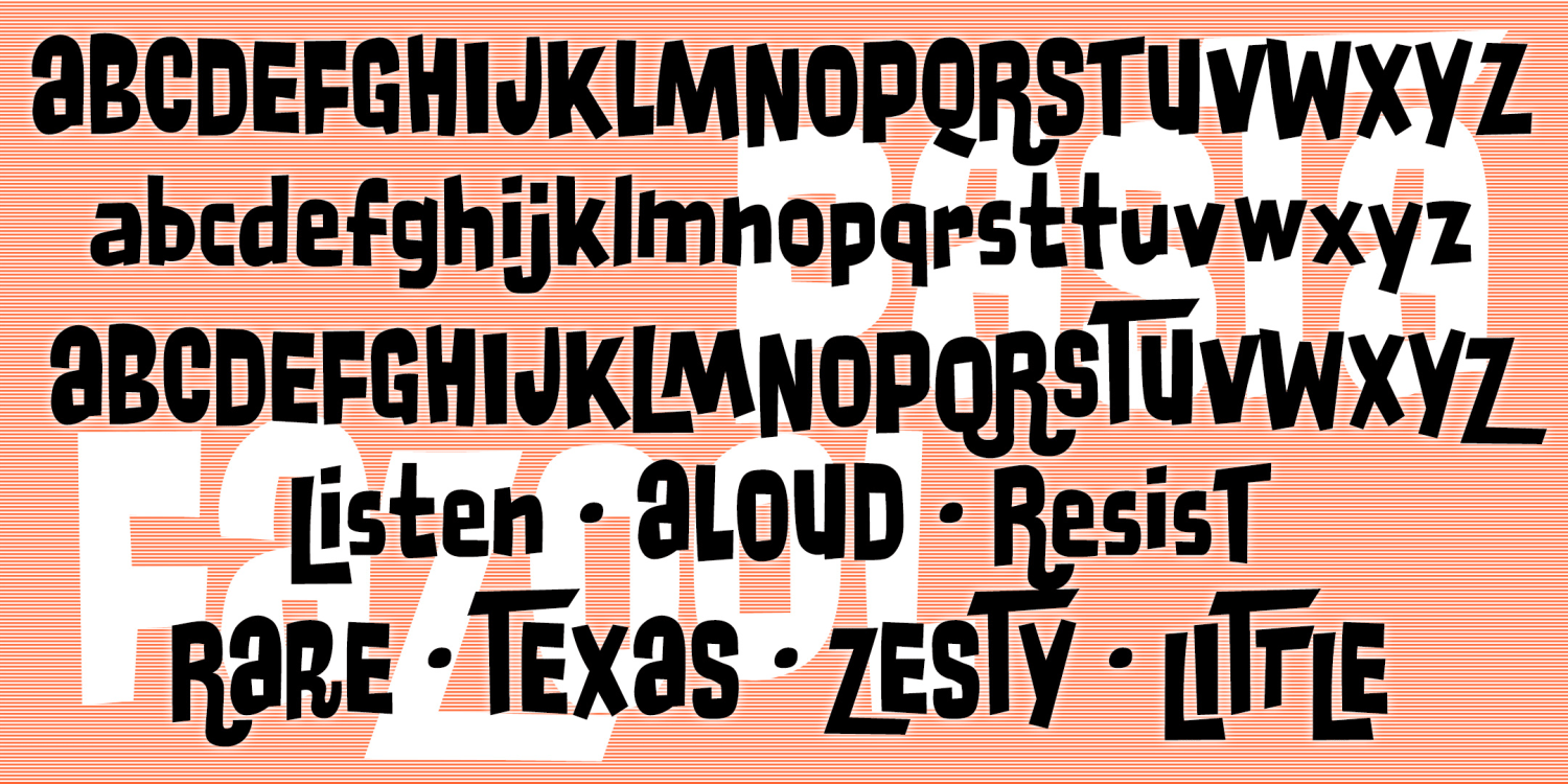
MEAN 26
3 Fonts | Free Download
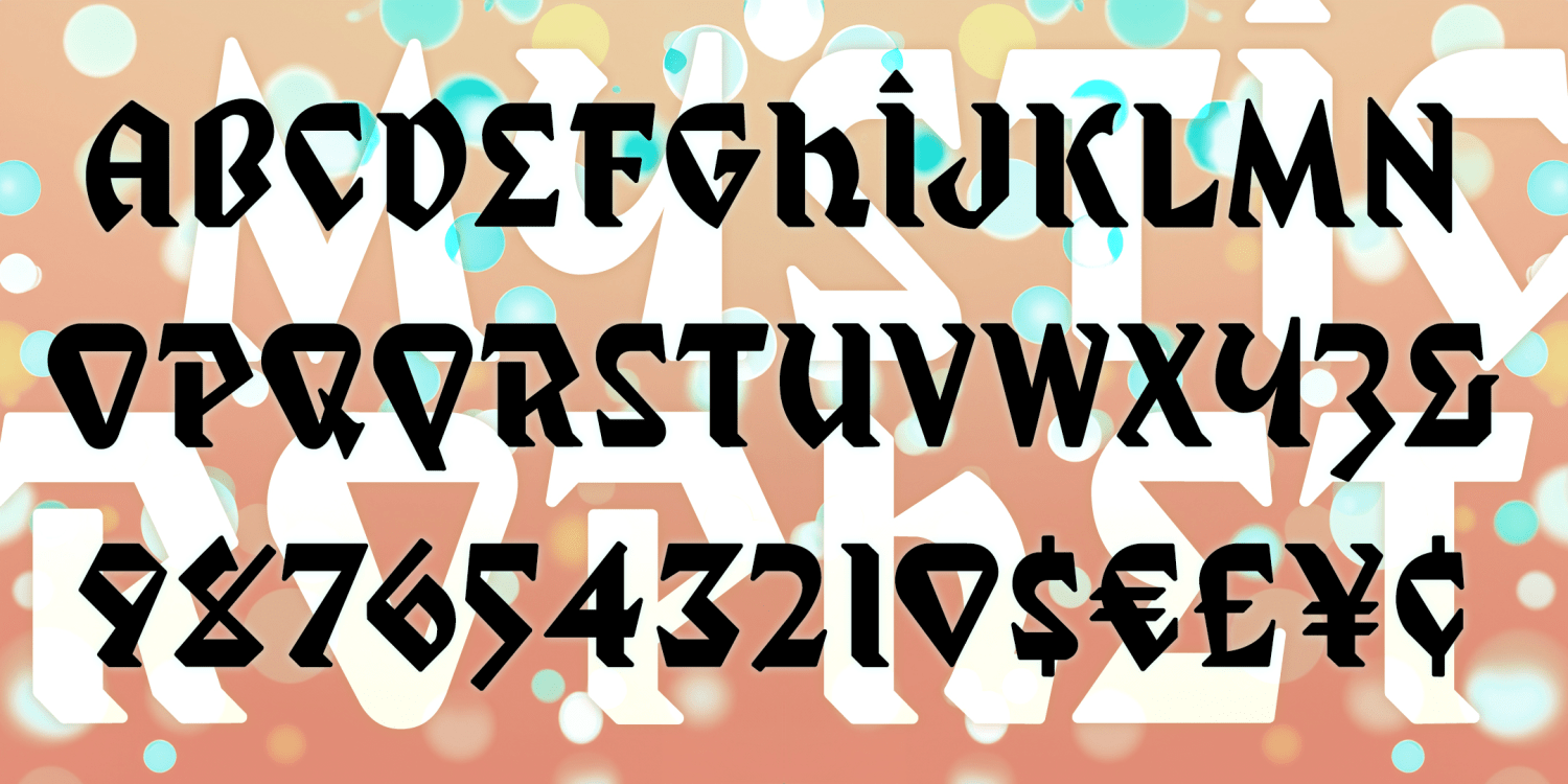
Mystic Prophet
1 Font | Free Download
Madfont
3 Fonts | Free Download
Lab Rat
1 Font | Free Download
King Xmas
1 Font | Free Download
Gamera
1 Font | Free Download
Flash Mob
1 Font | Free Download
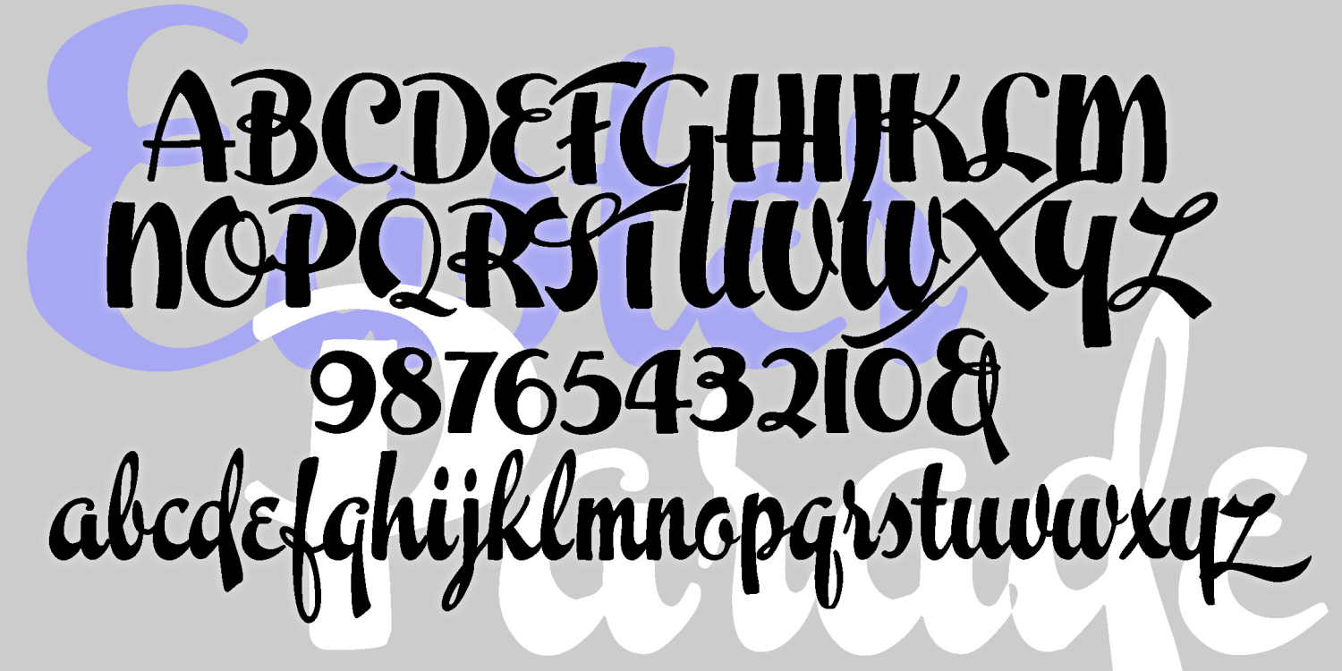
Echo
1 Font | Free Download
Boston & Philadelphia Line
4 Fonts | Free Download
Yard Sale
1 Font | Free Download
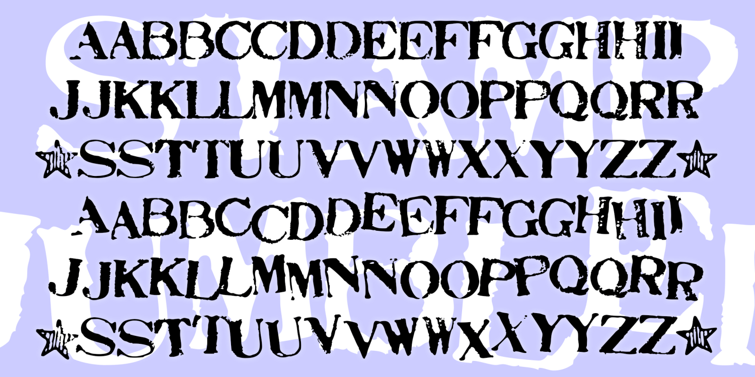
Stamp Act
2 Fonts | Free Download
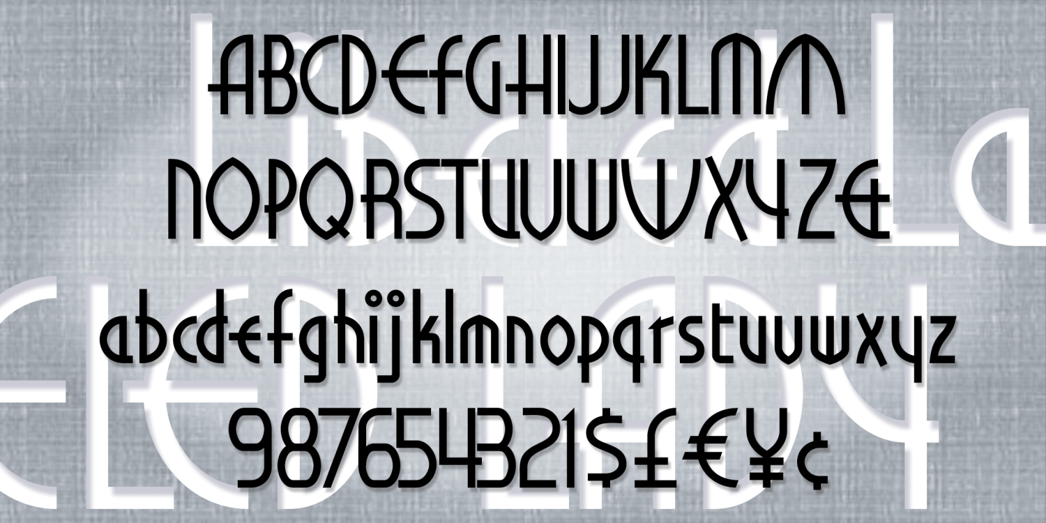
Libeled Lady
1 Font | Free Download
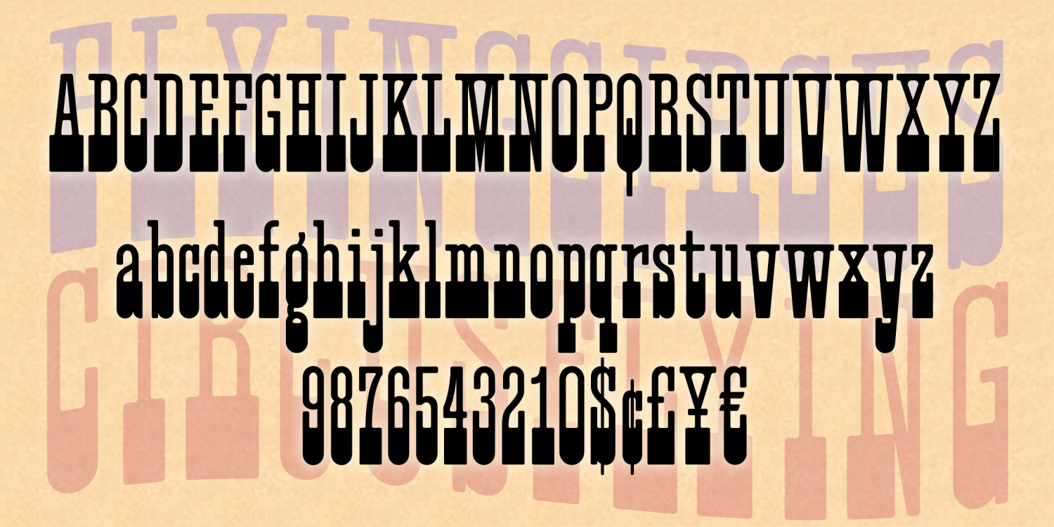
Flying Circus
1 Font | Free Download
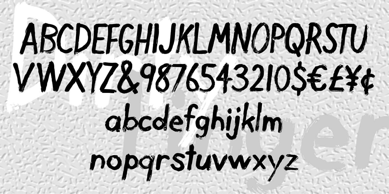
Dirty Finger
1 Font | Free Download
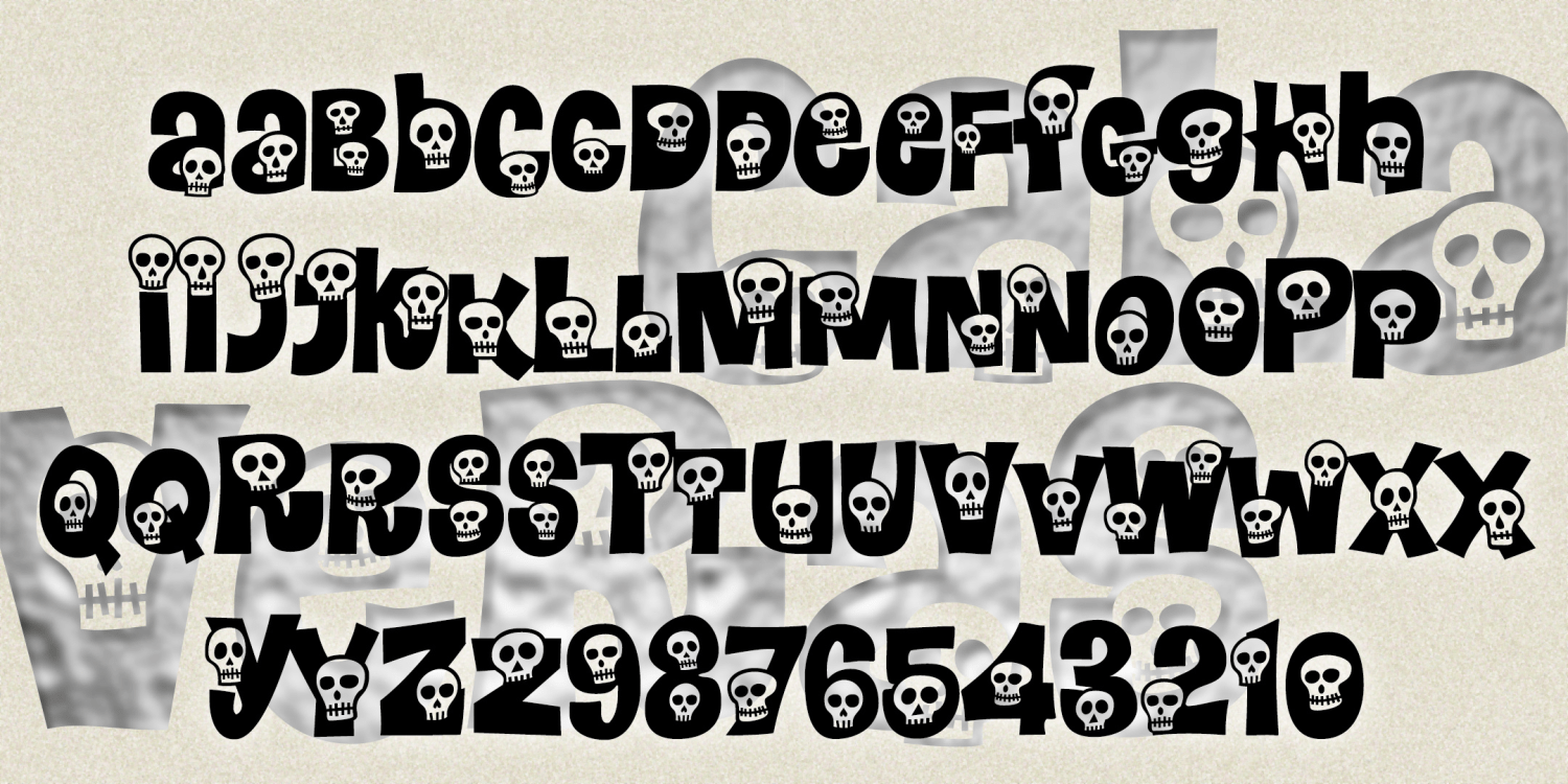
Calaveras
1 Font | Free Download
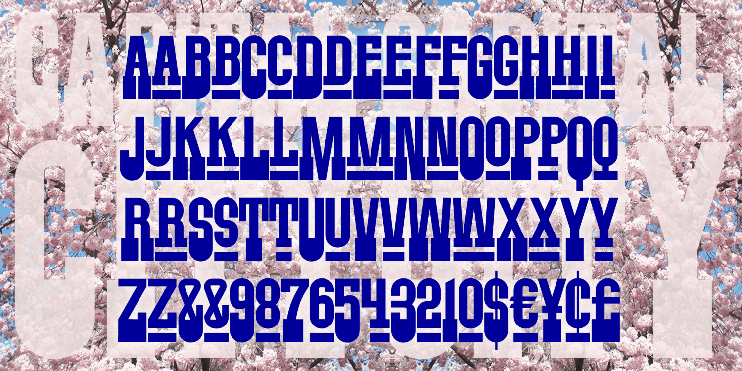
Capital City
1 Font | Free Download
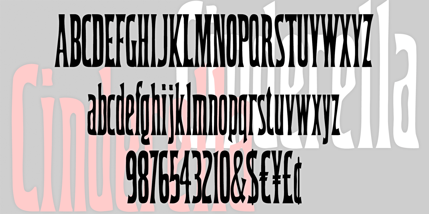
Cinderella
1 Font | Free Download
Horse Sense
1 Font | Free Download
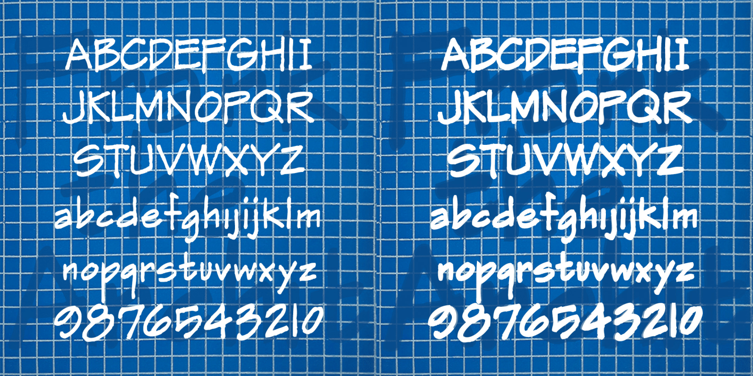
Pharmacy
1 Font | Free Download
Good Vibes
1 Font | Free Download
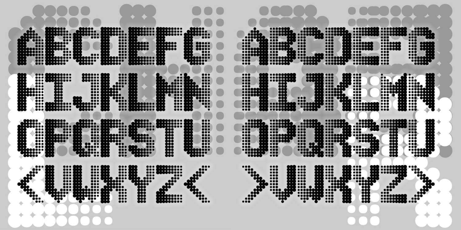
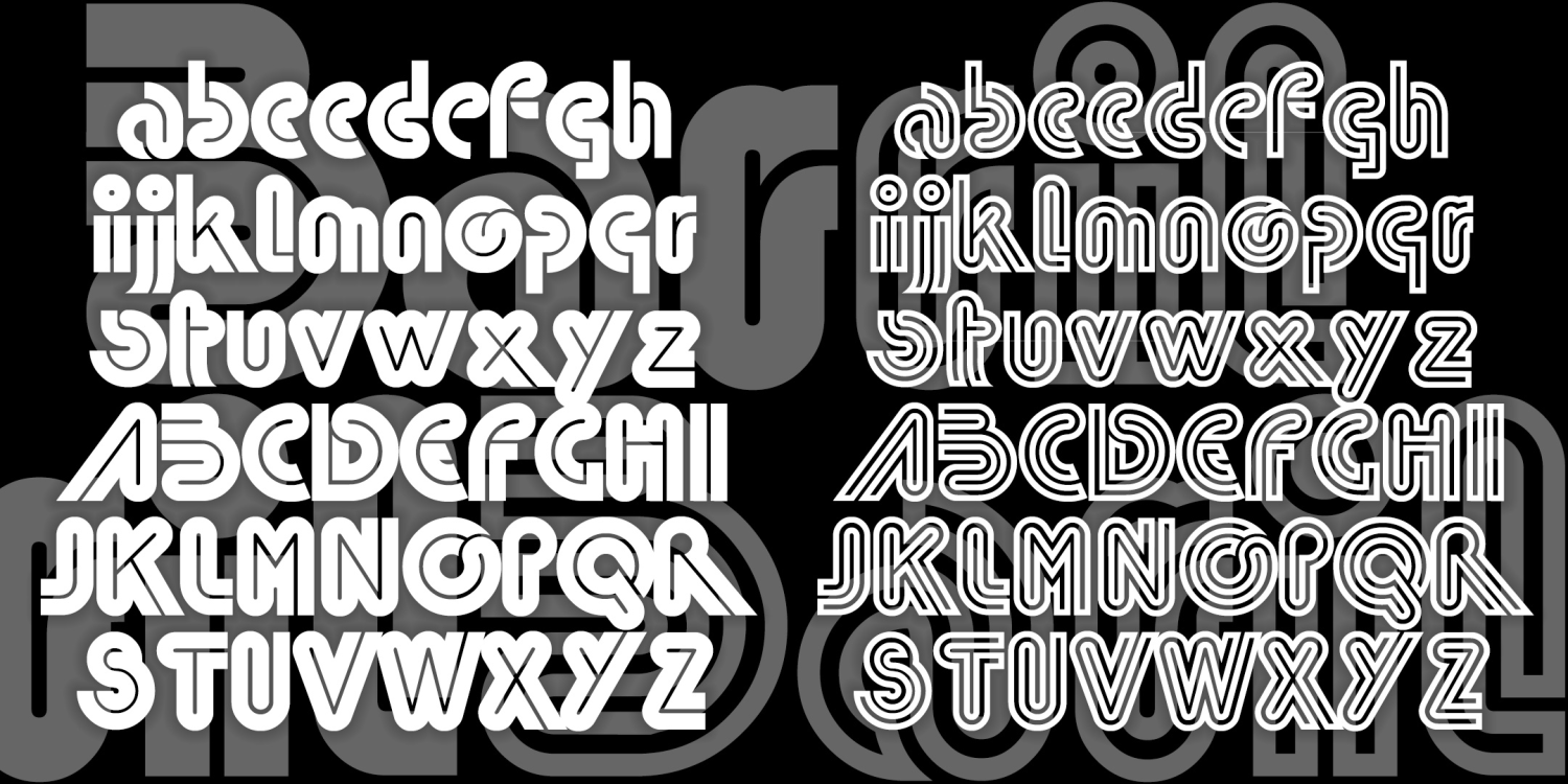
Wireframe
1 Font | Free Download
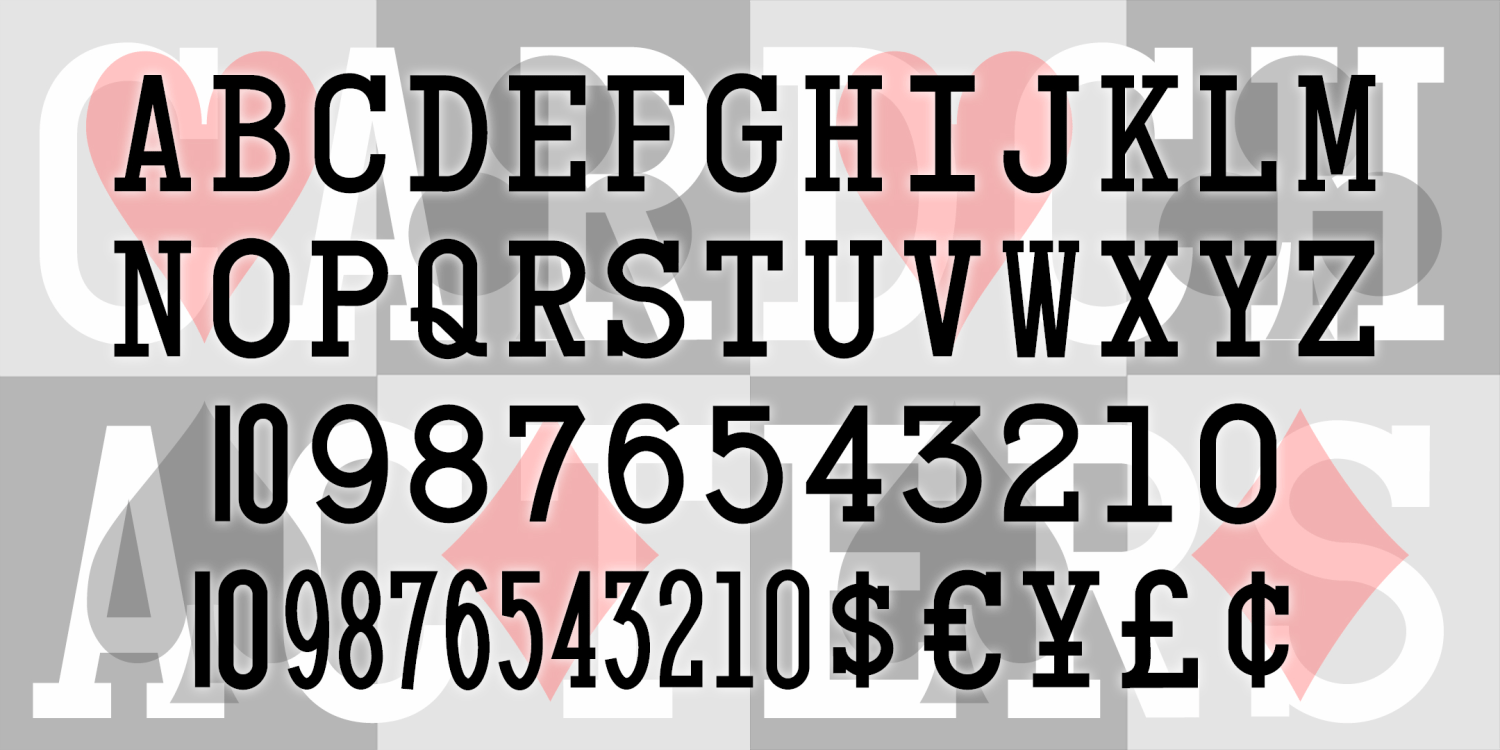
Card Characters
2 Fonts | Free Download
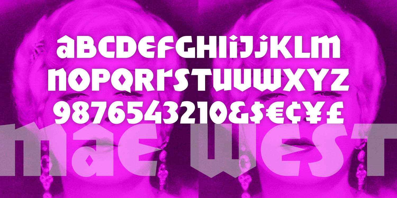
Mae West
1 Font | from $19.95
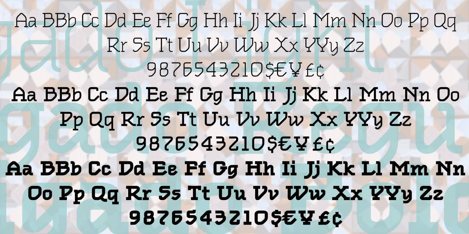
Inklijn Monograms
2 Fonts | from $19.95
Inklijn
2 Fonts | from $19.95
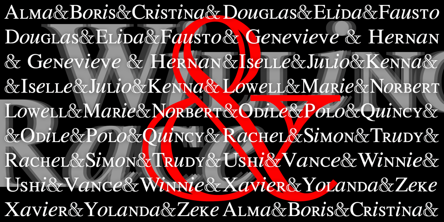
Willing Race
1 Font | Free Download
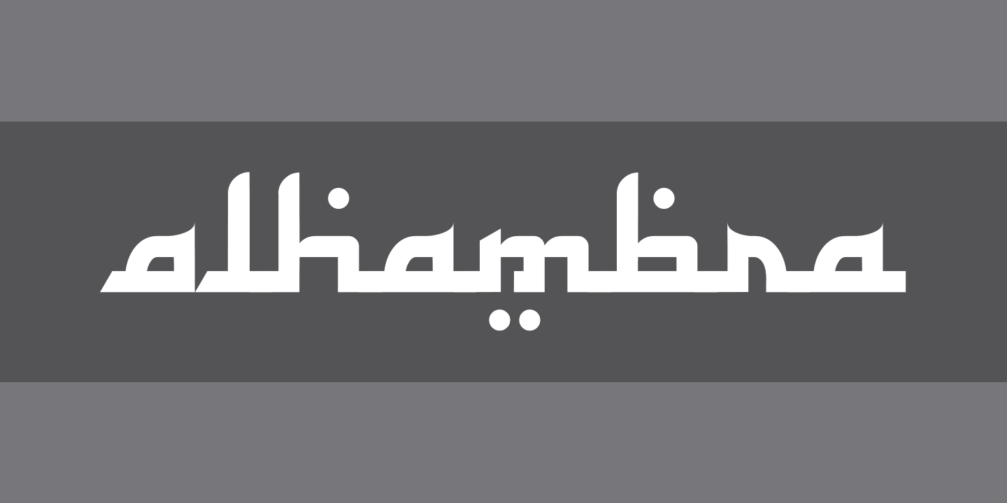
Alhambra
2 Fonts | Free Download
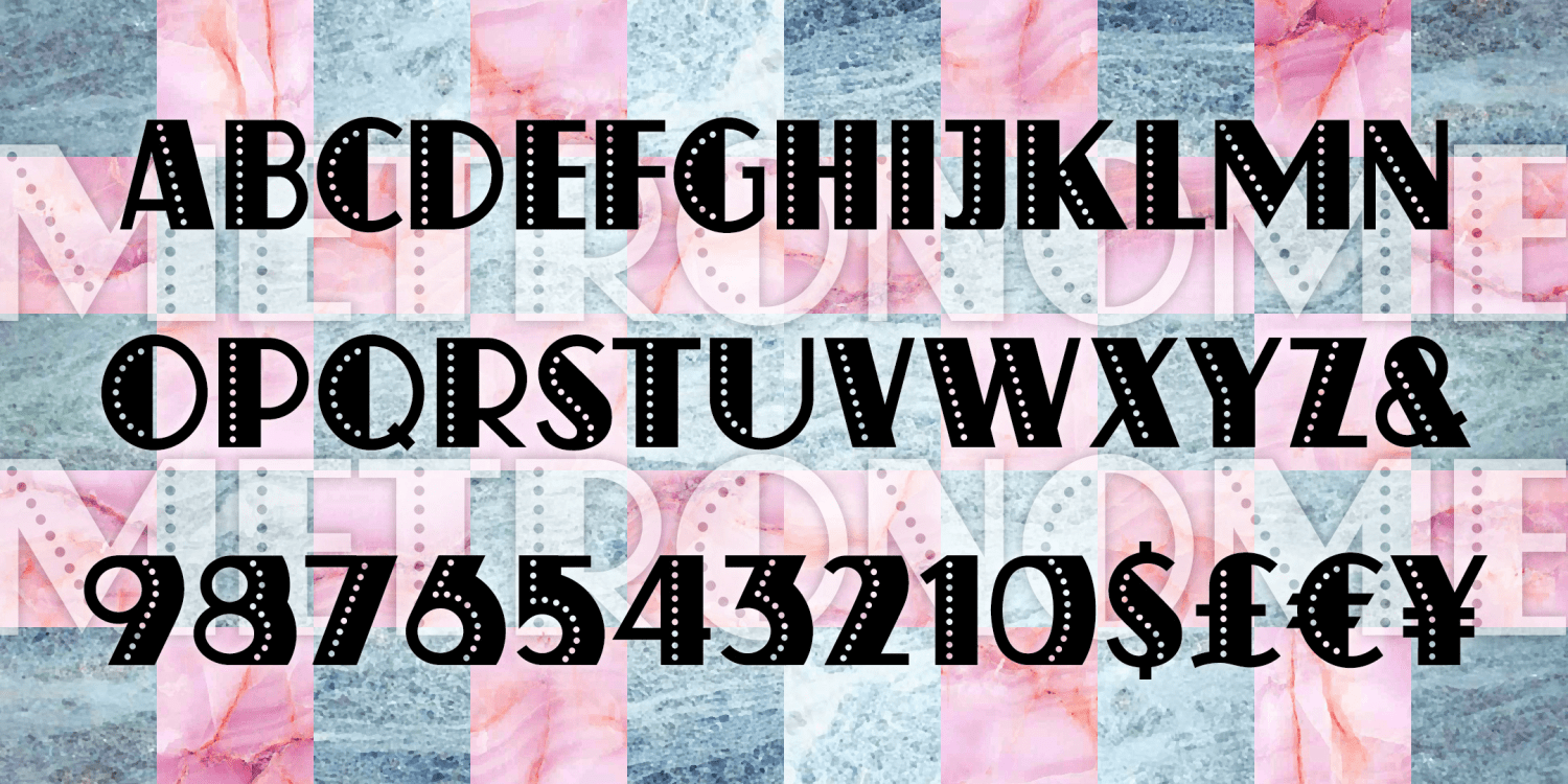
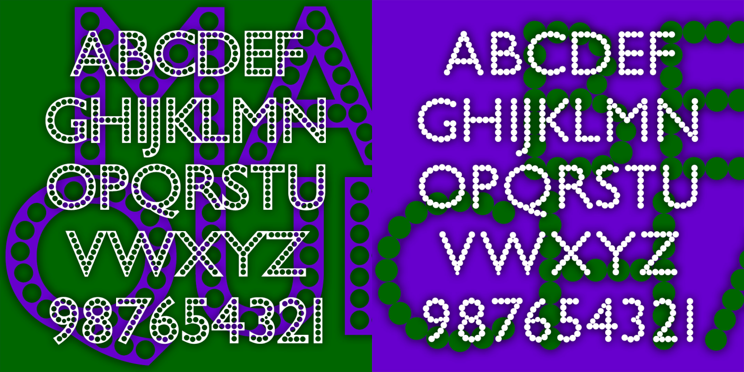
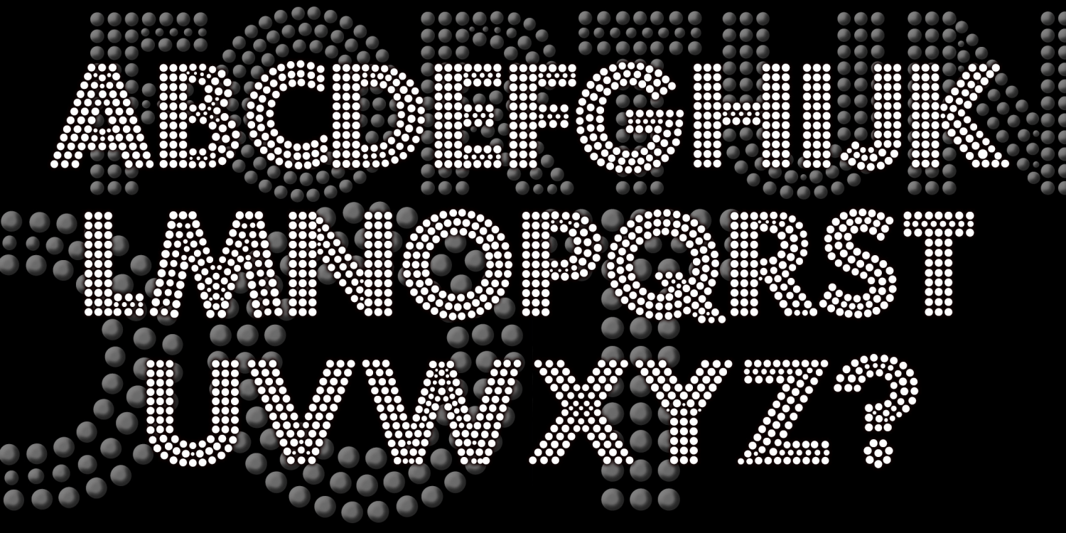
Metronome Pearls
1 Font | from $19.95
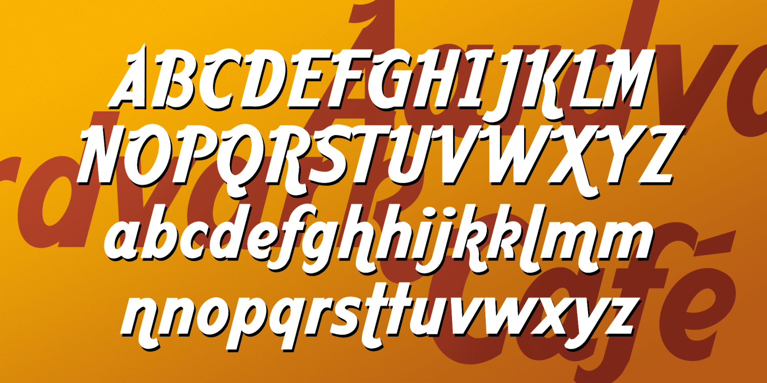
Aardvark Café
1 Font | Free Download
Aperture
1 Font | Free Download
Textona
1 Font | Free Download
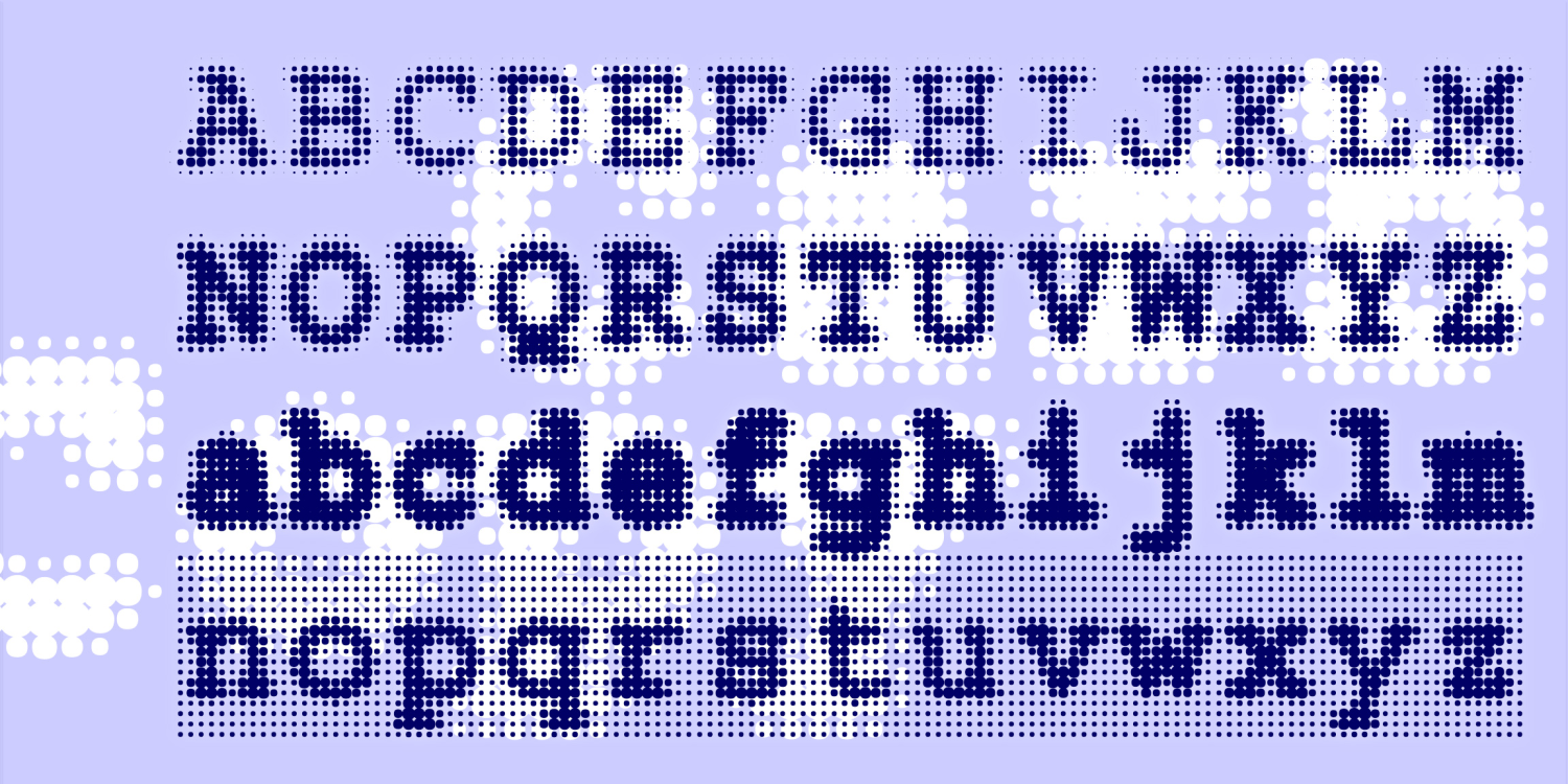
Niche
1 Font | Free Download
Arriaca
1 Font | from $19.95
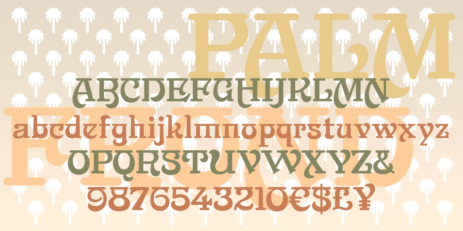
Palm Frond
1 Font | from $19.95
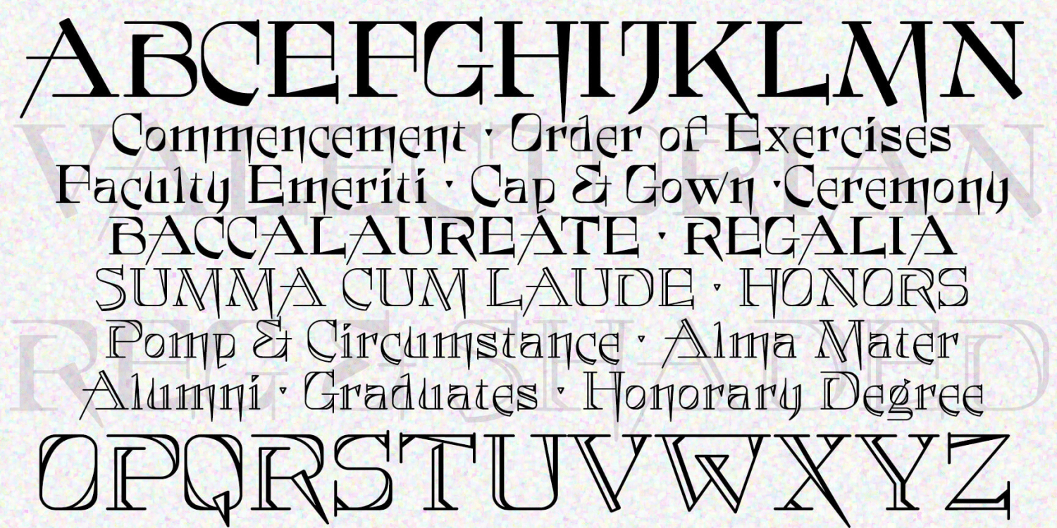
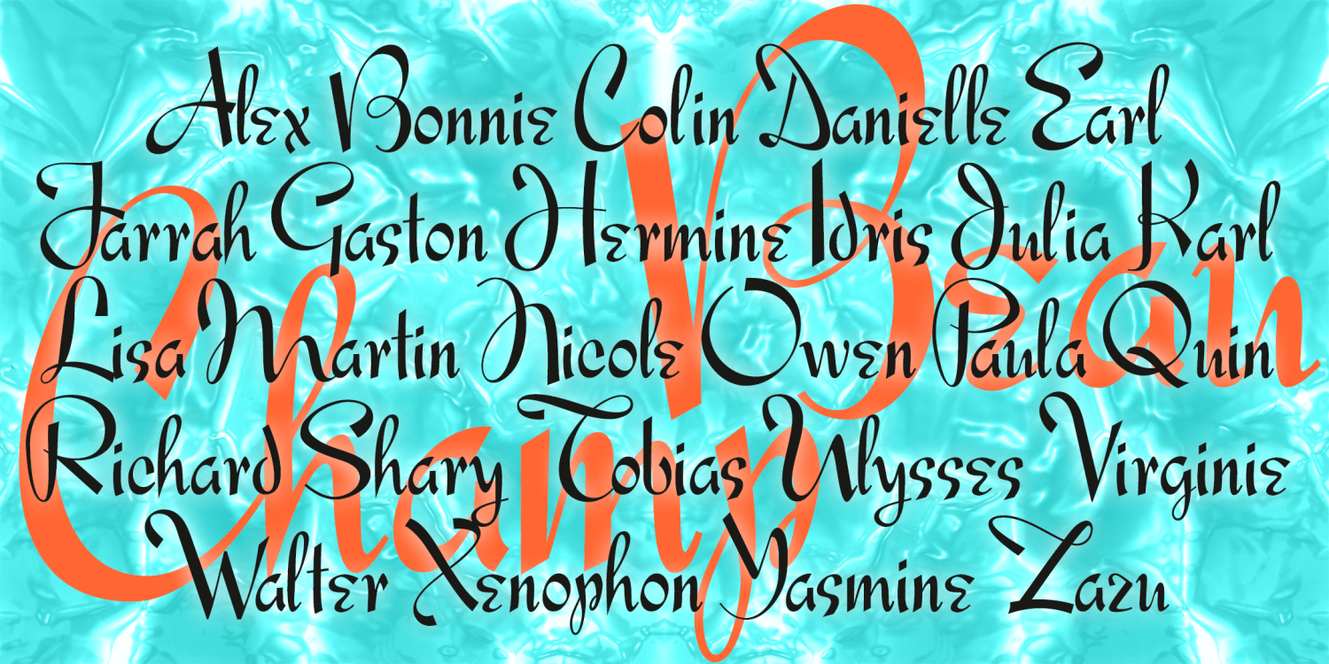
Valedictorian
2 Fonts | from $29.95
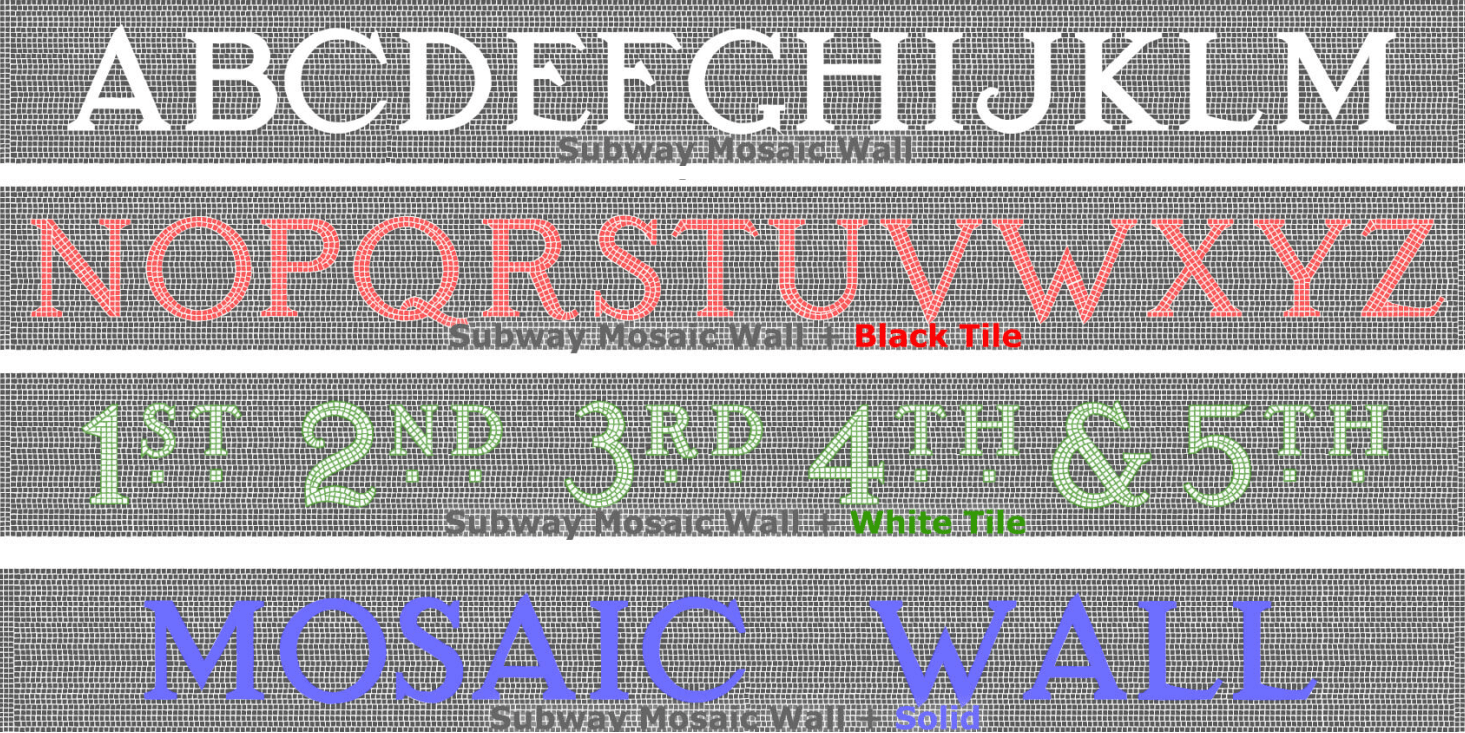
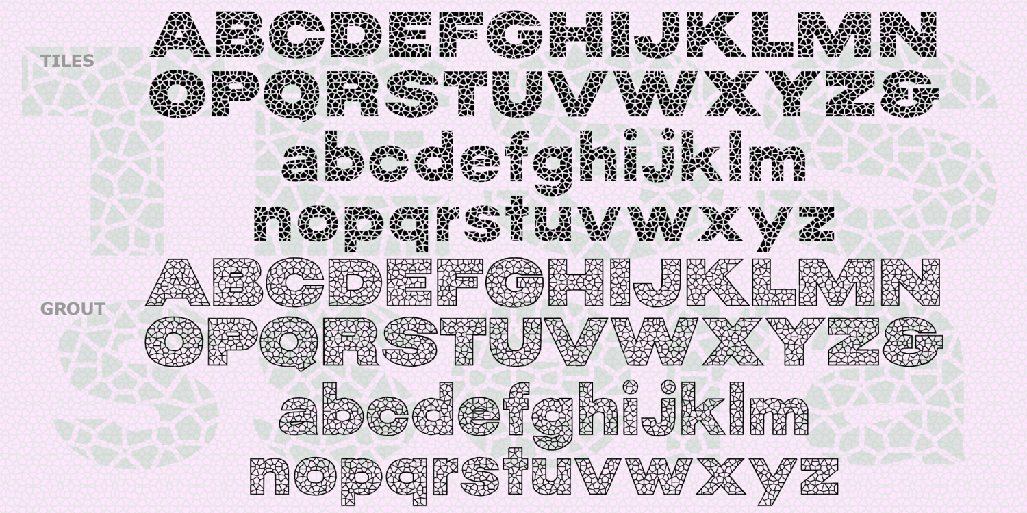
Subway Mosaic Wall
4 Fonts | from $39.95
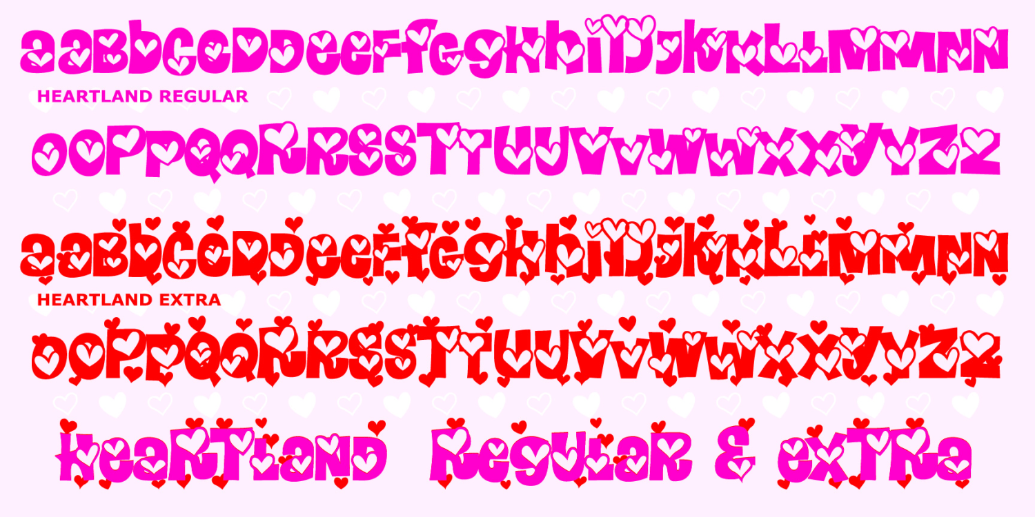
Heartland
2 Fonts | from $12
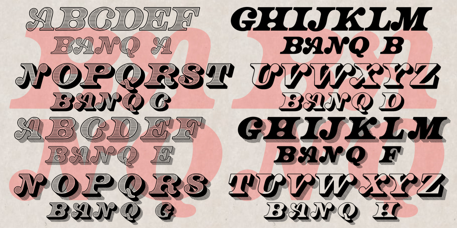
Banq
8 Fonts | from $49.95
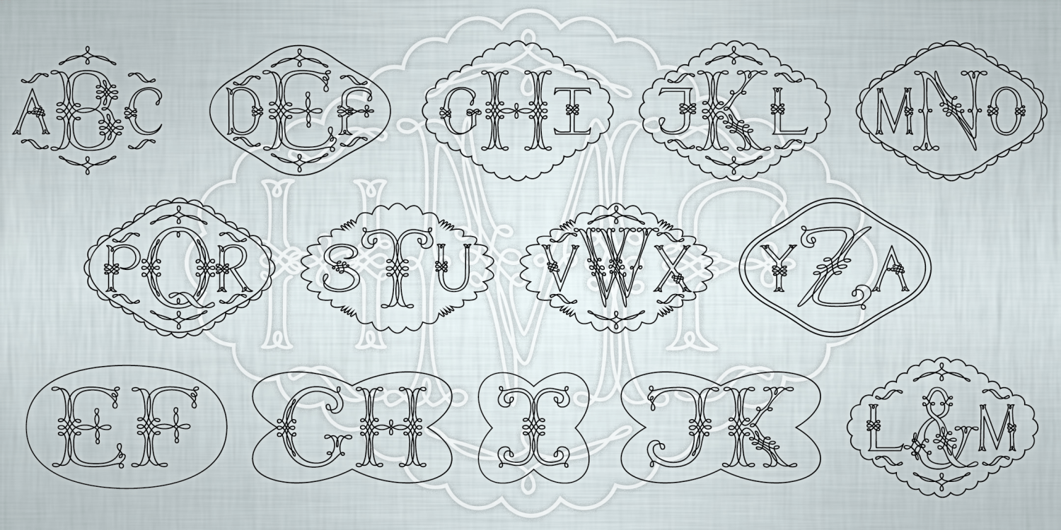
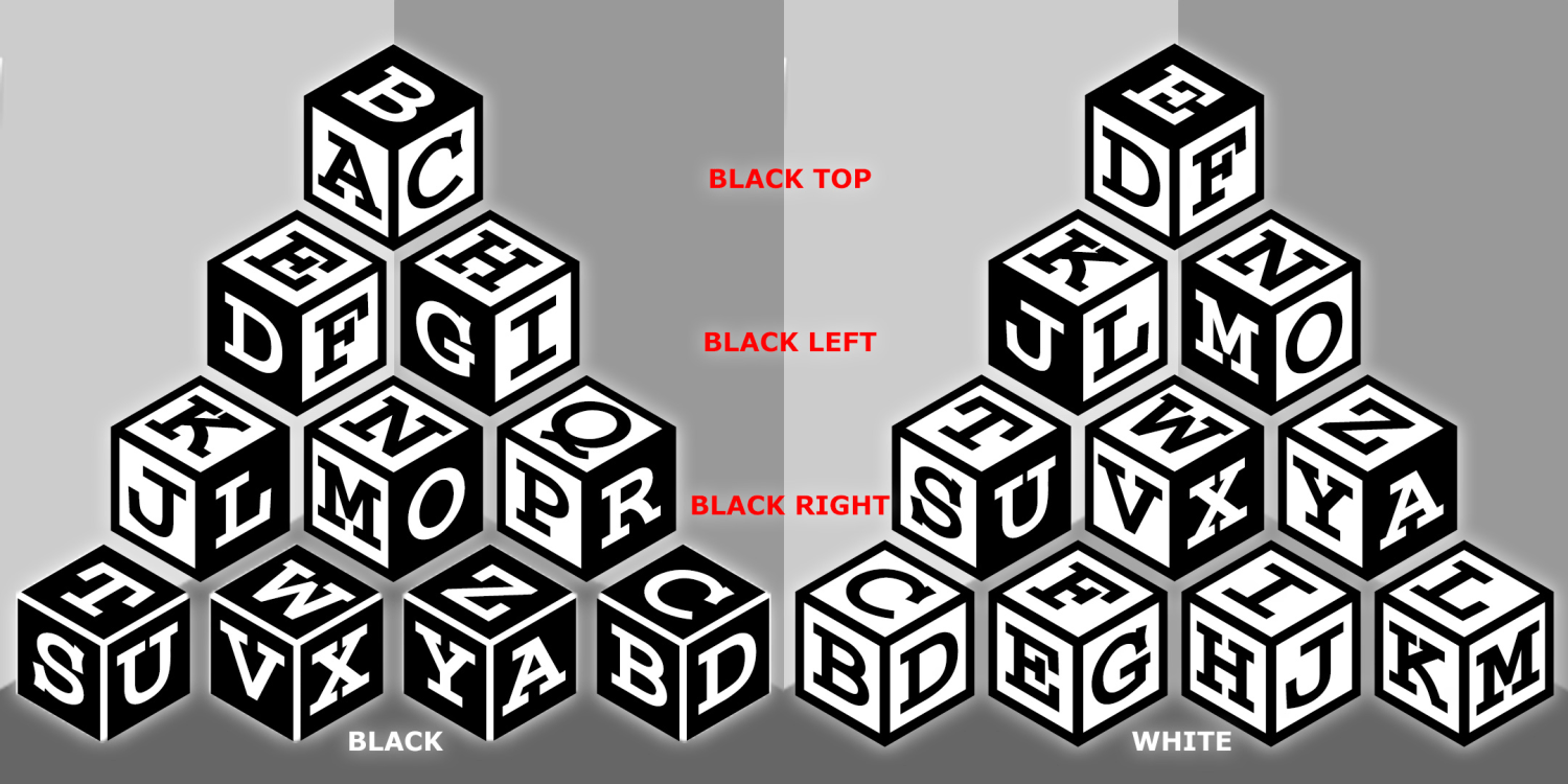
Marching Monograms
5 Fonts | from $29.95
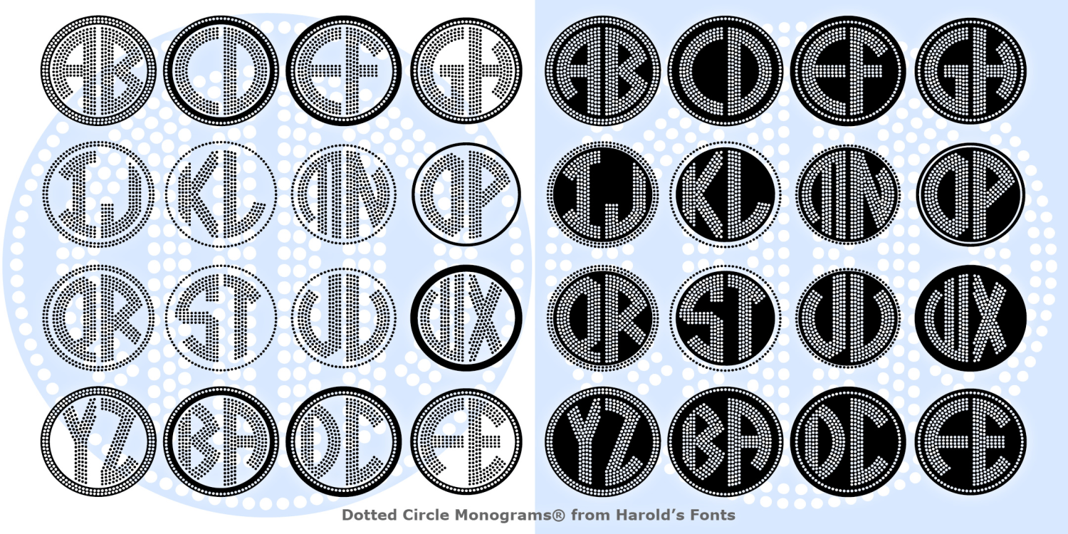
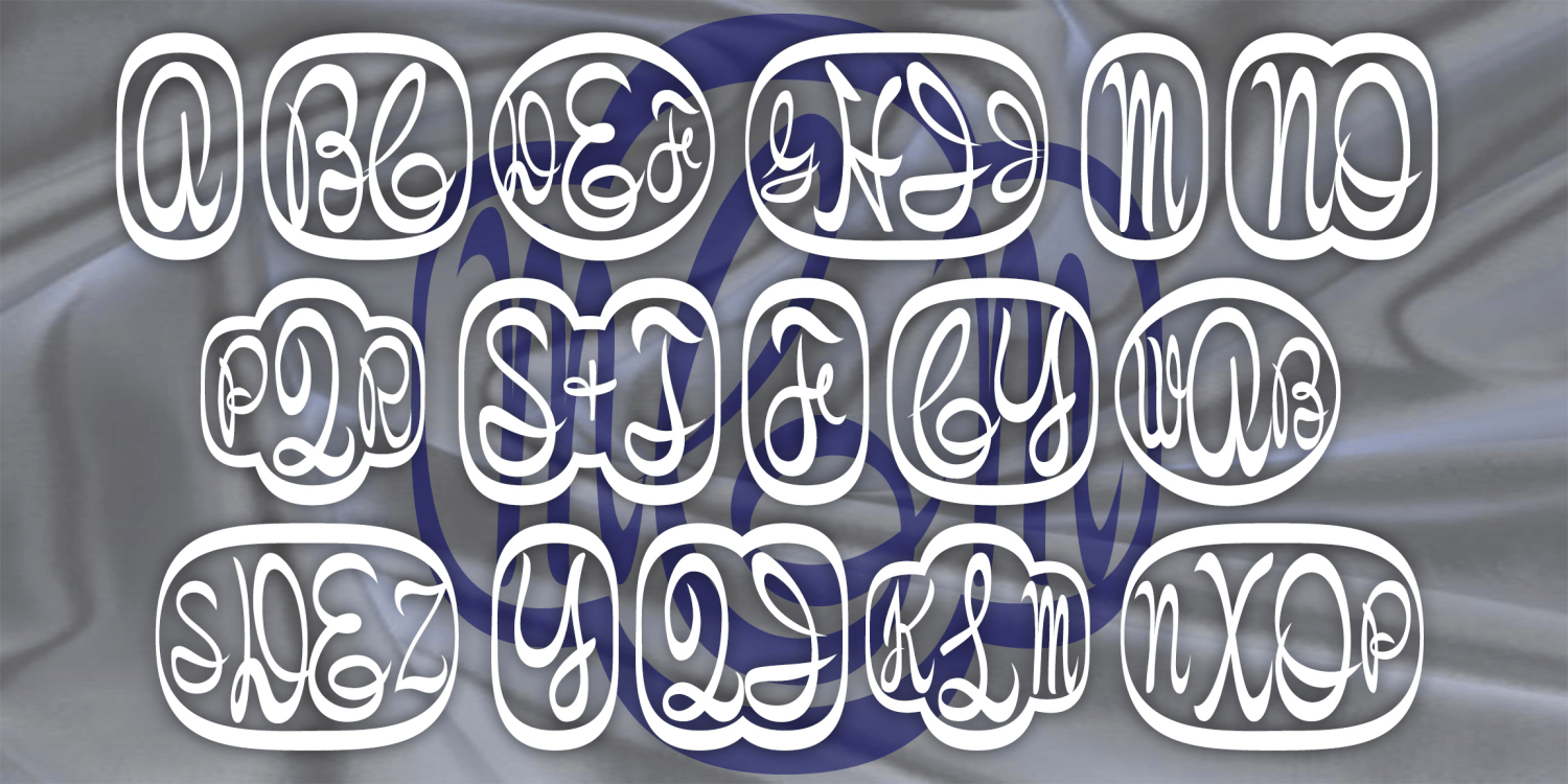
Dotted Circle Monograms
2 Fonts | from $19.95
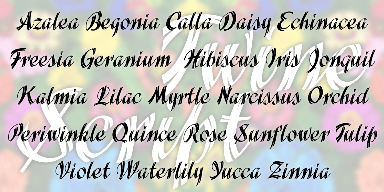
Twine Script
1 Font | from $19.95
Galathea
2 Fonts | from $29.95
Beauchamp
1 Font | from $19.95
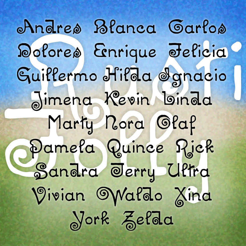
Rustic Folly
1 Font | from $12
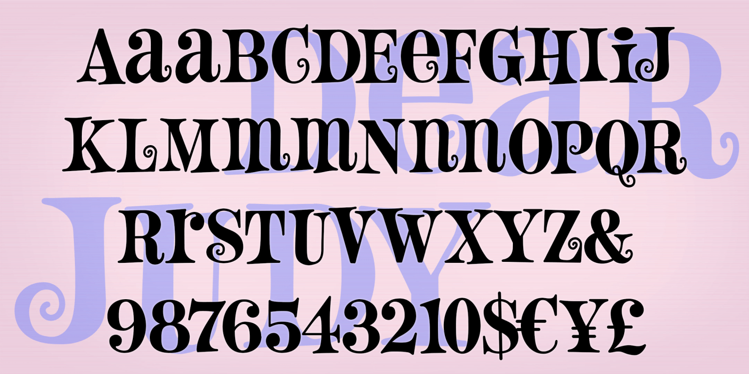
Dear Judy
1 Font | from $19.95
Royality
1 Font | from $19.95
Towne Monograms
3 Fonts | from $29.95
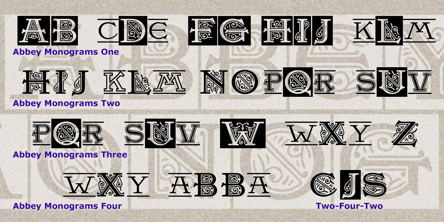
Abbey Monograms
4 Fonts | from $29.95
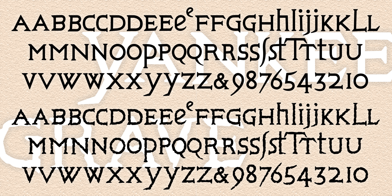
Yankee Grave
2 Fonts | from $29.95
Future Perfect
1 Font | from $19.95
Kechappu
1 Font | from $19.95
Backdrop
2 Fonts | from $29.95
Microfilm
1 Font | from $19.95
Prole
1 Font | from $19.95
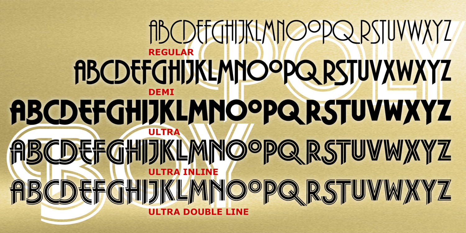
Polyboy
5 Fonts | from $49.95
Carousel Monograms
1 Font | from $19.95
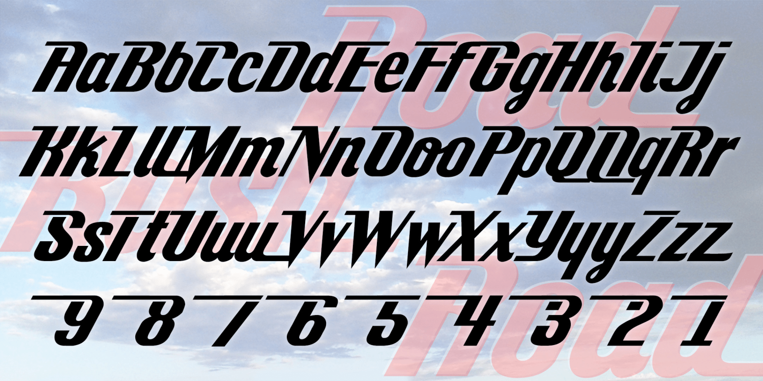
Road Rash
1 Font | from $19.95
Pyramid Monograms
4 Fonts | from $19.95
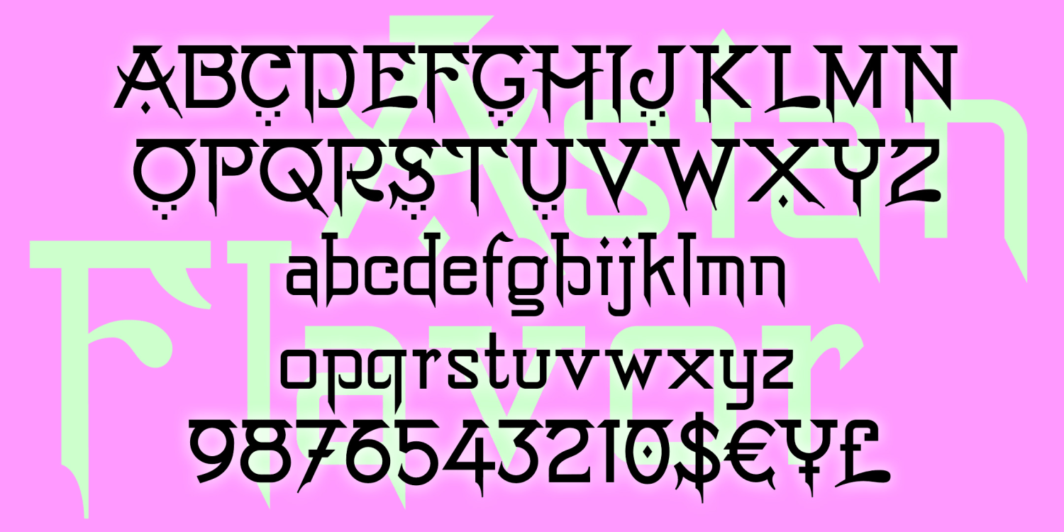
Lyric Tenor
2 Fonts | from $19.95
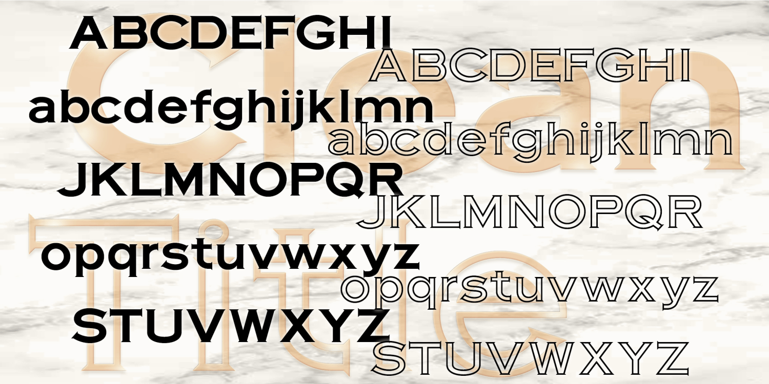
Clean Title
2 Fonts | from $19.95
Pasta Fazool
2 Fonts | from $19.95
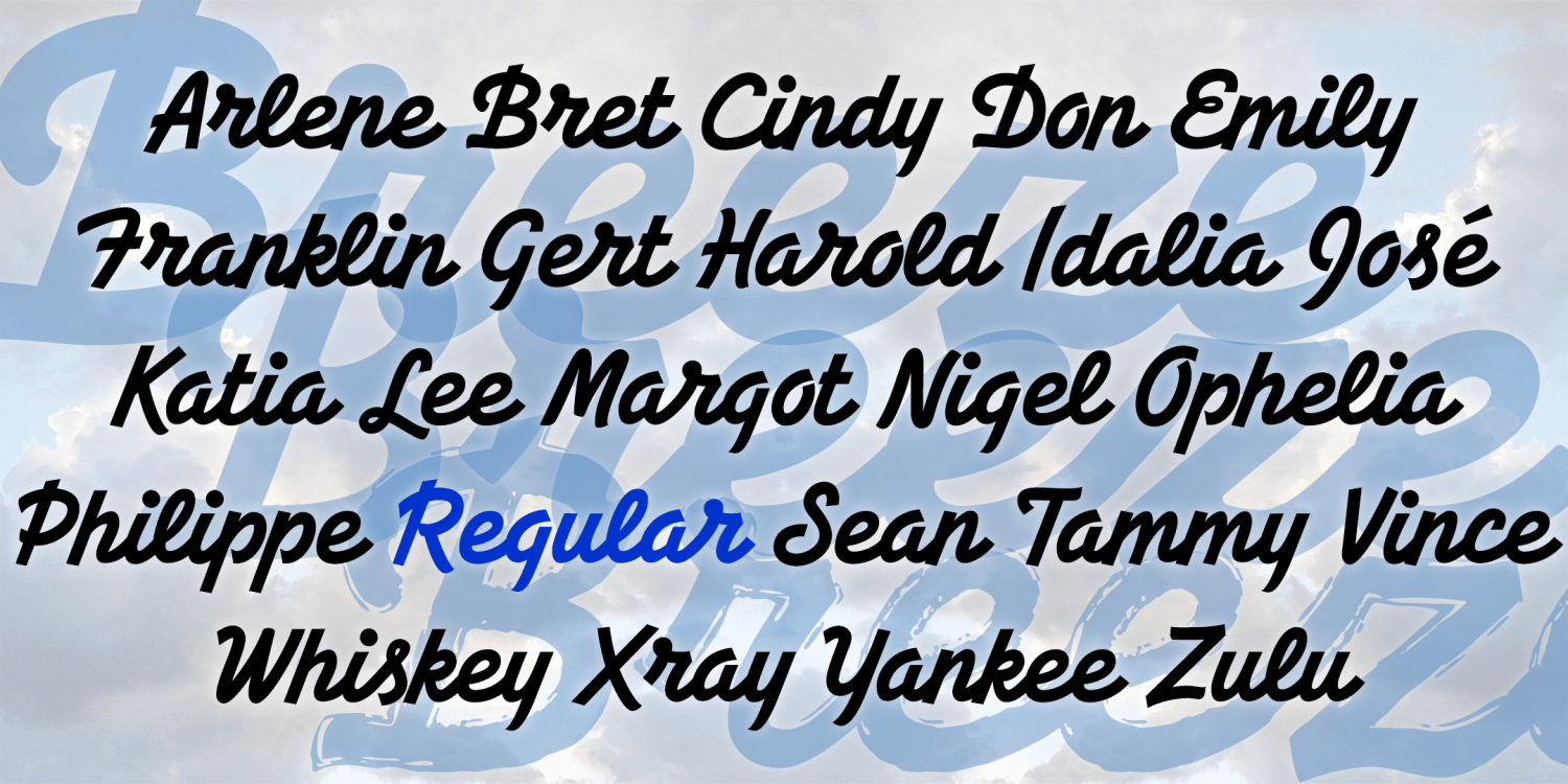
Breezeblock
3 Fonts | from $29.95
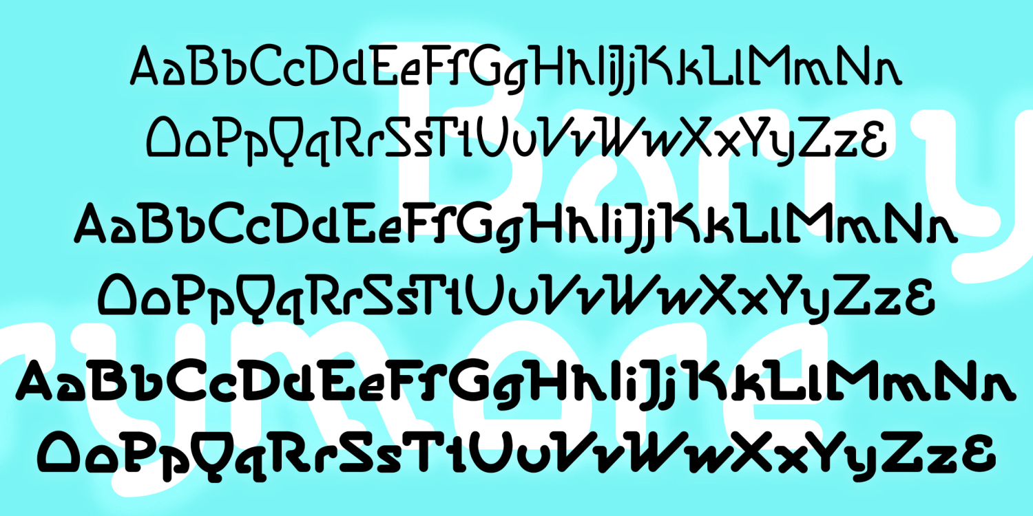
Barrymore
3 Fonts | from $39.95
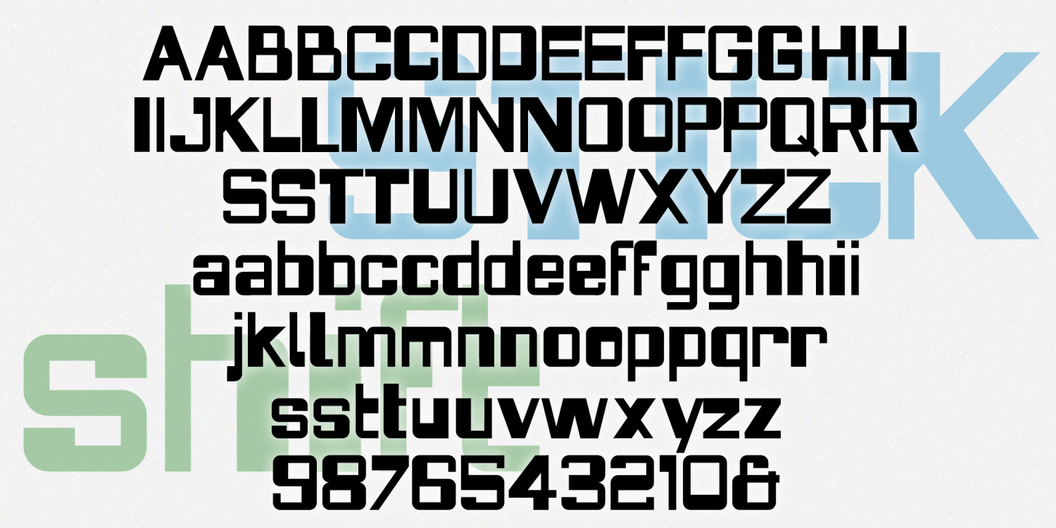
Stickshift
1 Font | from $19.95
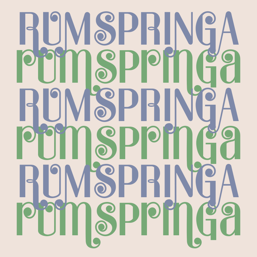
Rumspringa
2 Fonts | from $19.95
Edgewood
4 Fonts | from $19.95
Ixat
2 Fonts | from $12
Dilemma
3 Fonts | from $12
Sweet Bay
4 Fonts | from $19.95
Tessera
4 Fonts | from $19.95
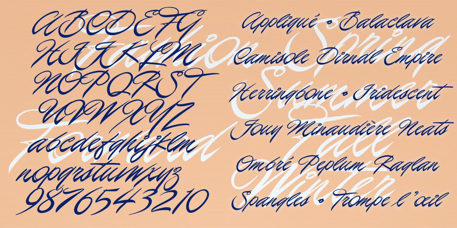
Fashion Forward
1 Font | from $19.95
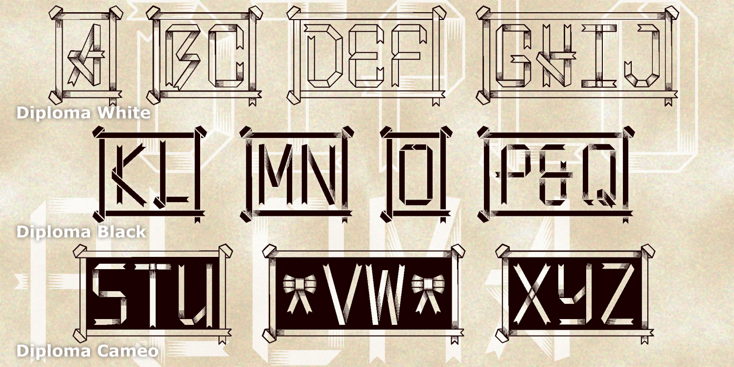
Diploma Monograms
3 Fonts | from $19.95
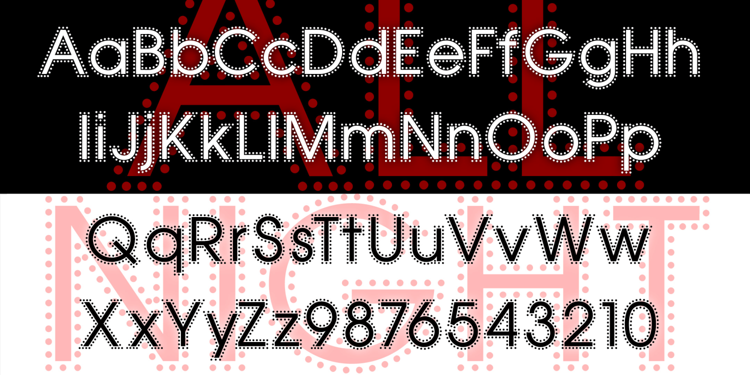
All Night
1 Font | from $19.95
Obligado
3 Fonts | from $12
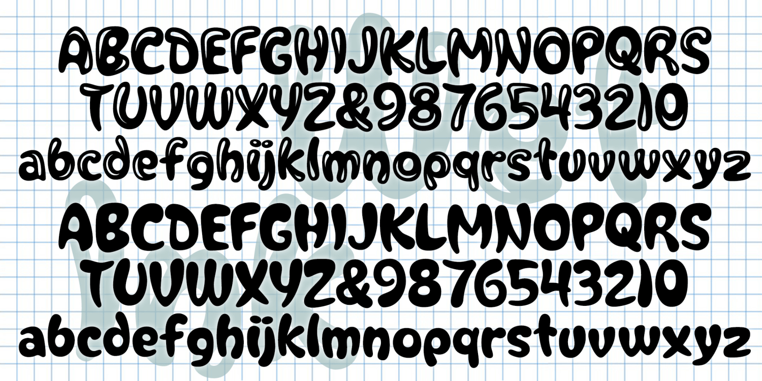
Wet Ink
1 Font | from $19.95
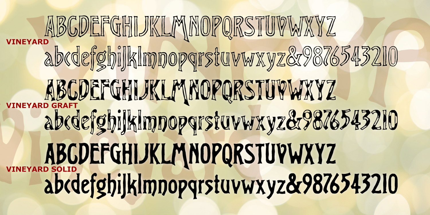
Vineyard Family
6 Fonts | from $39.95
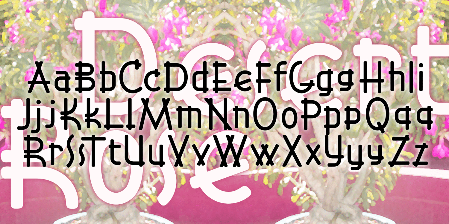
Desert Rose
1 Font | Free Download
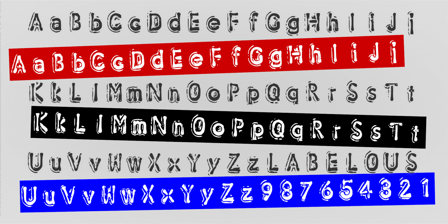
Labelous
2 Fonts | from $19.95
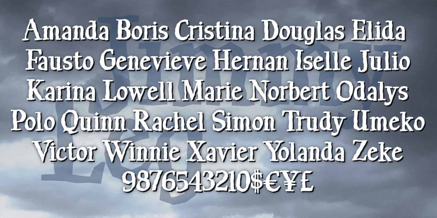
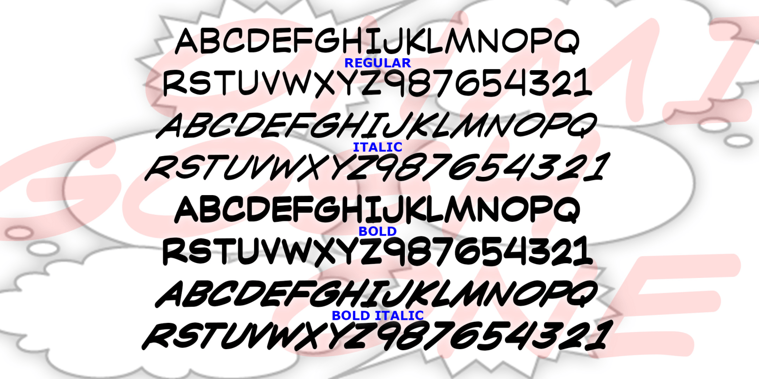
Jimmy Leg
1 Font | from $19.95
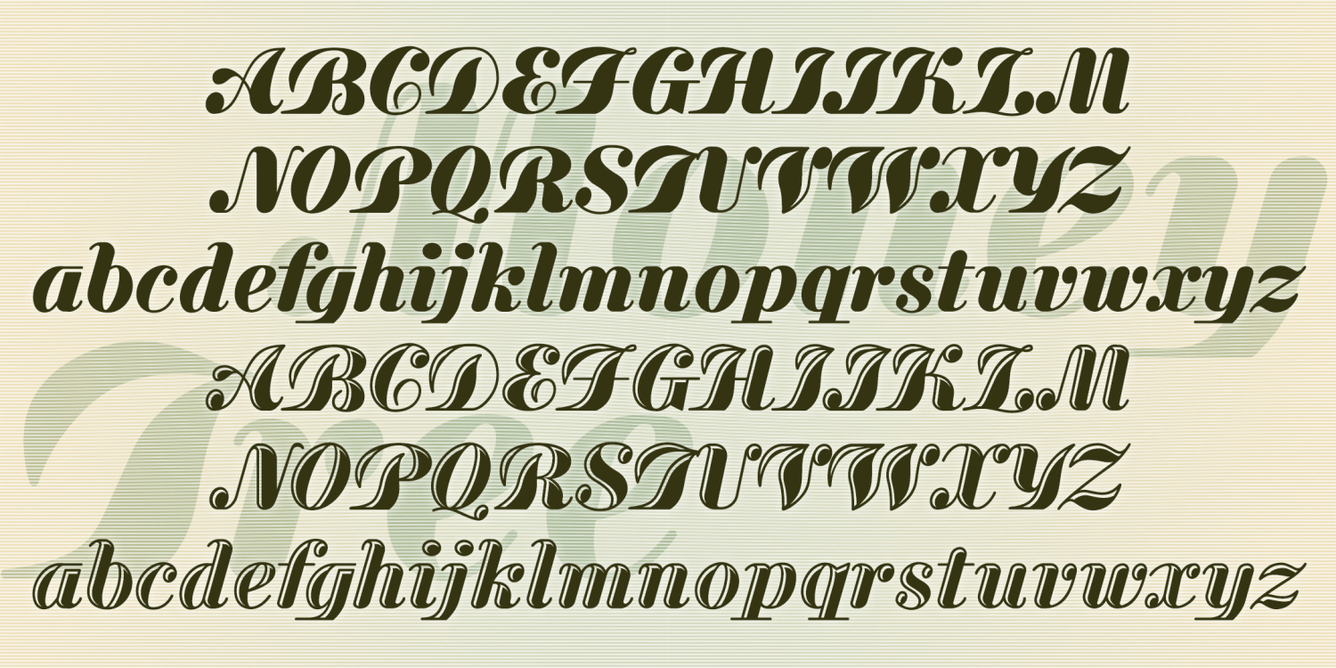
Money Tree
3 Fonts | from $39.95
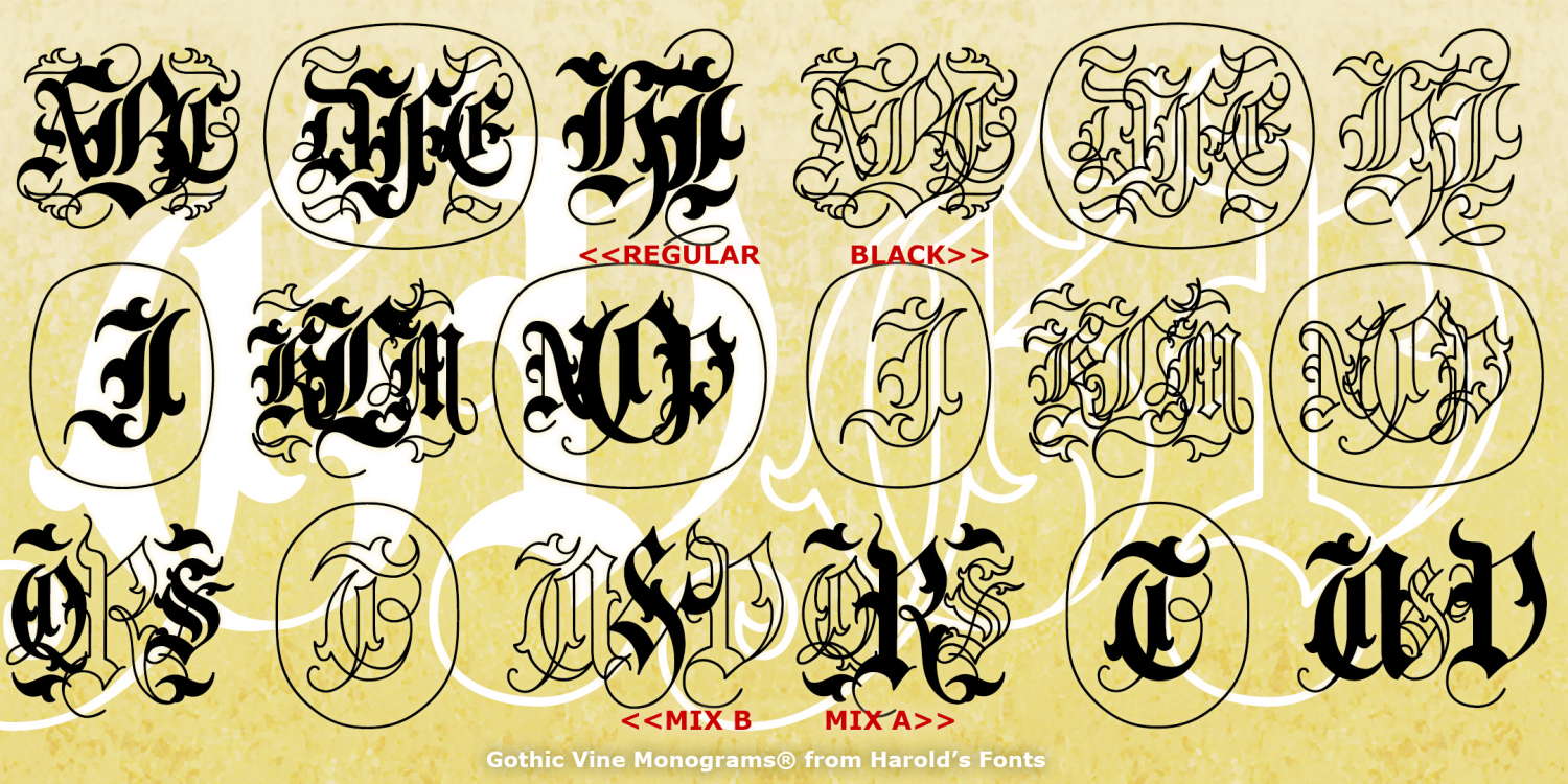
Gothic Vine Monograms
4 Fonts | from $19.95
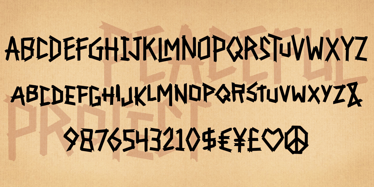
Peaceful Protest
1 Font | from $19.95
Divinity Rose Monograms
4 Fonts | from $19.95
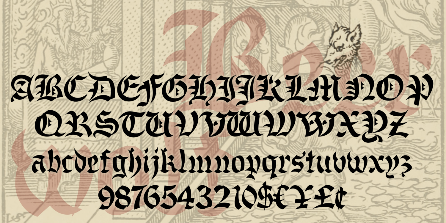
Beerwolf
1 Font | from $19.95
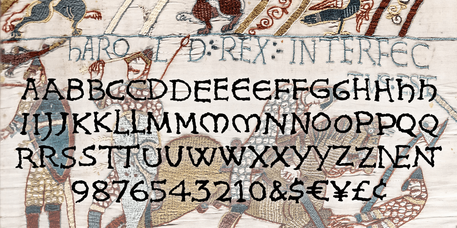
King Harold
1 Font | Free Download
Neurotoxin
1 Font | Free Download
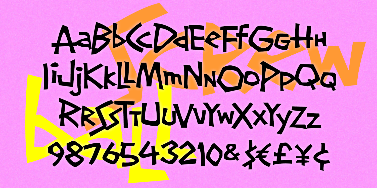
Screwball
1 Font | Free Download
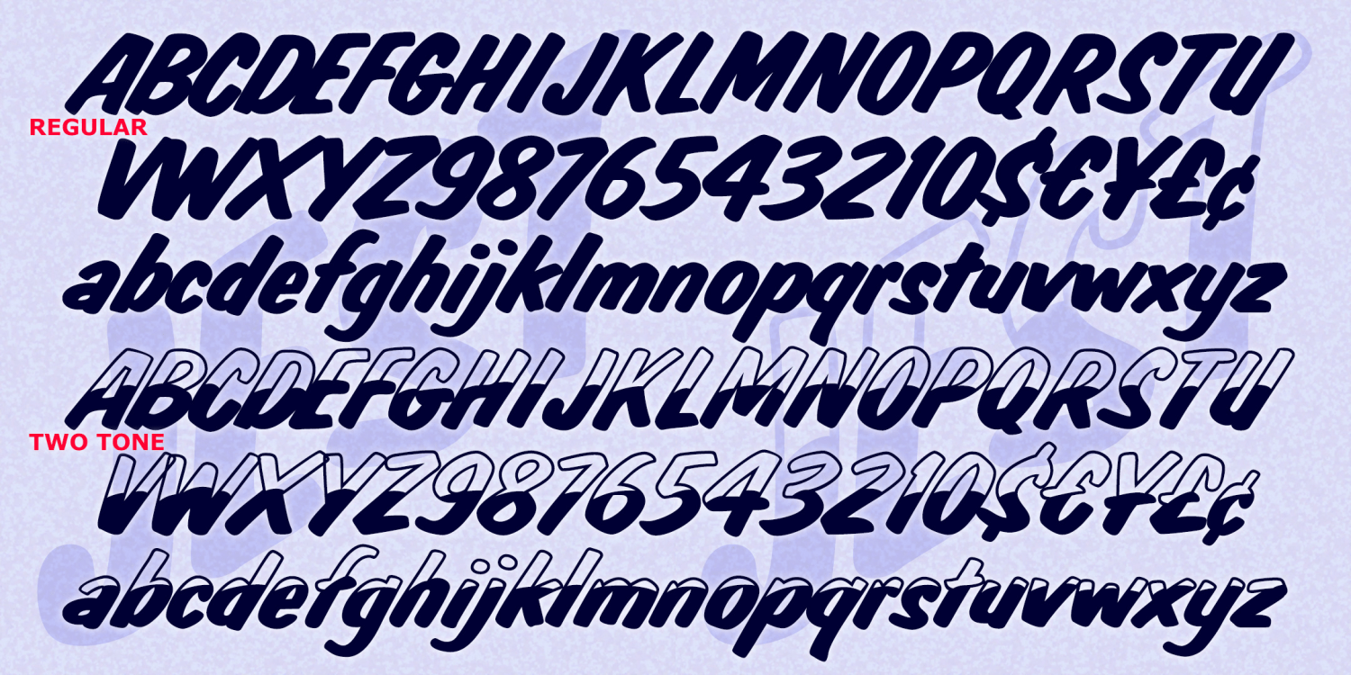
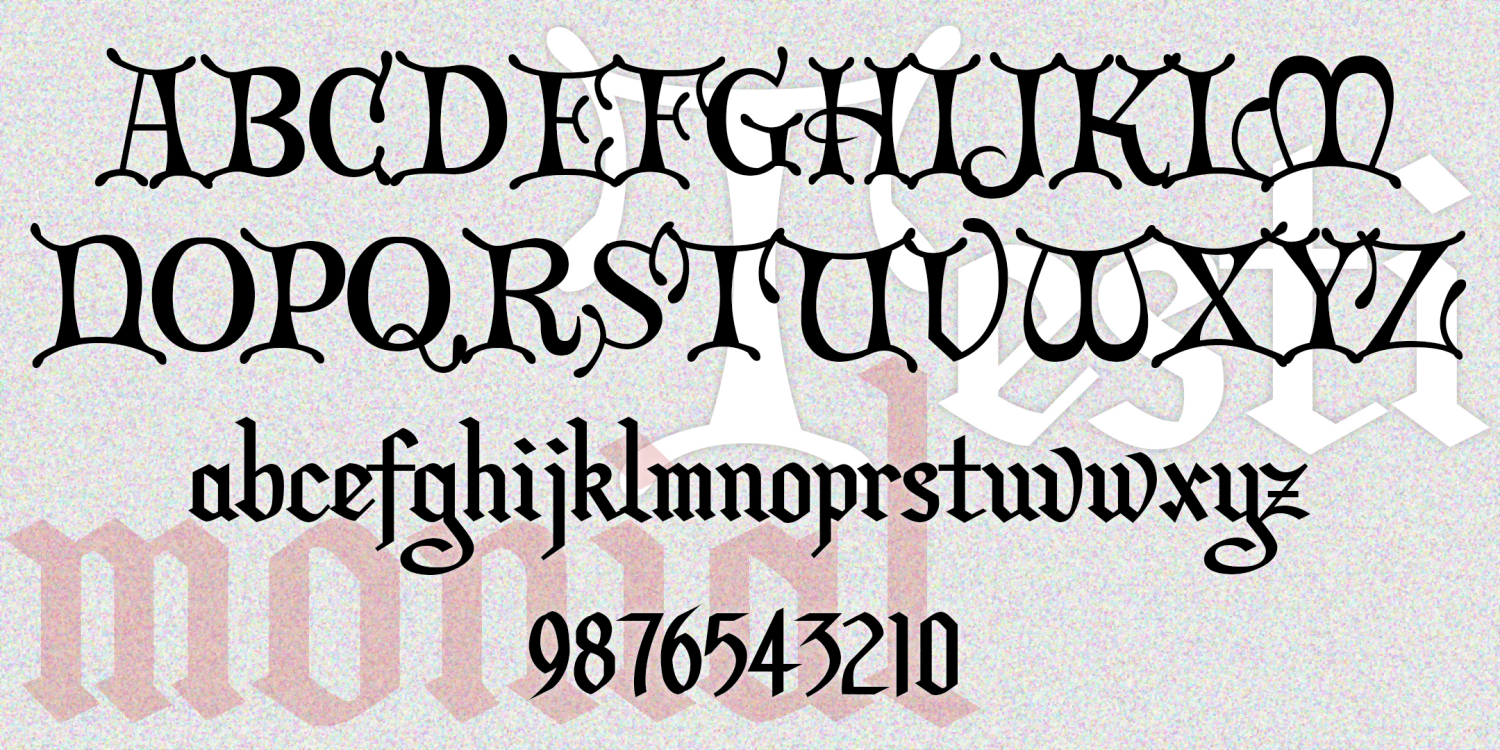
Jest
6 Fonts | from $19.95
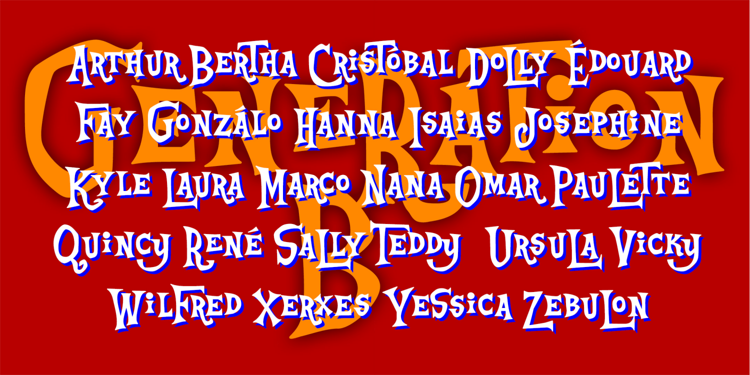
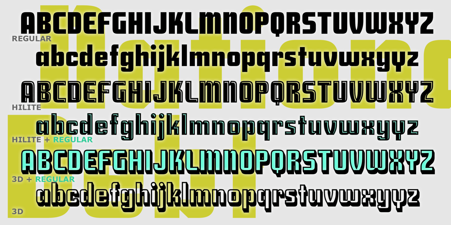
Generation B
1 Font | from $19.95
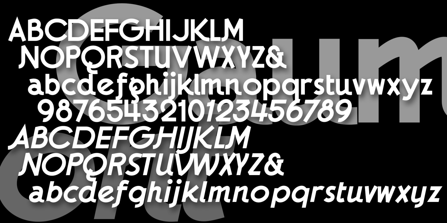
Gaumont
4 Fonts | from $19.95
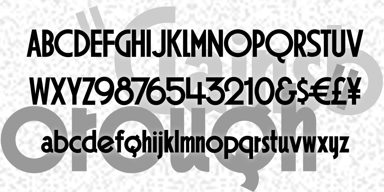
Gainsborough 2.0
1 Font | from $19.95
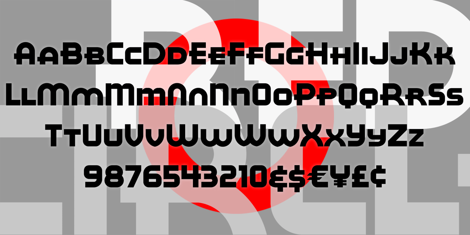
Red Circle
1 Font | from $12
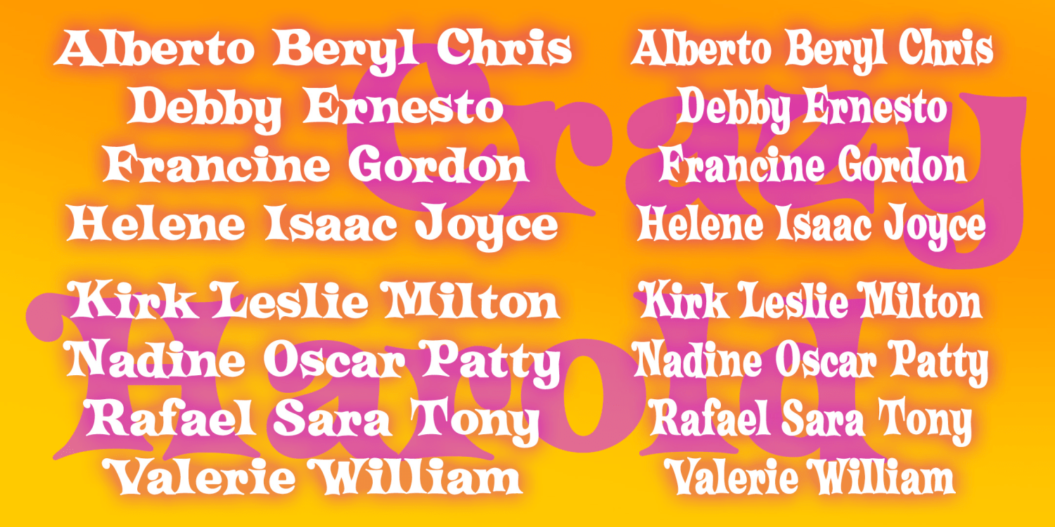
Crazy Harold
4 Fonts | from $29.95
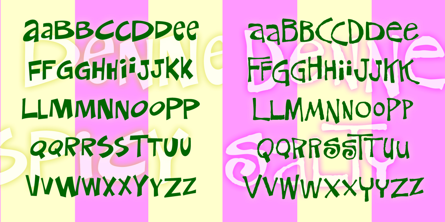
Denney
2 Fonts | from $29.95
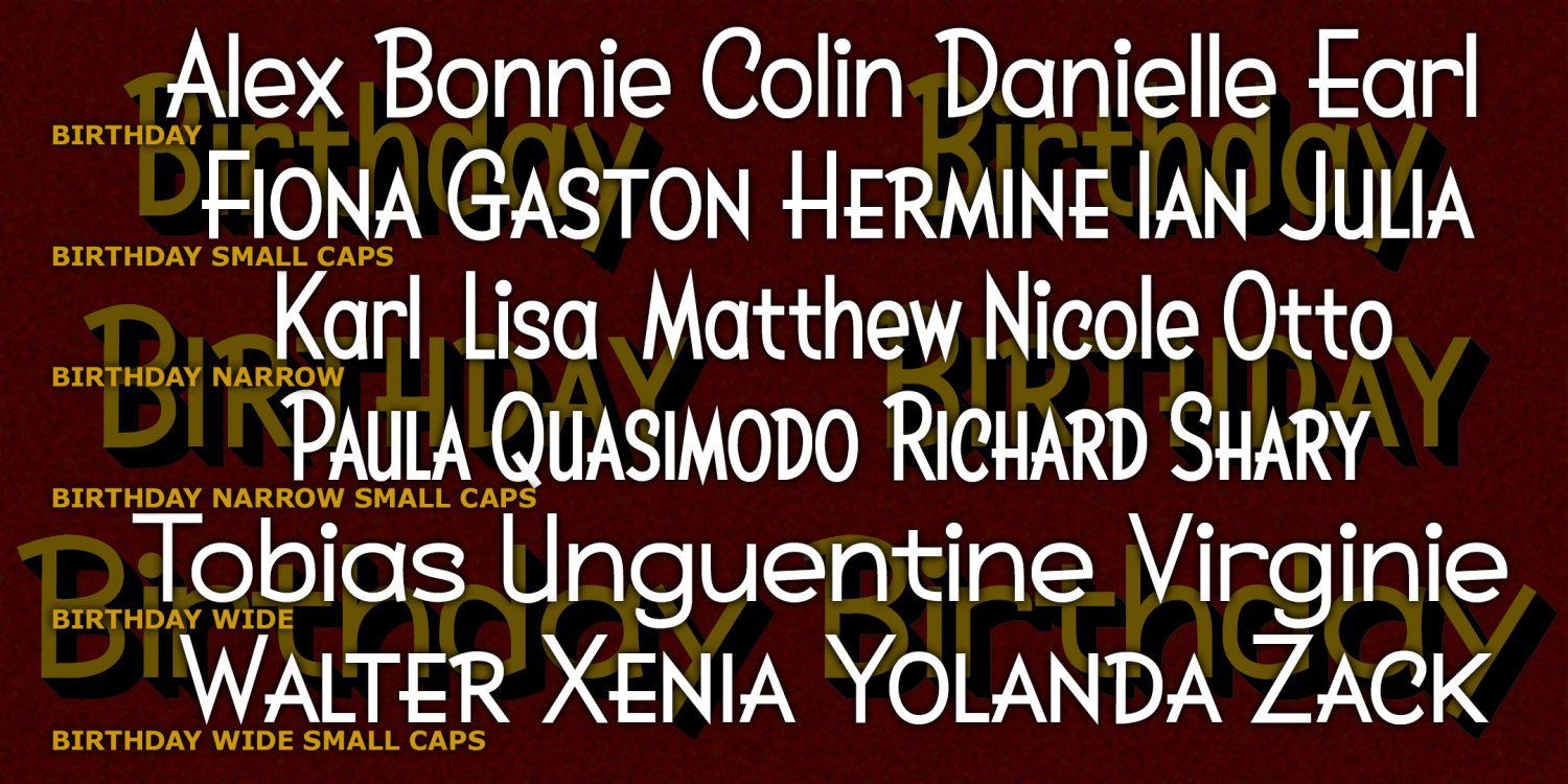
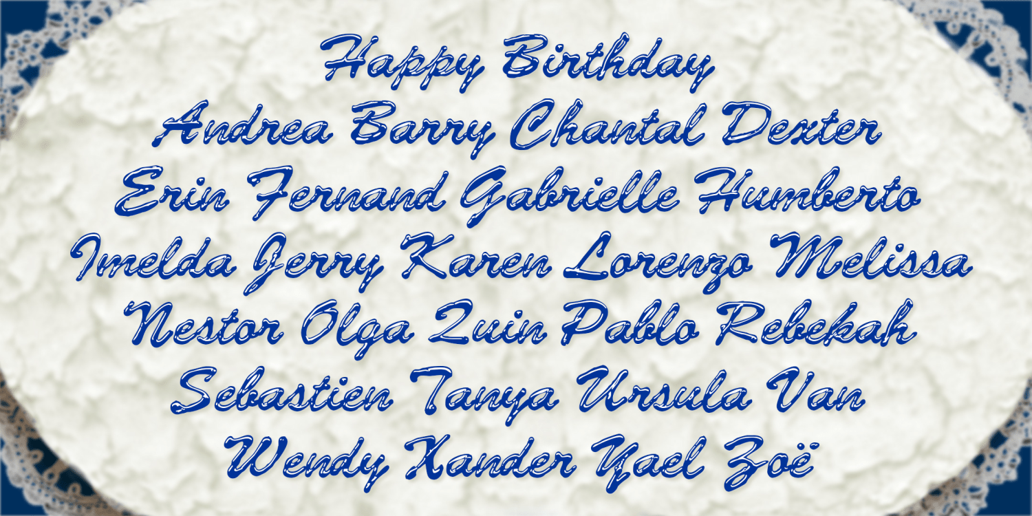
Birthday
6 Fonts | from $49.95
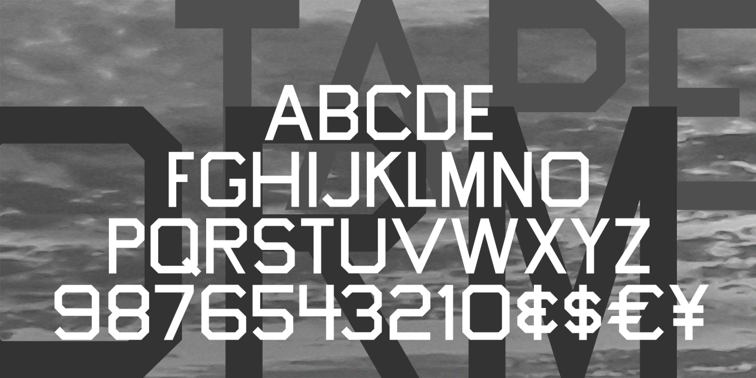
Tapeworm
1 Font | from $19.95
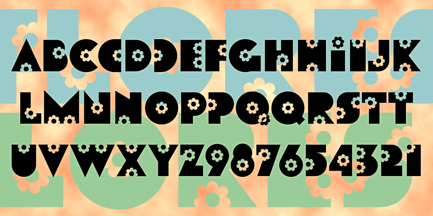
Flores
1 Font | Free Download
Backhand Brush
1 Font | Free Download
Subtext
1 Font | Free Download
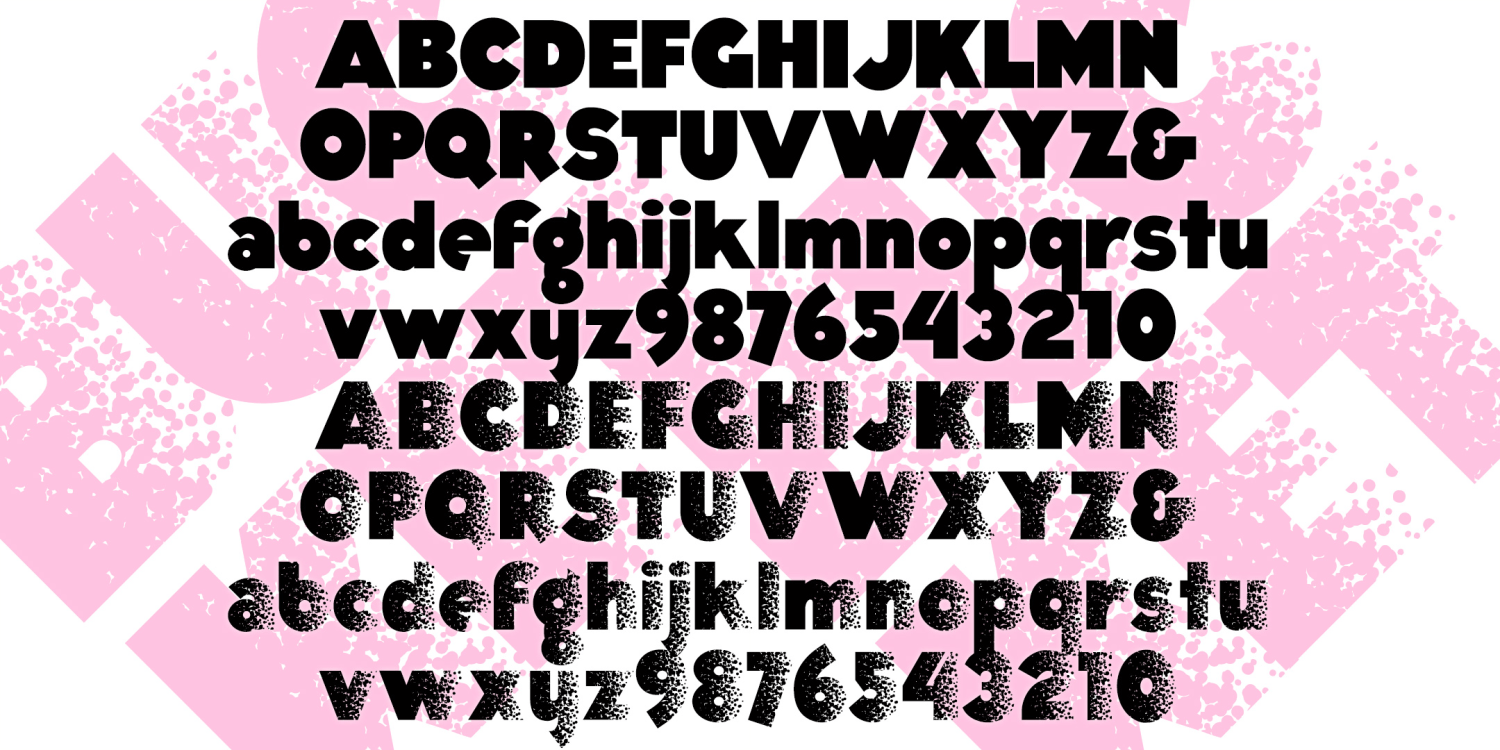
Bucket
2 Fonts | from $19.95
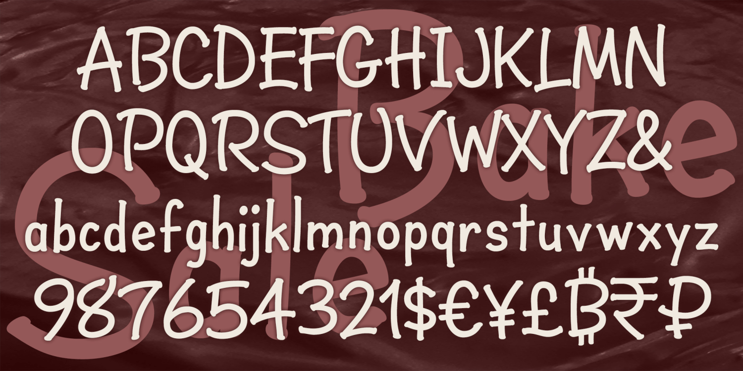
Bake Sale
1 Font | from $19.95
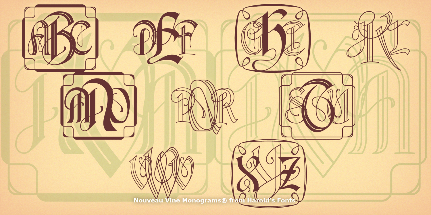
Nouveau Vine Monograms
4 Fonts | from $19.95
Pheather
1 Font | from $19.95
Library Monograms
2 Fonts | from $19.95
Extremadura
1 Font | from $19.95
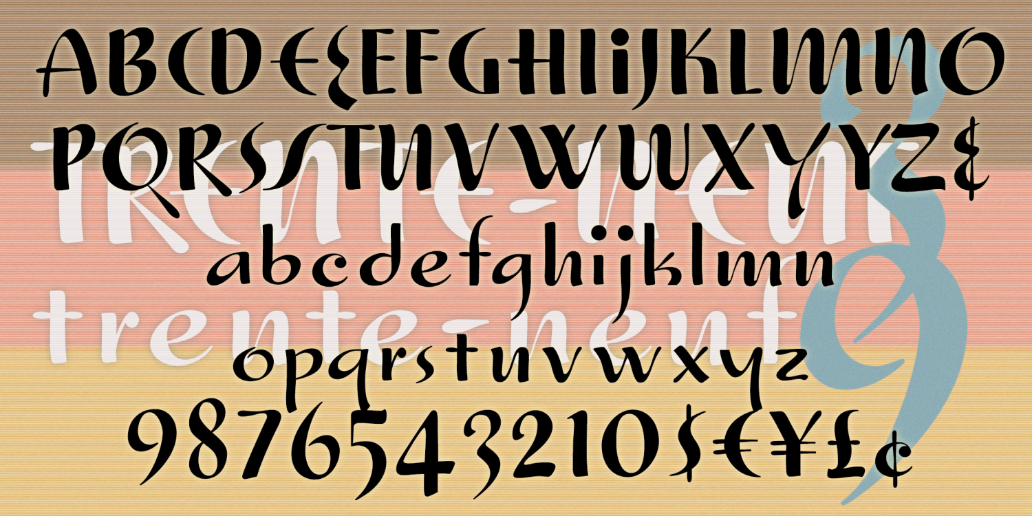
Trente Neuf
1 Font | from $19.95
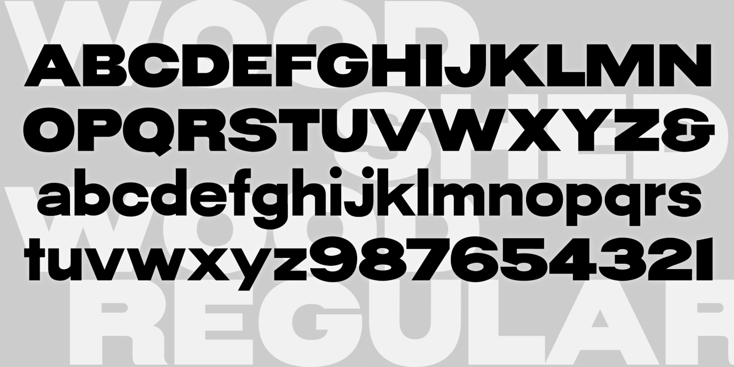
Wood Shed
3 Fonts | from $29.95
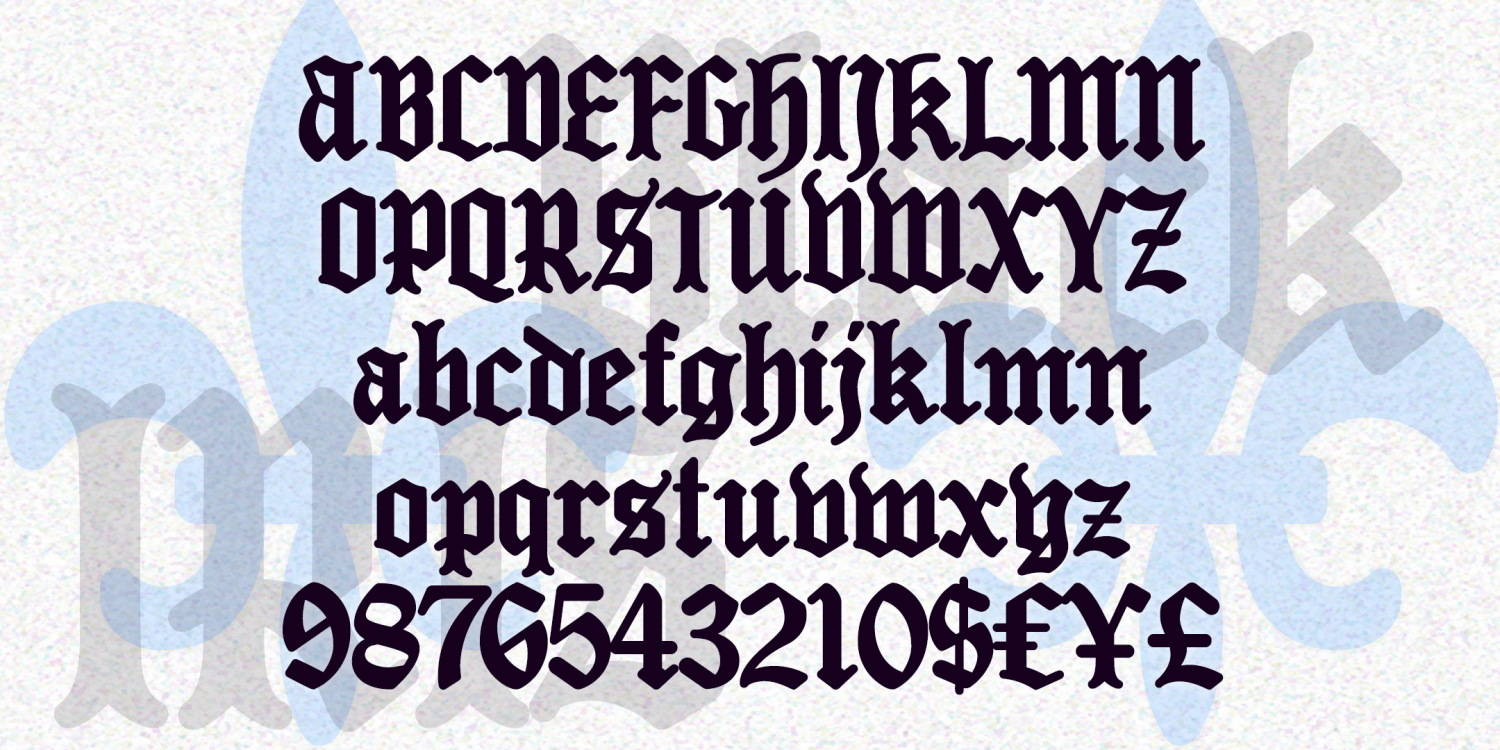
Black Iris
1 Font | from $19.95
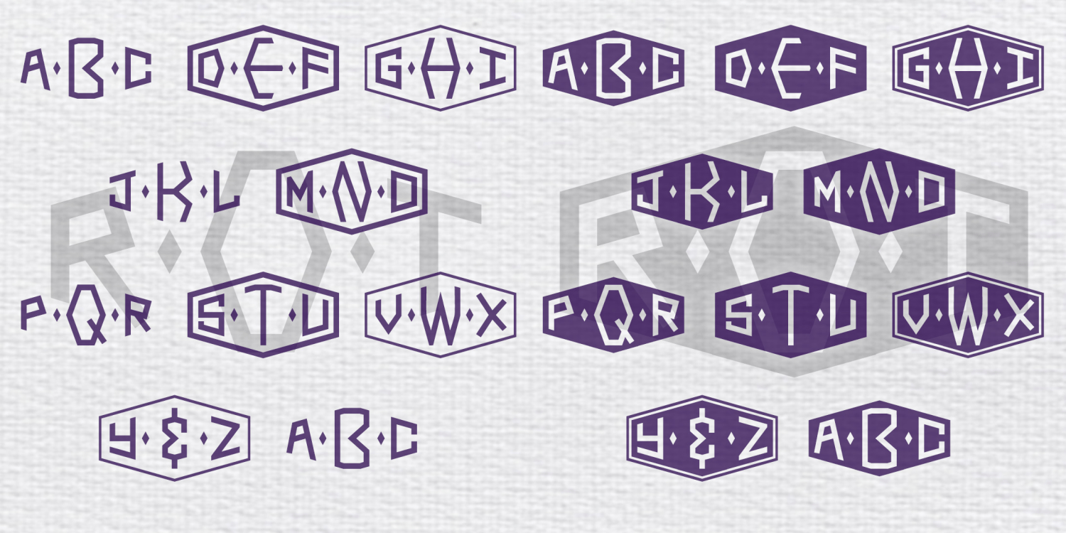
Thornhill Monograms
2 Fonts | from $19.95
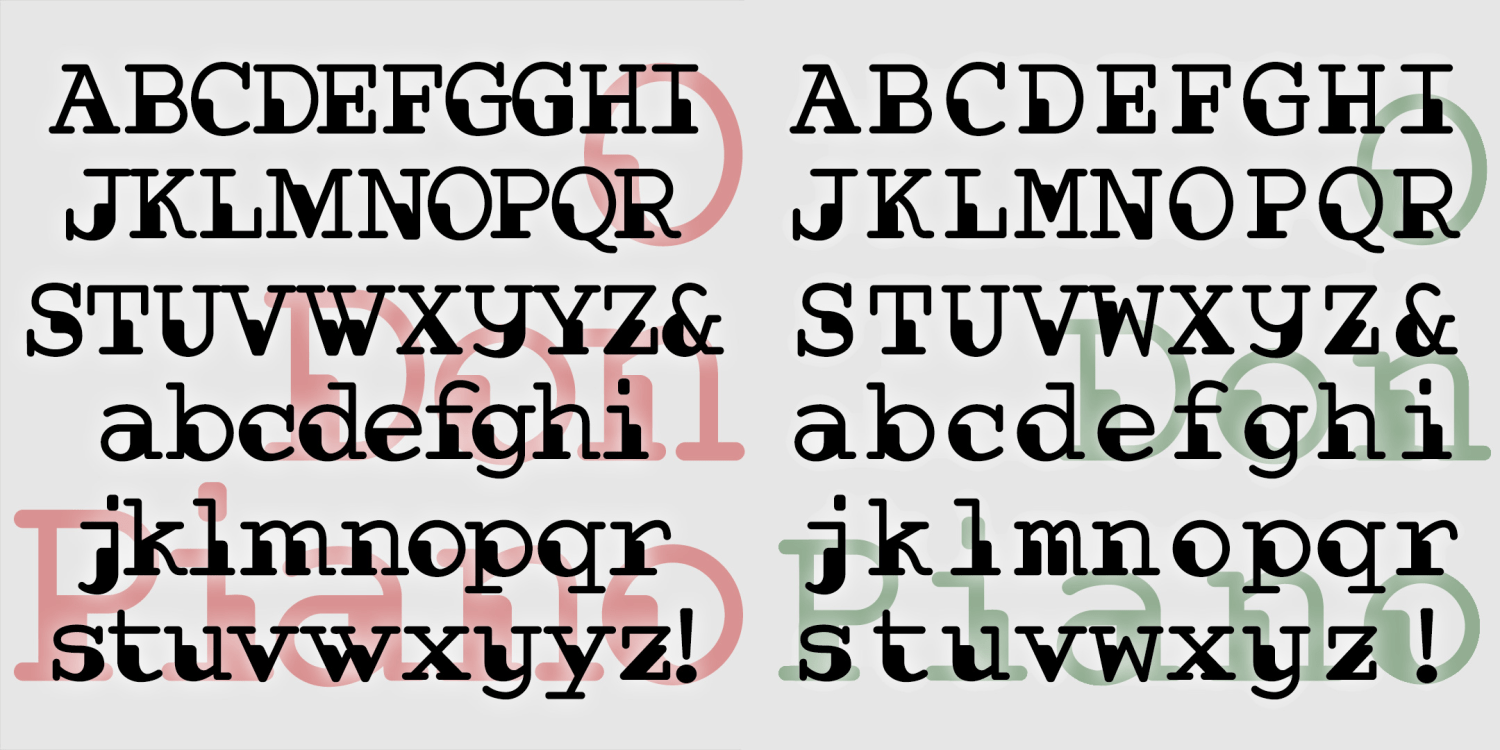
Don Piano
2 Fonts | Free Download
Bankroll
4 Fonts | from $39
Tablet Monograms
6 Fonts | from $19.95
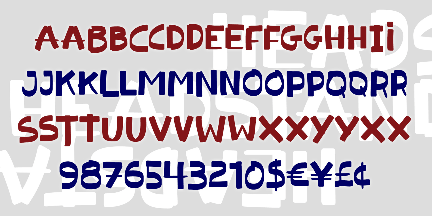
Headstand
1 Font | from $12
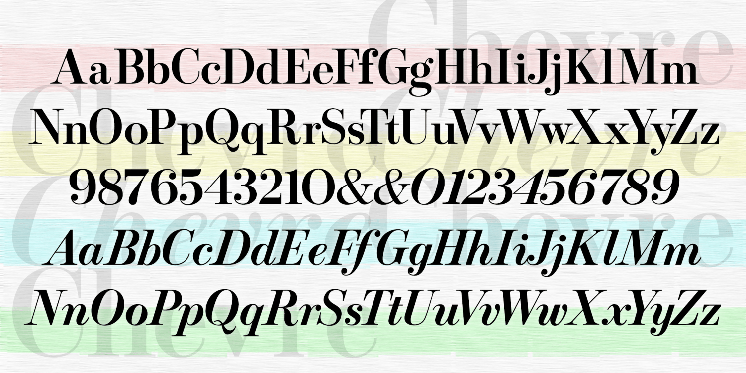
Chevre
4 Fonts | from $49
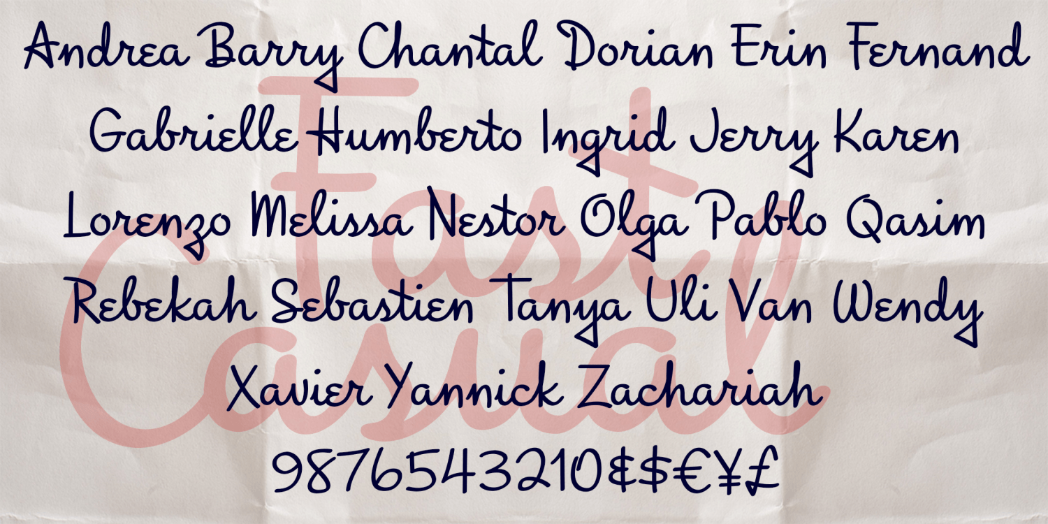
Fast Casual
1 Font | from $19.95
Plush Monograms
6 Fonts | from $19.95
Licorice Whip
1 Font | from $19.95
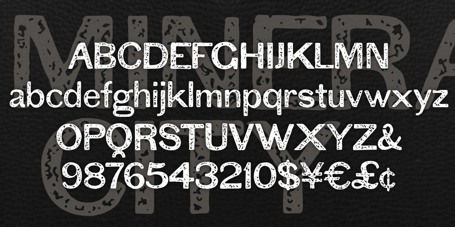
Mineral City
1 Font | from $19.95
Cascade Monograms
1 Font | from $19.95
Minaret
1 Font | from $19.95
Trails End
1 Font | from $19.95
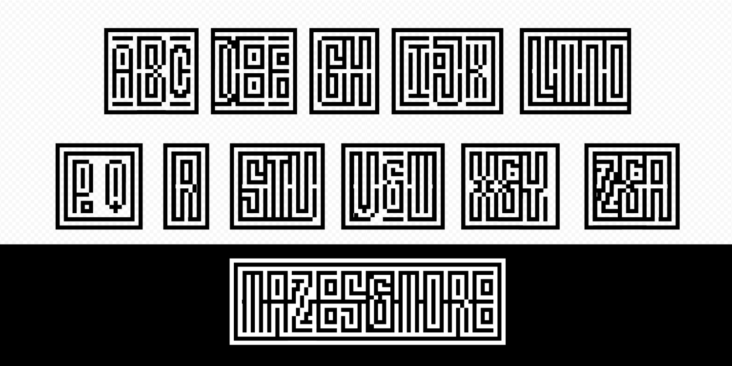
Maze Monogram
1 Font | from $19.95
Harmonium
2 Fonts | from $18
Tidal Wave
1 Font | from $19.95
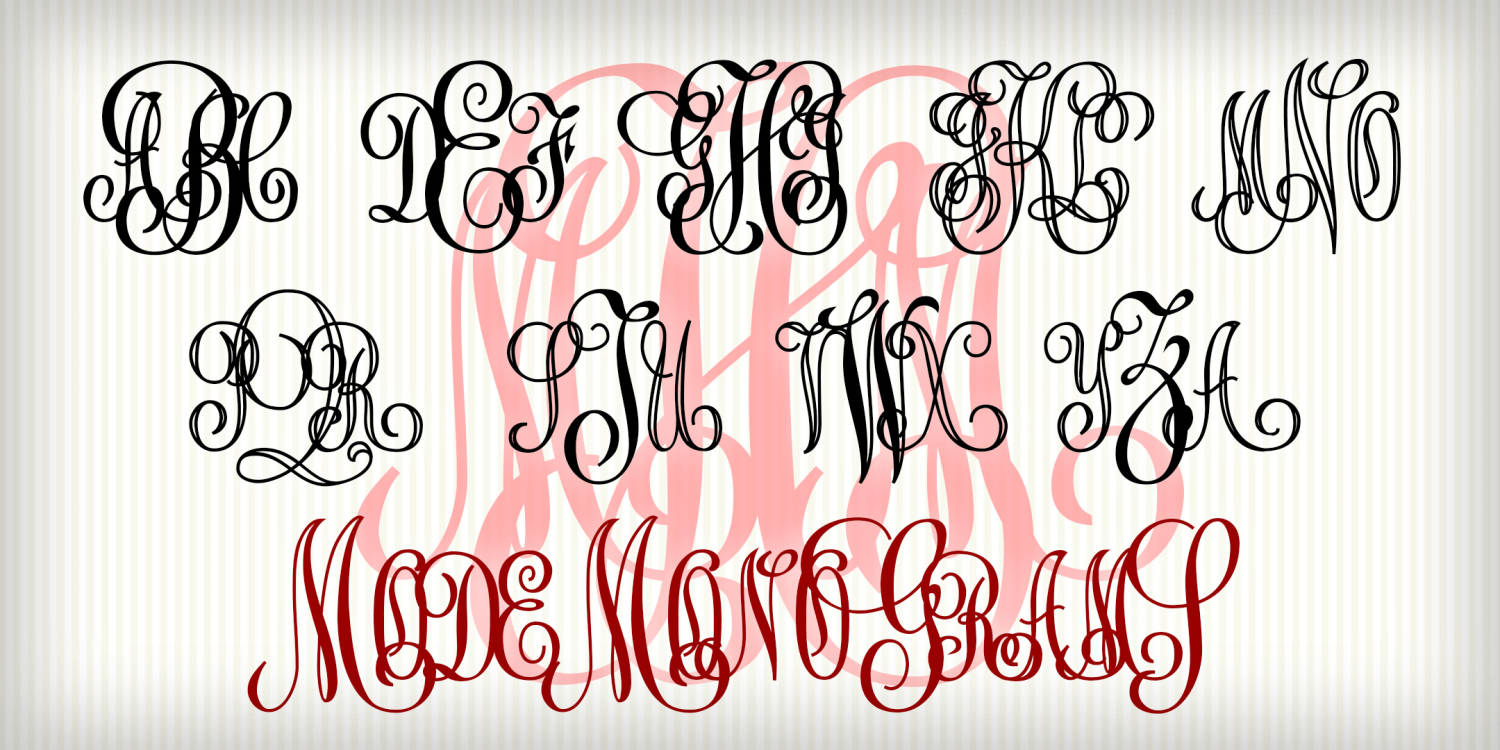
Mode Monograms
4 Fonts | from $29.95
Asian Flavor
1 Font | from $19.95
Decoy
4 Fonts | from $29.95
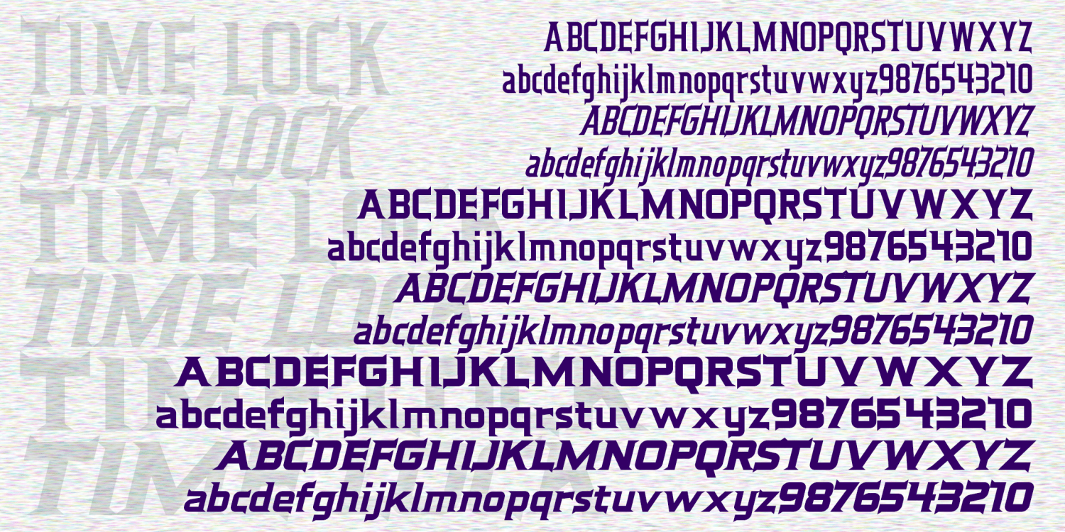
Time Lock
6 Fonts | from $59.95
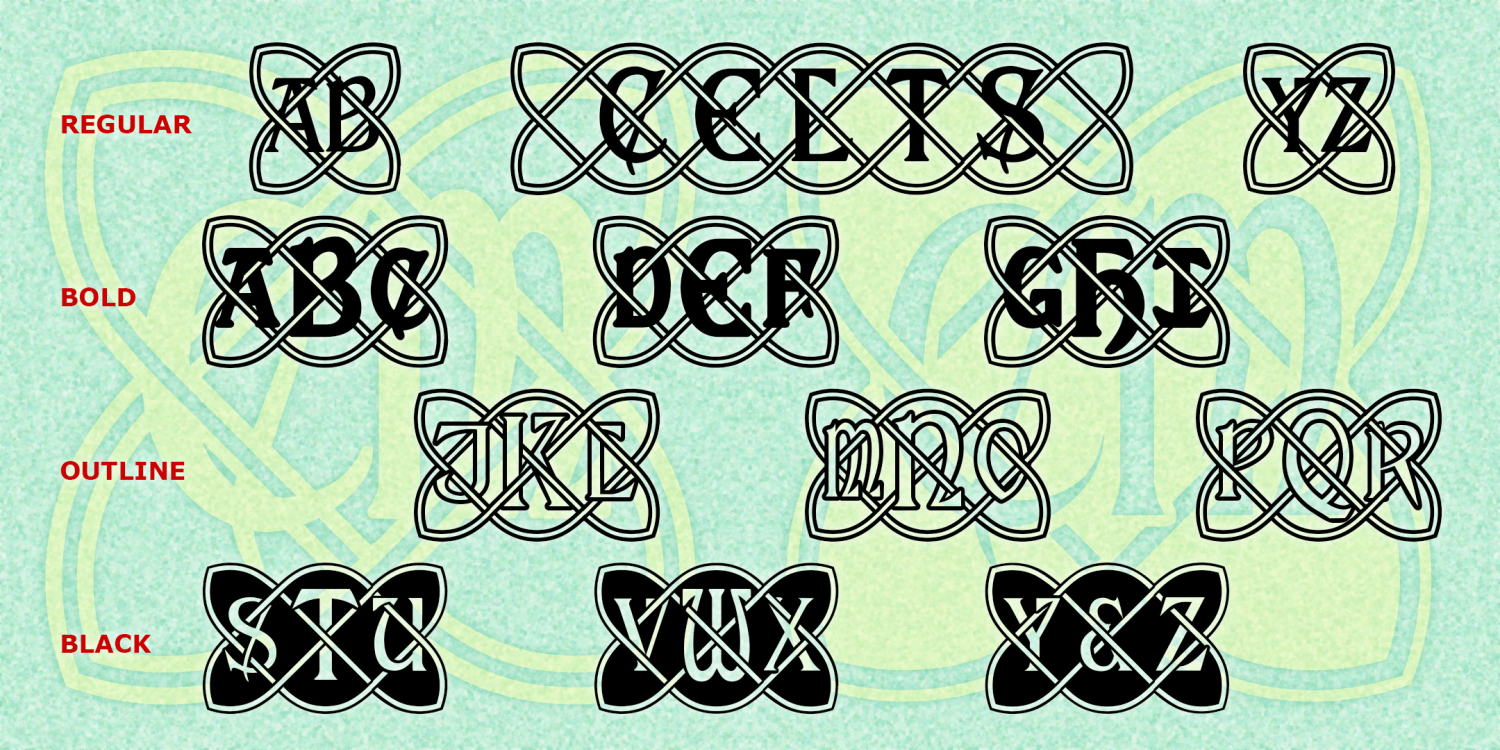
Celtic Knot Monograms
4 Fonts | from $19.95
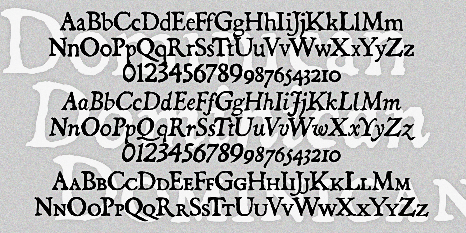
Dominican
3 Fonts | from $39.95
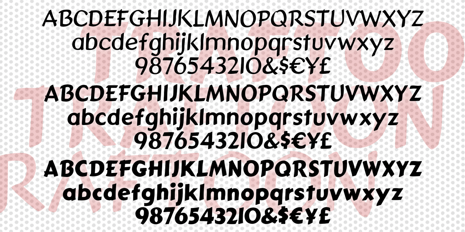
Traftoon
3 Fonts | from $39.95
Art Deco Monograms
1 Font | from $19.95
True Confession
1 Font | from $19.95
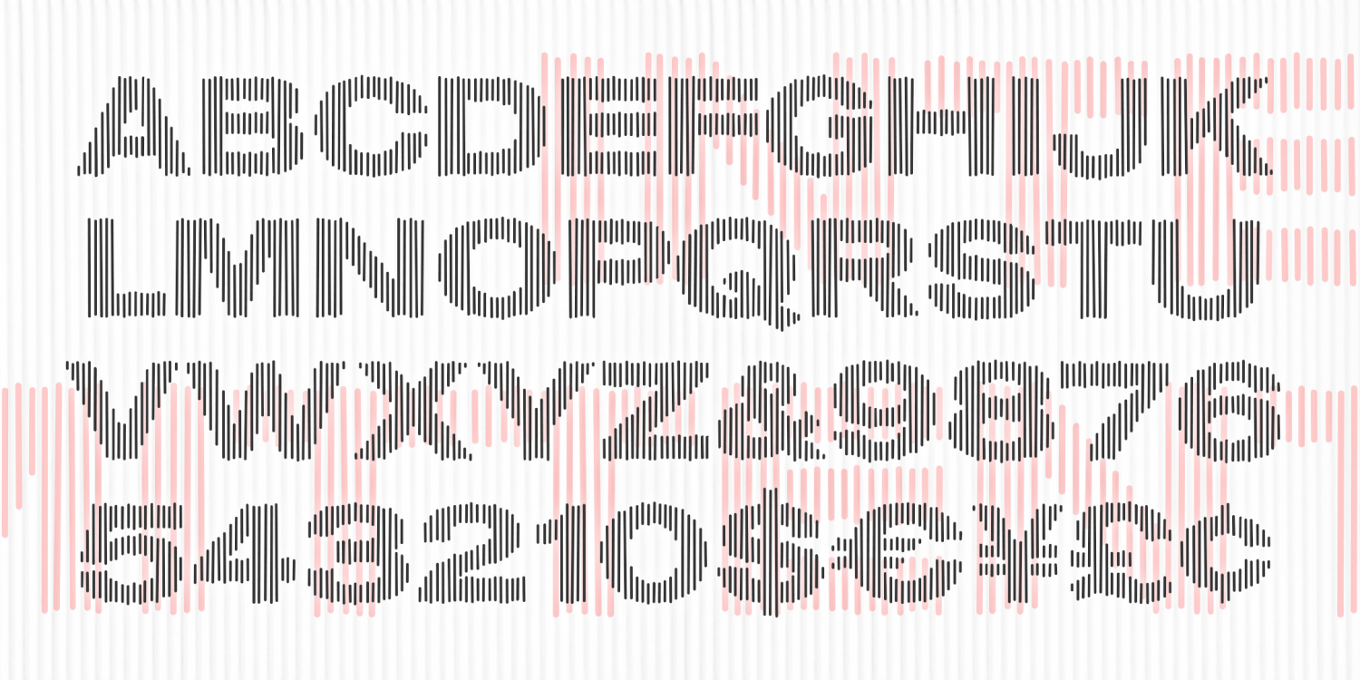
Intermittent
1 Font | from $19.95
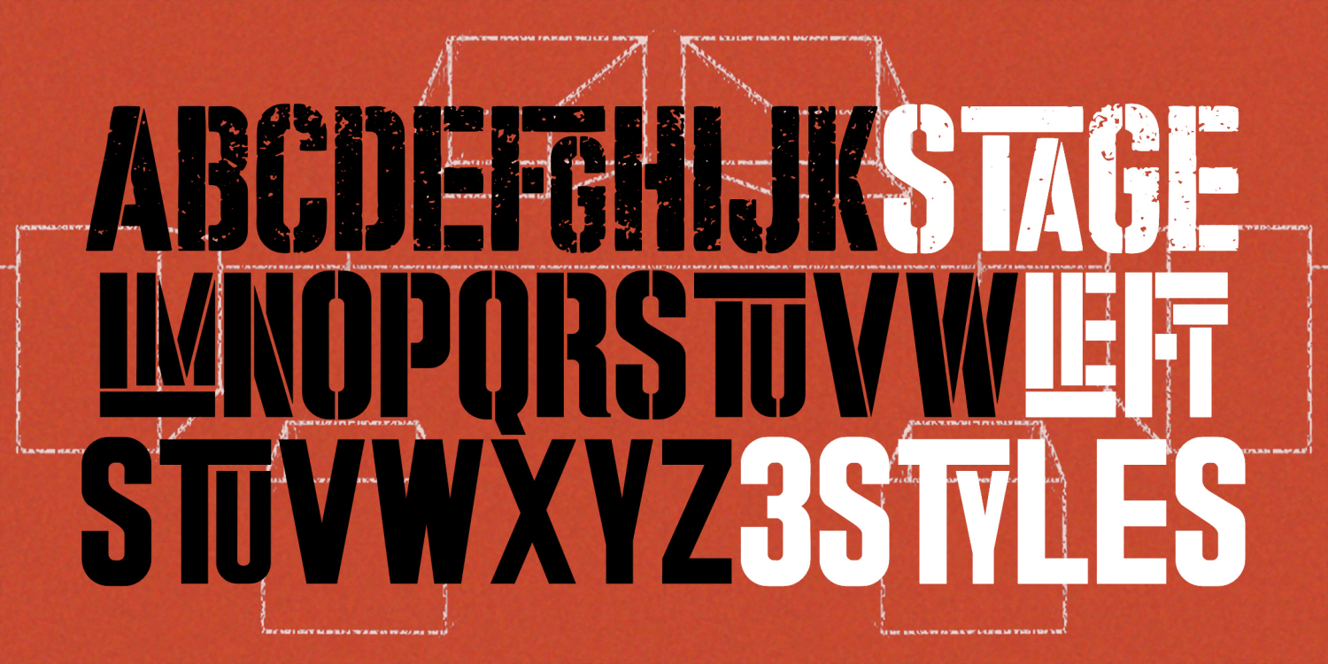
Stage Left
3 Fonts | from $39.95
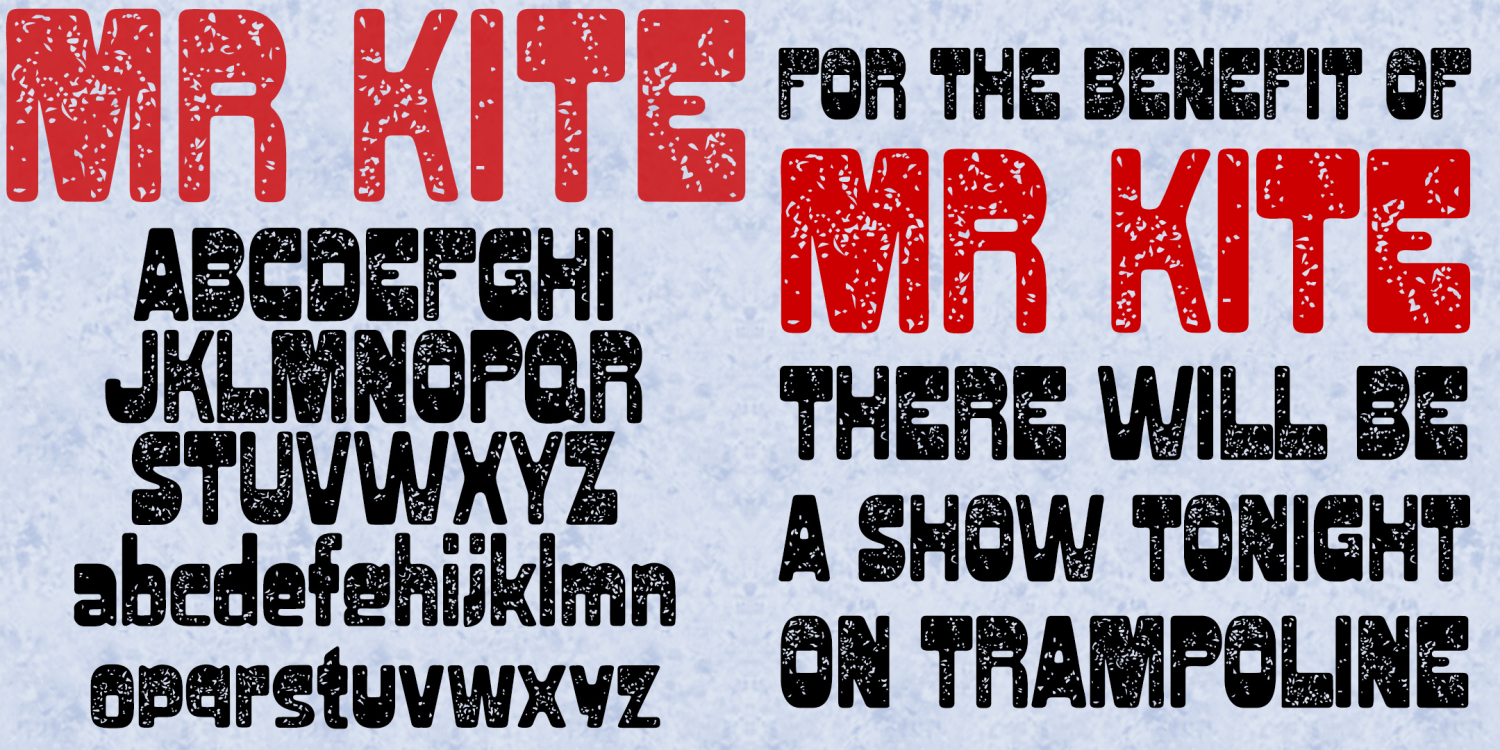
Mr Kite
1 Font | Free Download
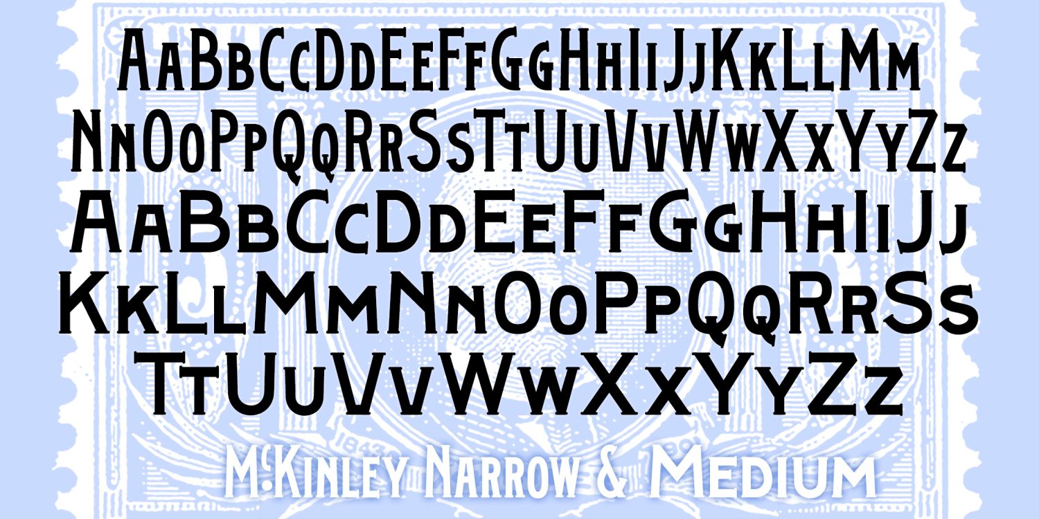
McKinley
4 Fonts | from $39.95
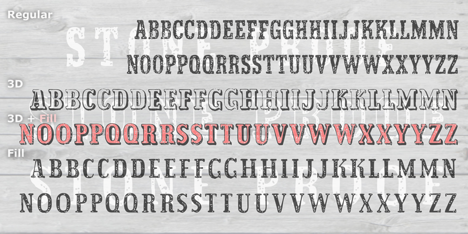
Stone Proof
3 Fonts | from $39.95
Old New England
1 Font | from $19.95
Bootstrap
1 Font | from $19.95
Schnapps
1 Font | from $19.95
Egyptian Monograms
4 Fonts | from $29.95
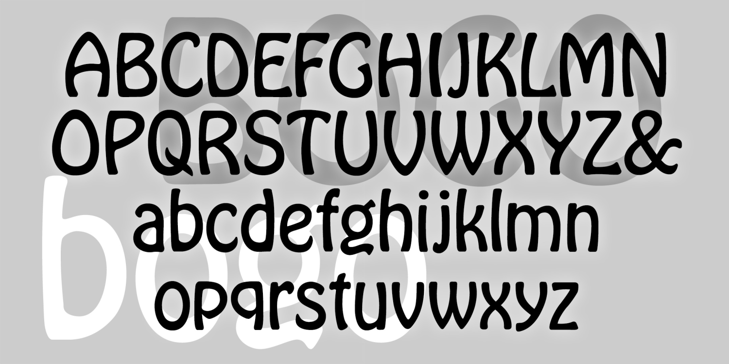
BOGO
1 Font | from $19.95
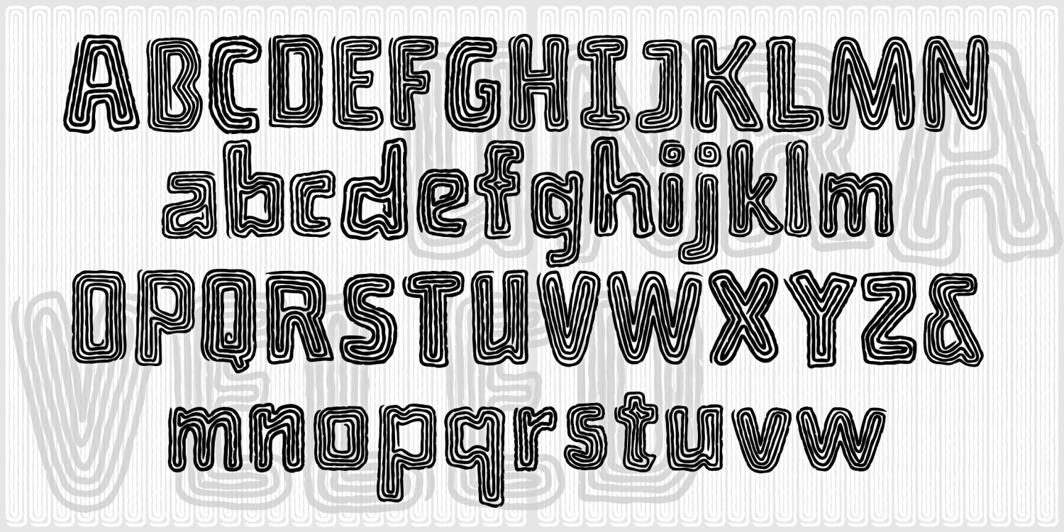
Unraveled
1 Font | from $19.95
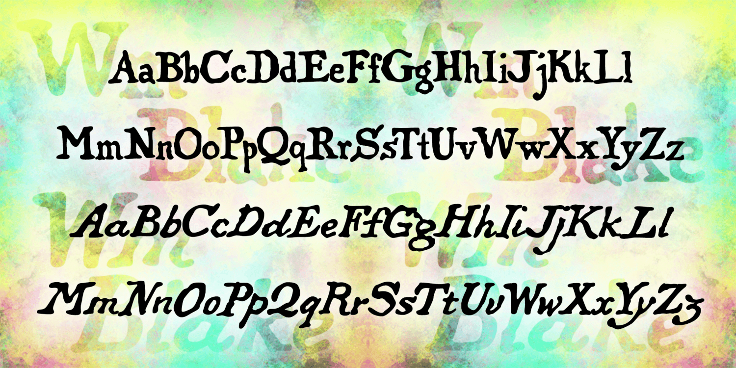
WM Blake
2 Fonts | from $29.95
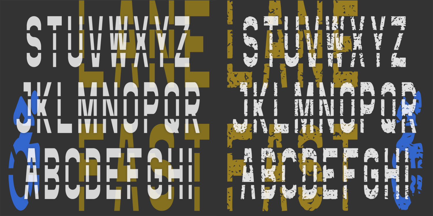
Fast Lane
4 Fonts | from $29.95
Filigree Monograms
1 Font | from $19.95
Harold's Monogram Collection Volume 2
13 Fonts | from $99
Linx
2 Fonts | from $19.95
Medicine Eagle
1 Font | Free Download
Olden Rings
4 Fonts | from $19.95
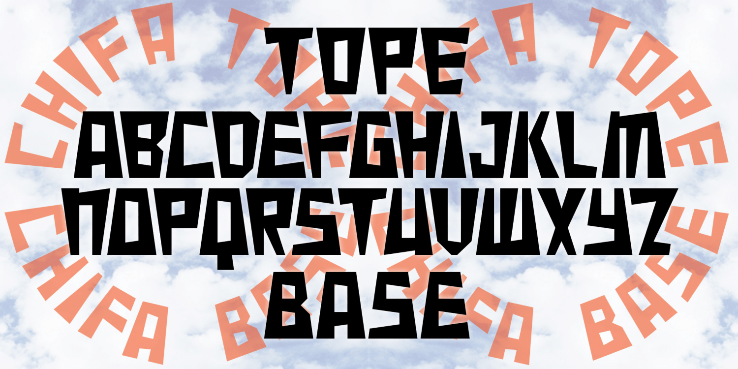
Chifa
3 Fonts | from $19.95
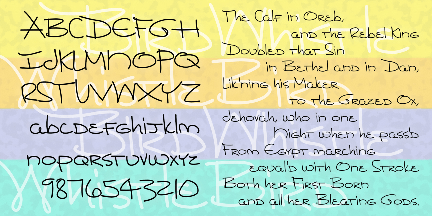
Birdwhistle
1 Font | from $19.95
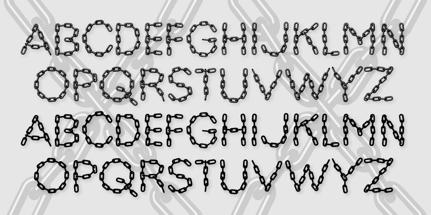
Bead Chain & Marquee
2 Fonts | from $19.95
Ceremony Monograms
1 Font | from $19.95
Needlepoint Monograms
4 Fonts | from $29.95
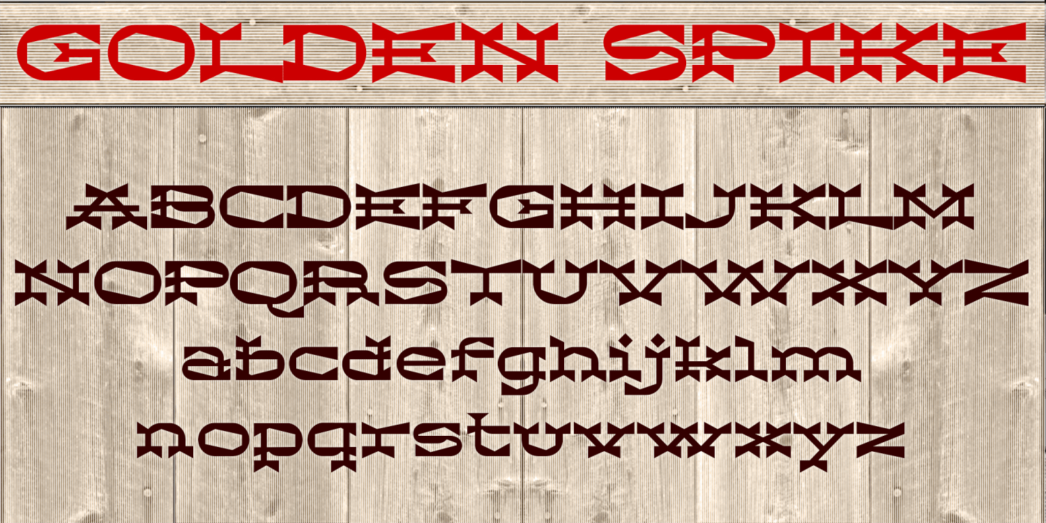
Golden Spike
2 Fonts | from $18
Gilded Age
3 Fonts | from $39.95
Calico Cat
1 Font | from $19.95

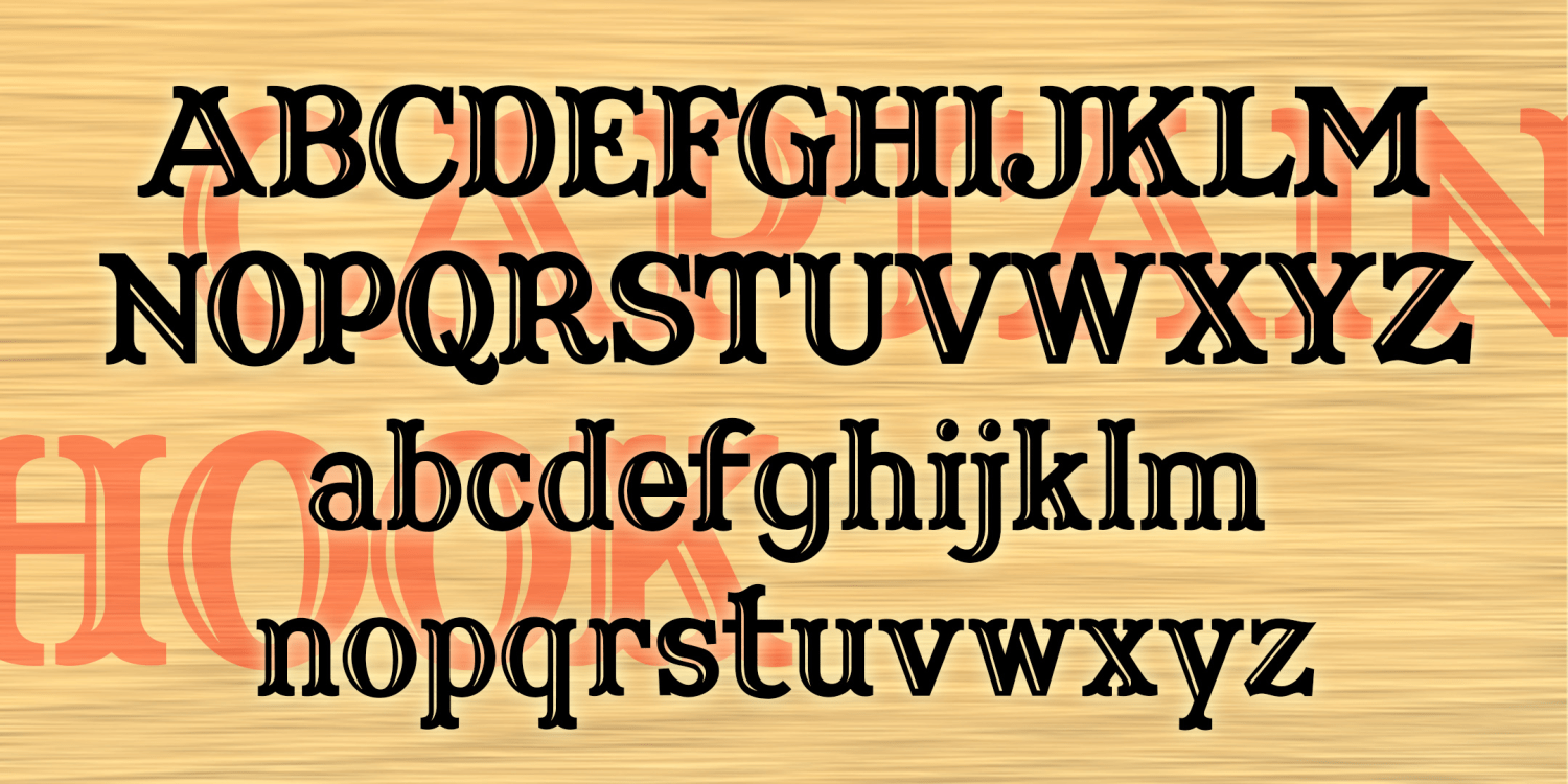
Captain Hook
2 Fonts | from $19.95
Sprezzatura
2 Fonts | from $29.95
Western Avenue
2 Fonts | from $29.95
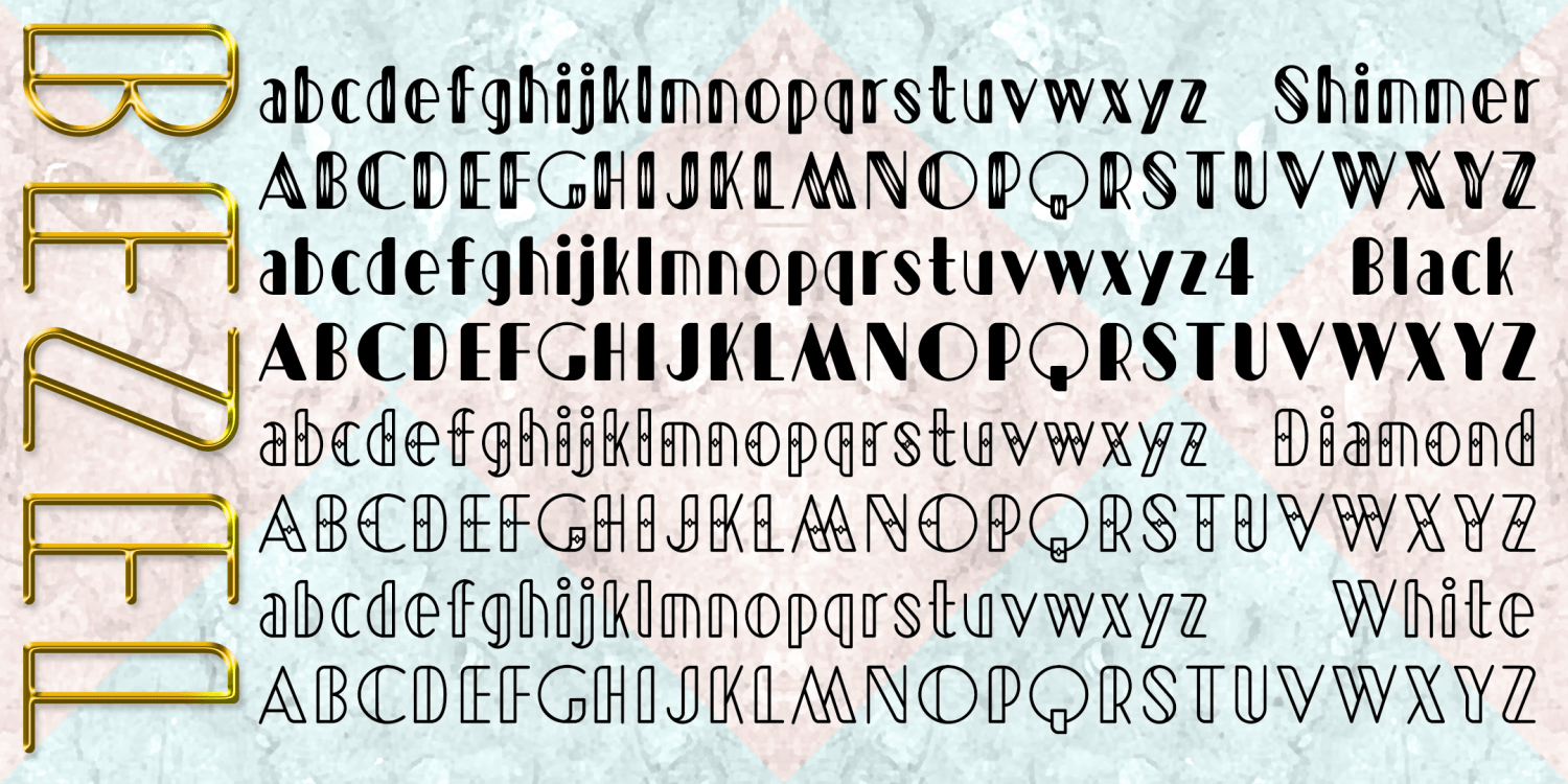
Bezel
4 Fonts | from $24
Superfan Monograms
1 Font | from $19.95
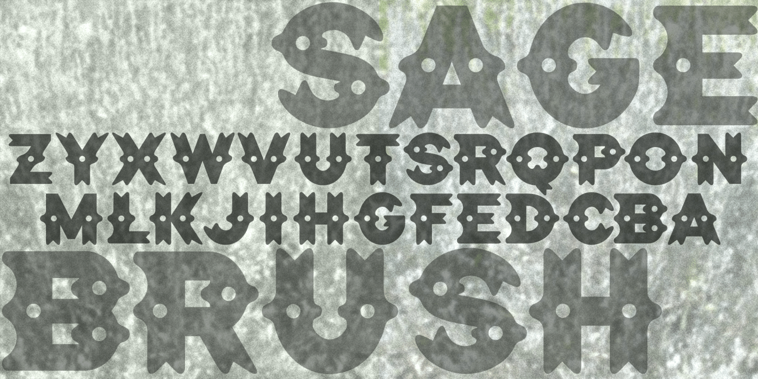
Sagebrush
1 Font | from $12
American Monograms
1 Font | from $19.95
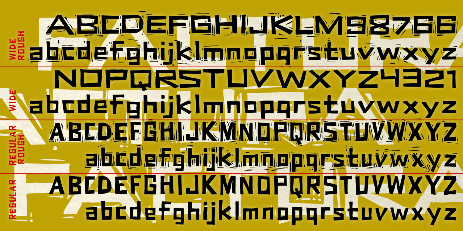
Factura
4 Fonts | from $39.95
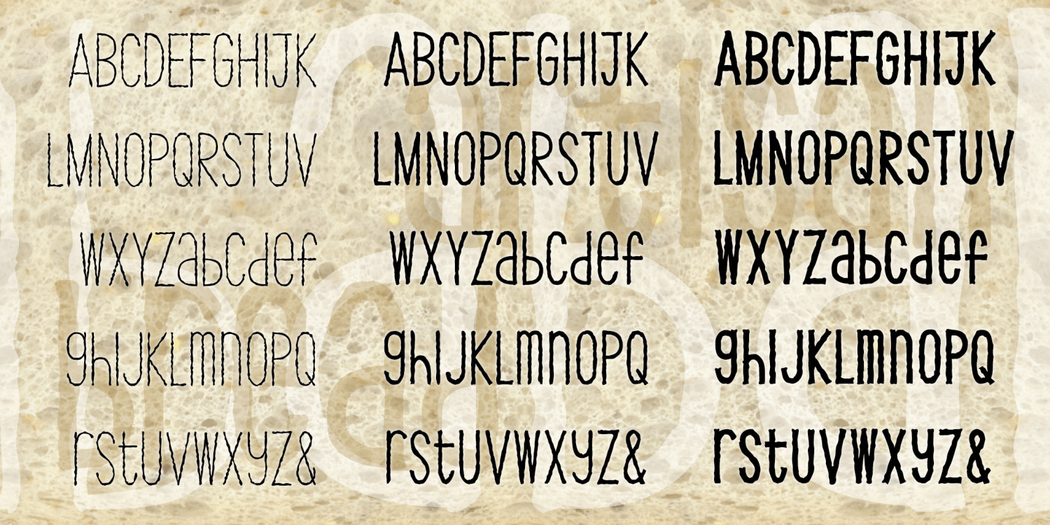
Artisan Bread
3 Fonts | from $39.95
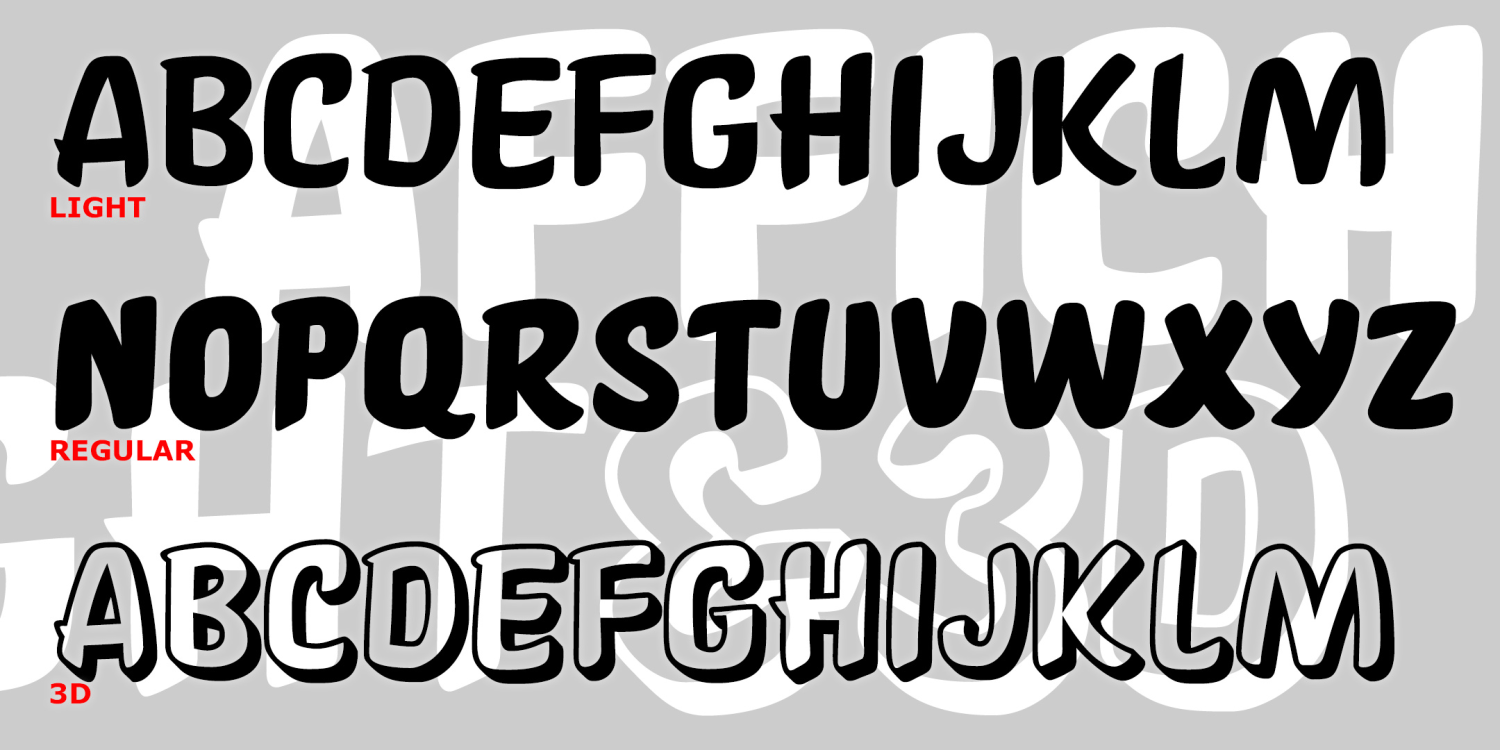
Affiche
3 Fonts | from $39.95
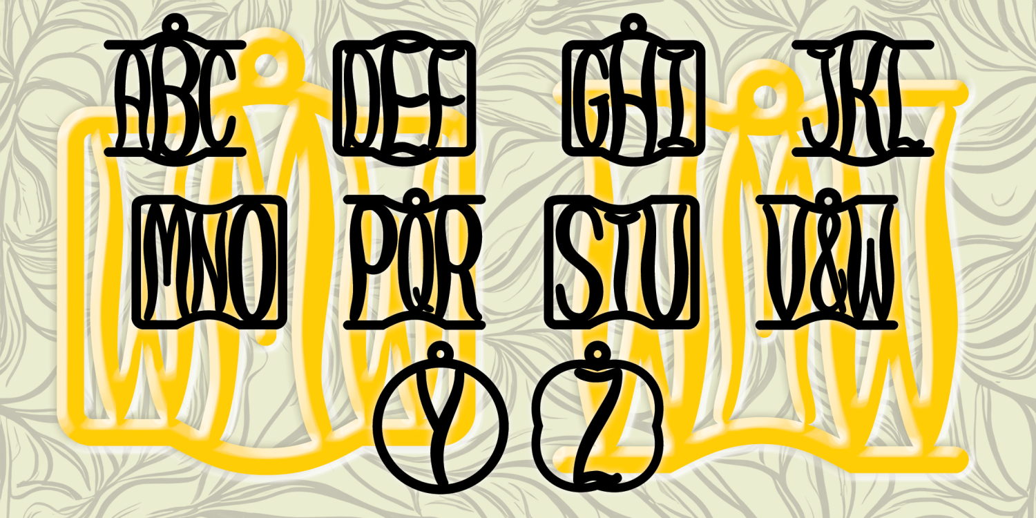
Willow Monogram
1 Font | from $19.95
Love Shack
1 Font | from $19.95
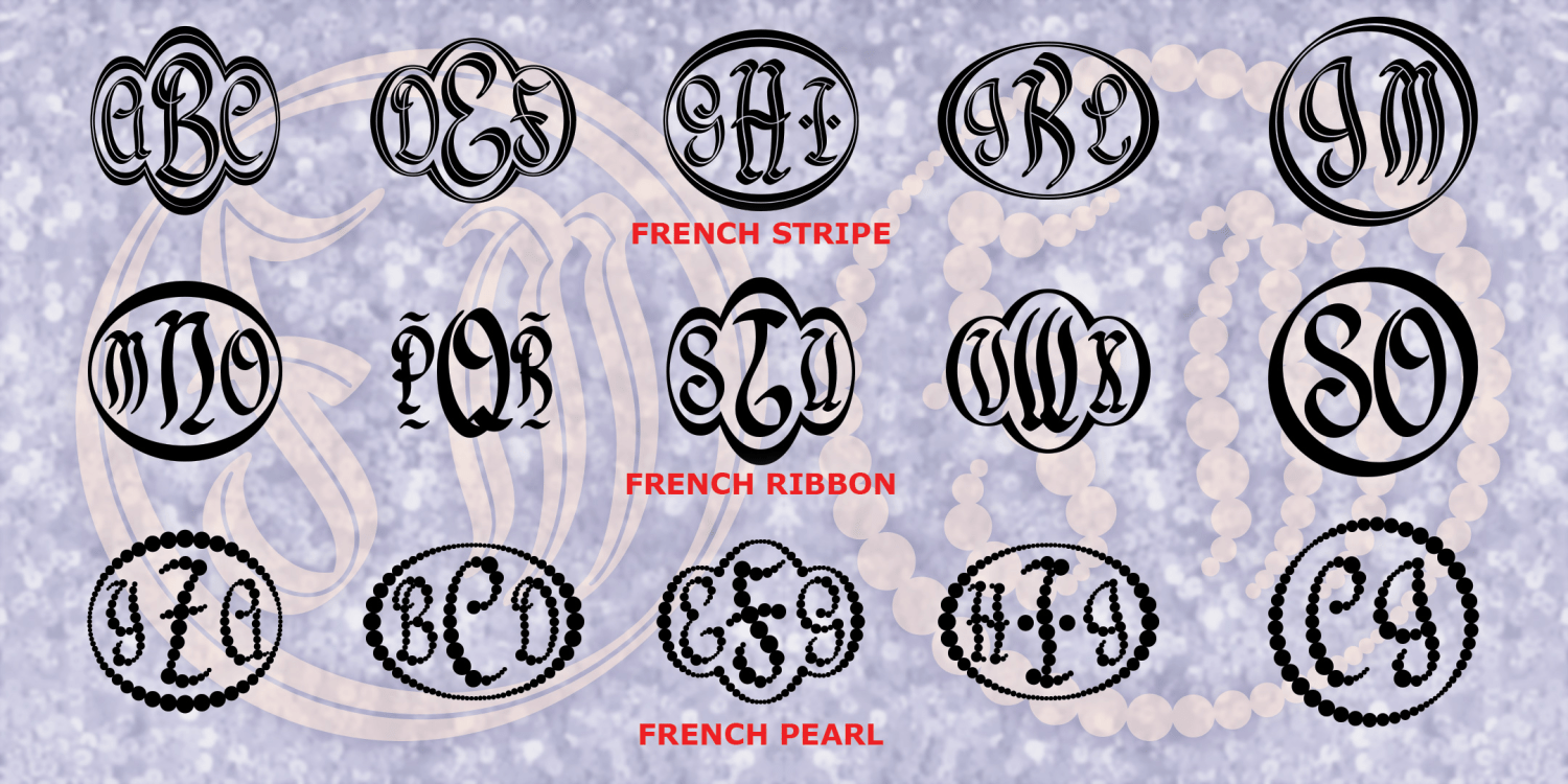
French Monograms
3 Fonts | from $19.95
Tech Elite
4 Fonts | from $29.95
Empress Monograms
1 Font | from $19.95
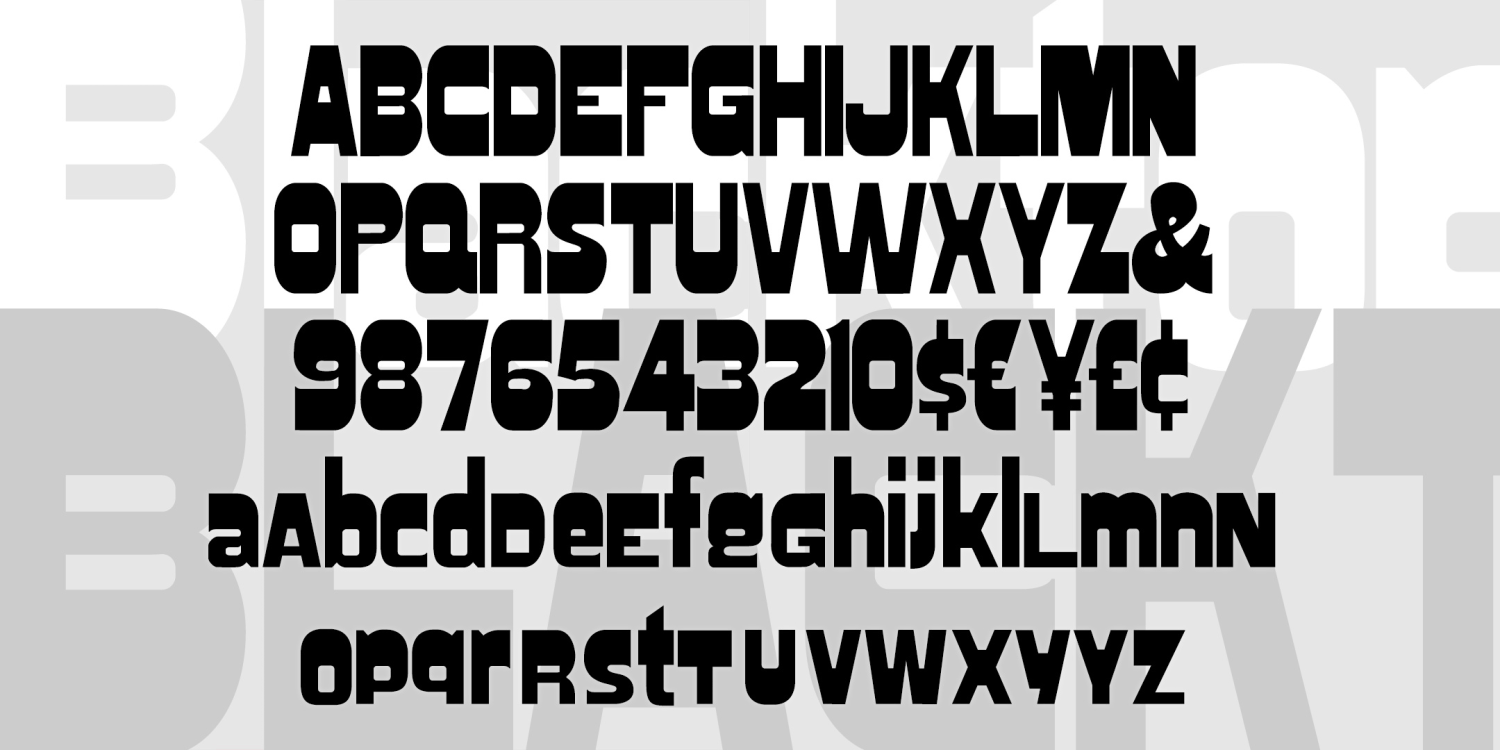
Blacktop
1 Font | Free Download
Popstreet
2 Fonts | from $29.95
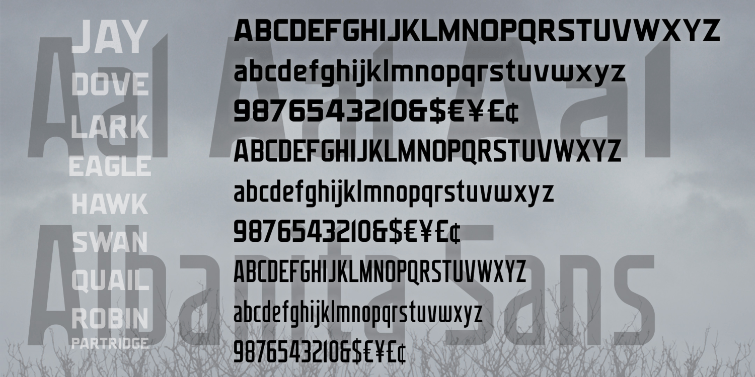
Albanita
6 Fonts | from $60
OK Monograms
1 Font | from $19.95
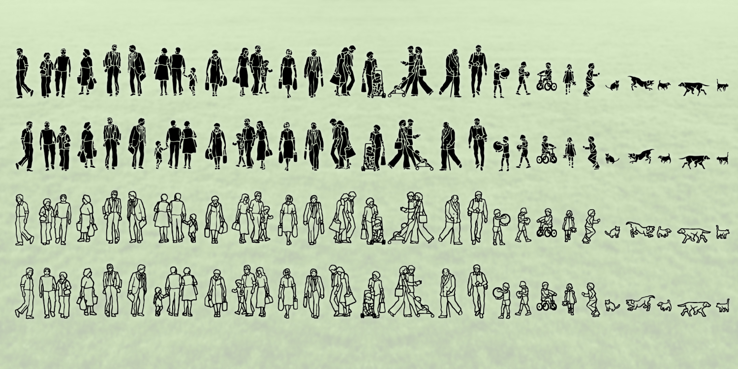
Everyday People
2 Fonts | Free Download
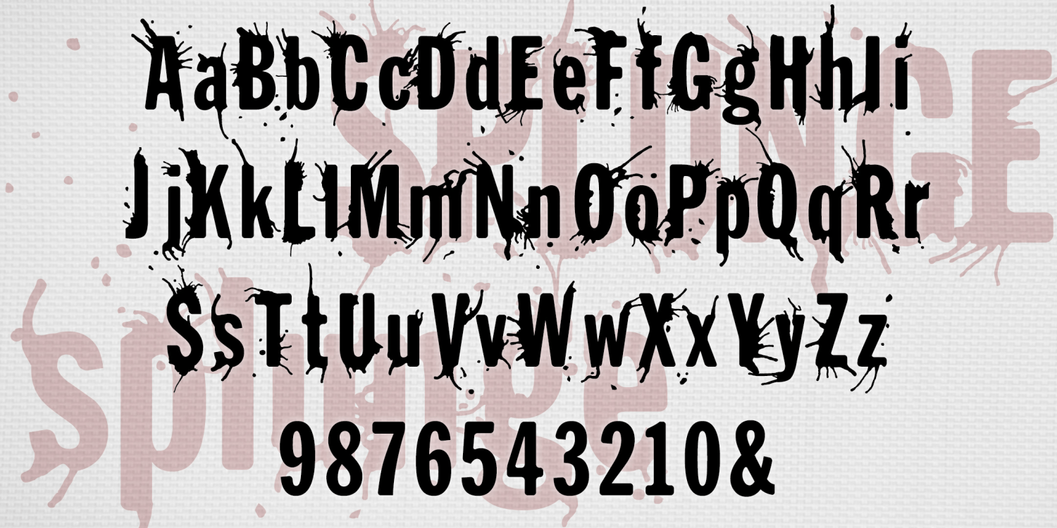
Splunge
2 Fonts | from $29.95
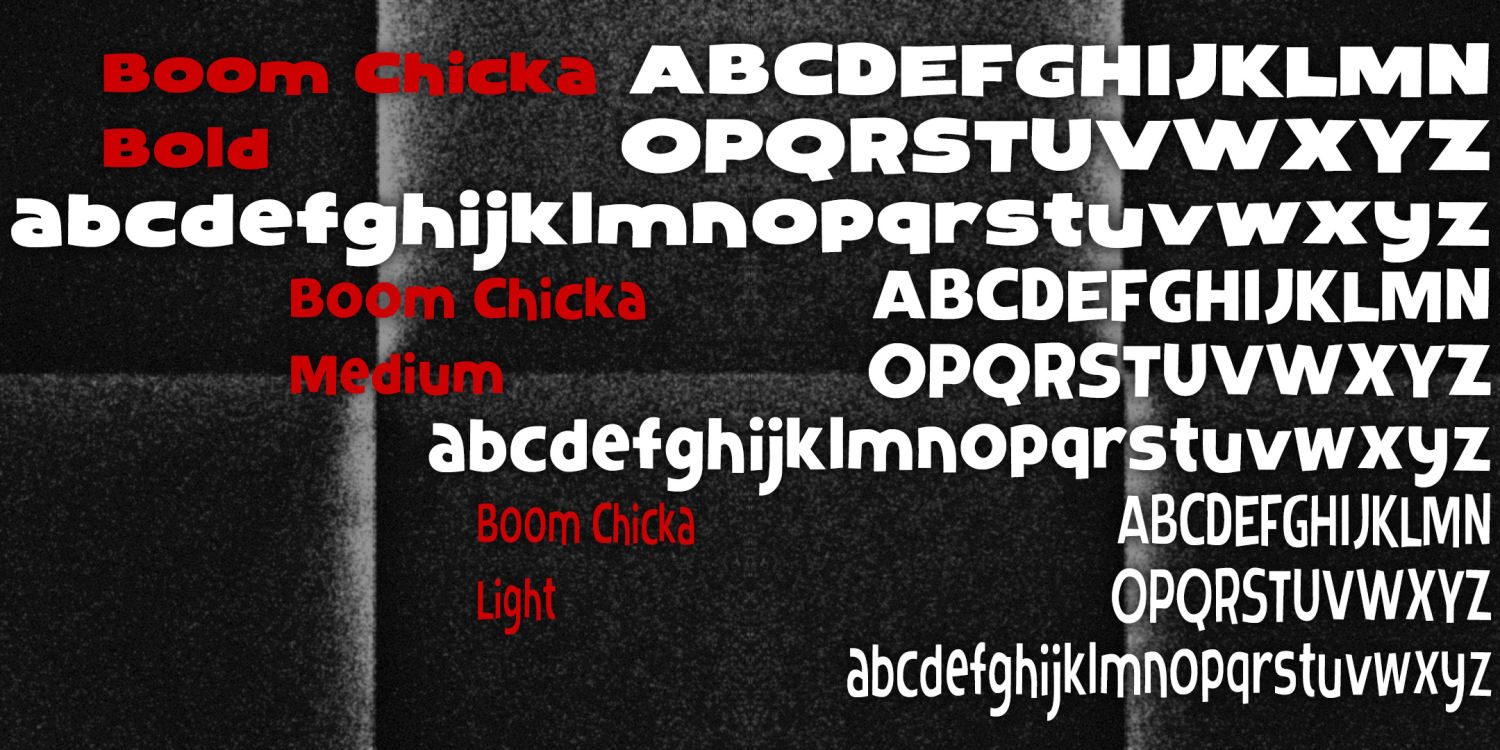
Boom Chicka
3 Fonts | from $39.95
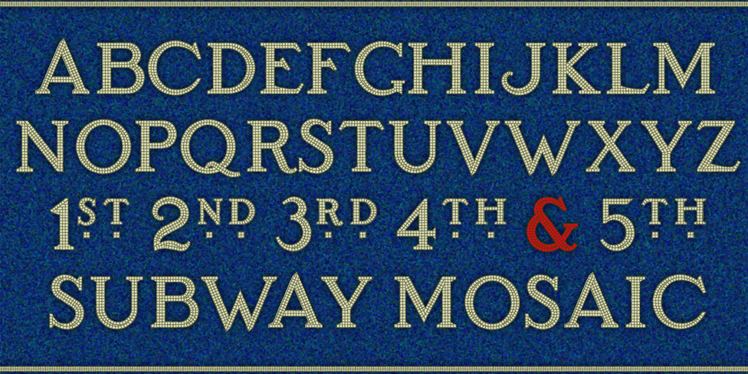
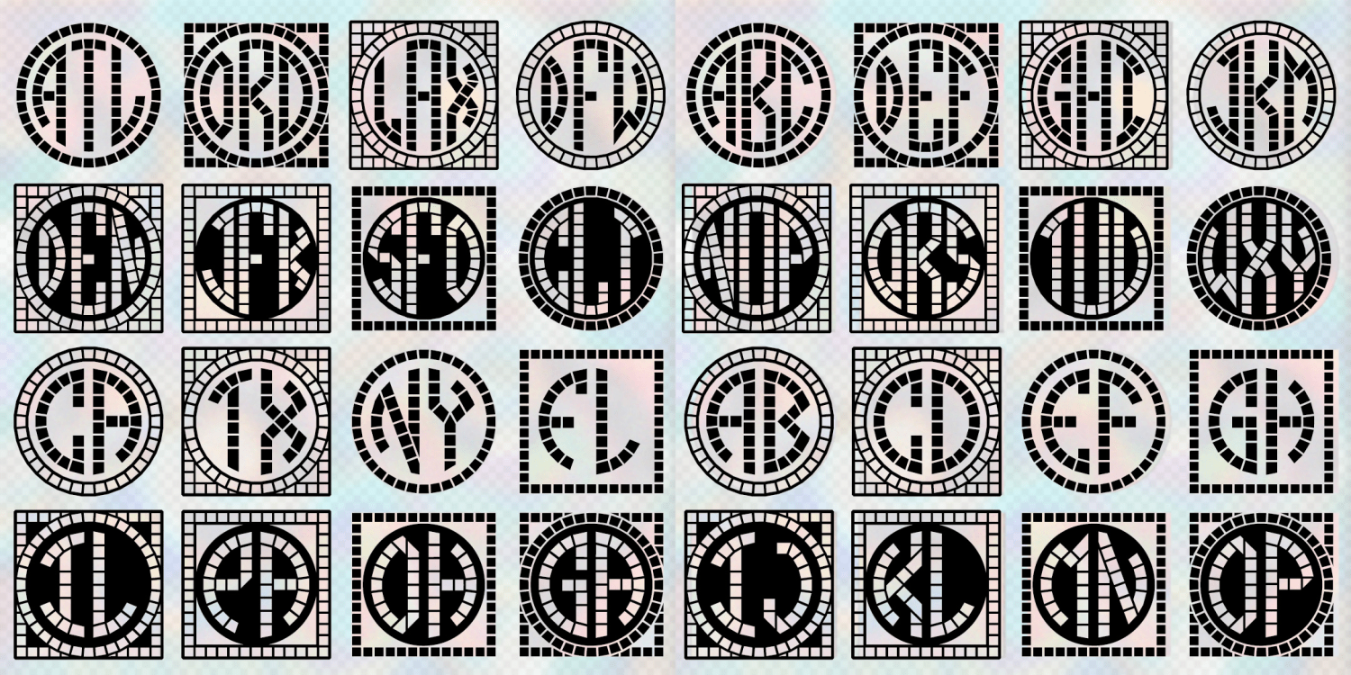
Subway Mosaic
3 Fonts | from $19.95
Mosaic Monograms
4 Fonts | from $19.95
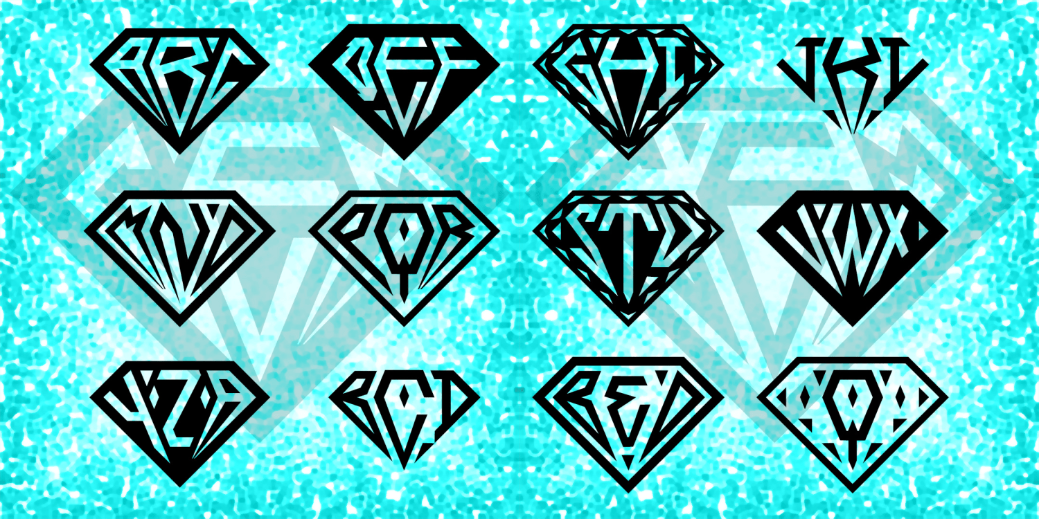
Gem Monograms
2 Fonts | from $19.95
Baselina
4 Fonts | from $49.95
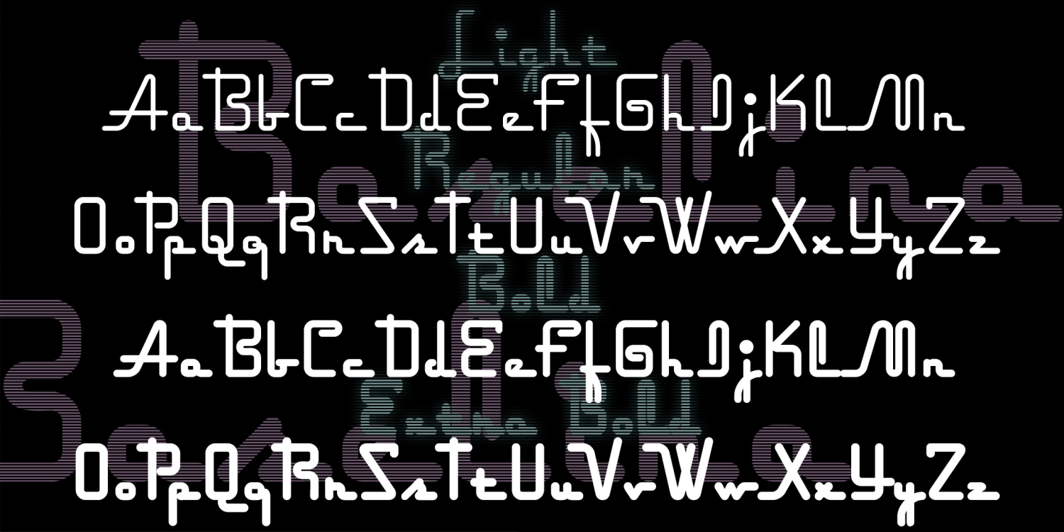
Hangover Square
3 Fonts | from $29.95
Pencilstripe
3 Fonts | from $19.95
Penstripe
3 Fonts | from $19.95
Holmes & Watson Monograms
4 Fonts | from $29.95
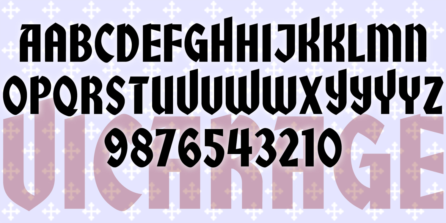
Vicarage
1 Font | from $12
Rectory
1 Font | from $12
Parsonage
1 Font | from $12
Stupid Cow
1 Font | from $19.95
Florent
4 Fonts | from $19.95
Keepsake Monograms
2 Fonts | from $29.95
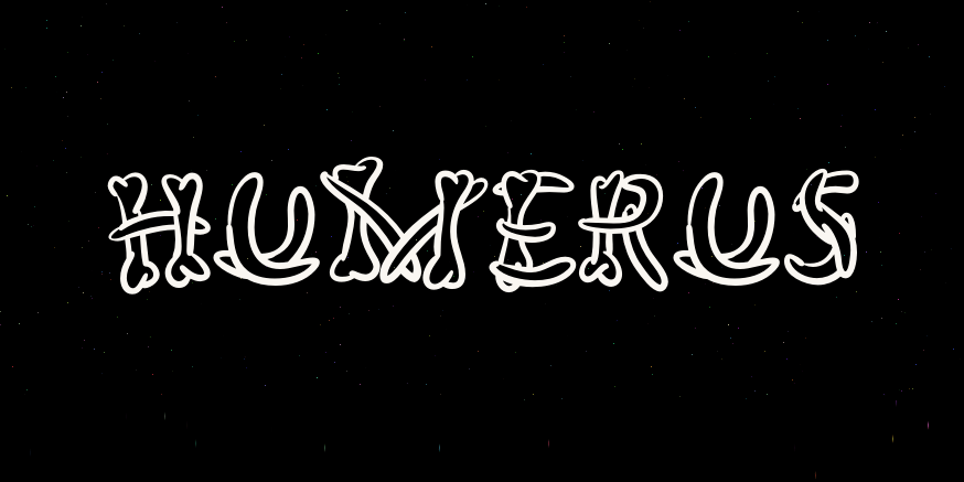
Humerus
2 Fonts | from $19.95
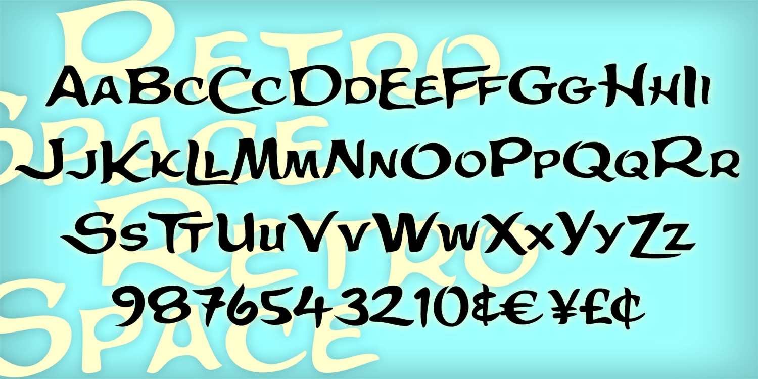
Retrospace
1 Font | from $19.95
London
4 Fonts | from $29.95
Hardline
1 Font | from $19.95
Mod Monograms
2 Fonts | from $19.95
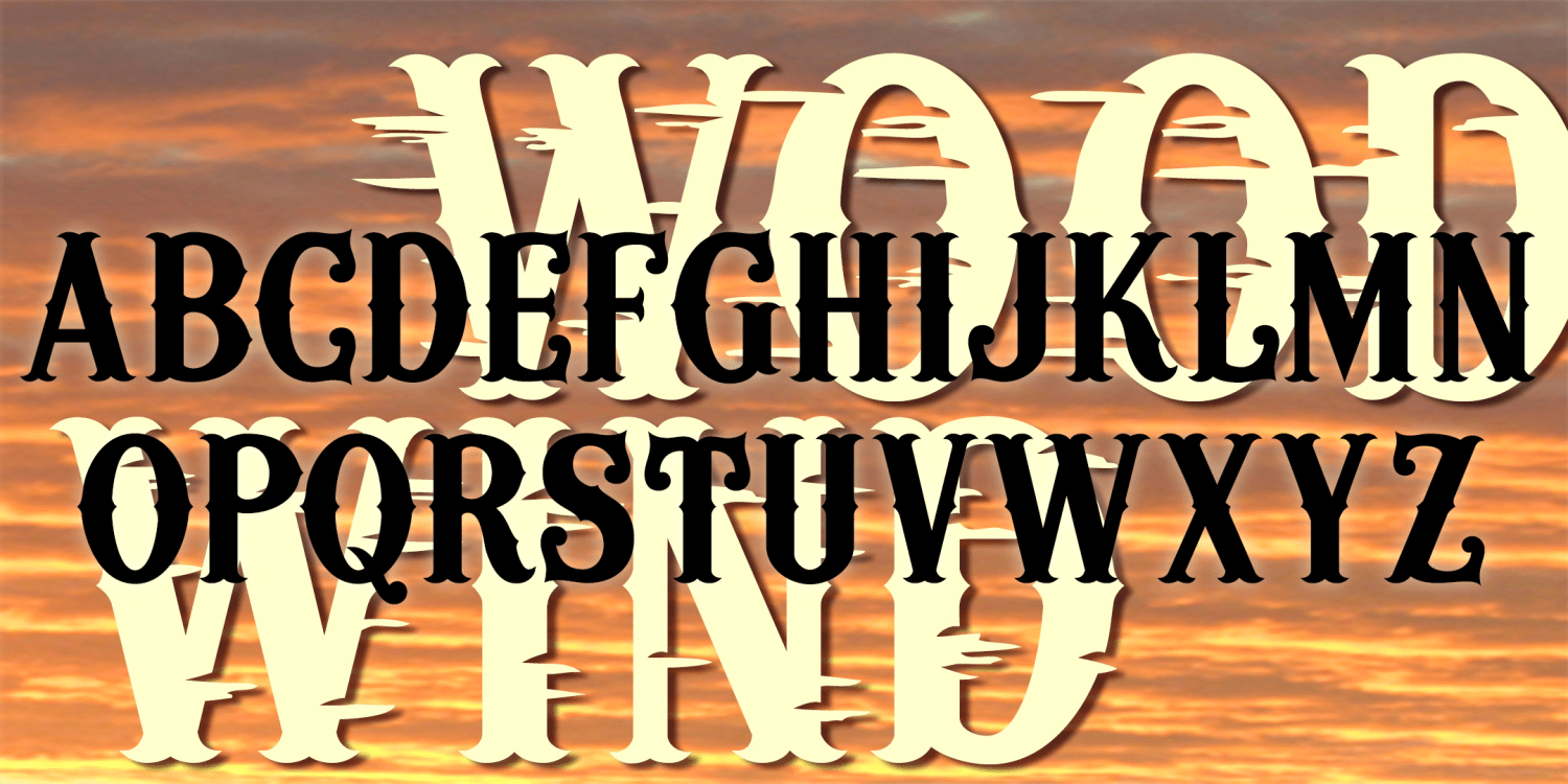
Woodwind
3 Fonts | from $24.95
Seafare
3 Fonts | from $39.95
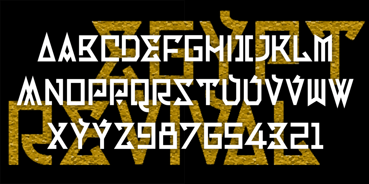
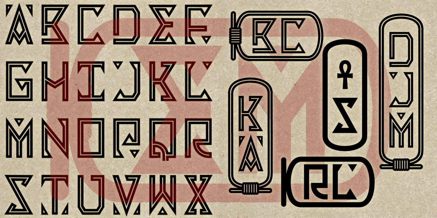
Egyptian Revival
2 Fonts | from $19.95
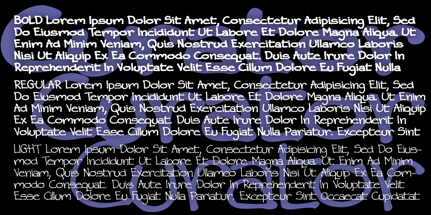
Curator
3 Fonts | from $24.95
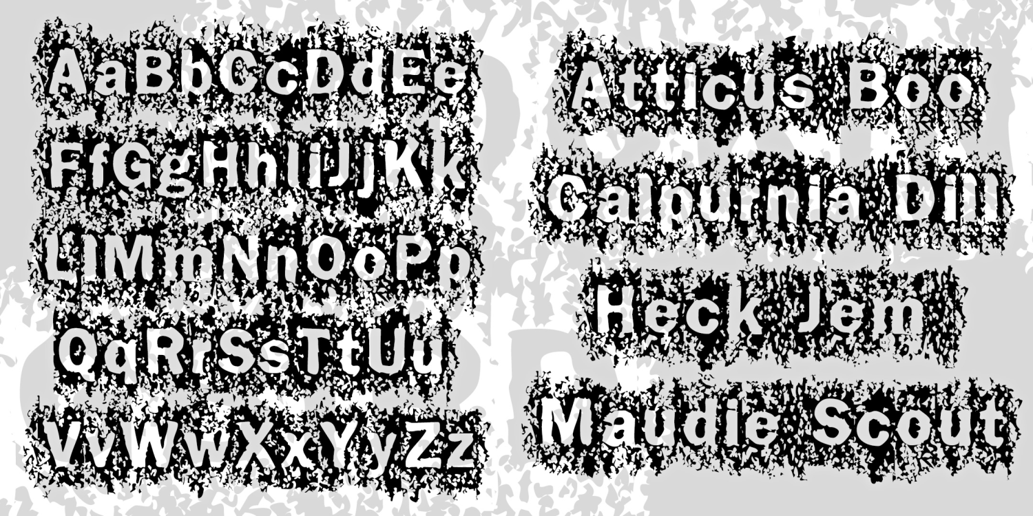
Fabulous Prizes
1 Font | Free Download
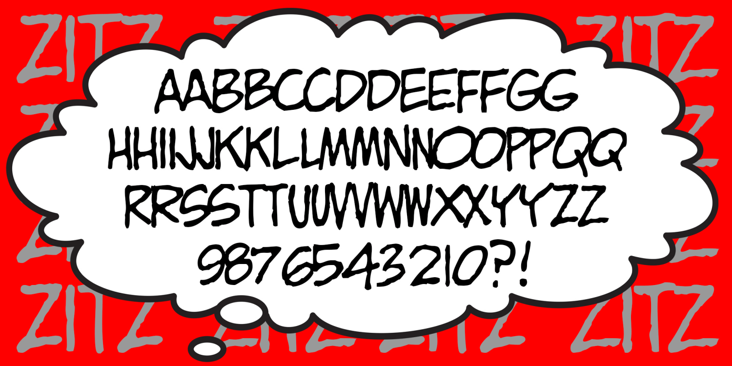
Zitz
1 Font | Free Download
Waldorf Text
3 Fonts | from $39.95
Harold's Monogram Collection
13 Fonts | from $99
Shoemaker
1 Font | from $19.95
Waldorf Monograms
4 Fonts | from $19.95
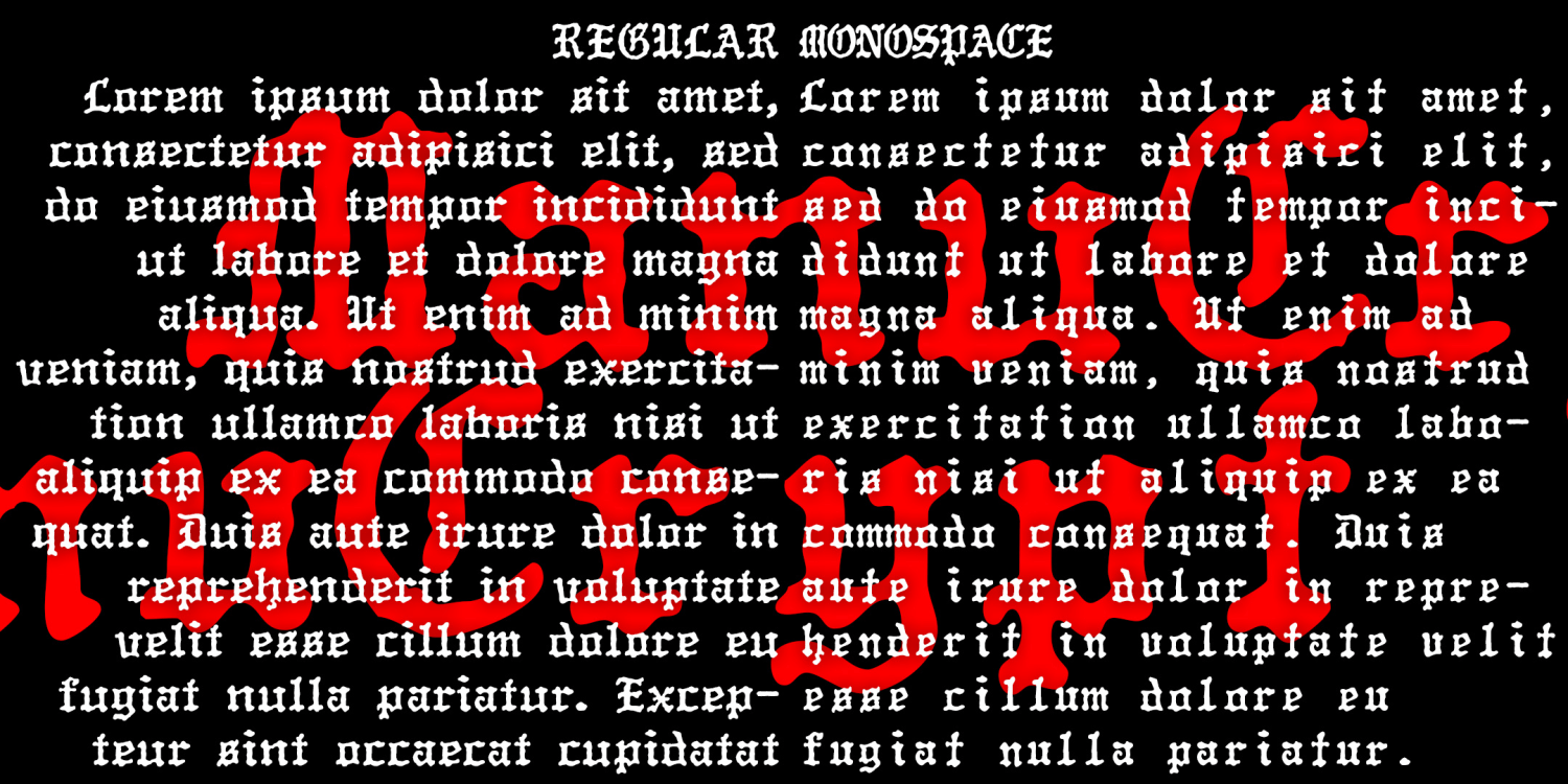
ManuCrypt
2 Fonts | from $19.95
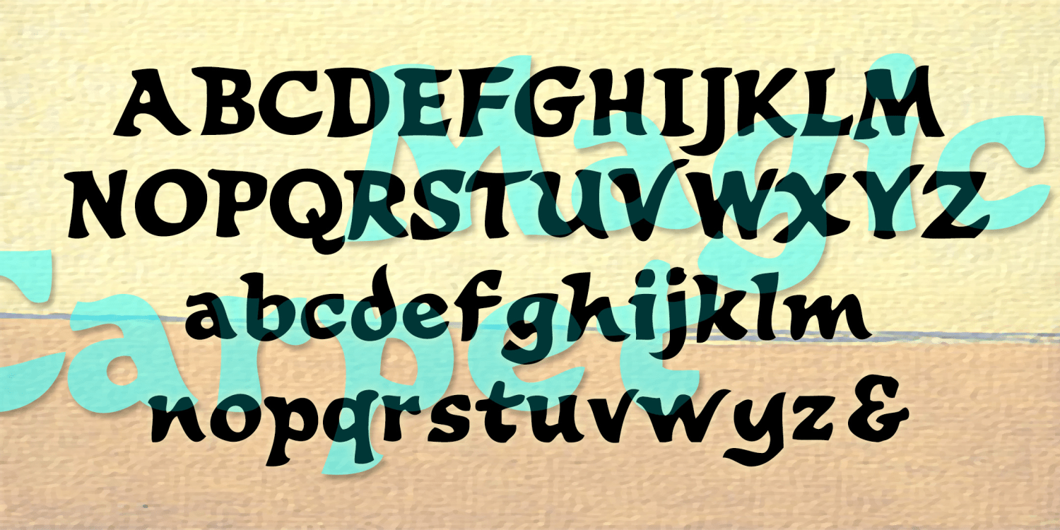
Magic Carpet
1 Font | from $19.95
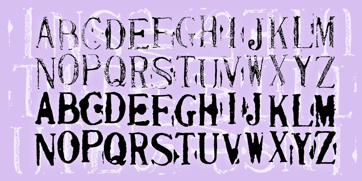
Institute Stamps
2 Fonts | from $29.95
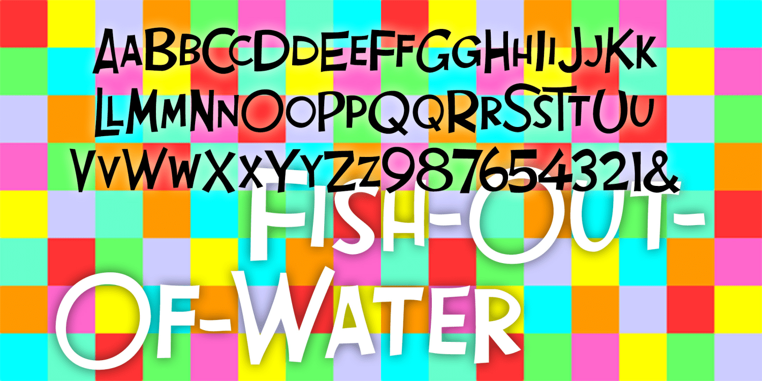
Fish Out Of Water
3 Fonts | from $39.95
Benighted
2 Fonts | from $20
Epicurus
1 Font | from $19.95
Dynamotor
1 Font | from $19.95
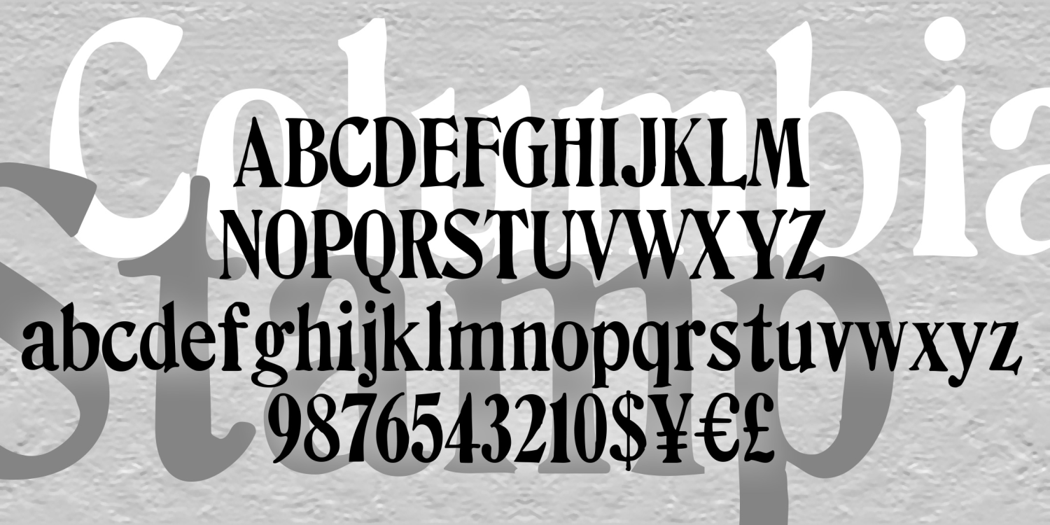
Columbia Stamp
1 Font | from $12
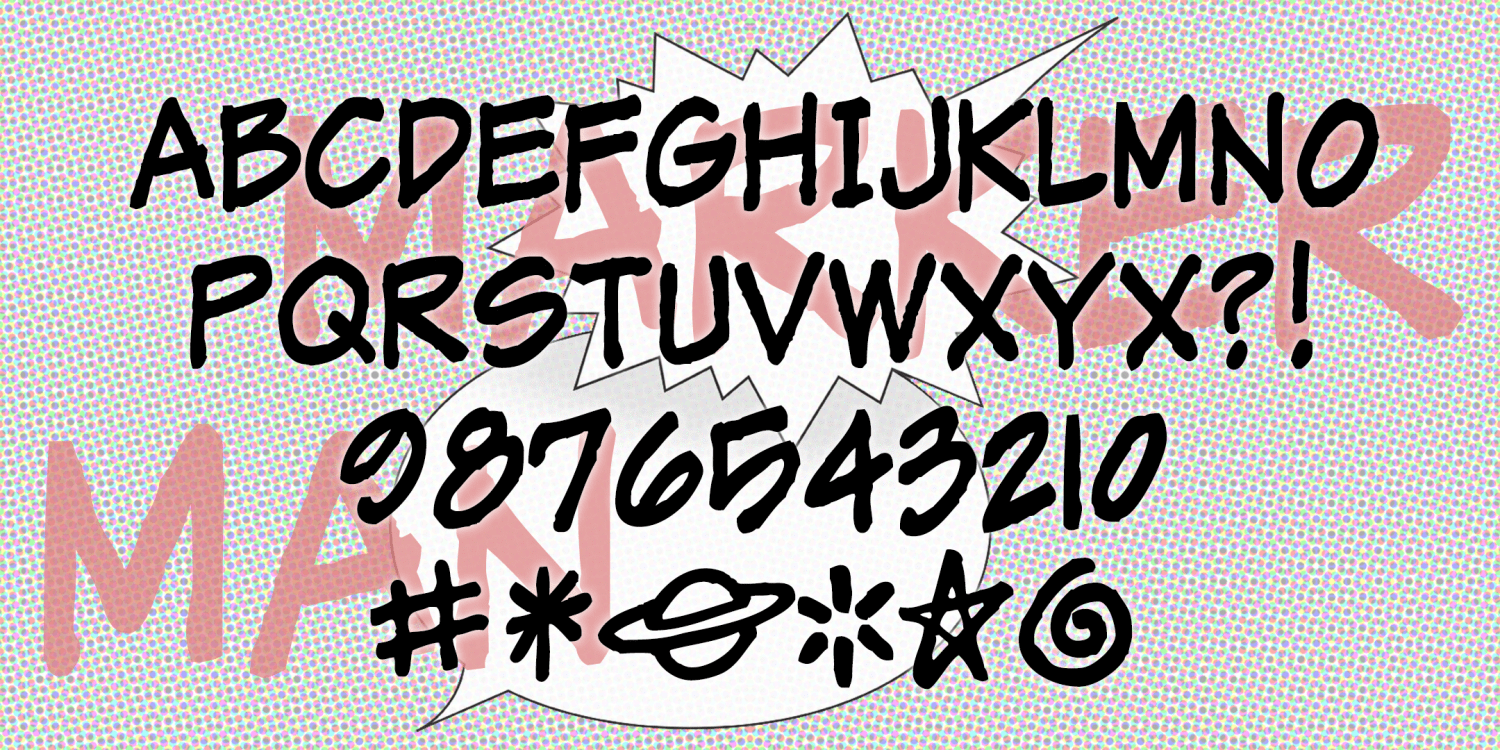
MarkerMan
1 Font | from $19.95
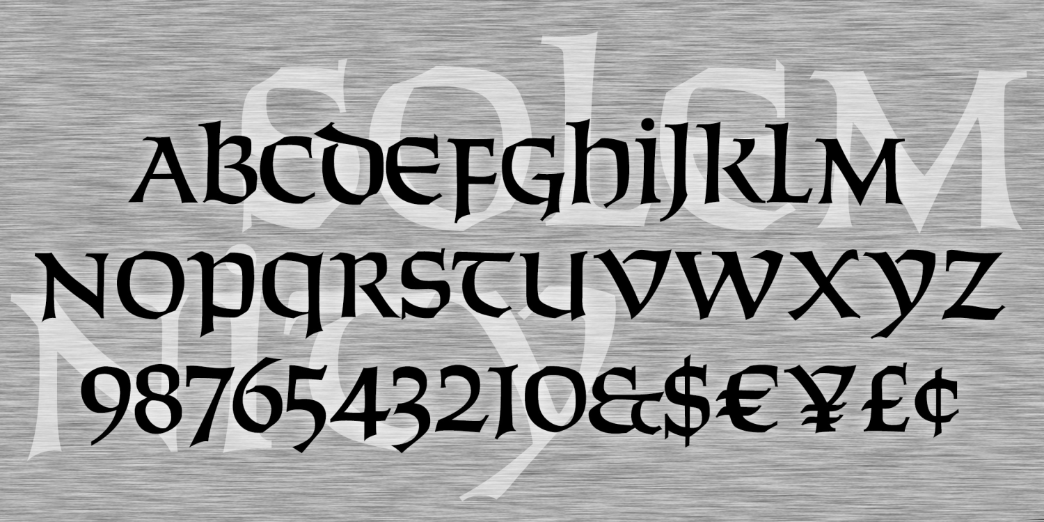
Solemnity
1 Font | from $12
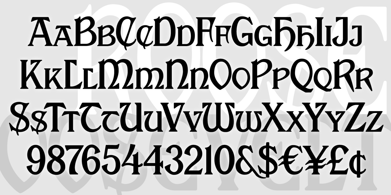
Roosevelt
1 Font | from $12
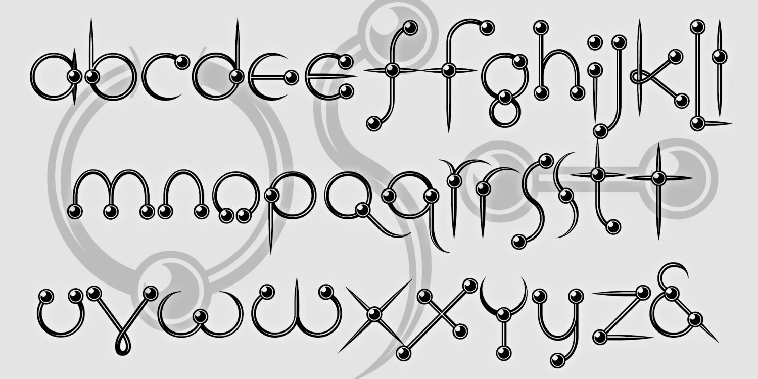
Ringpin
1 Font | from $12
Testimonial
1 Font | from $19.95
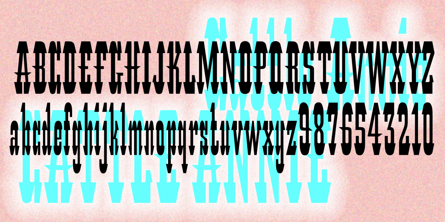
Cattle Annie
1 Font | from $12
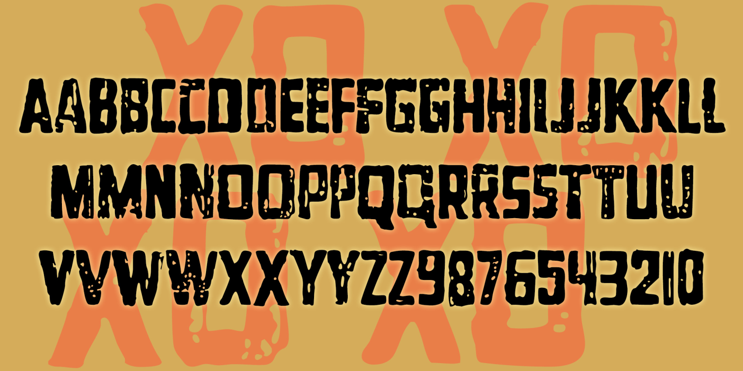
XOXO
1 Font | from $12
Espangles
1 Font | from $19.95
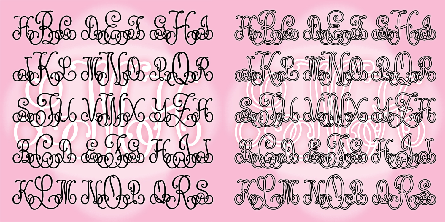
Entwined Monograms
1 Font | from $19.95
Rude Goth
1 Font | from $19.95
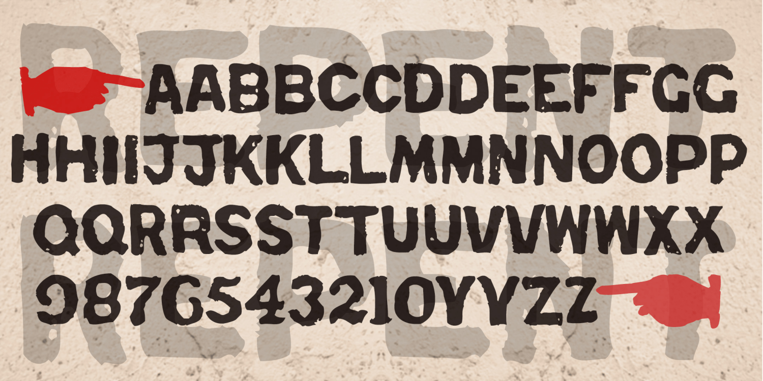
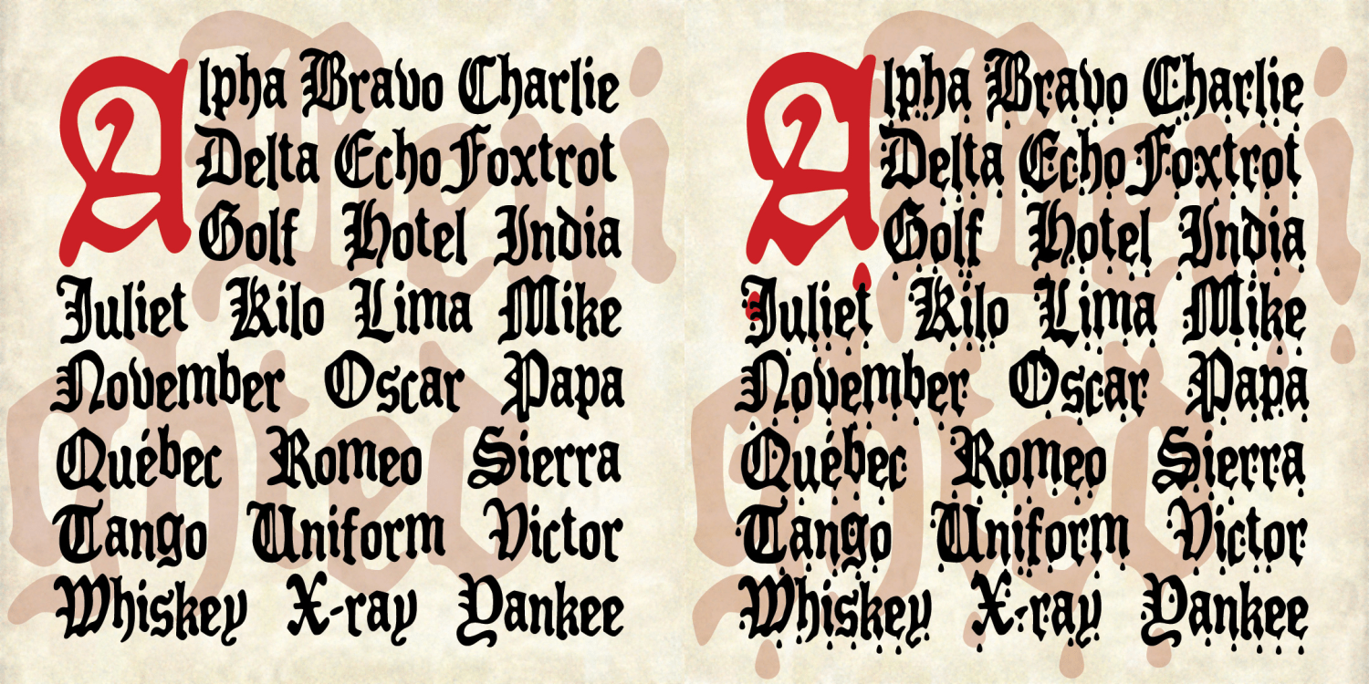
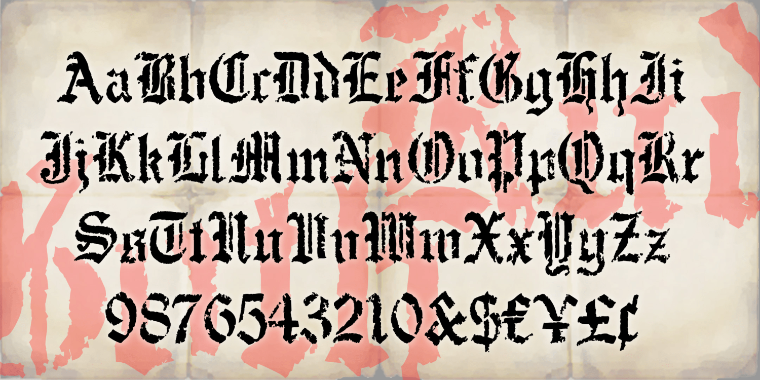
Repent
1 Font | from $19.95

Rebus Font
1 Font | from $19.95
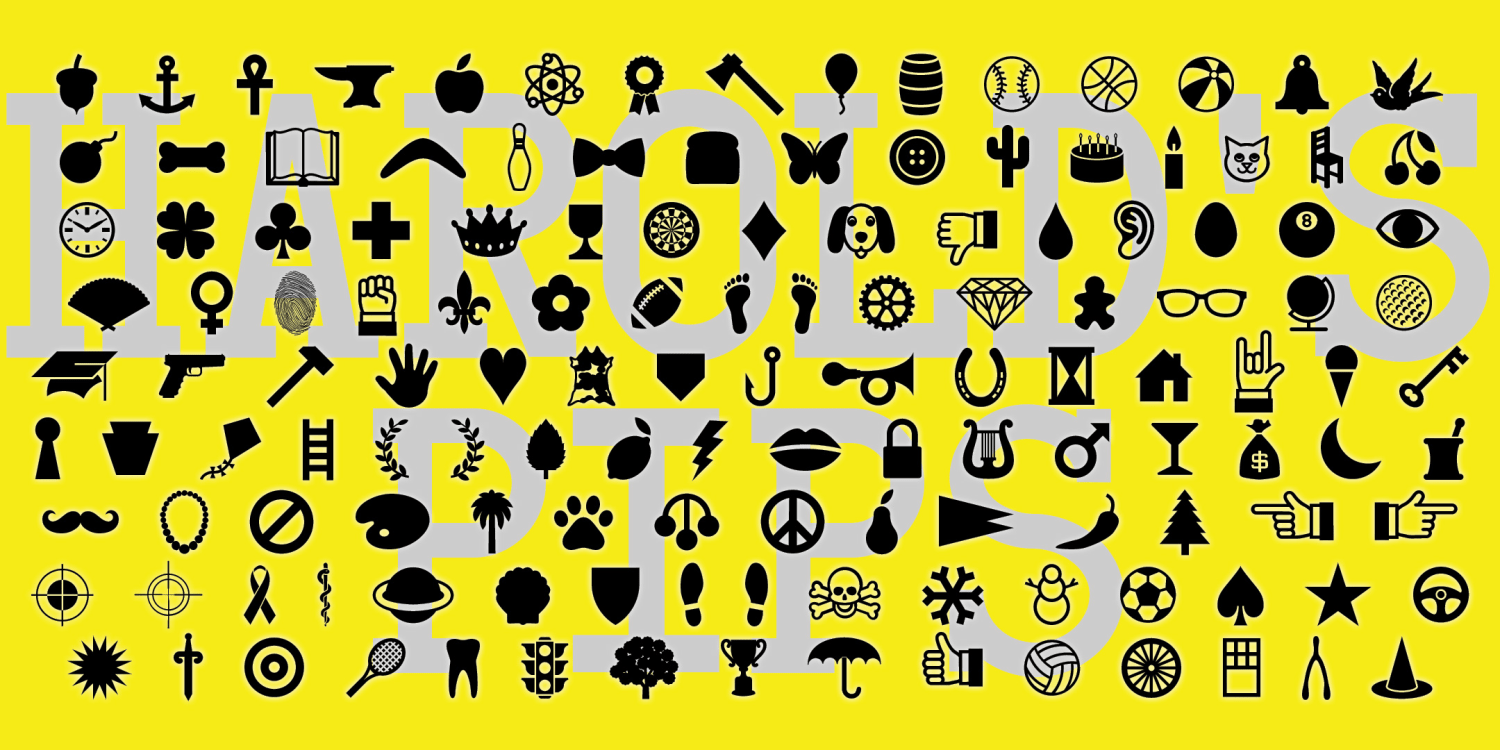
Harold's Pips
1 Font | from $19.95
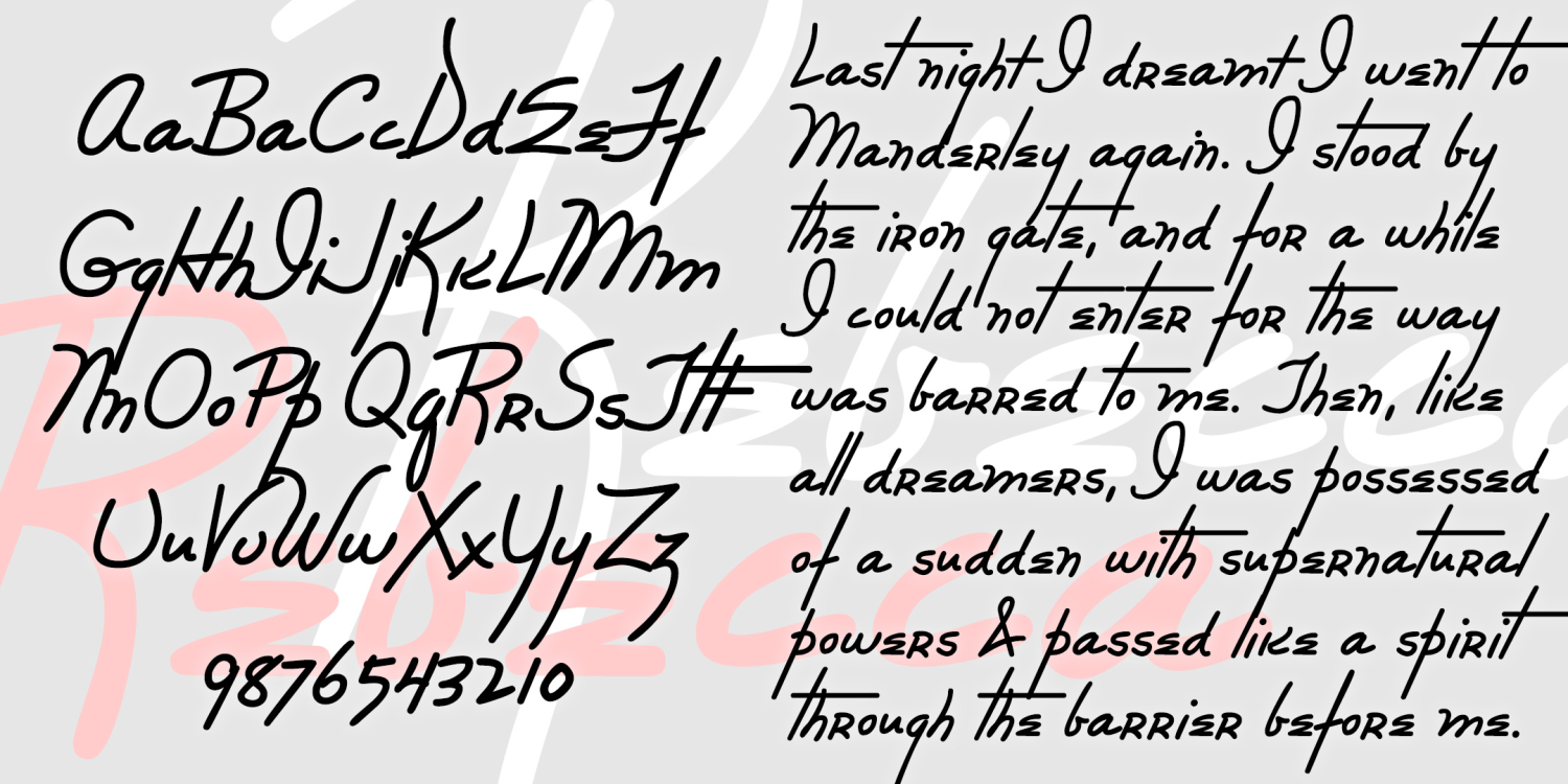
Rebecca
1 Font | from $19.95
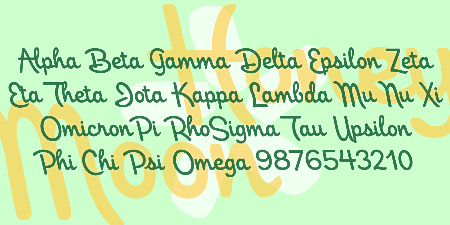
Honeymoon
1 Font | from $19.95
Quince
1 Font | from $19.95
Pearlie
1 Font | from $19.95
Pen Script Monograms
1 Font | from $19.95
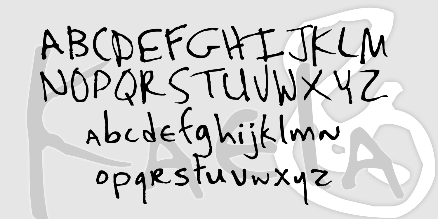
Kaela
1 Font | from $19.95
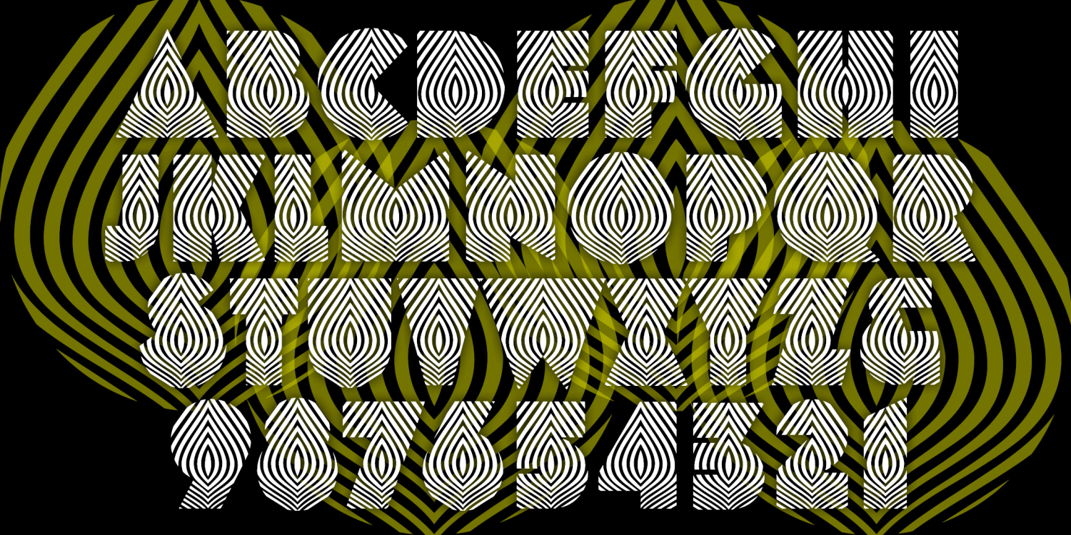
Onion
1 Font | from $19.95
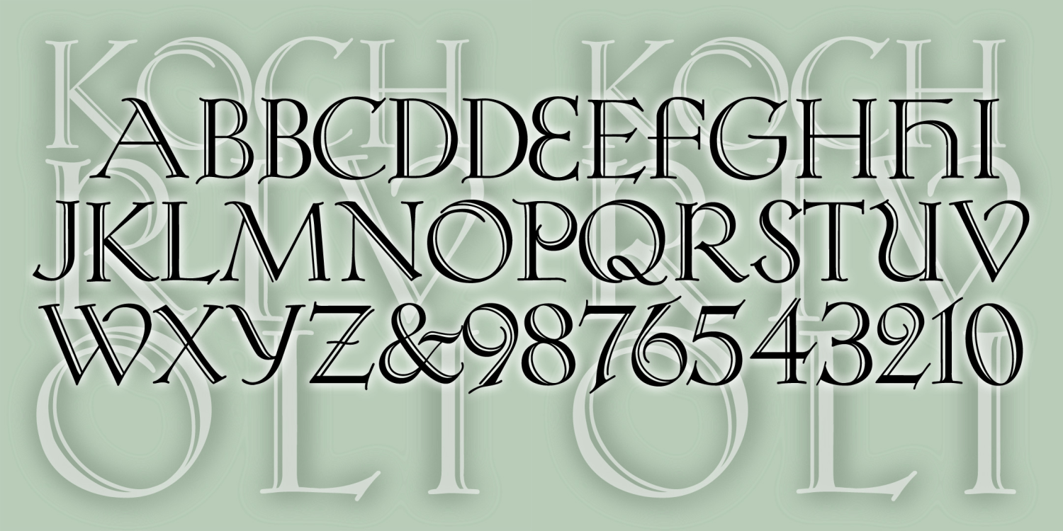
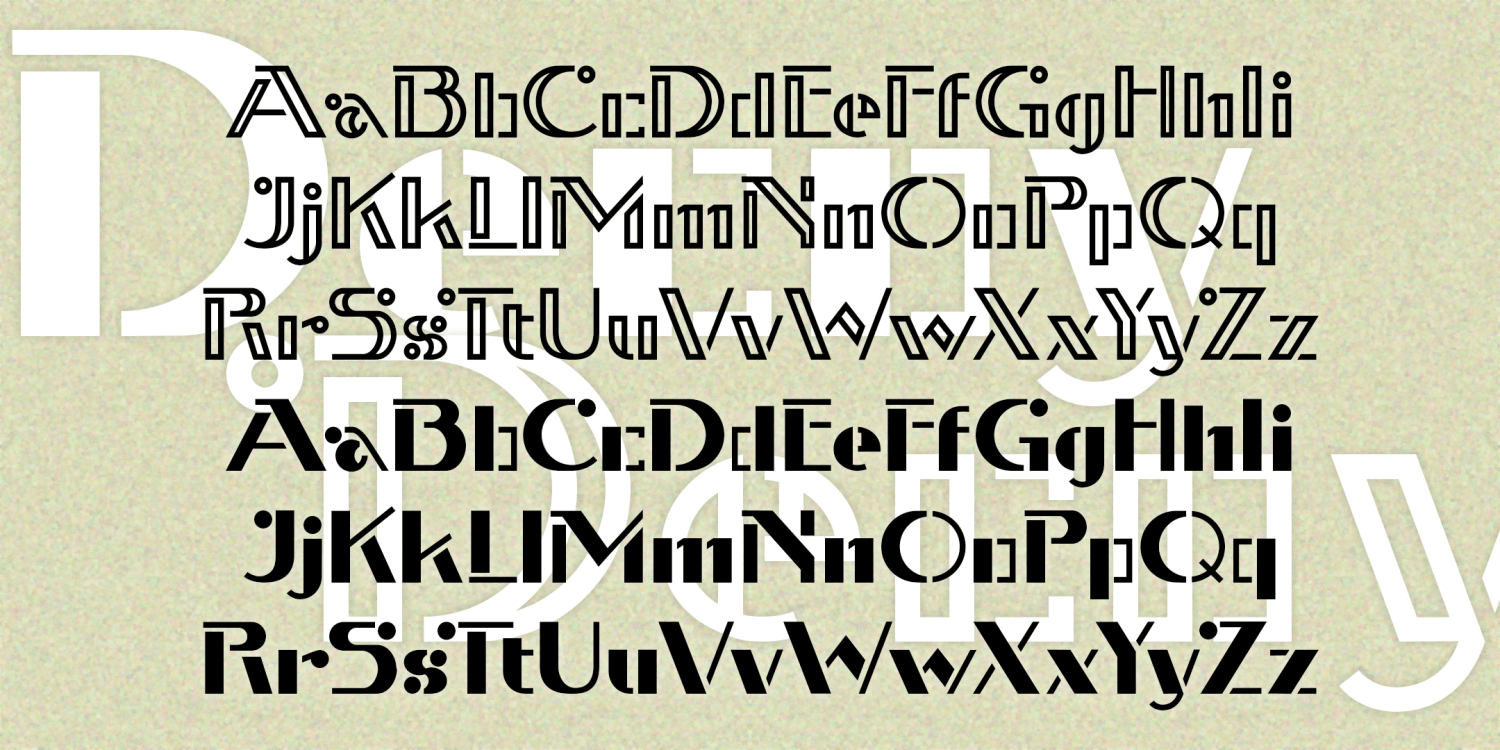
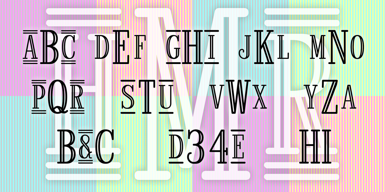
Koch Rivoli
1 Font | from $19.95
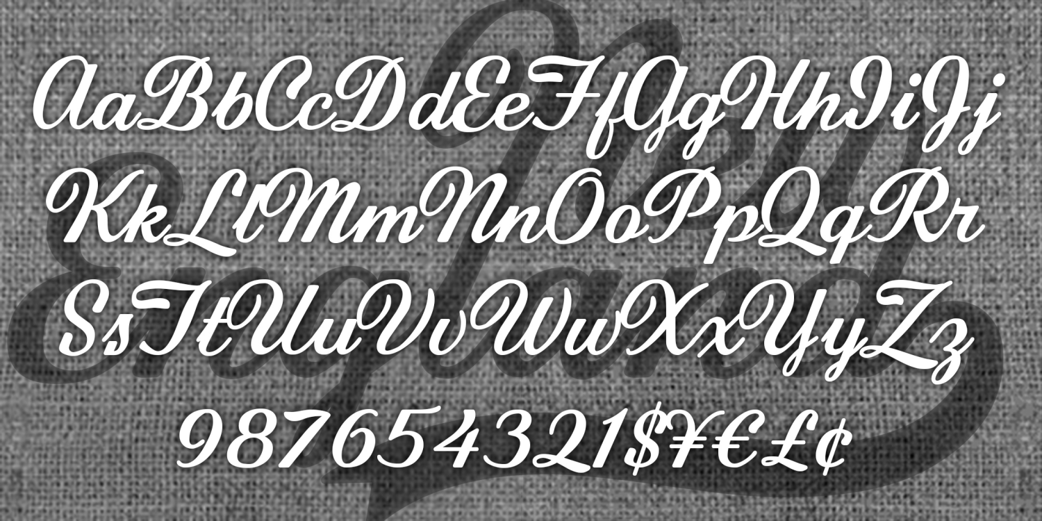
New England
1 Font | from $19.95
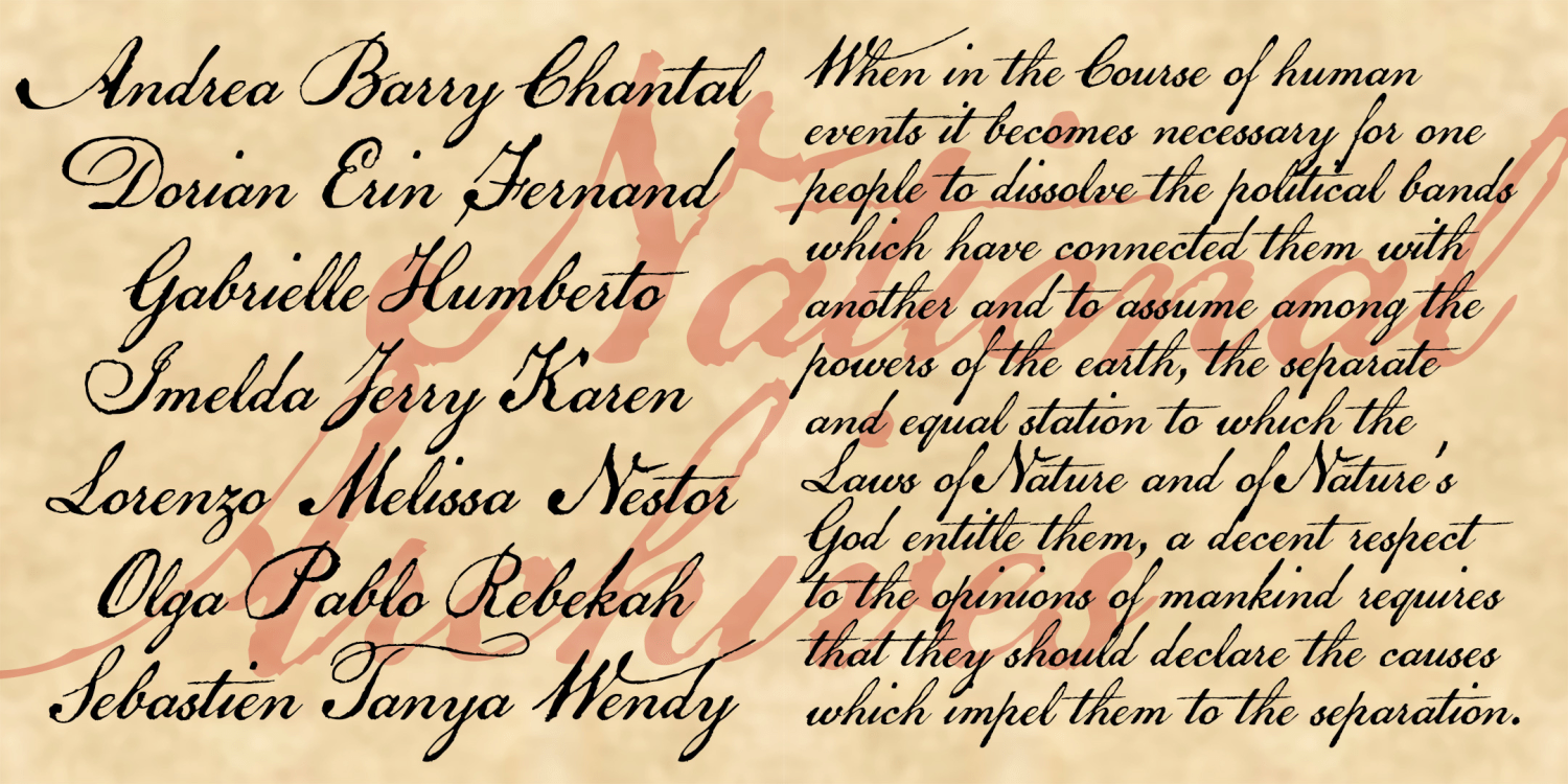
National Archive
1 Font | from $19.95
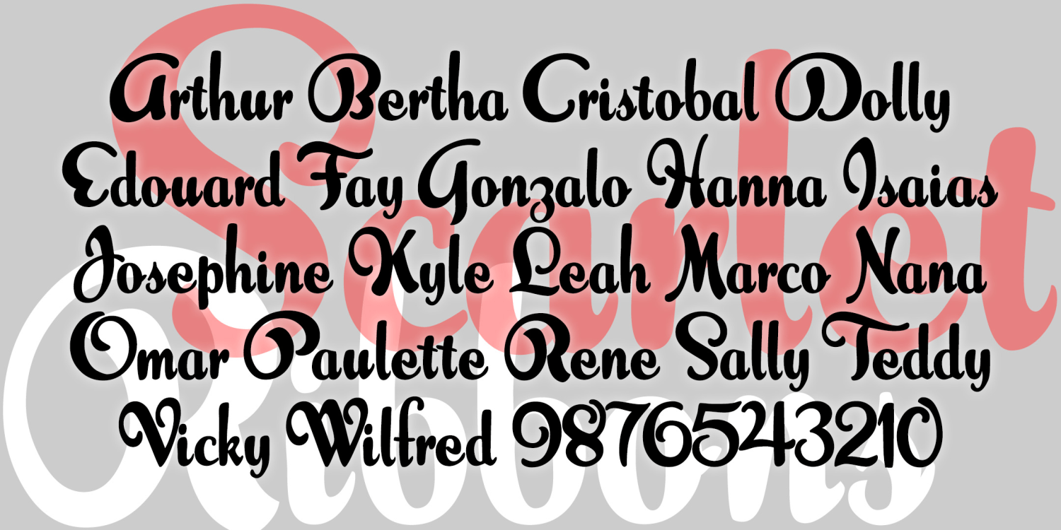
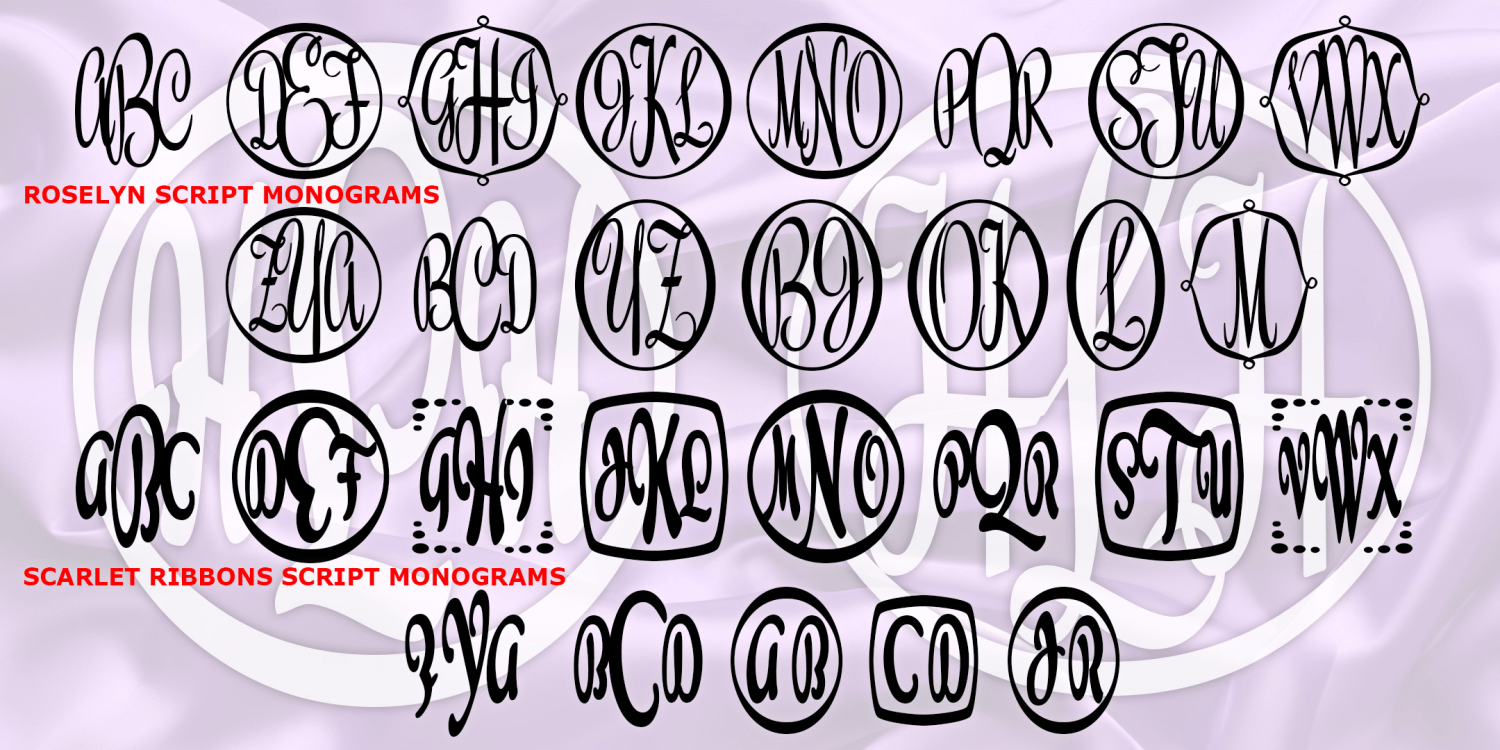
Scarlet Ribbons
1 Font | from $19.95
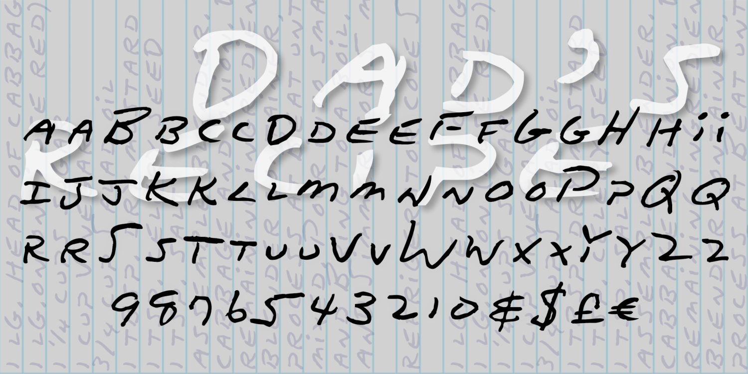
Dad's Recipe
1 Font | from $19.95
Captain Howdy
1 Font | from $19.95
Comfy
1 Font | from $19.95
Diversion
1 Font | from $19.95
Don Semiformal
1 Font | from $19.95
Easter Parade
1 Font | from $19.95
Mockingbird
1 Font | from $19.95
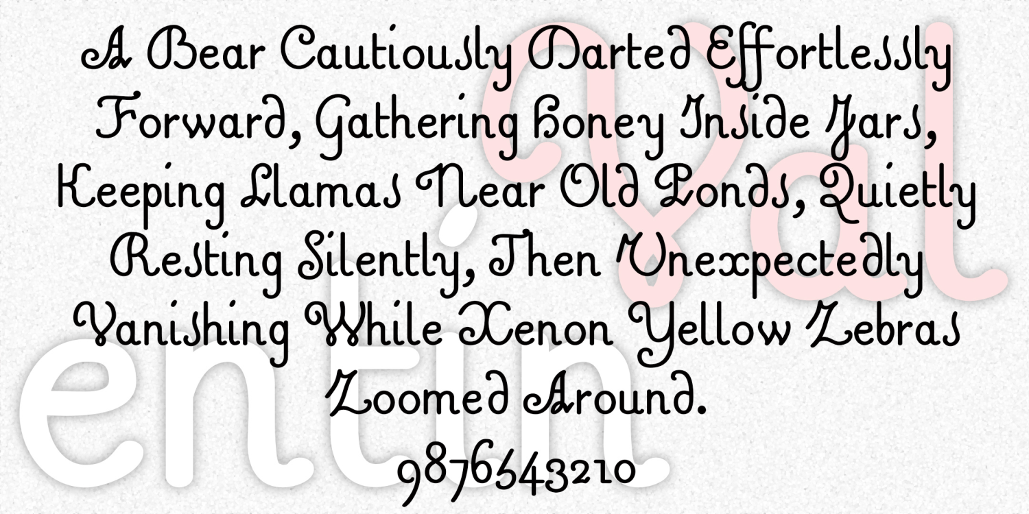
Valentin
1 Font | from $19.95
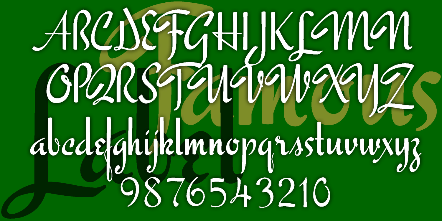
Famous Label
1 Font | from $19.95
Tricot
1 Font | from $19
Thanksgiving
1 Font | from $19.95
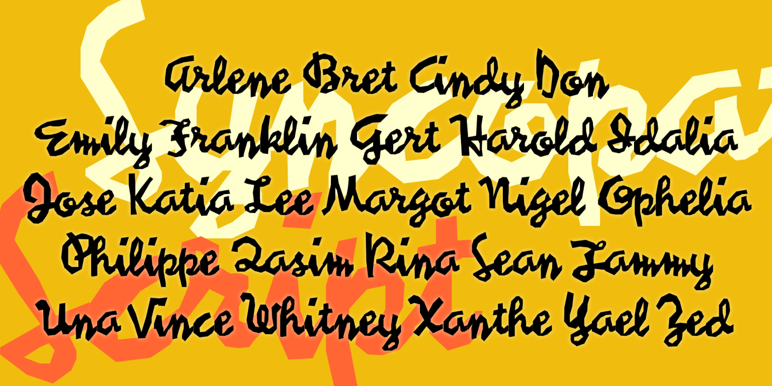
Syncopated Script
1 Font | from $19.95
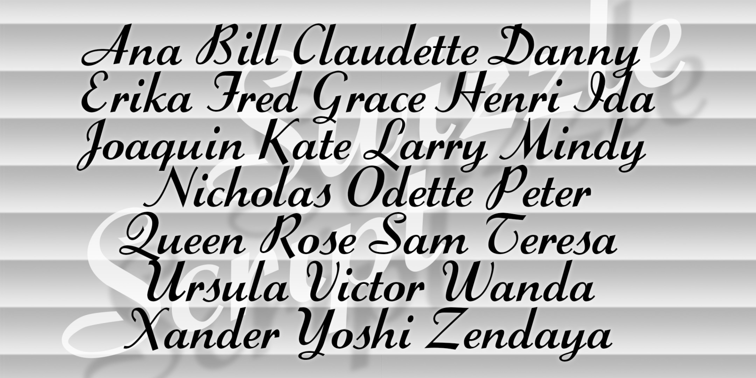
Swizzle Script
1 Font | from $19.95
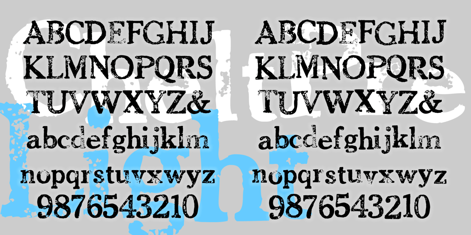
Chelt Press Light
2 Fonts | from $19.95
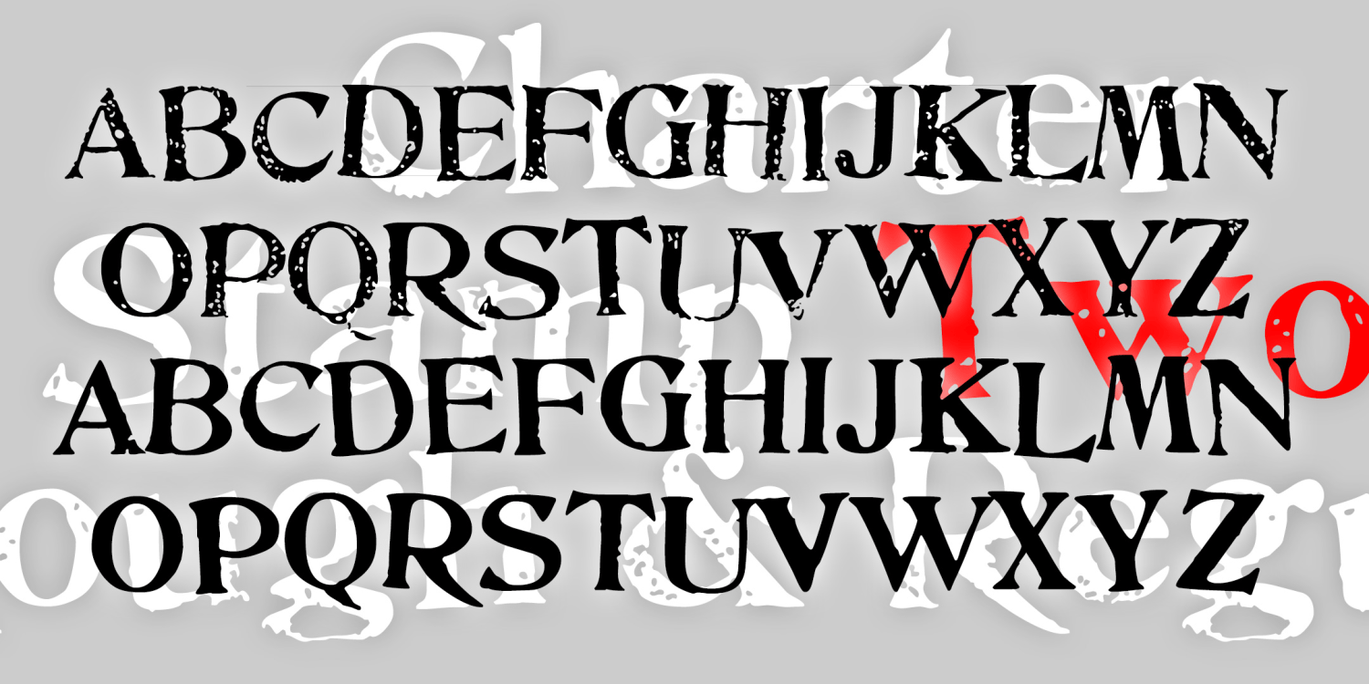
Charter Stamp Two
2 Fonts | from $19.95
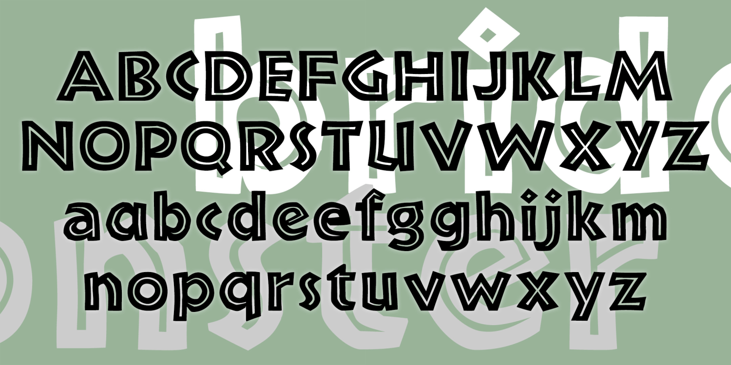
Bride of the Monster Inline
2 Fonts | from $19.95
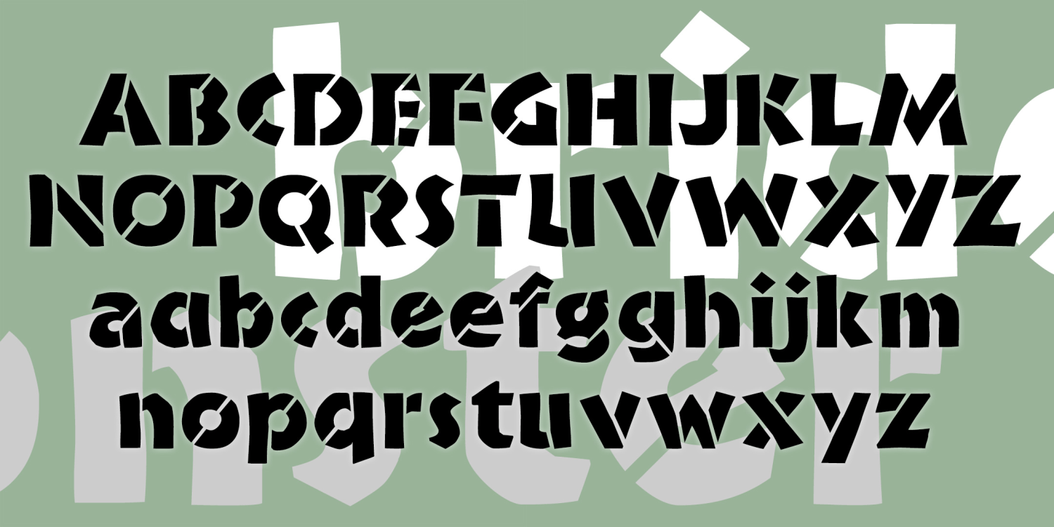
Bride of the Monster Stencil
2 Fonts | from $19.95
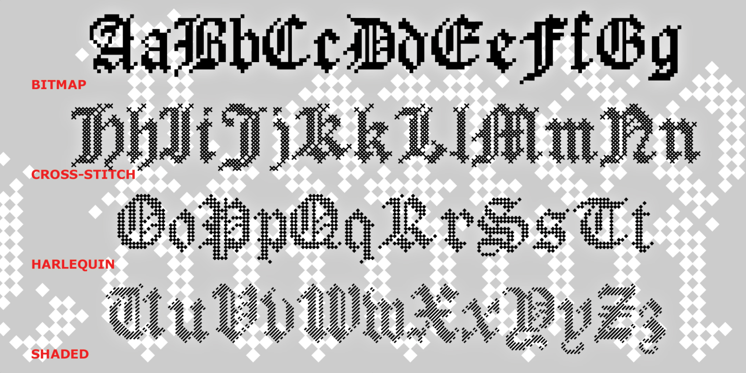
Blocked
5 Fonts | from $12
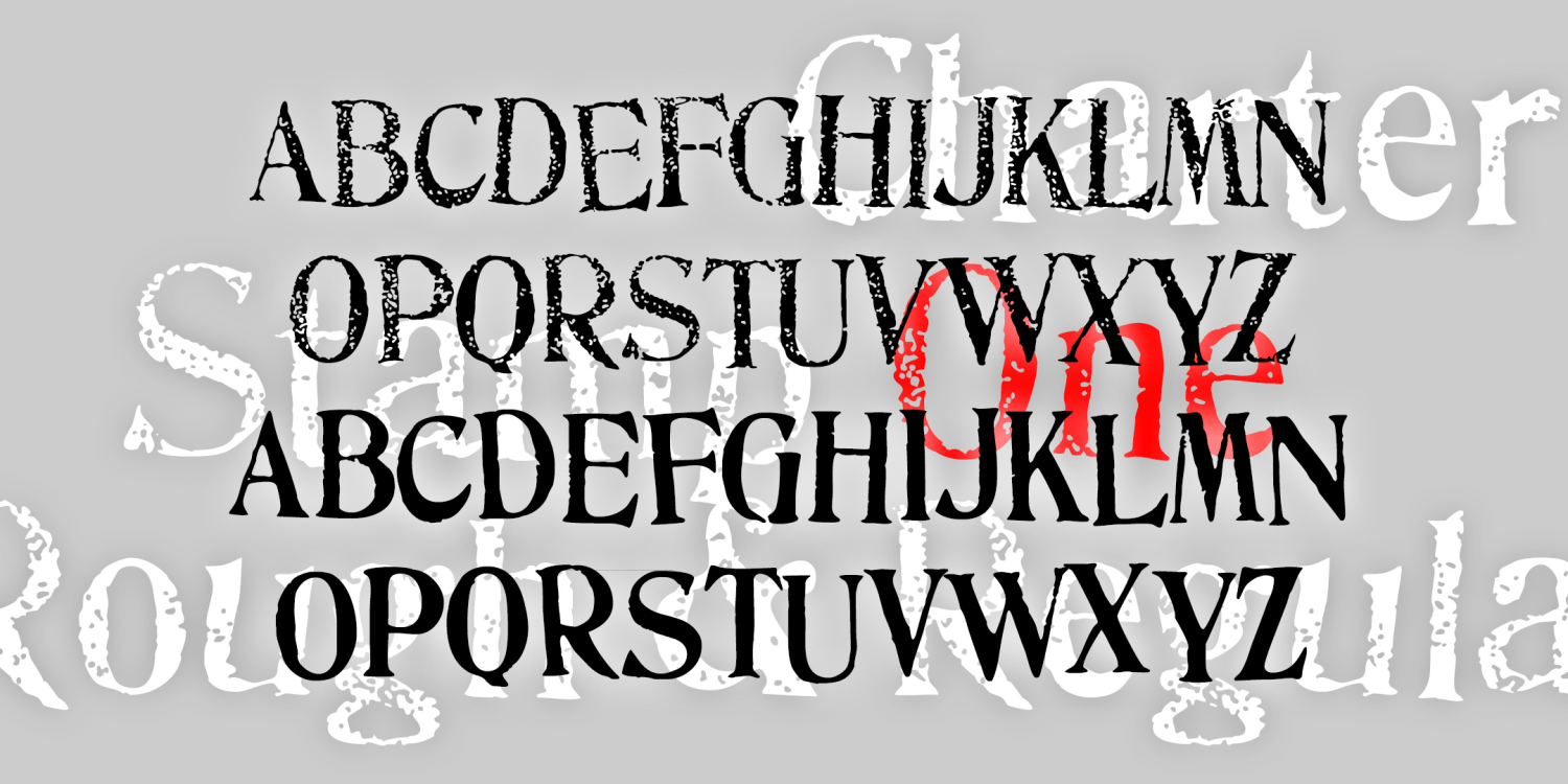
Charter Stamp One
2 Fonts | from $19.95
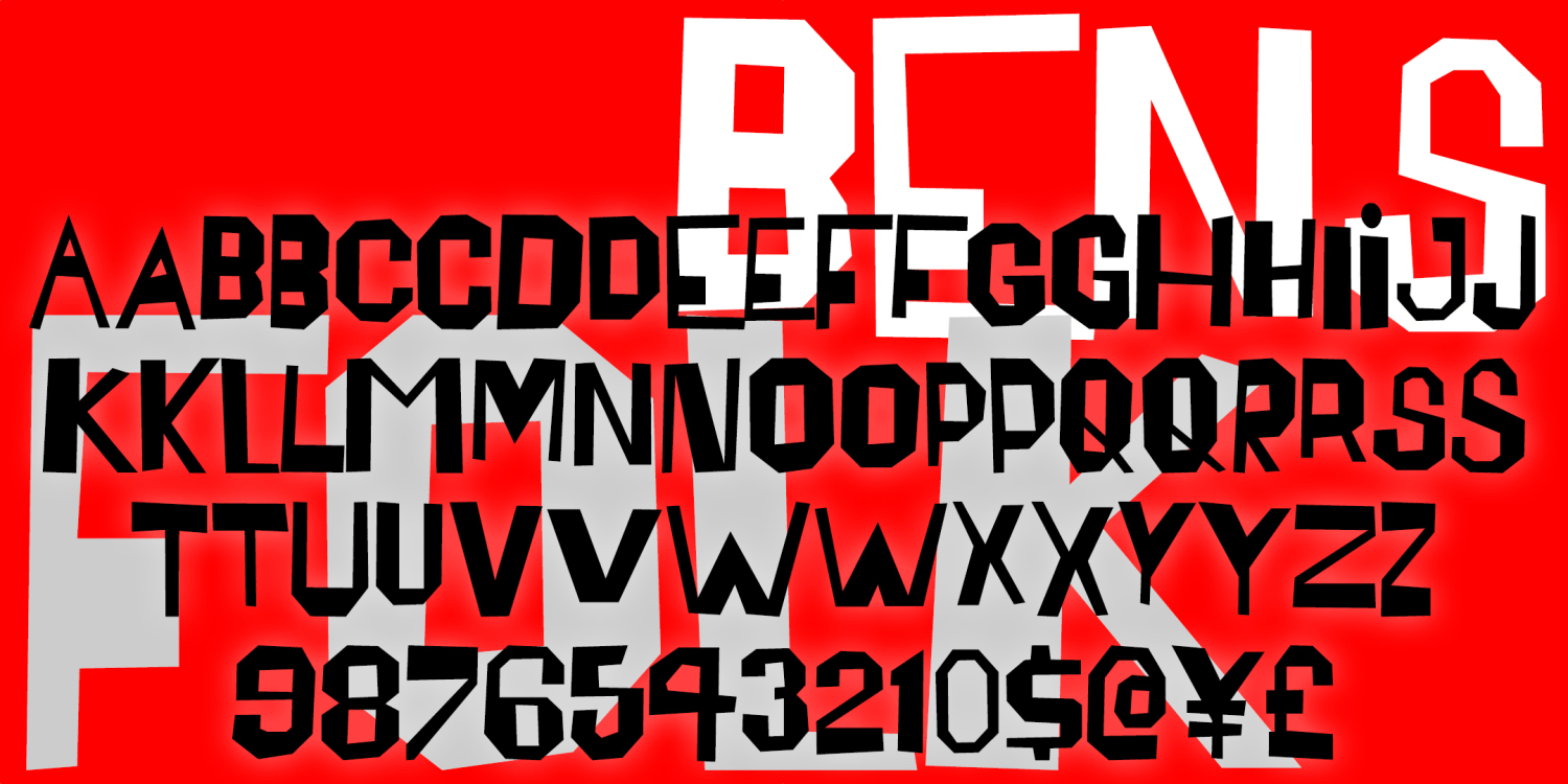
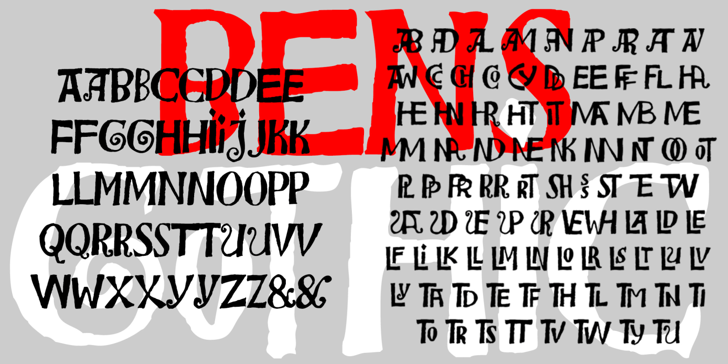
Bensfolk
2 Fonts | from $19.95
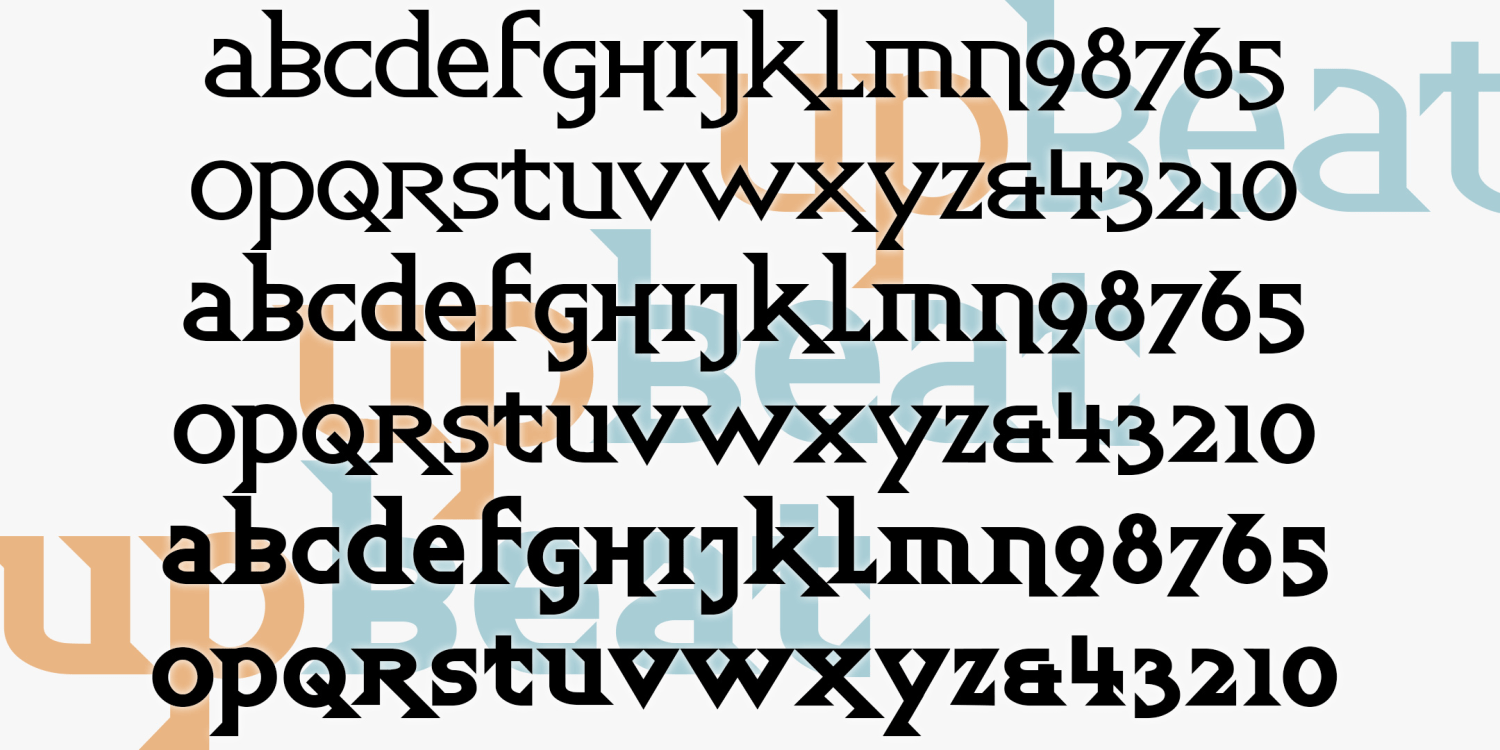
Upbeat
3 Fonts | from $49.95
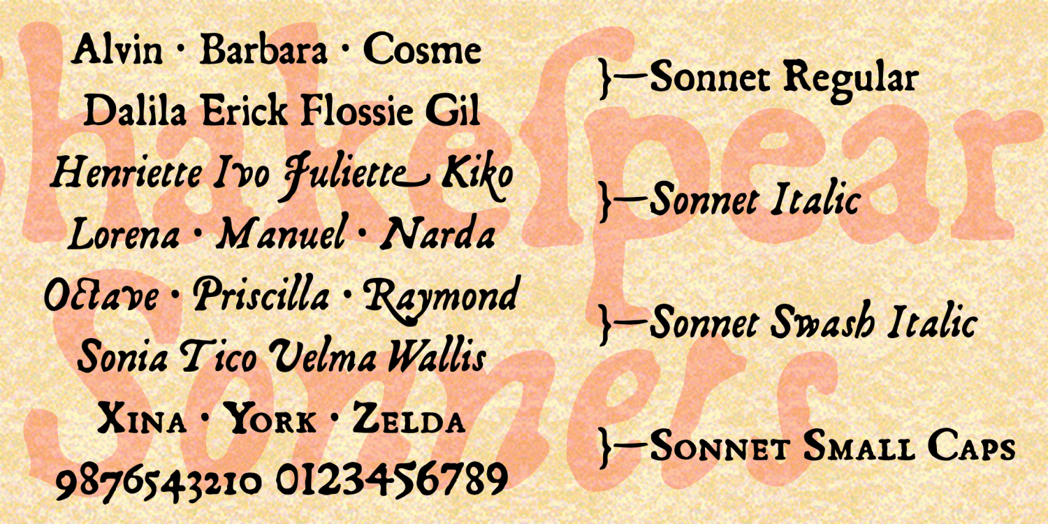
Sonnet
6 Fonts | from $39.95
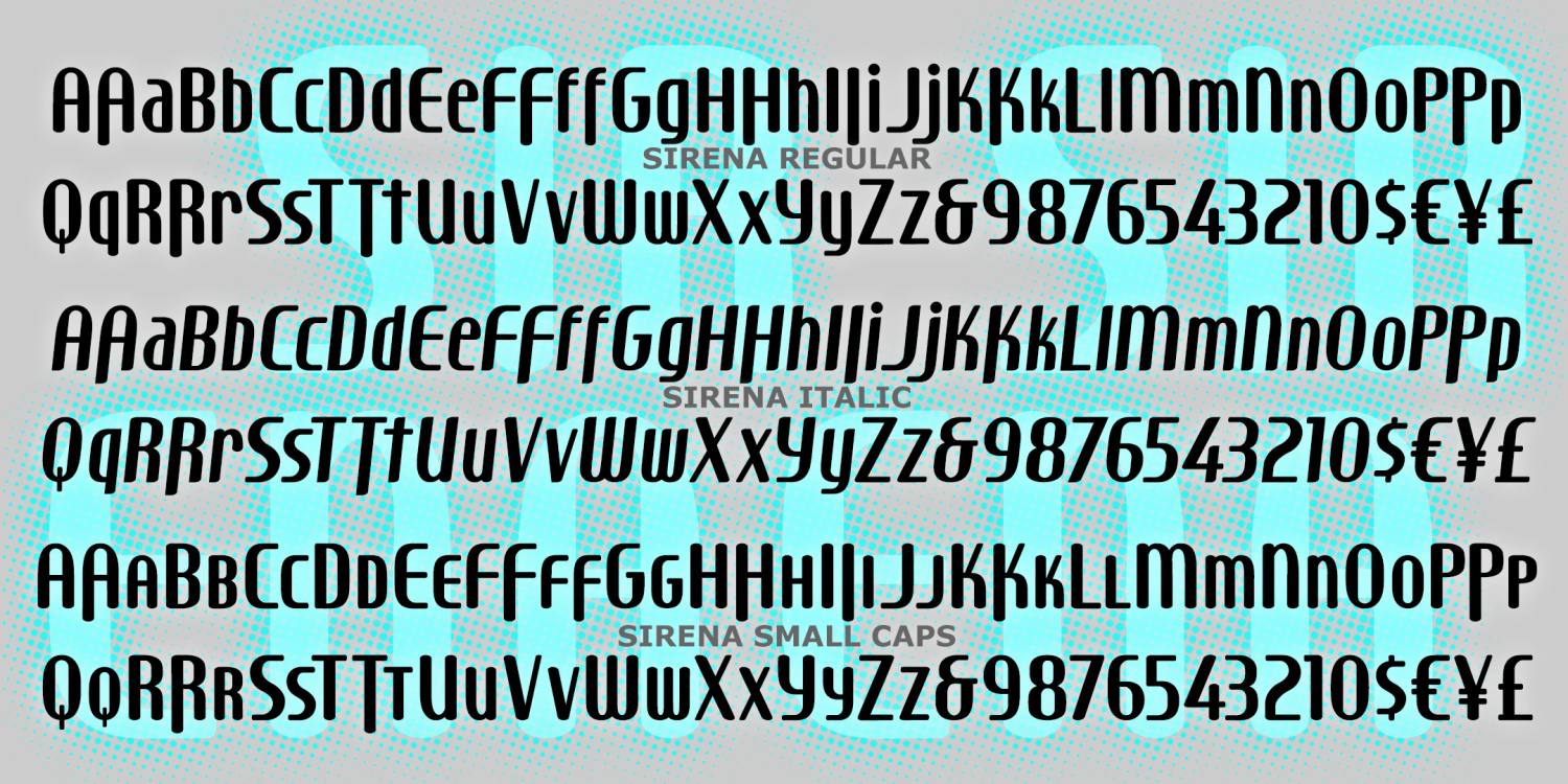
Sirena
5 Fonts | from $19.95
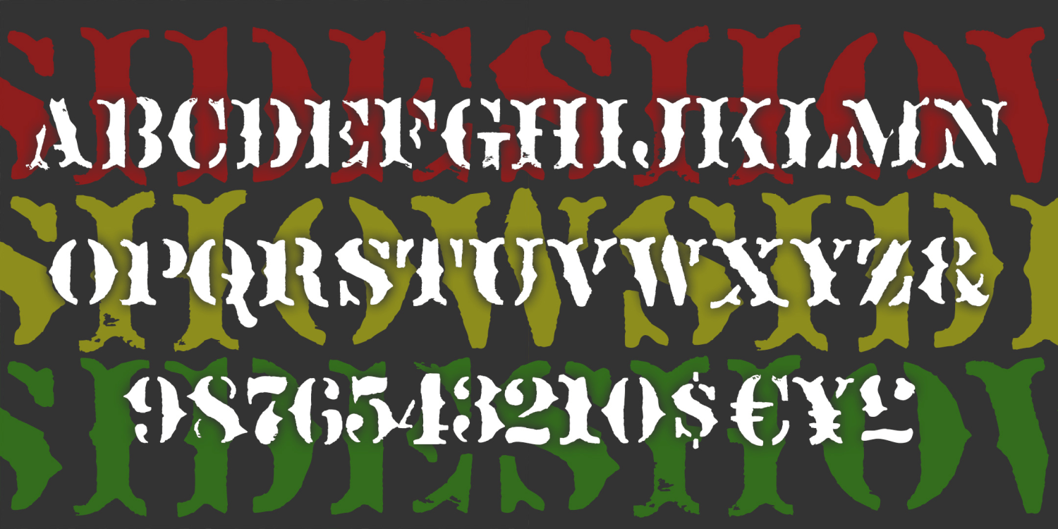
Sideshow
1 Font | from $19.95
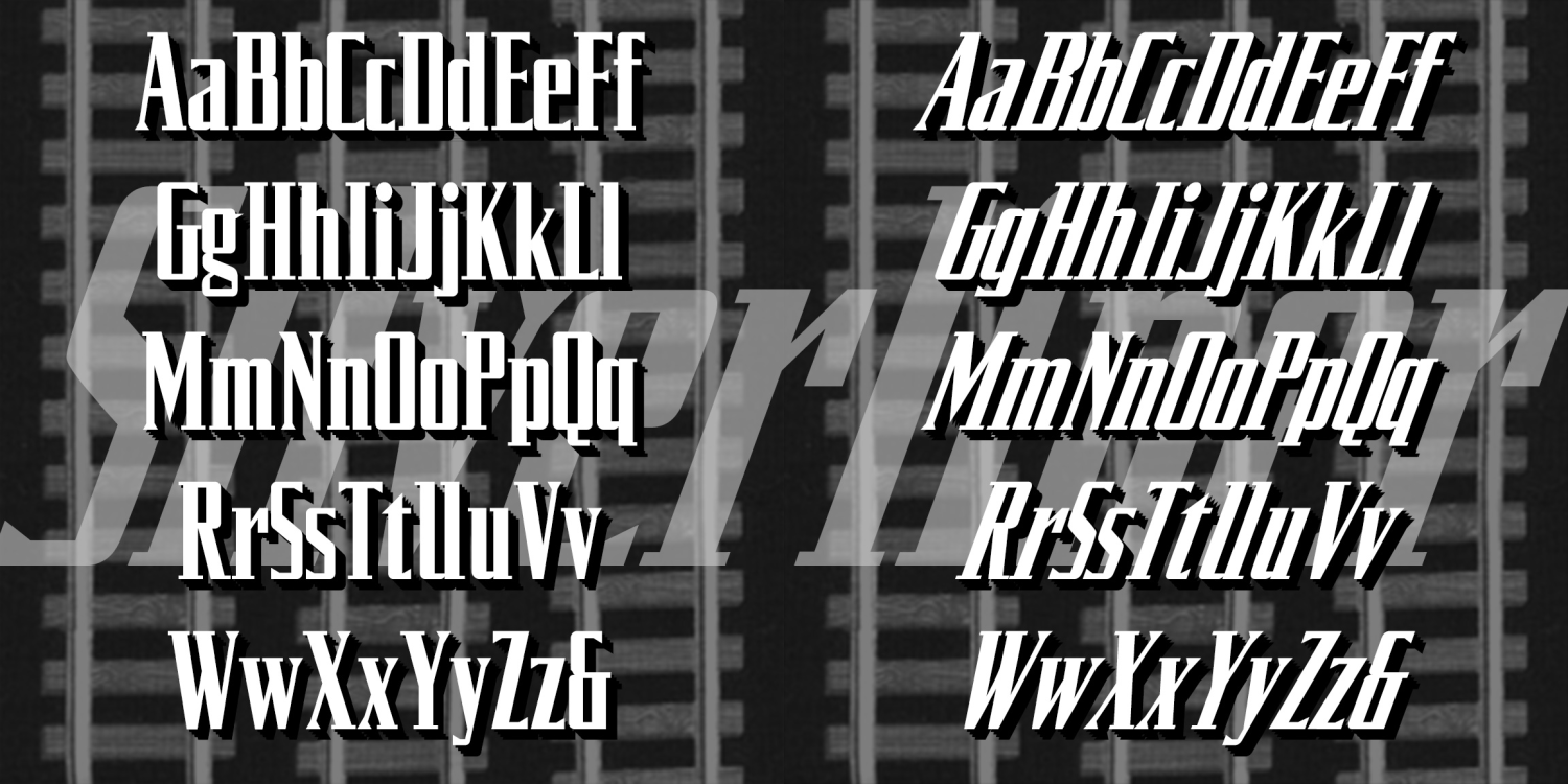
Silverliner
4 Fonts | from $19.95
Rudland Hand
2 Fonts | from $29.95
Royal Wedding Monograms
4 Fonts | from $19.95
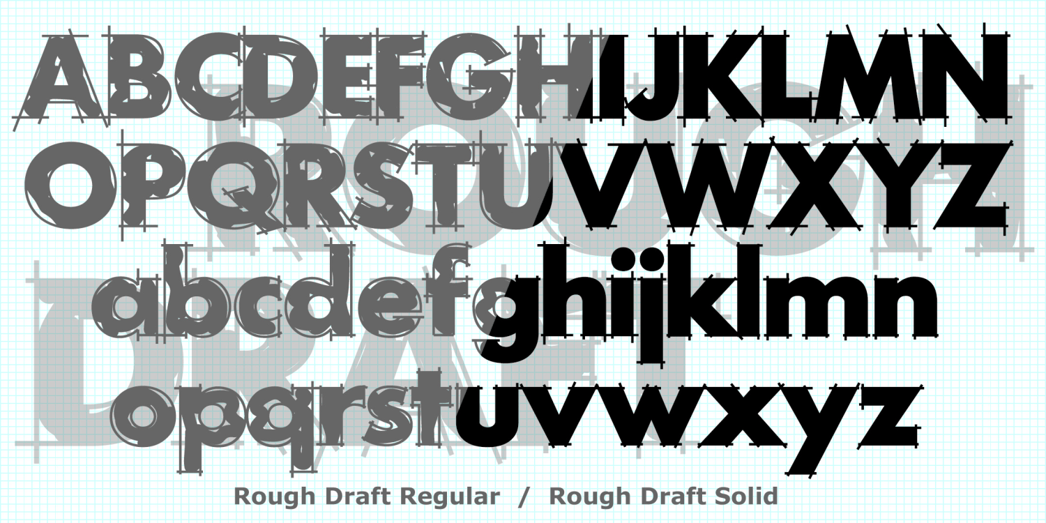
Rough Draft
5 Fonts | from $29.95
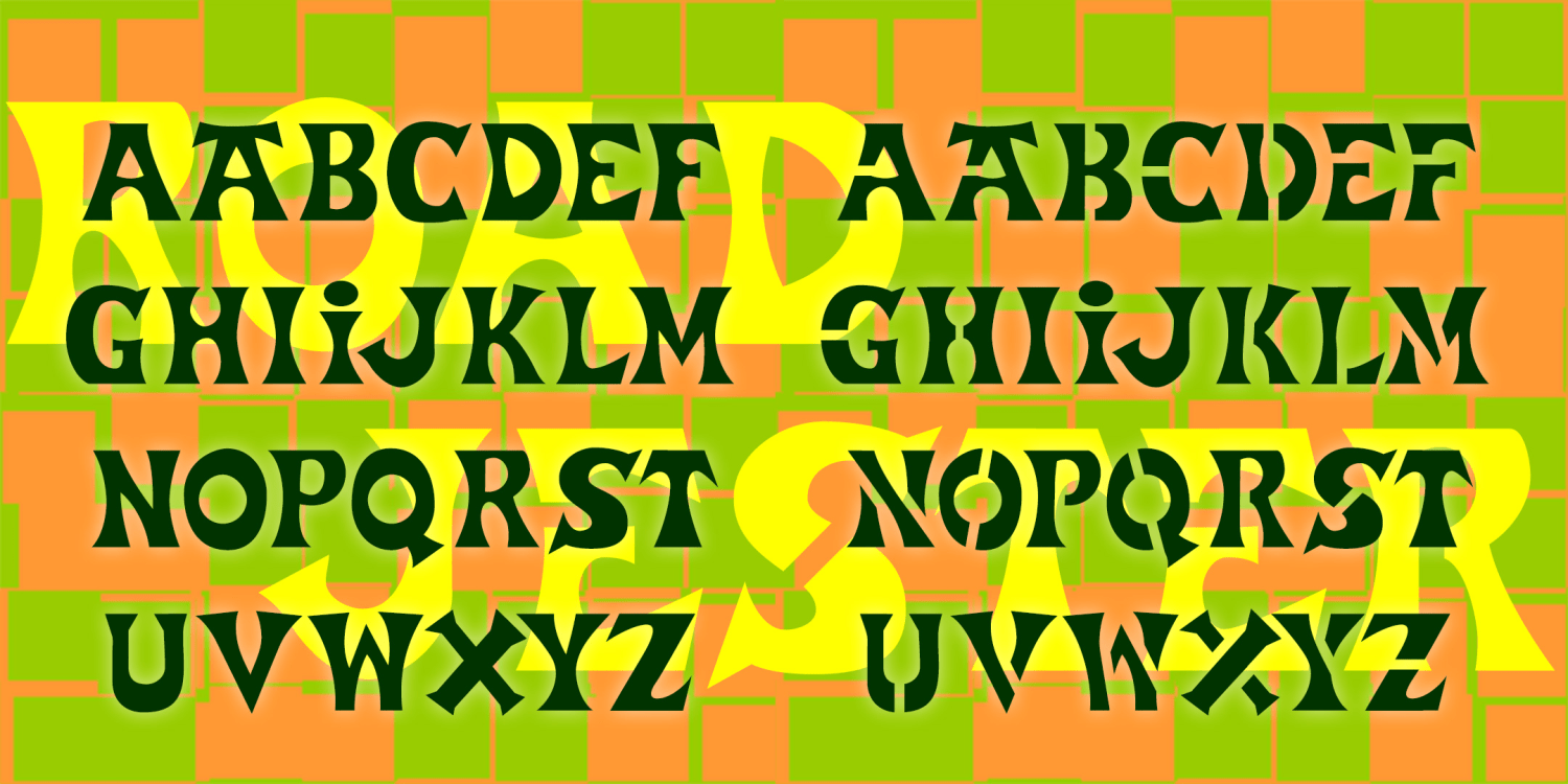
Road Jester
2 Fonts | from $29.95
Palimpsest
4 Fonts | from $19.95
Ohmigosh
12 Fonts | from $29.95
National Debt
3 Fonts | from $49.95
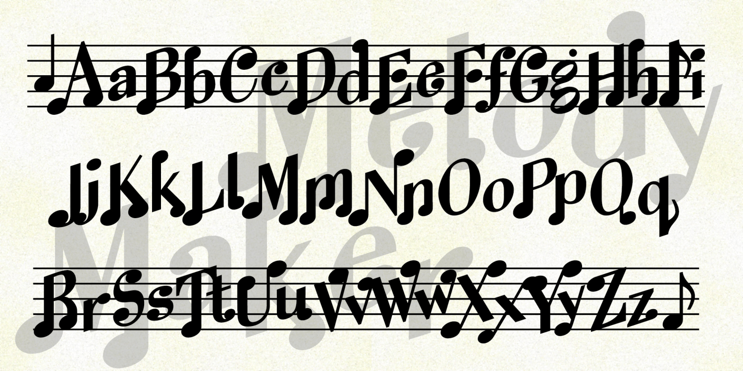
Melody Maker
3 Fonts | from $19.95
Le Film
3 Fonts | from $19.95
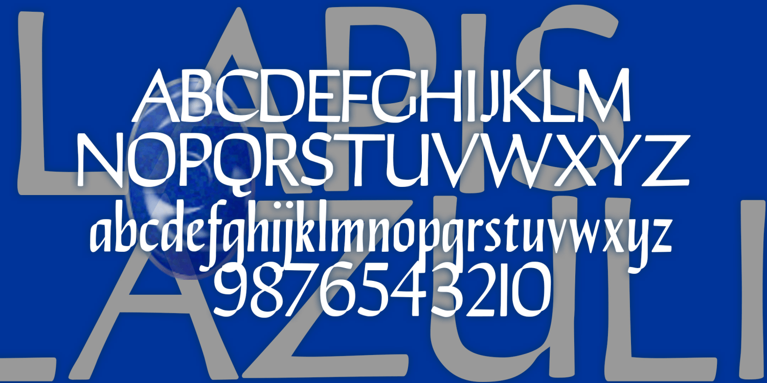
Lapis Lazuli
3 Fonts | from $29.95
Lace Monograms
2 Fonts | from $19.95
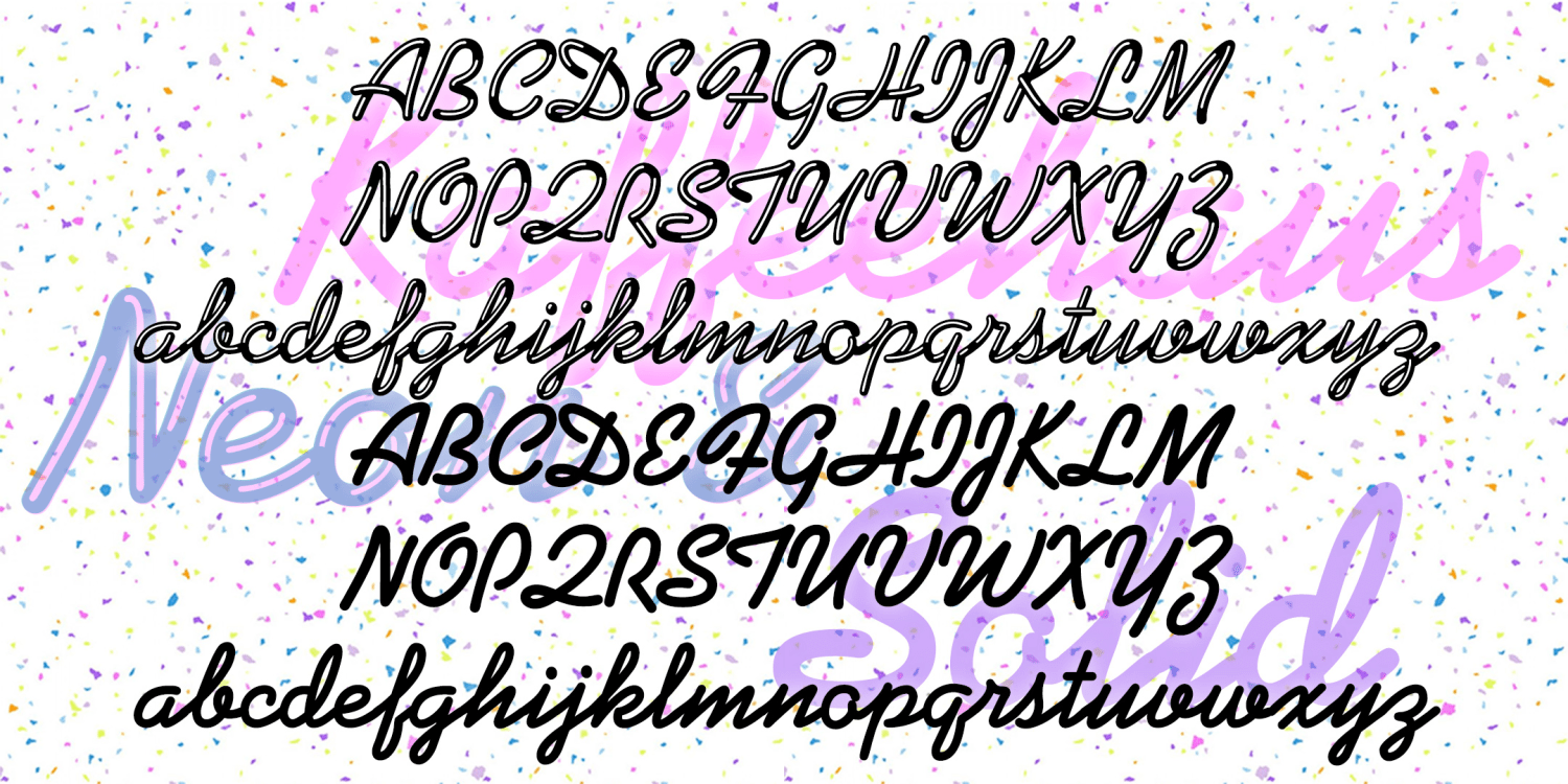
Kaffeehaus
2 Fonts | from $29.95
JJ Stencil
4 Fonts | from $29.95
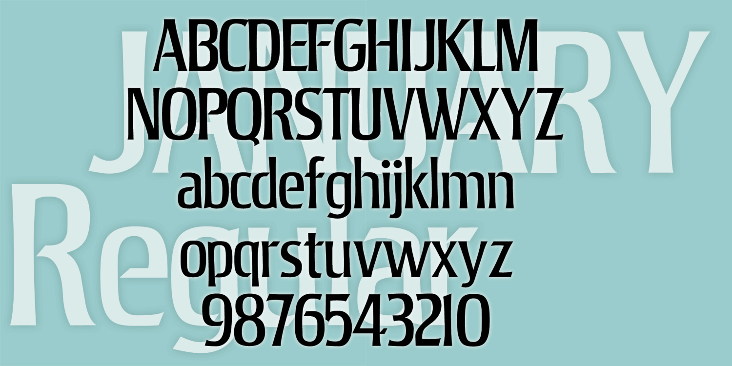
January
3 Fonts | from $39.95
Imitation
3 Fonts | from $29.95
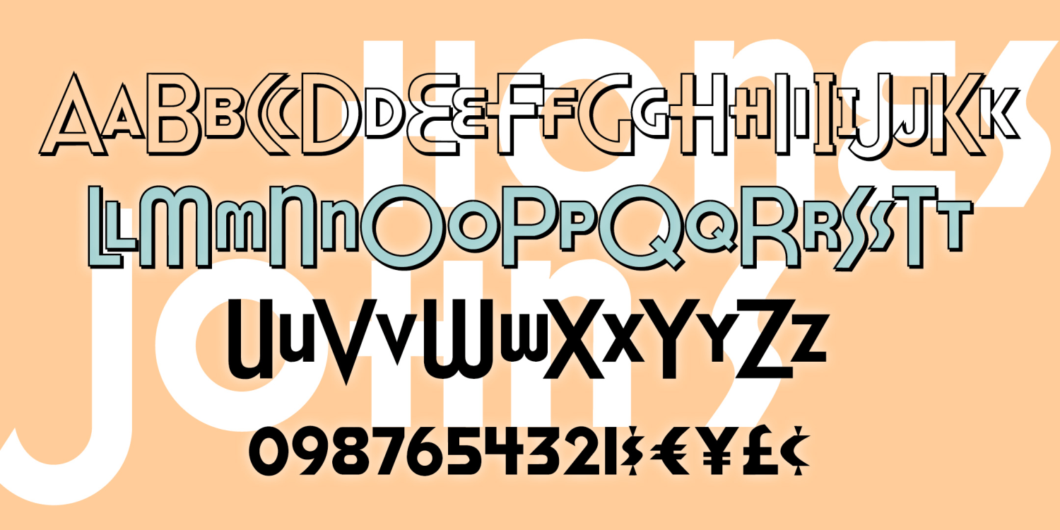
Honest John's
2 Fonts | from $19.95
Snowflake Monograms
4 Fonts | from $19.95
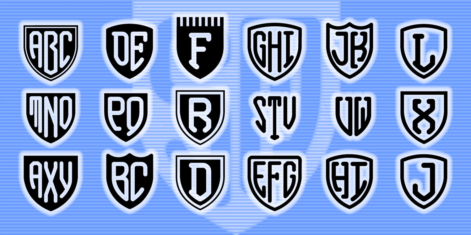
Shield Monograms
5 Fonts | from $19.95
Script Monograms
2 Fonts | from $19.95
Roman Monograms
8 Fonts | from $19.95
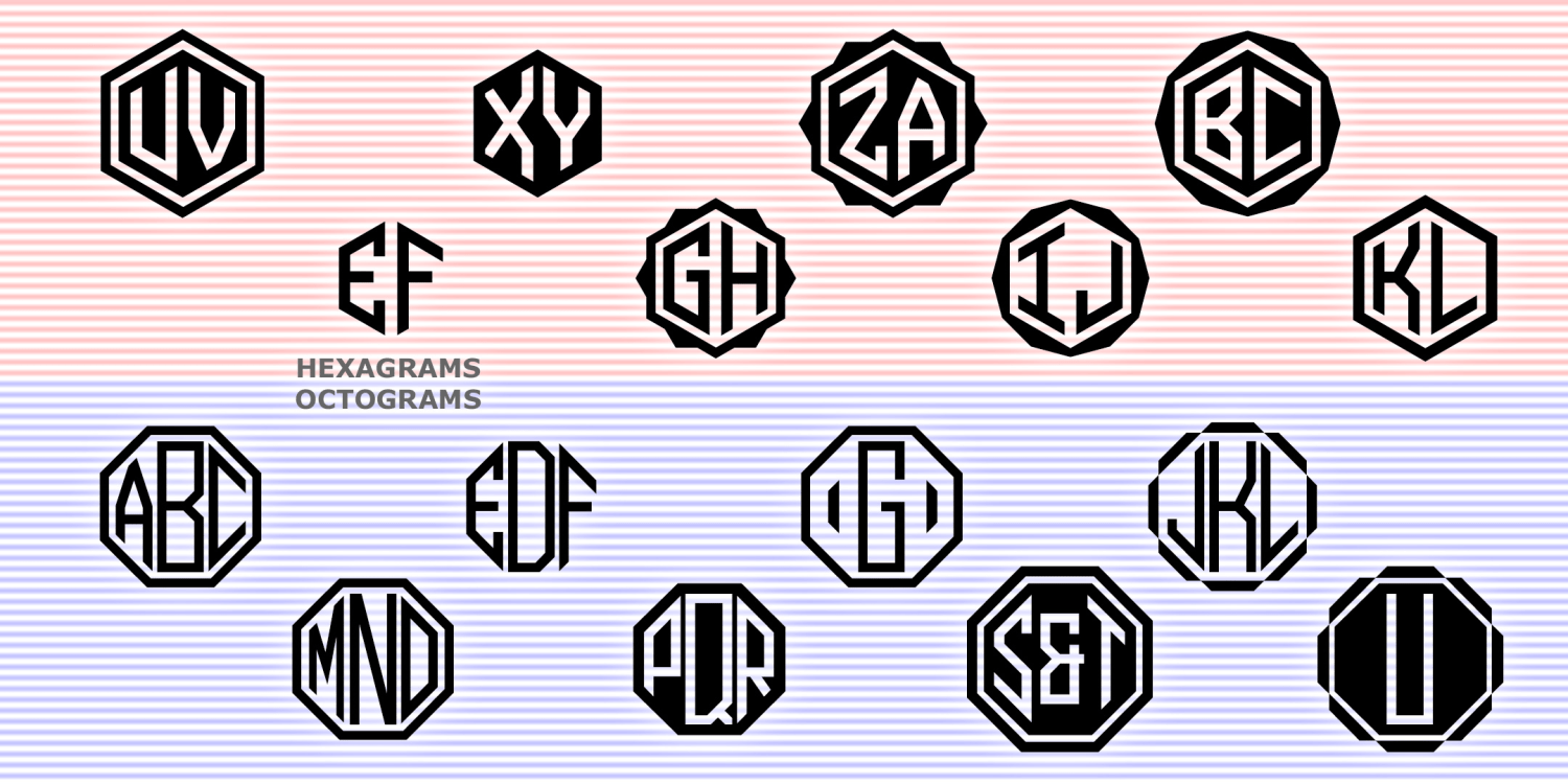
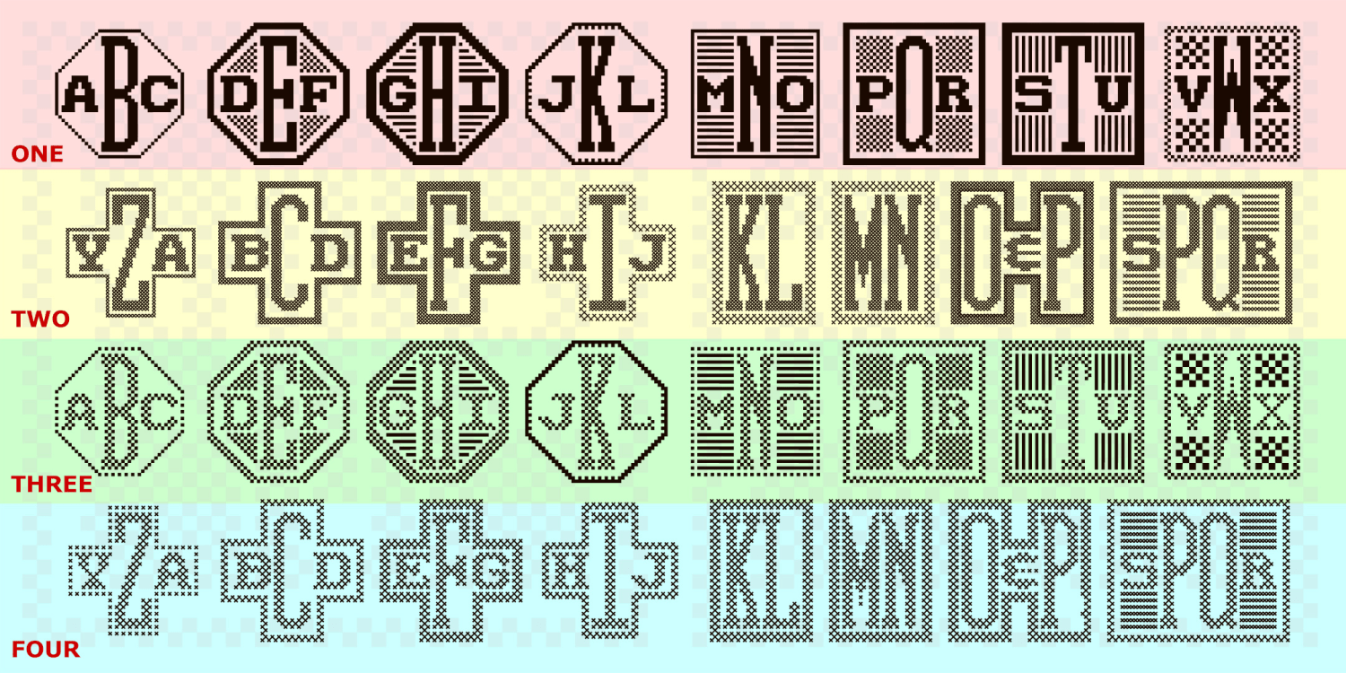
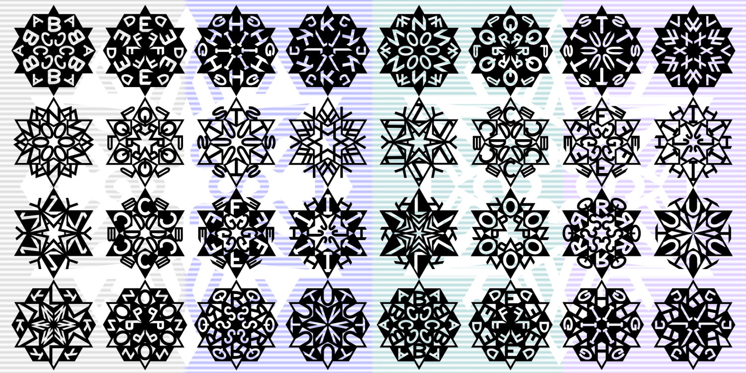
Hexagrams & Octograms
4 Fonts | from $19.95
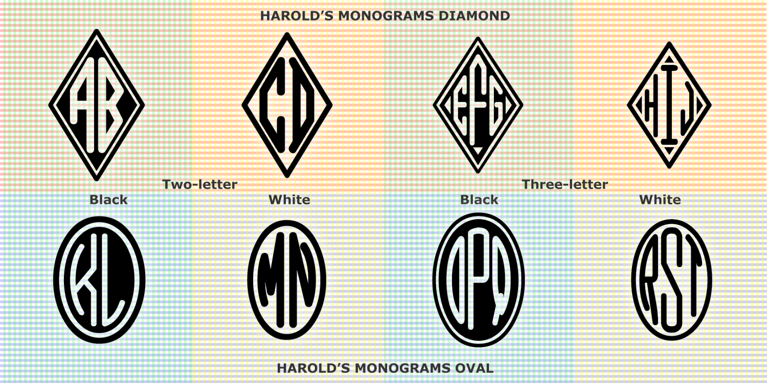
Harold's Monograms
16 Fonts | from $19.95
Handbill
4 Fonts | from $39.95
Graceful Ghost & Sweet Spirit
2 Fonts | from $29.95
Goya
4 Fonts | from $49.95
Garden
4 Fonts | from $29.95
Esquivel
3 Fonts | from $19.95
Fashion
2 Fonts | from $29.95
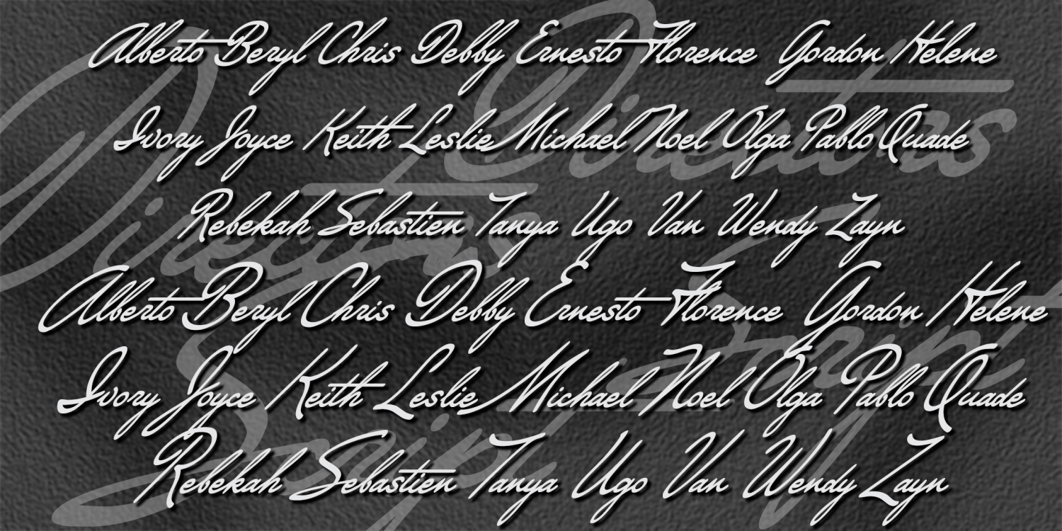
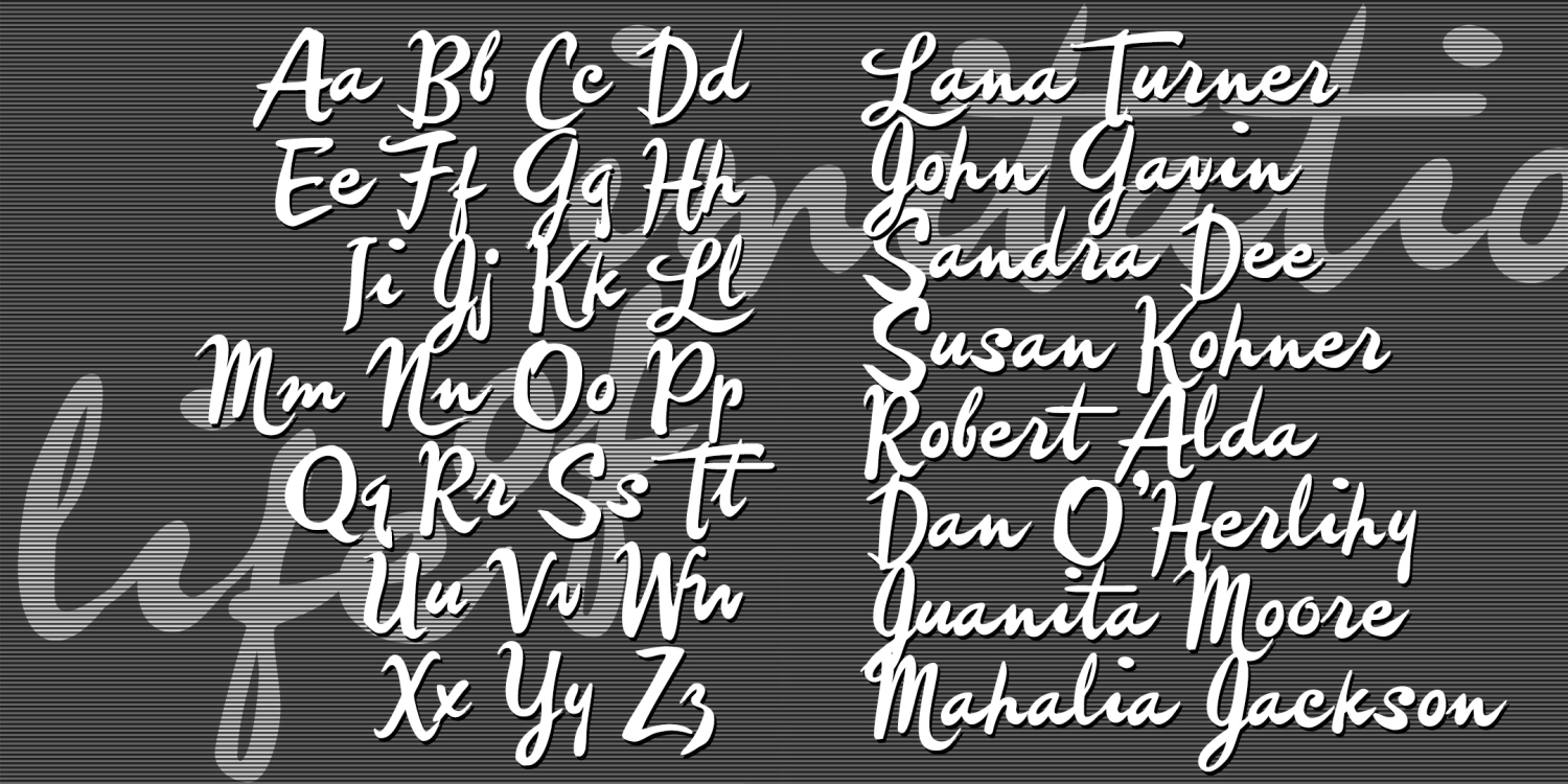
Directors Script
2 Fonts | from $19.95
Collegiate Monograms Three
4 Fonts | from $19.95
Collegiate Monograms Two
4 Fonts | from $19.95
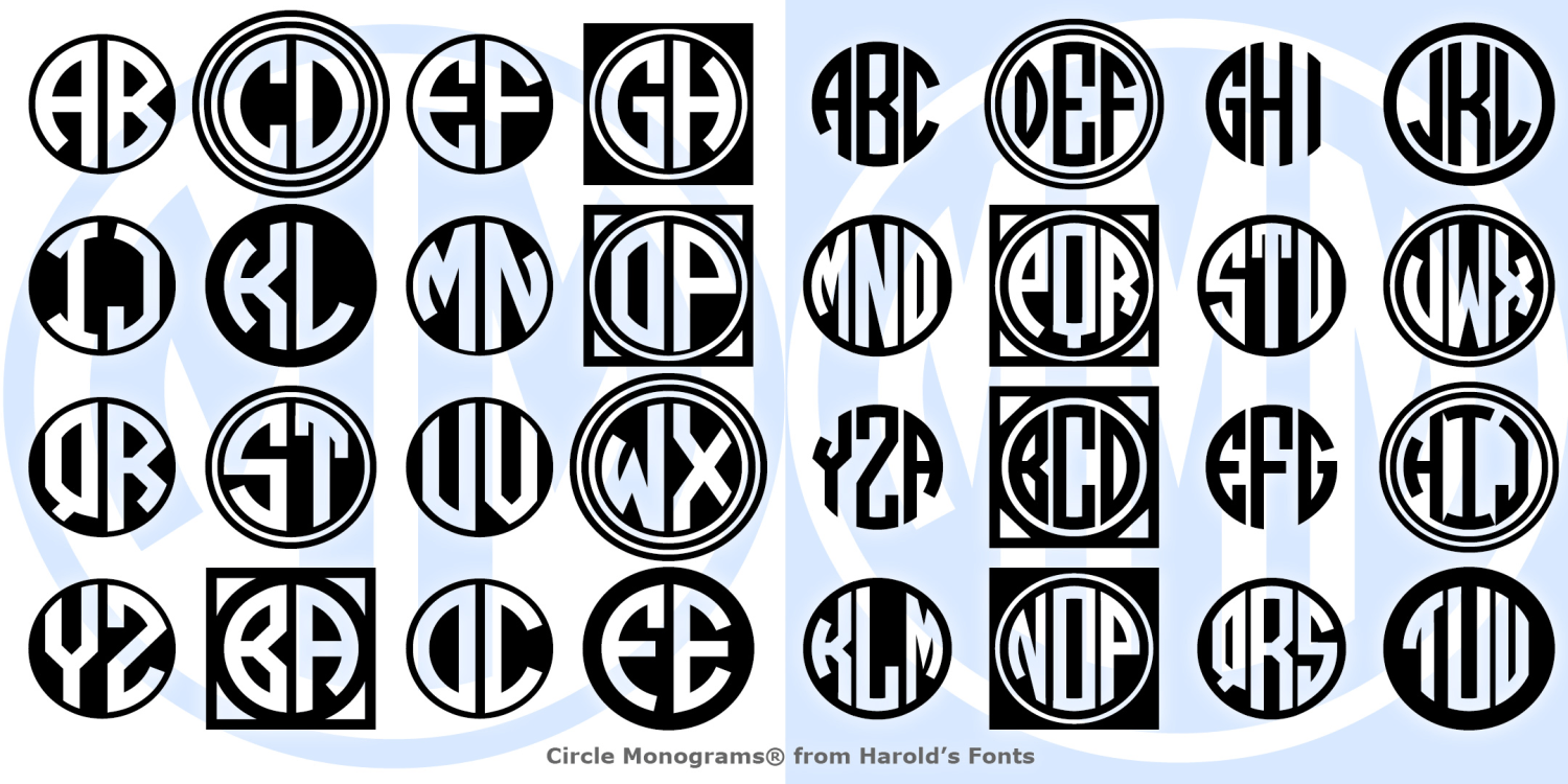
Circle Monograms
4 Fonts | from $19.95
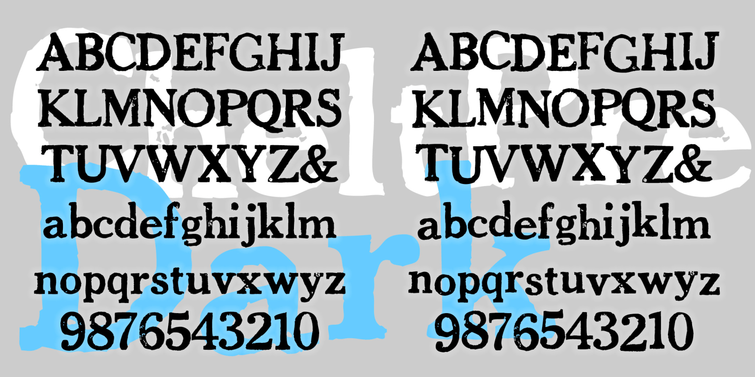
Chelt Press Dark
2 Fonts | from $19.95
Chaser
2 Fonts | from $19.95
Carmen Monograms
3 Fonts | from $19.95
Carbon Copy
4 Fonts | from $19.95
Cantabile
6 Fonts | from $29.95
Bride of the Monster
2 Fonts | from $19.95
Bracelet Monograms
8 Fonts | from $19.95
Blooper
2 Fonts | from $19.95
Bloop Script
2 Fonts | from $19.95
Blockograms
5 Fonts | from $19.95
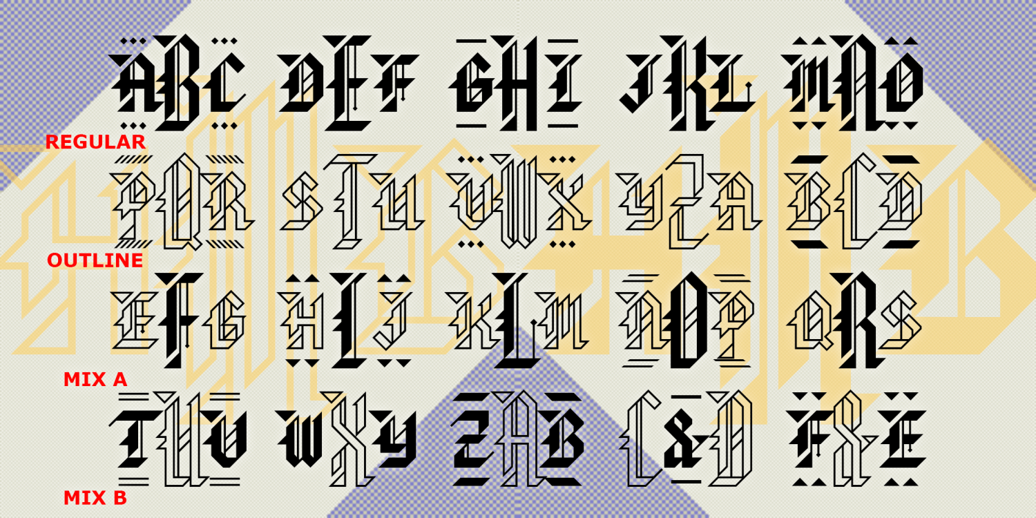
Bensgothic
2 Fonts | from $19.95
Baronial Monograms
4 Fonts | from $19.95
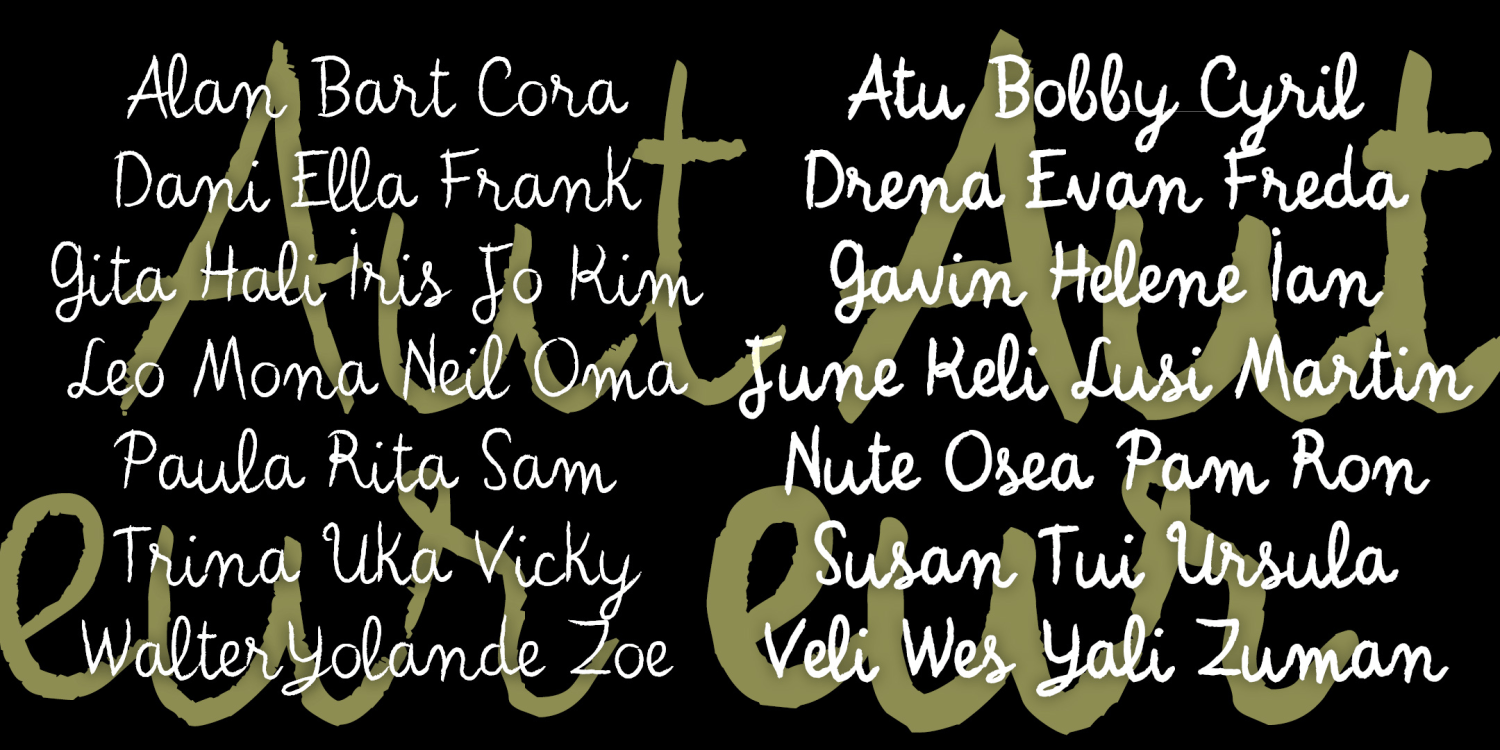
Auteur
2 Fonts | from $19.95
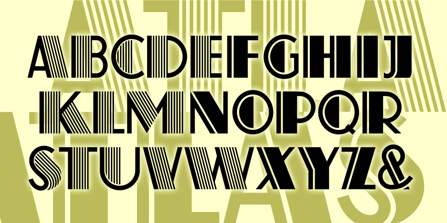
Atlas
2 Fonts | from $29.95
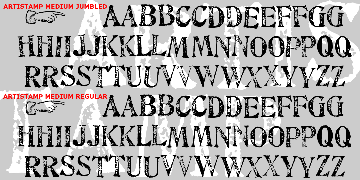
Artistamp
4 Fonts | from $29.95
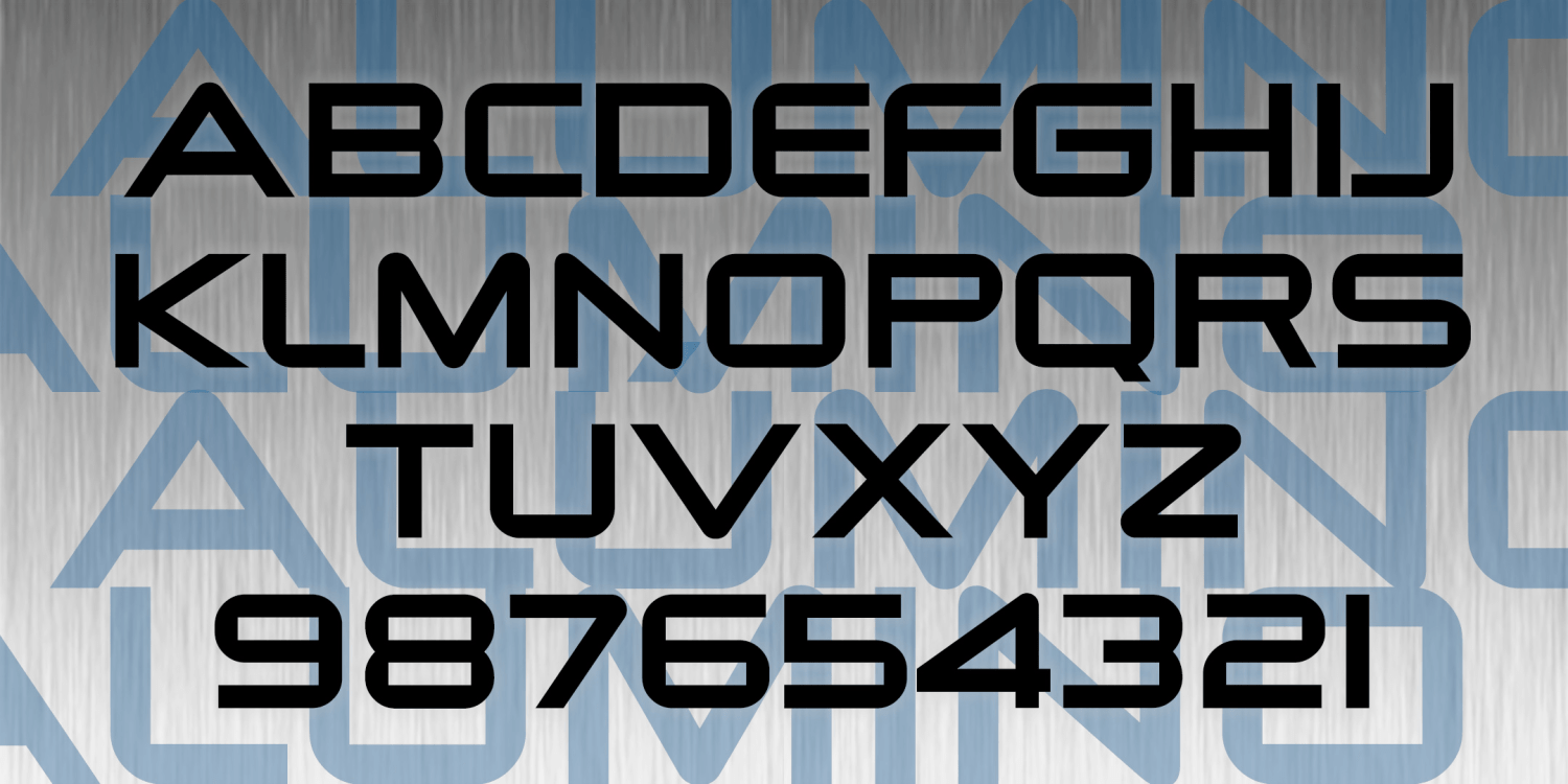
Alumino
2 Fonts | from $19.95
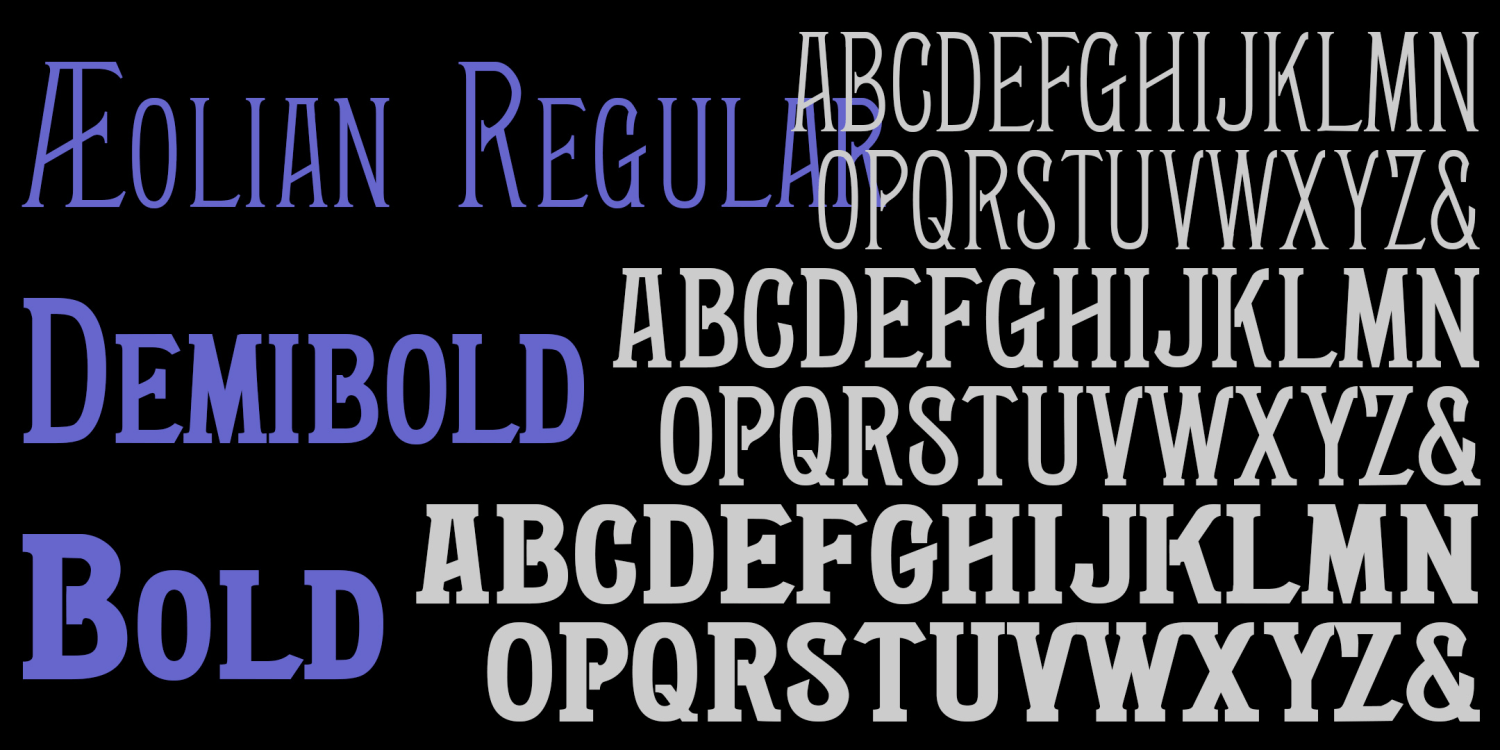
Aeolian
3 Fonts | from $39.95
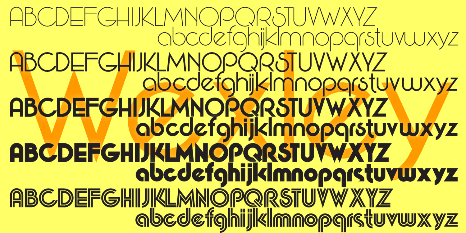
Wexley
5 Fonts | from $49.95
Triad Monograms
4 Fonts | from $19.95
Thaleia
2 Fonts | from $22
Safety Pin
2 Fonts | from $12
Roberta
8 Fonts | from $60
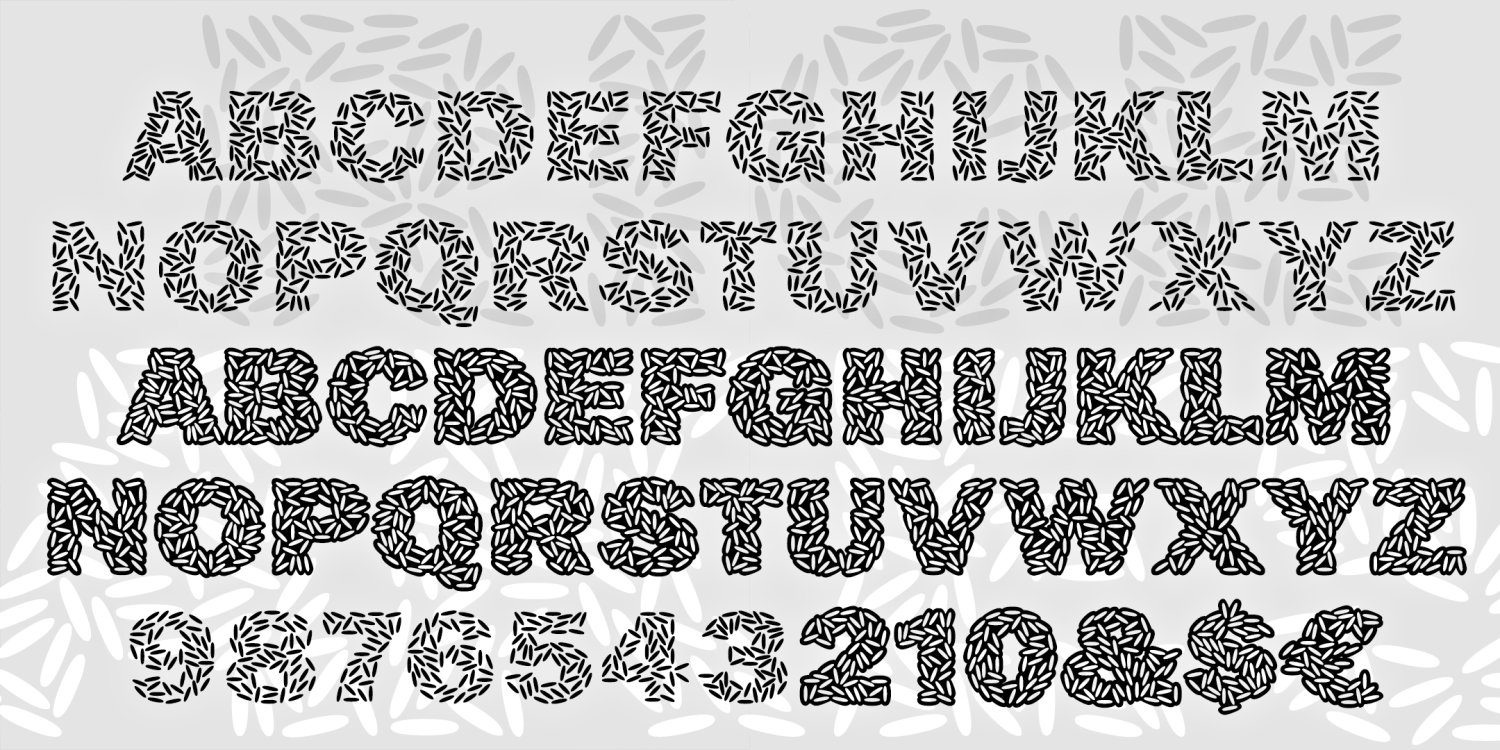
Ricecakes
2 Fonts | from $12
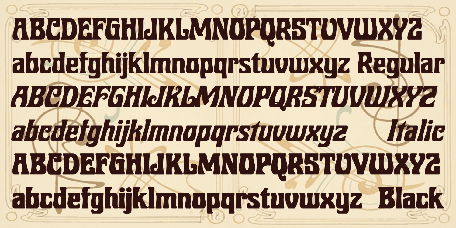
Republique
4 Fonts | from $24
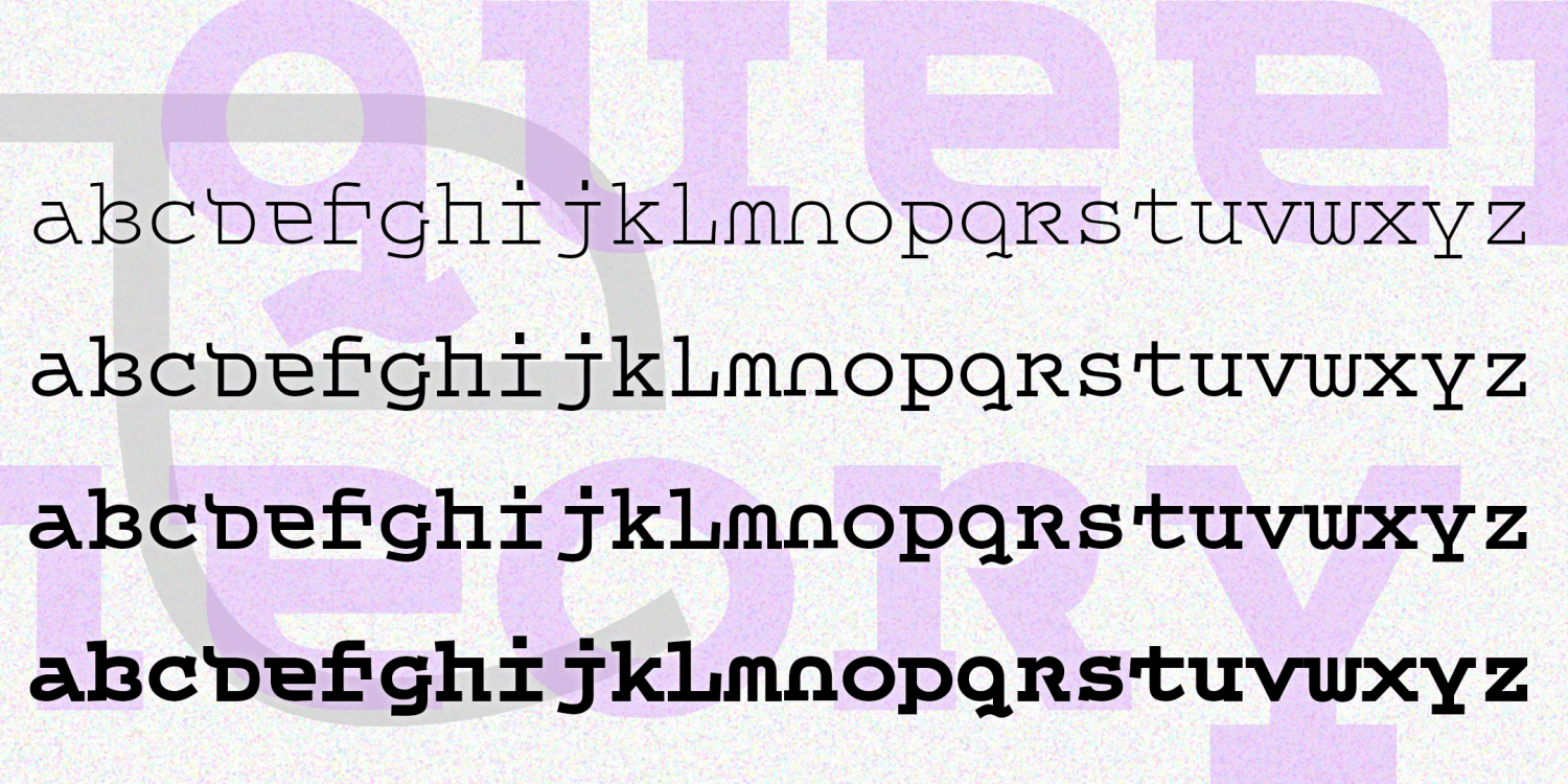
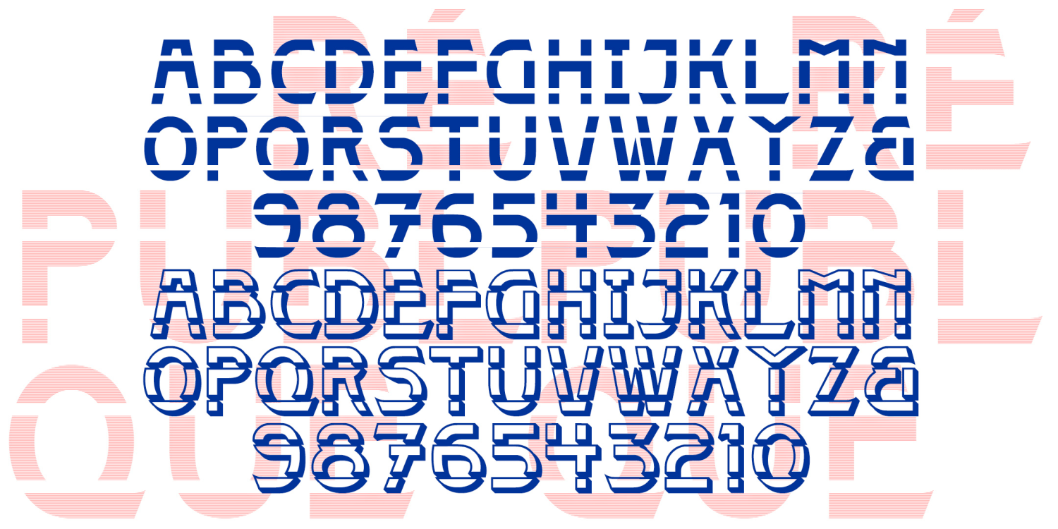
Queer Theory
4 Fonts | from $12
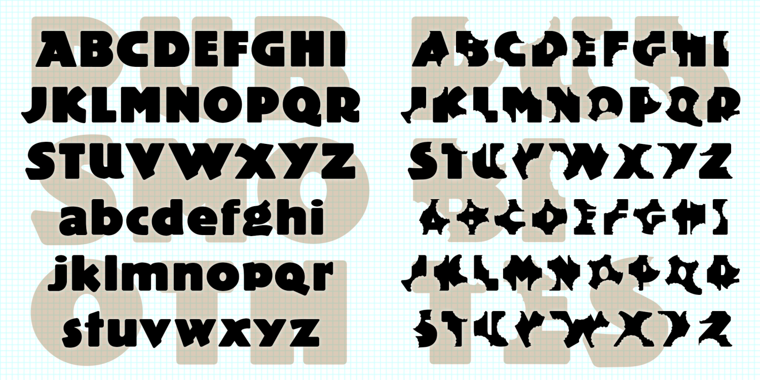
Pub Smooth & Pub Bites
2 Fonts | from $12
Project
5 Fonts | from $24
Poignant
2 Fonts | from $19.95
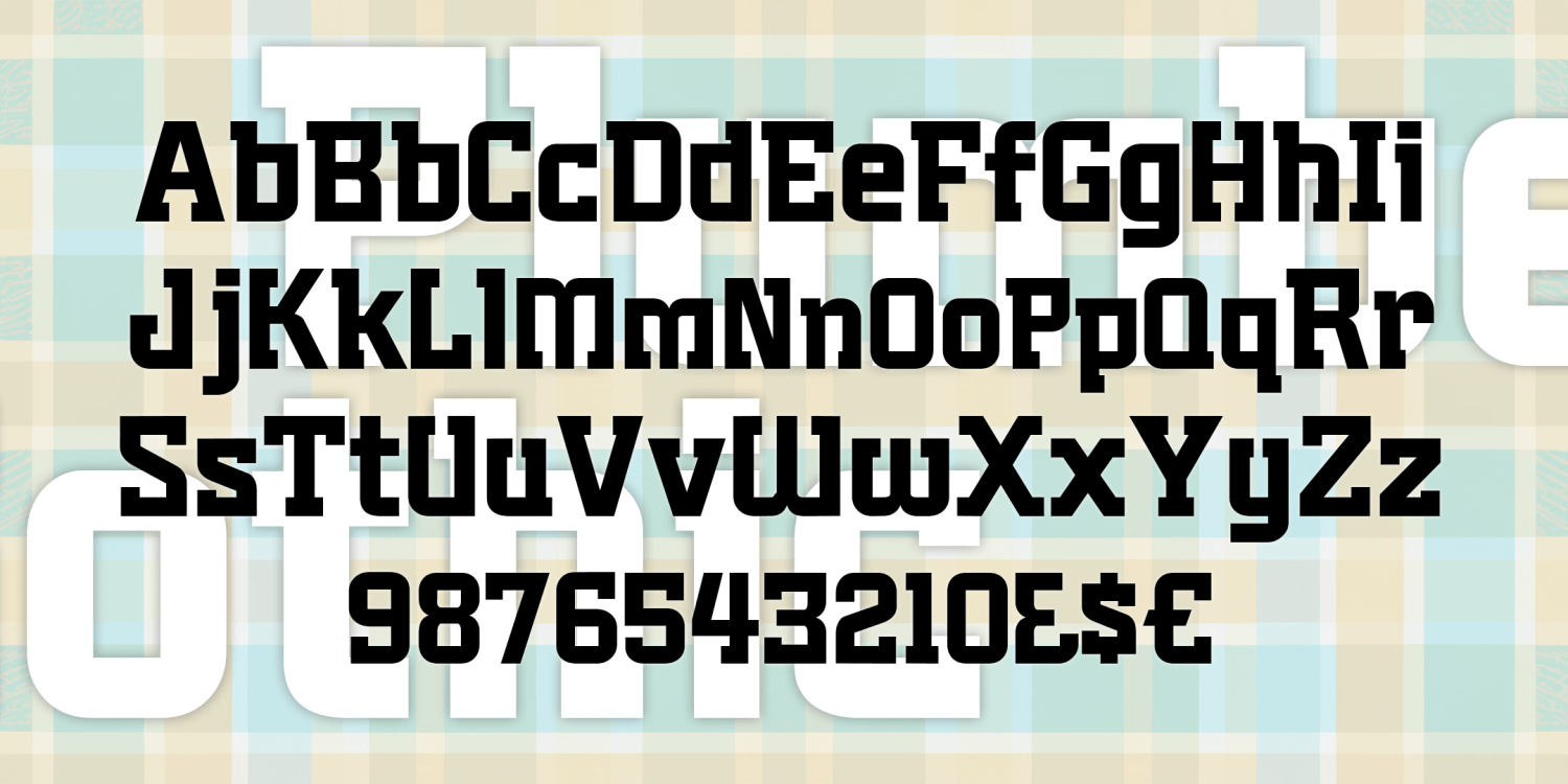
Plumbers Gothic
3 Fonts | from $24
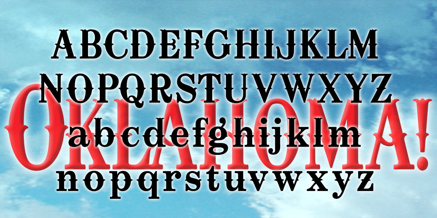
Oklahoma
1 Font | from $12
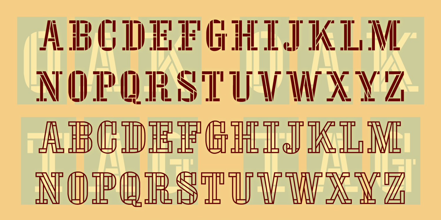
Oaktag
6 Fonts | from $24
Milky Way
2 Fonts | from $12
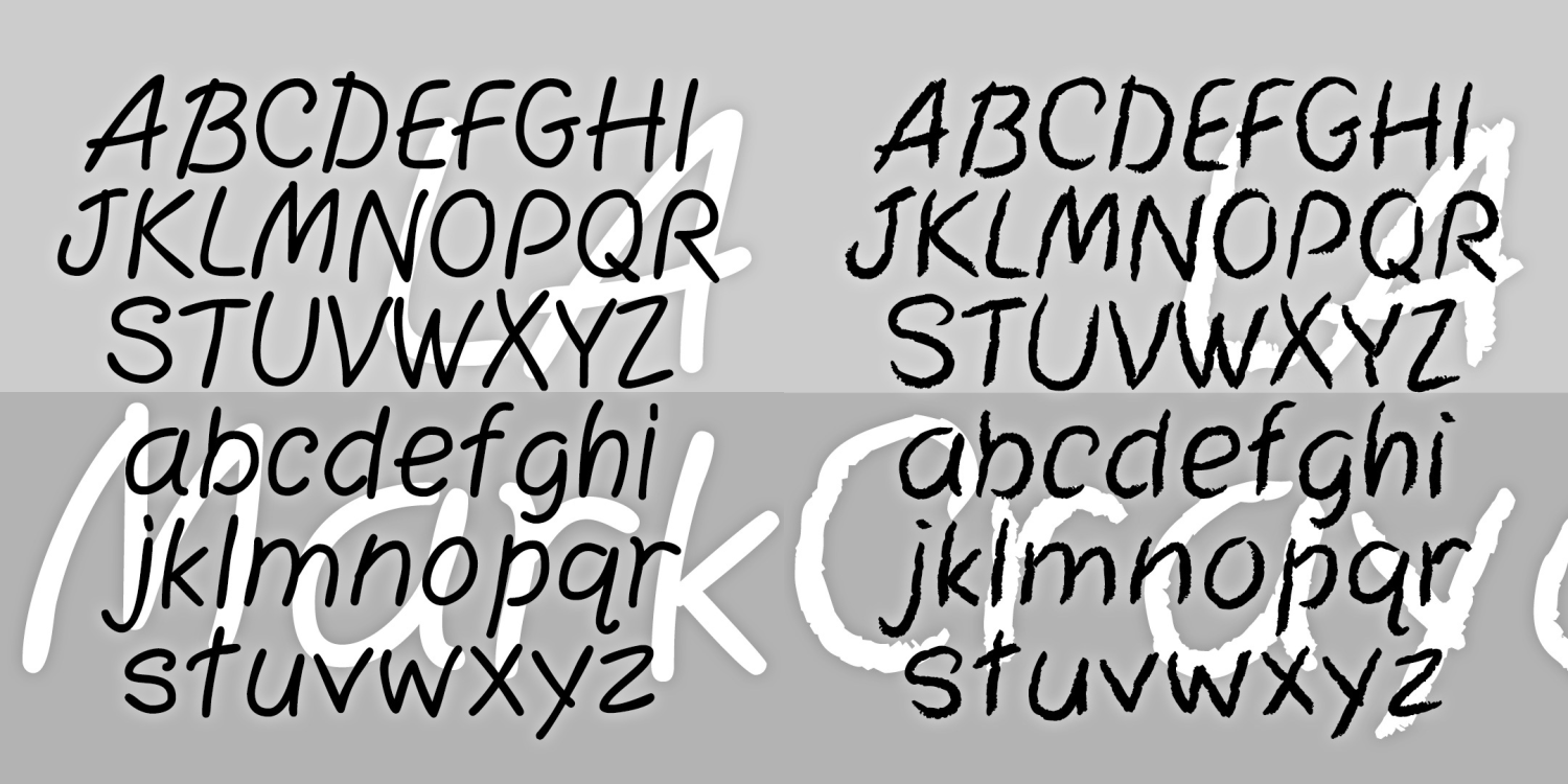
LA Marker & LA Crayon
2 Fonts | from $29.95
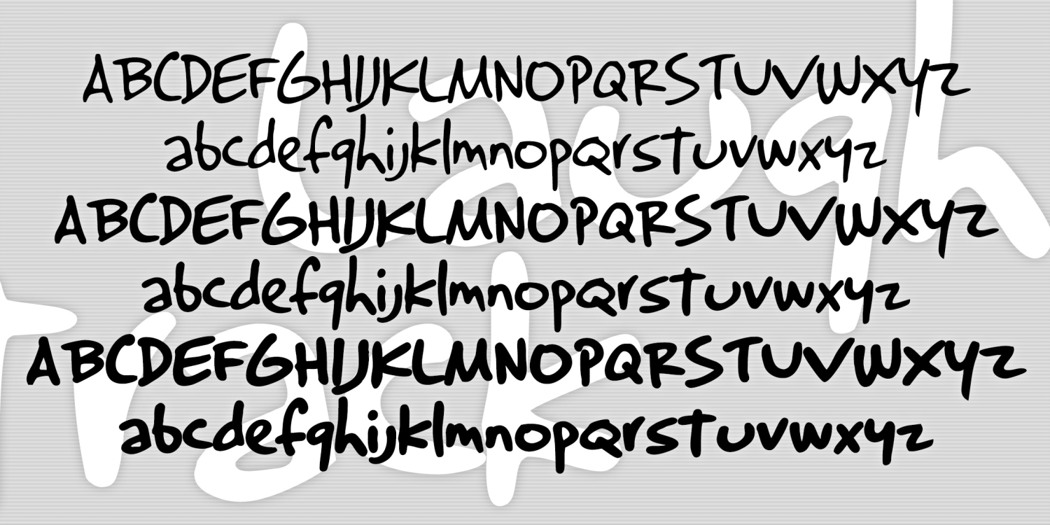
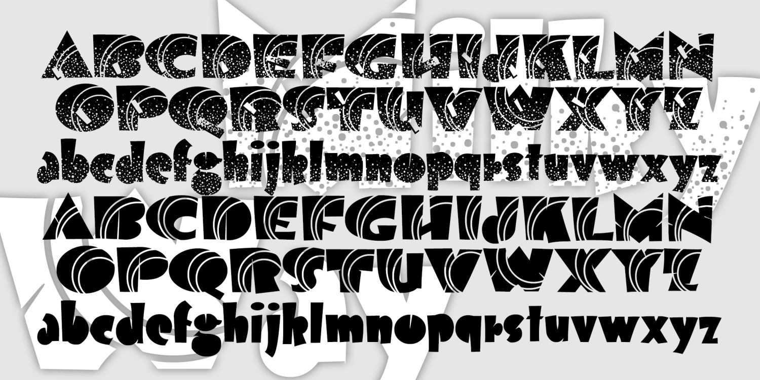
Laughtrack
3 Fonts | from $39.95
Karta
3 Fonts | from $19.95
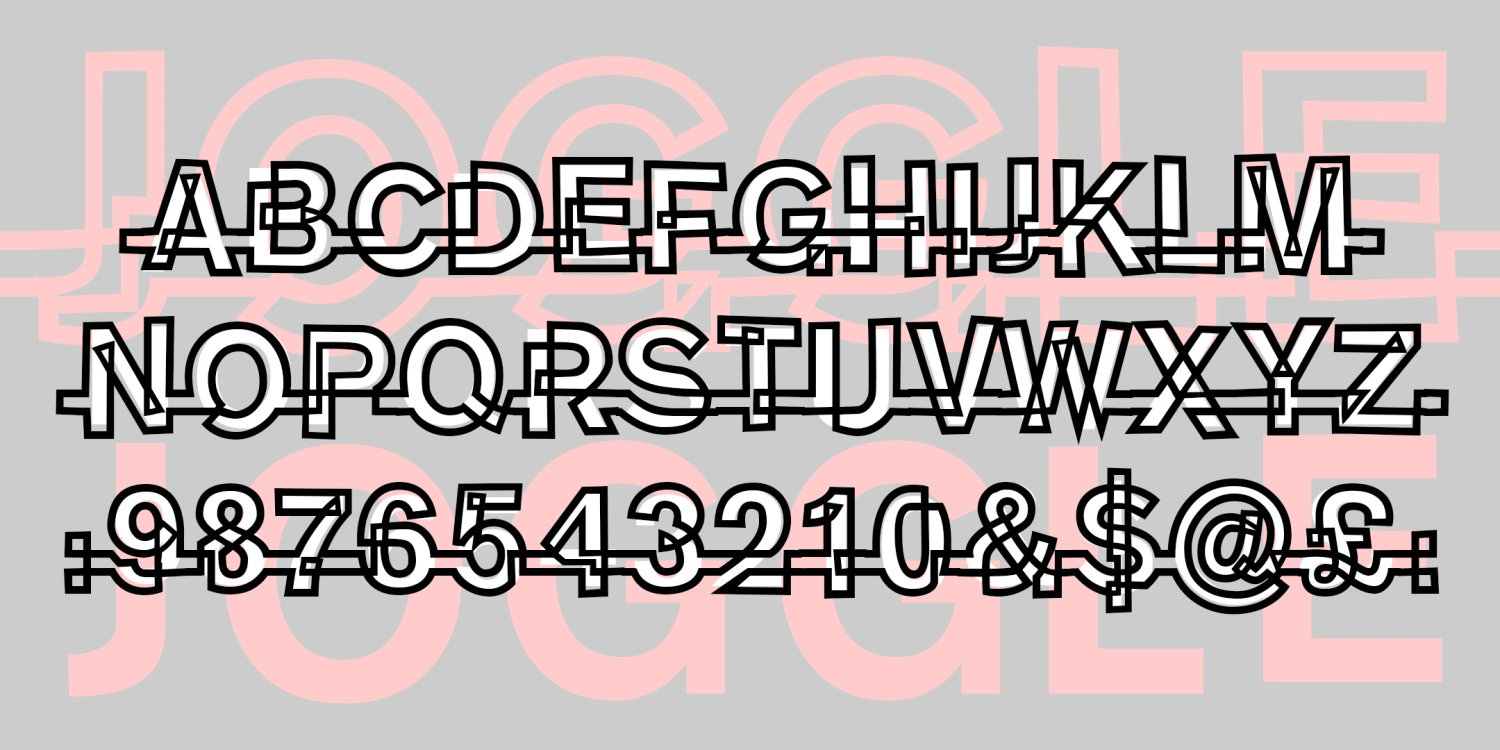
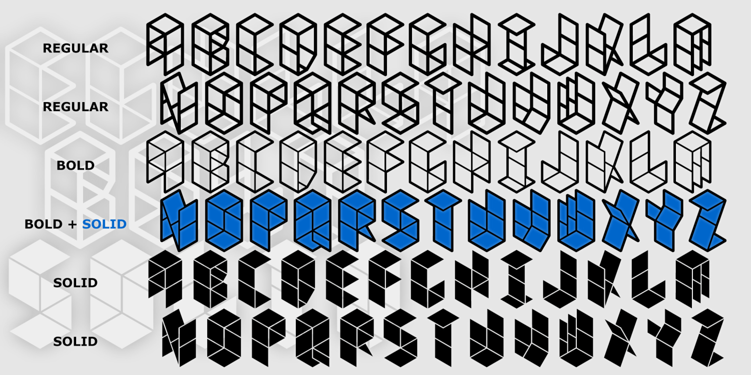
Joggle
2 Fonts | from $12
Jim Dandy
6 Fonts | from $24
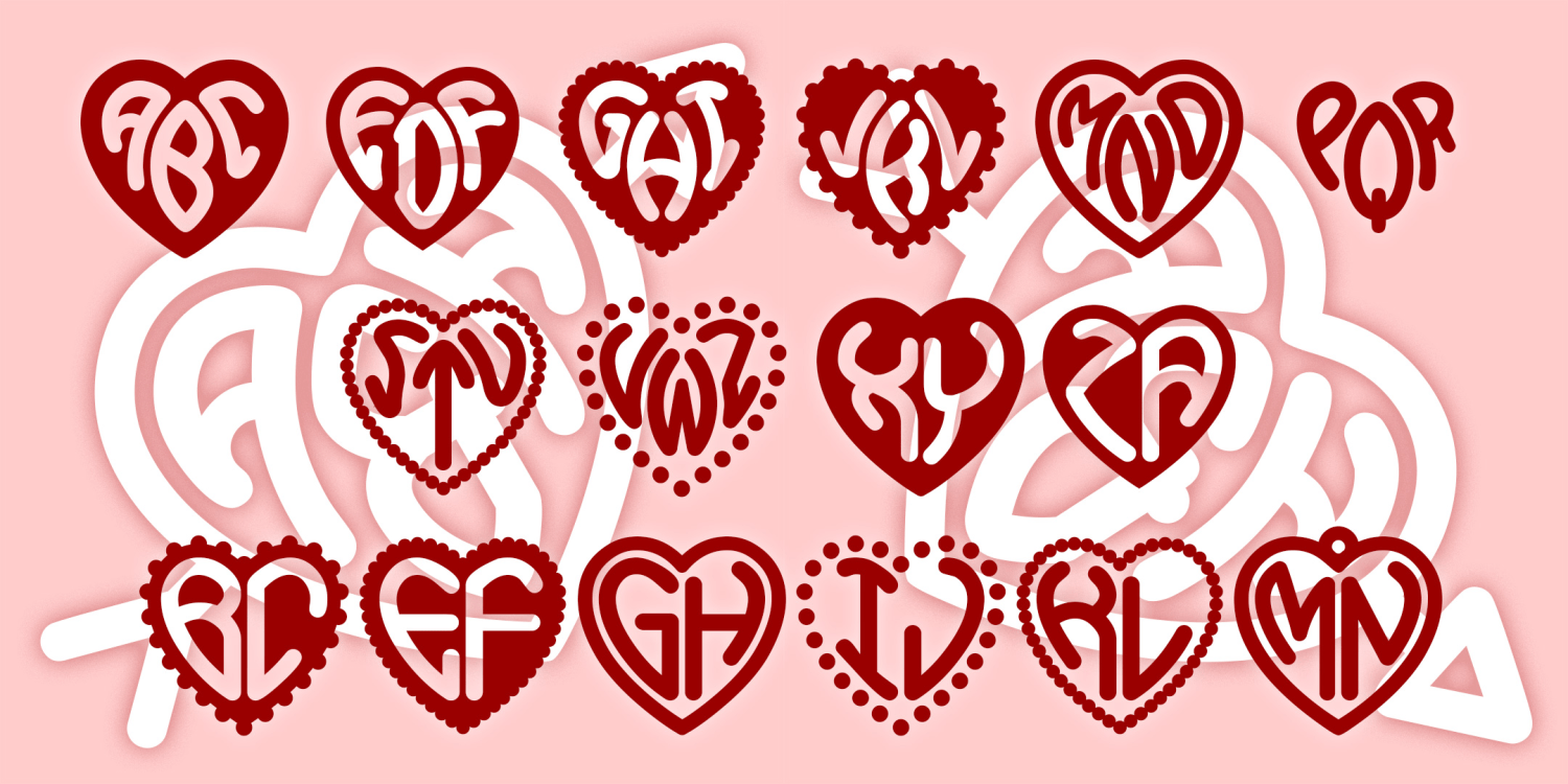
Heart Monograms
4 Fonts | from $19.95
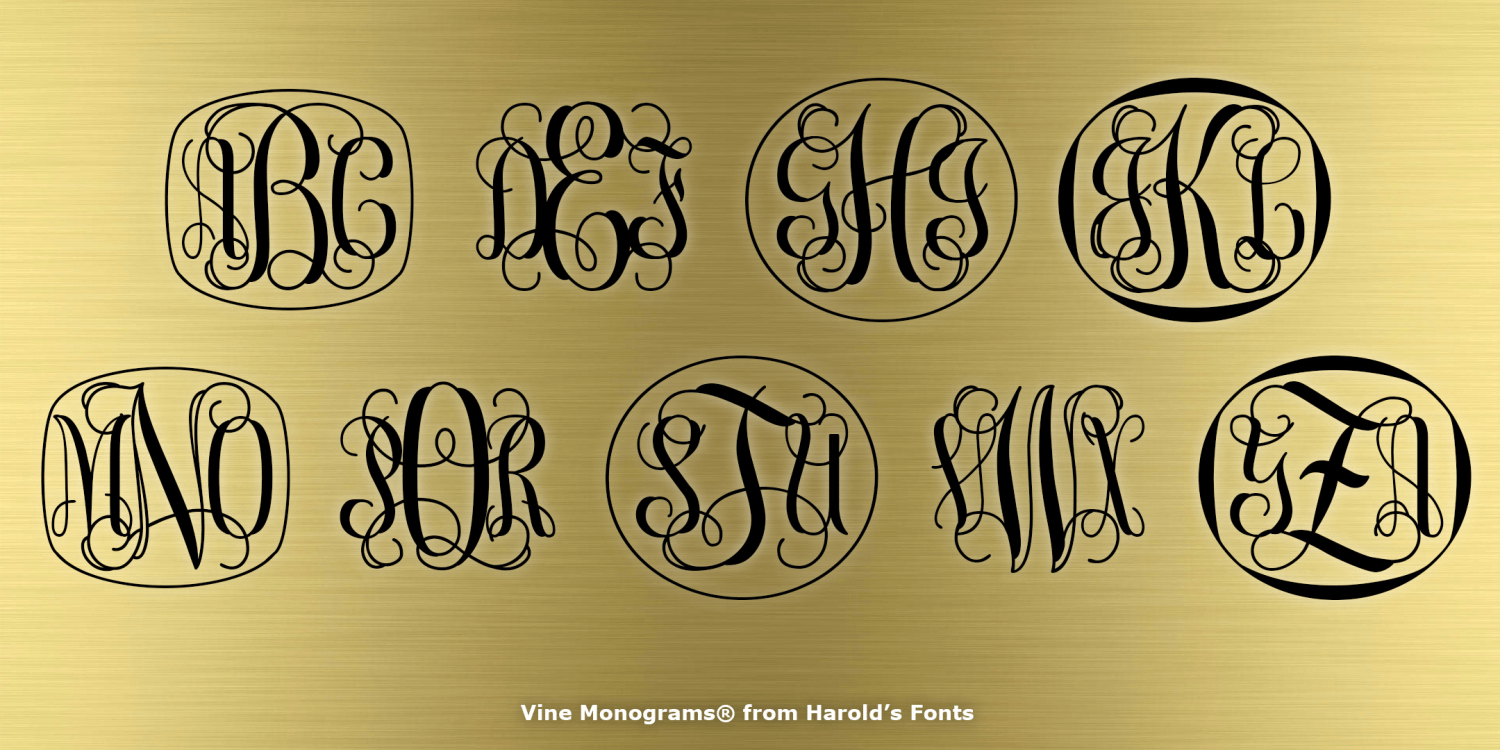
Vine Monograms
6 Fonts | from $19.95
Guadalupe
2 Fonts | from $12
Frank the Architect
4 Fonts | from $19.95
Fortuna Dot
3 Fonts | from $19.95
Clover Monograms
2 Fonts | from $19.95
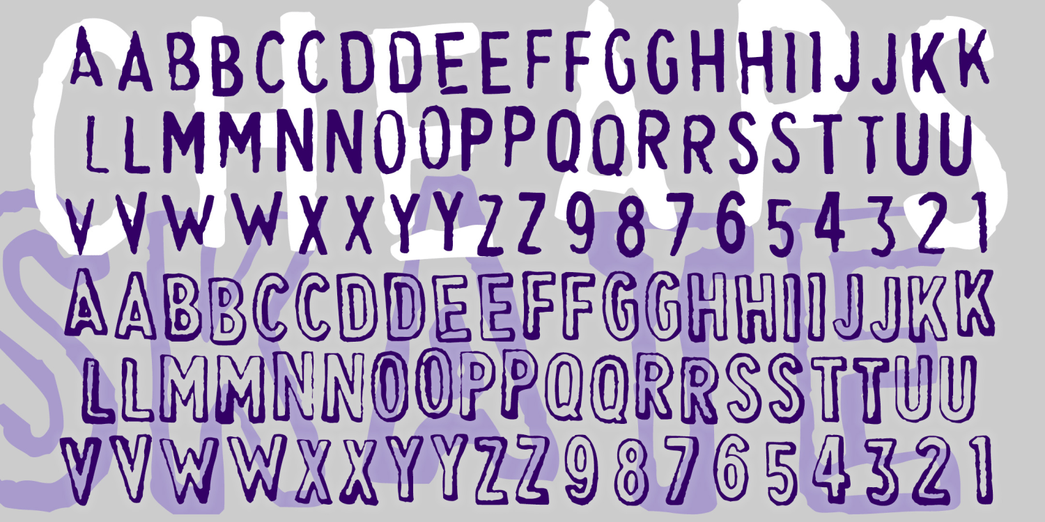
Cheapskate
2 Fonts | from $29.95
Bruce Mikita
2 Fonts | from $19
Barril
2 Fonts | from $12