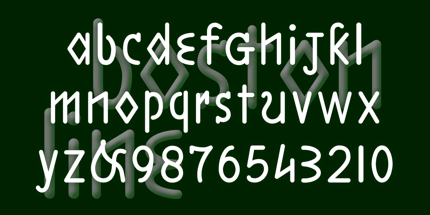
Boston & Philadelphia Line
Free Download | 4 Font Family by Harold's Fonts
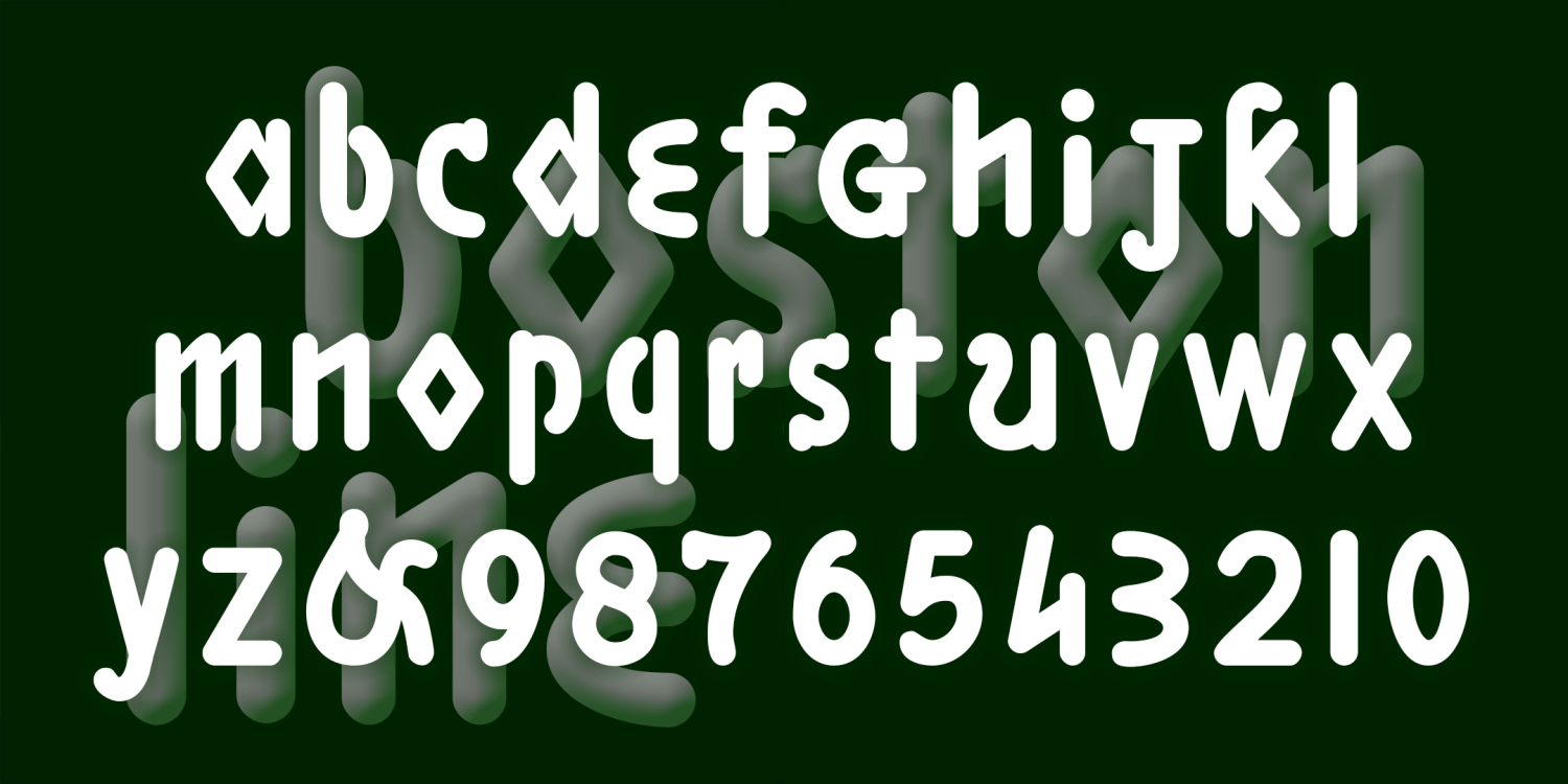
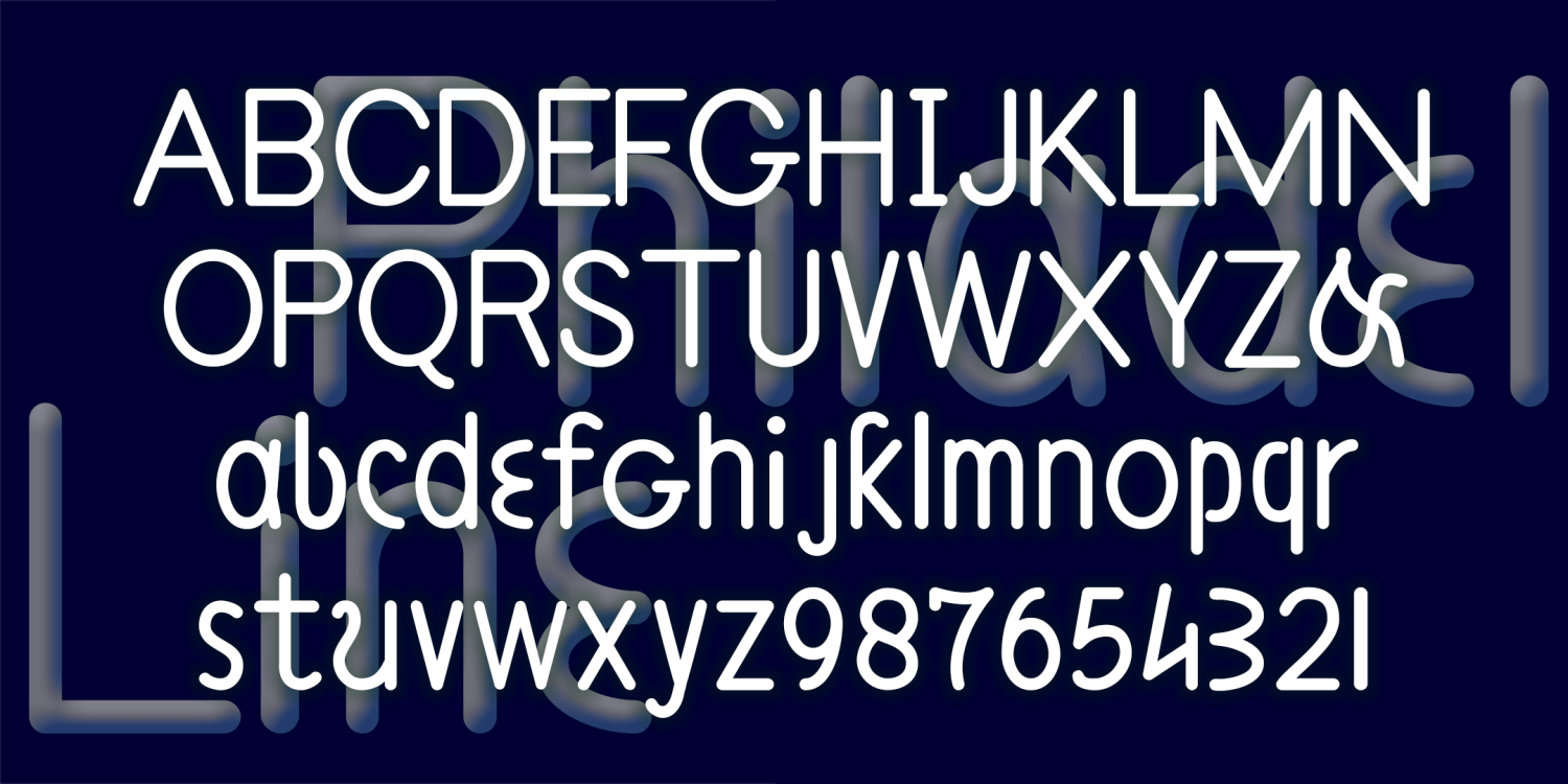
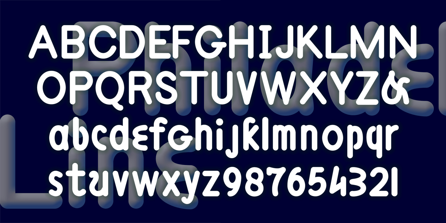
BOSTON LINE and PHILADELPHIA LINE fonts each have an unusual sanserif design, quirky letterforms, and rounded mechanical strokes that suggest template lettering or machine-readable fonts. Boston is lowercase only, Philadelphia is a bit more conventional including upper and lowercase, Regular and Bold for each.
These were inspired by 2 different 19th-century educators’ attempts to make a raised-letter alphabet for the blind. Eventually, the dot grid of Braille would prove easier to use, but Samuel Gridley Howe’s legacy lives on at Boston’s Perkins School, as does Julius Friedlander’s at Philadelphia’s Overbrook School.
In the original designs, all the letters were aligned on the baseline, including letters with descenders. I have lowered them to their conventional positions, retaining the original raised ones as alternates to be used for the greatest historical accuracy.
Download at Font BrosTest Drive This Font
Type Your Text Here
4 Fonts Included
Boston Line Regular
Boston Line Regular
Boston Line Bold Regular
Boston Line Bold Regular
Philadelphia Line Regular
Philadelphia Line Regular
Philadelphia Line Bold Regular
Philadelphia Line Bold Regular
View More Fonts