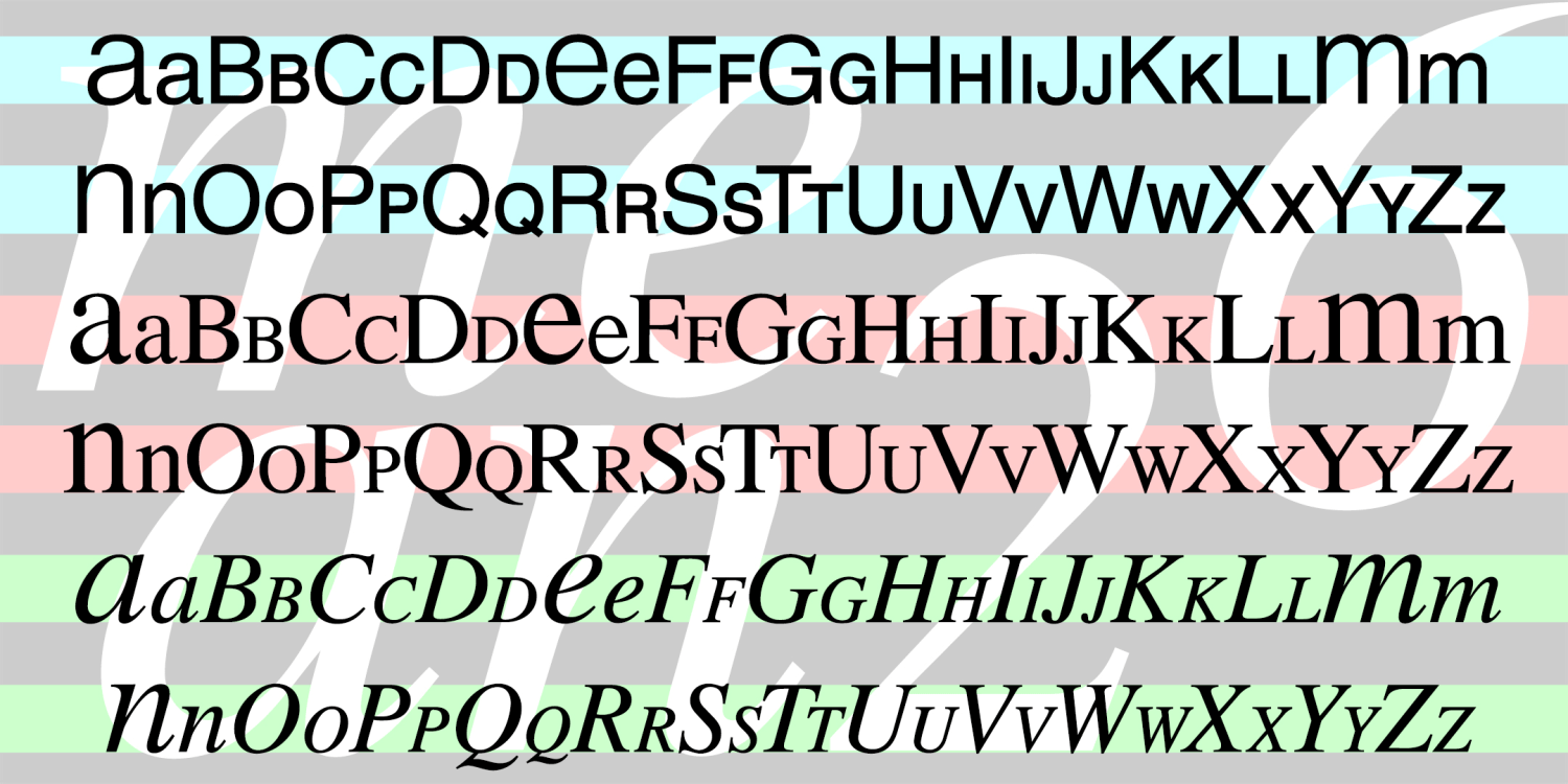
MEAN 26
Free Download | 3 Font Family by Harold's Fonts
MEAN 26 was inspired by Alphabet 26, Bradbury Thompson’s famous 1950 proposal for redesigning the alphabet. The idea was that there would be just one case, favoring the uppercase forms except for a, e, m and n, totaling 26. There would be a large and small version of each to use as capitals.
Thompson used the distinctive Baskerville for his prototype, and Alphabet 26 owes it much of its beauty to that choice. For my fonts, I’ve retooled lookalikes of familiar text fonts, adjusting the weights in an attempt to balance the big and little letters. Avoid the obvious font choice and give your text an unusual feel, rather like large and small caps or Cyrillic!
My opinion: the Alphabet 26 approach to typesetting does create an unusual texture, but its failure to catch on may be due to the fact that it actually reduces legibility by eliminating the differences between letters. It is overreaching to propose that learning two shapes for each letter is burdensome. The quirky differences between normal lowercase letters, including ascenders and descenders, enable legibility, rather than hinder it. If you want to help reading, at least in English, work on simplifying spelling.
Download at Font BrosTest Drive This Font
Type Your Text Here
3 Fonts Included
MEAN 26 Sans Regular
MEAN 26 Sans Regular
MEAN 26 Serif Regular
MEAN 26 Serif Regular
MEAN 26 Italic Regular
MEAN 26 Italic Regular
View More Fonts